Blog
Typography Tutorial: The Soul in the Machine – Adding Glitch Techniques to Your Work
What is Glitch Art?
In this tutorial, my aim is to introduce some techniques that you might not be familiar with that can achieve a unique glitch aesthetic in your designs. I like the idea of using some aspects of glitch art to incorporate into graphic design and give it a digital feel whilst still keeping the main focus intact. If you are unfamiliar with glitch art, then I recommend watching this short video by PBS called The Art of Glitch.
This tutorial will be broken up into three sections. In the first section I will explain how I have created a glitch font using the free online font-building tool Fontstruct. The second section will explore some experimental approaches that can be used to create glitches within your imagery. The third section will be focusing on the happy accidents that were generated through the glitches and how to bring everything together in Photoshop.
1: Creating the Font
I decided that I wanted to create a custom font for this project because I wanted to experiment with a series of posters, each of these with different phrases on them. If you don’t have the time to create a new font from scratch then manipulating an existing font in Photoshop can be just as effective. Alternatively you can download my font for free.
I created my font using the free font-building tool Fonstruct. Creating a similar font doesn’t require expert knowledge in typography, you will just need a bit of patience and an eye for what looks good and what doesn’t.
Firstly, I recommend finding an existing font that you want your font to look similar to and keep it in front of you for reference at all times. Any legible sans serif font would work great.
Inside the Fontstruct editor, you will be given many different shapes to work with which can be used to give your font a digital/pixelated feel. Experiment with the different shapes in your letters. You don’t need to be overly careful, but make sure that the letters still remain legible at smaller pt sizes. Try to keep some consistency throughout. If you find a cool pattern with the shapes on one letter, see what other letters you can replicate the same pattern in.
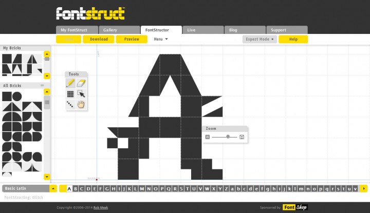
Continue to play around with the different shapes. Although it is supposed to look rough, try to keep the cap heights, median, descenders etc. similar to the font you have chosen to use as a guide. When you are happy with your font, click save and download your font.

2: Break the JPEG
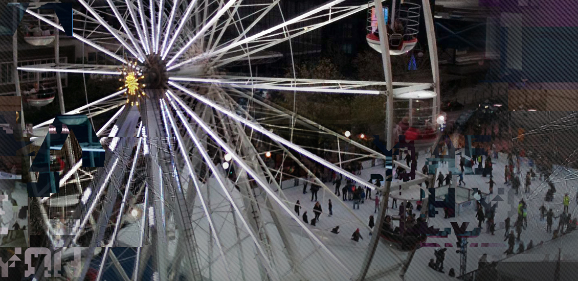
In this section of the tutorial I will go through 2 simple methods on how I go about glitching my imagery. I will be using one of my own photographs which I took in my home town of Birmingham, England during the Christmas period.

Firstly, set up a new document in Photoshop at the size you want your artwork to appear. Insert the image that you want to use, and then save it out in JPEG format in a different name. This will be the image you will manipulate to produce a glitched effect.
Locate that file and change the extension from .jpg to .txt. Then, open it up in a basic text editor like TextEdit. Begin to cut chunks of text out and paste it into different parts of the document. If you are working with a large image, you might need to use very large chunks of text. Keep within the middle and three quarters of the way down the document to avoid breaking any of the necessary the code.

Every image will react differently, so keep experimenting with cutting different parts out and moving sections around until you get something that looks cool. Create a few different ones and open them up in Photoshop. Sometimes Photoshop will throw up an error because it thinks the image has corrupted. If this happens, all you need to do is save it again from a photo viewer like Preview on Mac. You should then be able to open it up in Photoshop.

The second method is even simpler. There is an online glitch generator created by multimedia designer Georg Fischer where you can create multiple glitch images just with a few clicks. Go to http://snorpey.github.io/jpg-glitch/ and upload your image. Play around with the settings until you have something you like and then download your image. This is obviously a much quicker way of doing it, but I recommend using both methods so that you have a more diverse range of imagery to work with.

3: Bring It Together In Photoshop
Go back to the document that you set up in Photoshop with the original image inside as a background. You can now start cutting sections out from your glitched images. This will take a lot of trial and error. Try to use the more interesting glitches with the colours that stand out. Place them on top of your original background image roughly in the same place. Cut around the main focus of your design so that the glitched elements aren’t getting in the way too much.

Play around with layer styles. I found that using Screen worked particularly well in some places. Since some of the glitched images can look low quality, your design can end up looking a bit too blurry, so it is always good to use the Unsharp Mask filter to sharpen things up a bit.
For the text boxes, I decided to create a diagonal line pattern to really enforce the digital aesthetic of the design. To do this, I have created a new document that is 3 x 3 pixels and have chosen a white background colour. Zoom as far into your document as you can, then create 3 pixels forming a diagonal line. Click Edit > Define Pattern and name it.

Now with the Type tool, type in whatever text you want to appear in your design and position it wherever looks best. Draw out some basic rectangles behind it so that the text is legible but not covering up too much of the imagery.
On the layer that includes your text box, click on the Layer Styles icon and select Pattern Overlay. There you can locate your custom diagonal pattern. Make sure it is scaled so that you can see it clearly enough. I set the transparency to around 20%, but do whatever works best for you.

Duplicate all of your imagery layers just in case you want to keep the original layers. Then, merge the duplicated layers so that they become one layer. Use Hue and Saturation to make the colours more vivid so that the imagery stands out more.
Duplicate the merged layer again and apply your diagonal line pattern in the Patterns Overlay. Again you want the transparency to be around 20%. Once that is applied, use the Eraser tool to erase the middle so that you have the nice diagonal line pattern subtly appearing in from the edges.

Merging letters from your font into the background can also be very effective. Maybe you can type in some hidden messages that the viewer won’t notice right away. Just type out your text, transform it to wherever looks best and add some layer styles, but make sure it doesn’t distract from the main text.

Wrapping Things Up
I hope you have enjoyed exploring glitch aesthetics through typography and imagery and that you have discovered something new. Don’t worry if something hasn’t worked out the way you had hoped. The purpose of this tutorial is to encourage experimentation in your work. If you have come across something particularly cool with these techniques, then focus on that and bring the most out of it.
