Blog
Mix Cover Tutorial: Outer Limits Pioneer
Creating a Mix Cover
In case you didn’t know, whipping up mix covers is a great way to exercise some of your creative muscles. It’s an outlet I like to focus some of my more random ideas towards… whether it be subject matter, or a new technique I want to try out. Every once in a while I’ll make a new mix and create an accompanying cover for it to post to my site BLK Apple. Generally these mixes are based around a central theme, idea, or situation, making them perfect for some semi-structured visual experimentation.
With this mix I wanted to create a cover that touched on a Jonny Quest, meets Steve Zissou, meets Outer Space, meets National Geographic vibe. So what you’ll see in this tutorial is the process by which I came to the result you see above. I want to mention at the outset that this was a very loose process. Alot of the steps I took were completely random, but what you read below is a true un-altered account of the process. Let’s begin…
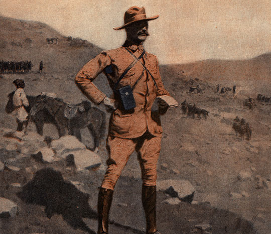
The image you see above is something I came across while digging through some old advertisement archives before I even had an idea to make the mix. Finding it quite fitting, featuring a strong gentlemanly character, I decided to use this as the basis for my cover.
First things first, I cranked up the saturation (ctrl+U, then adjust to eye), and start to cutout the character.
To cut out the character, enter quick mask mode by pressing Q, and start tracing his outline with the pen tool.
Once you complete your path, exit quick mask mode (by pressing Q ) and select ‘Load Path as Selection’ in the the Paths palette.
The chap will appear selected. From here I duplicate the layer by pressing ctrl+J.
Here he is, in all his cutout glory. Next up we’ll use the Clone Stamp Tool to fix up the background now that we have the character on his own layer.
When I do this, I generally have it set to around 30% opacity and the brush semi-softened (a nifty shortcut to quickly adjust the hardness of your brush is ‘shift+[‘ and ‘shift+]’)
Here is what I came up with. It’s not super seamless or perfect, but it’ll do the job… Just to make sure, see what our chap looks like on it…
Looks pretty good. The edges of our character don’t seem too bad, moving on…
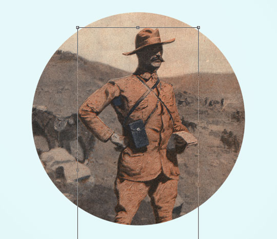
From here I decided I wanted to frame the content, both to trim the excess imagery and to evoke a more record-sleeve feel. I simply used the Elliptical Marquee Tool to make a circle, then inverted the selection (ctrl+shit+i) and filled (shift+F5) the layer.
I then scaled and placed the character to my liking within the new frame.
From here I started to emphasize the composition by adding in some highlights and lighting effects. Specifically, I sampled a pink hue from the background and started painting where I wished to highlight, then set the layer to Overlay.
Continuing this thought process, I went ahead and added in more highlights and shadows in the following steps.
This, as I mentioned before, was a very fluid process. I would add a bit here, erase some there until I felt I had something I could work with.
At this point I wanted to add an inner shadow to the frame. I simply created a circle the exact size of the frame, set the Fill to 0% and added an Inner Shadow style (double click the layer to bring up the layer style window, select Inner Shadow).
At this point I’m feeling pretty good about where this is going. However I want to ramp up the ethereal/spacey vibe a bit more, so I decide to abstract the background image…
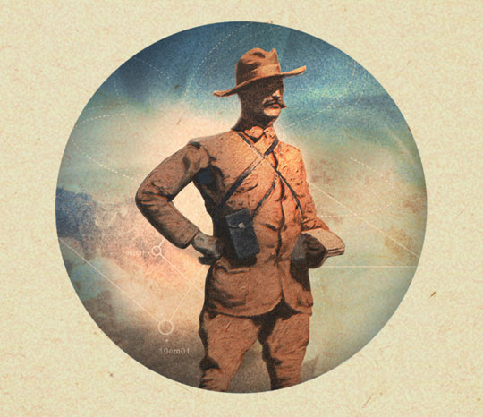
Basically what I decided to do was to duplicate the background, and start blurring and tweaking it… Experimented with combining different Layer Styles, such as Exclusion on top of an Overlay.
With the background now looking a bit more flat, I wanted to add little details to help it out just a little bit.
I started painting on some lines and then rubbing them around with the Smudge tool. I started to see a sort of ‘warping’ effect going on, so I ran with that by painting more lines in a circular motion around the character.
Here I decided that I liked how it was starting to turn out, but I wanted to unify all the different hues and textures. So what I did was track down a texture that was fairly uniform, and would help warm up the piece.
This paper image seemed appropriate, so I scaled it to where I liked it (basically so the grain of the paper didn’t look too big) and set the layer to multiply, thus resulting in a more cohesive version….
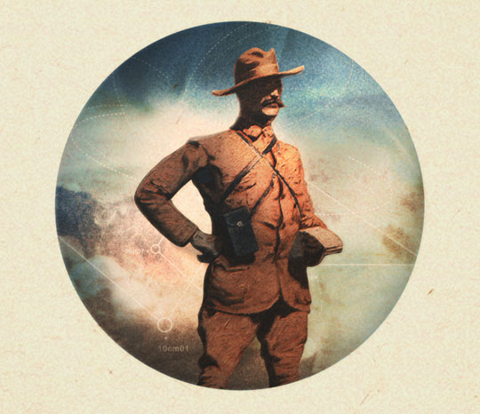
Looking at it, I still want to add some more detail to the background. So I decided to use some infographic vectors I contributed to Set 18 to aid me.
Now that I added alittle more intrigue to the background, I can start to see how I’m going to polish off the piece. Though everything is looking cohesive, I want to spike the contrast to add some contrast and drama. To do this, I select all the visible layers (ctrl+shift+A) and paste it on top of all the layers.
Desaturate (ctrl+U) it and adjust the levels (ctrl+L).
Then to soften it up, I add a Gaussian blur.
Set the layer to Multiply, and I now have the additional contrast I was looking for. Now to finish it off, I add in the copy.
I set the type in Avenir, which I am a huge fan of. The title line I chose to open up the tracking to let it breathe and to let the background image come through as much as possible. As well, I opened up the leading for the tagline for the same reason.
To finish it off, I add in my National Geographic-esque rules and add in the chapter one caption.
I hope you guys enjoyed the walk-through! And if you’re curious to hear the music and how it played in with the visual design, the mix will be up soon at BLK Apple.


