Blog
Logo Design On A Budget

I am frequently asked to put together logos or promotional materials for independent bands, which is fantastic, except they don’t have the budget of a signed or sponsored band. Through the years I’ve found ways to cut corners to limit design time without limiting the overall design quality. In this tutorial I’ll break down my creative process used on a logo design for the UK hip-hop duo Second Nature.
The Brief:
Second Nature had a clear vision of what they were wanting in a logo design, which can be good or bad. It does somewhat limit the designer’s creativity but on the plus side it saves the designer time trying to hit the correct style and layout. During the initial brief the group had stated that they wanted a logo that included an illustration of each member but they wanted a layout that had the focus on the text. They wanted the text to be huge and pay respects to the old school RUN-DMC logotype and layout. I started putting together some ideas and when they chose their favorite layout I had them snap some poses that would work with the layout.
Tools Used:
- Wacom Intuos3
- Photoshop CS4
- Illustrator CS4
- GoMedia Destoy 2 Vector Pack
The Illustration: Losing the Background
After I received the images I brought them in to Photoshop and made a selection using the pen tool.

I created a path around the bodies and then Cmd-click (or right click -> Make Selection) on the path to make a selection of the path.

After the image was selected I then used a layer mask to drop out the background.

I then applied the same process to the other member’s photo and saved both out as .tifs with transparency’s turned on and then placed them both into a new document in Illustrator.
The Illustration: Live-Trace
Because I was working around a budget it did conflict with my normal illustration process, which would be to illustrate in either Photoshop or Illustrator fully and if needed then live trace the Photoshop Illustration. I did not have the time to do this, so I decided to take an easy way out and then try and give it a hand drawn appearance.
I selected the image I wanted to live-trace and then opened the live-trace dialogue box from the Object menu.

The tracing options I used varied between photos, it really depends on the designer on how much or how little you want to use, as it will affect the amount you’ll have to draw in later.

The Illustration: Hand-Drawn Effect
After I had my image traced I began shading and filling in the empty spots with line work. I used a single brush preset for all of the illustrations to give it a uniform feel and make it look more hand-drawn. I placed the image in a second time and used it as a reference for shading.

(Tip: When drawing a lot of lines in a close area in Illustrator the default presets can be very annoying. It defaults to “Keep Paths Selected” and “Edit Selected Paths”. If you draw in a line close to where your last was drawn, it will disregard your last line and keep the new one, as it thinks you’re trying to edit the original. You can shut this off by double clicking the the brush icon in your toolbar and uncheck “Edit Selected Paths”.”
Once I have my brush set up and my reference image in place I create a new layer for my linework. I begin filling in and shading as you would any other drawing, but I start where the the live-trace leaves off, using that as my maximum shadow source. I shade densely from the shadow outward letting my lines get more and more sparse as they reach the light sources.

Though, it may look tedious, keep in mind you do not need to be a perfectionist. The customer was wanting a hand-drawn look, therefore uneven lines, messy shading and little oddities sometimes add to the design rather than take away from. They weren’t wanting a clean precise vector piece, so get I got messy, had fun and went really really quickly.

Within a few minutes I was done with the first illustration and moving on to the other member. I used the exact same presets and technique for the second illustration to keep them consistent.

Once both were done I was extremely happy with the result. I knew from my sketches of the layout that the illustrations were not going to be the focal point, and they would never be viewed at very close range compared to the rest of the logo, and these would work just fine.

The Layout: Implementing Text
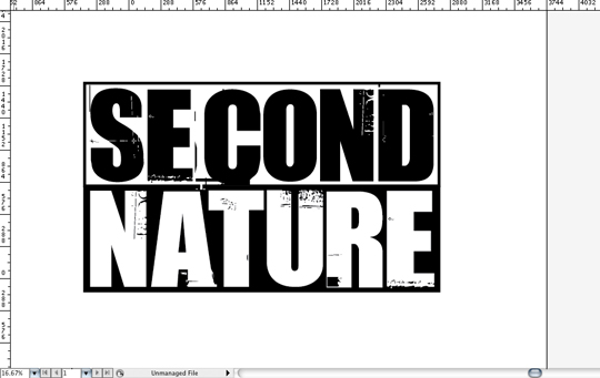
As I had mentioned above, Second Nature was wanting some giant bold text in similar respects to the old school RUN-DMC logo. They had only wanted a solid color, but needed the text to stand out more than anything. I knew I wanted a bold sans-serif that paid respect to RUN-DMC, but I also knew I wanted some minimal distressing that would reflect the hand-drawn feel. I’d don’t frequently use stylized typefaces, however when designing on a budget I didn’t have time to do the custom distressing. I took a look on dafont.com and found Uptown, which is exactly what I had in mind when I began the search.
I put the text in place and inverted the colors within a bounding box, that I created out of two shapes, to help pay homage to the RUN-DMC logo. Though, the font could use some adjusting on the tracking, I really didn’t want to adjust anything as I thought the inconsistency between the letters added character.
Once I was happy with the text layout I dove in to the GoMedia Arsenal to add some quick character to the type. I wanted to enhance the type treatment so it didn’t look so much like a free font. The Arsenal packs are great for when you’re working on a budget and don’t have the time to custom draw in type treatment or create paint splatters.

I grabbed the first one in the destroy 2 vector pack, which is my all time favorite for distressing type or backgrounds. I dragged the file over to my logo document and sized it appropriately.

Once I was happy with the placement I then used the eraser tool to erase any part of the Arsenal file that was outside of the bounding box. When I created this logo I wasn’t aware of the wonders of Pathfinder, so I chose the eraser route. Once I had cleaned up the surrounding area, the text portion of the logo was done!

I then pulled a vector splatter from one of my archives and used it to show the size and perspective of the text.


The Final Layout
Once I was happy with the text and added elements I added in the illustrations. It all came together and Second Nature was extremely pleased with the final result.
