Blog
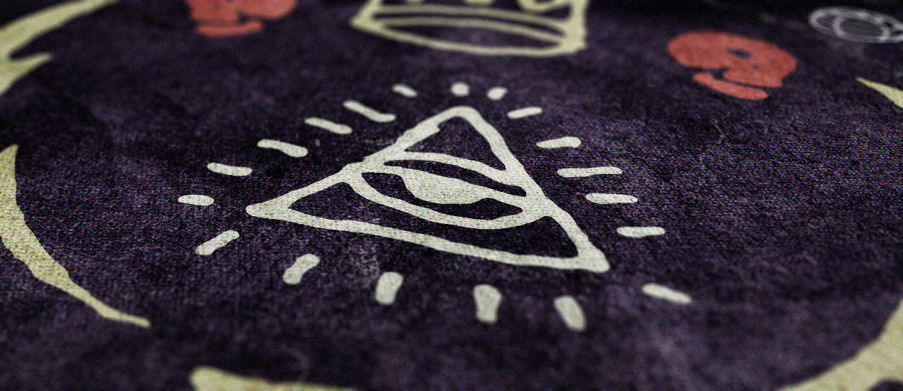
Illustrator and Photoshop Tutorial: Create a cool occult LP jacket with the occult symbols vector collection!
A dive in the deep end
Hello Zine readers! Simon from The Shop here.
It’s been a while, and I hope you all have had cool things happen since we spoke last. I’m excited to be back here today, and to share my latest Illustrator / Photoshop tutorial with you. We’re going to create a cool album cover with Jeff’s Occult vector collection found on the Go Media Arsenal.
You should get the complete thing. For less than $40, you get a really nice set of assets, that you can re-use in so many projects.
BUY THE OCCULT SYMBOLS COMPLETE COLLECTION
The brief is alas fake, but let me introduce you to the band: they’re called Fiat Lux, and have just released their album Æterna. Imagine a band at the crossroads between Xploding Plastic’s Kissed by a kisser:
https://www.youtube.com/watch?v=KStWfDdOYlM
And Slipknot’s Vermilion Part II
With these references, we could define the band’s universe as dark, strange, occult, mysterious, and “out there.” From there, it’s time to look at our resources, and to start sketching.
Step 0: conceptualizing
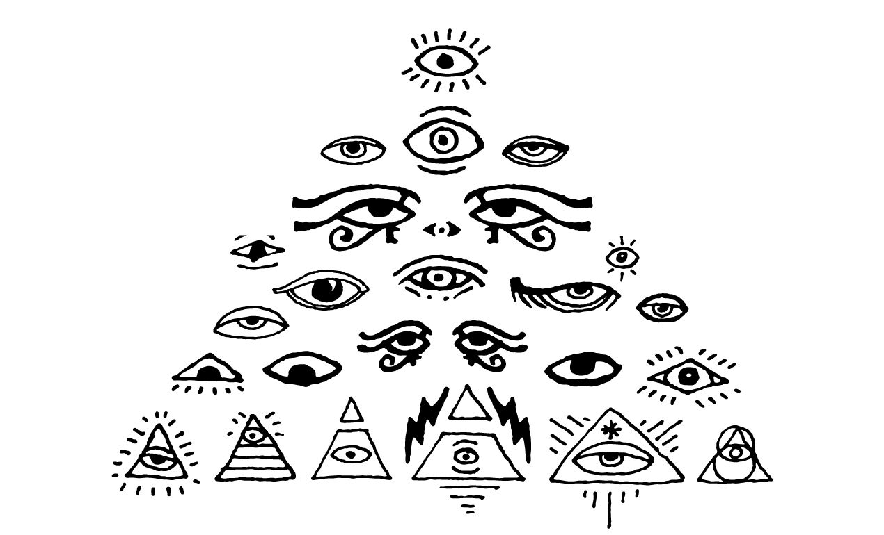
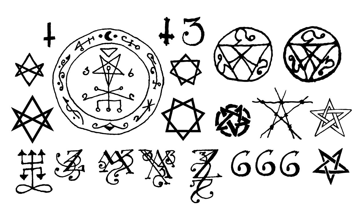
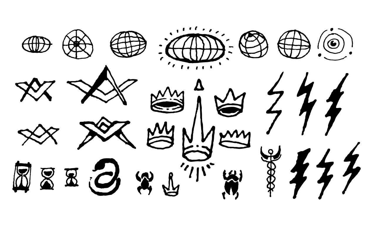
Like I said earlier, our primary resource will be the sweet collection of occult symbols and esoteric elements Jeff designed and recently released on the Arsenal. Let’s have a closer look at the various packs composing the full collection.
As you can, the 500+ elements give us quite a range of options to choose from, and of directions to explore. It’s time to break out the pencil and paper, and to find arrangements that fit the band’s universe. After a few hours of playing with combinations, these are the ones I came up with that I liked the most and that I felt were presentable to “the client.”
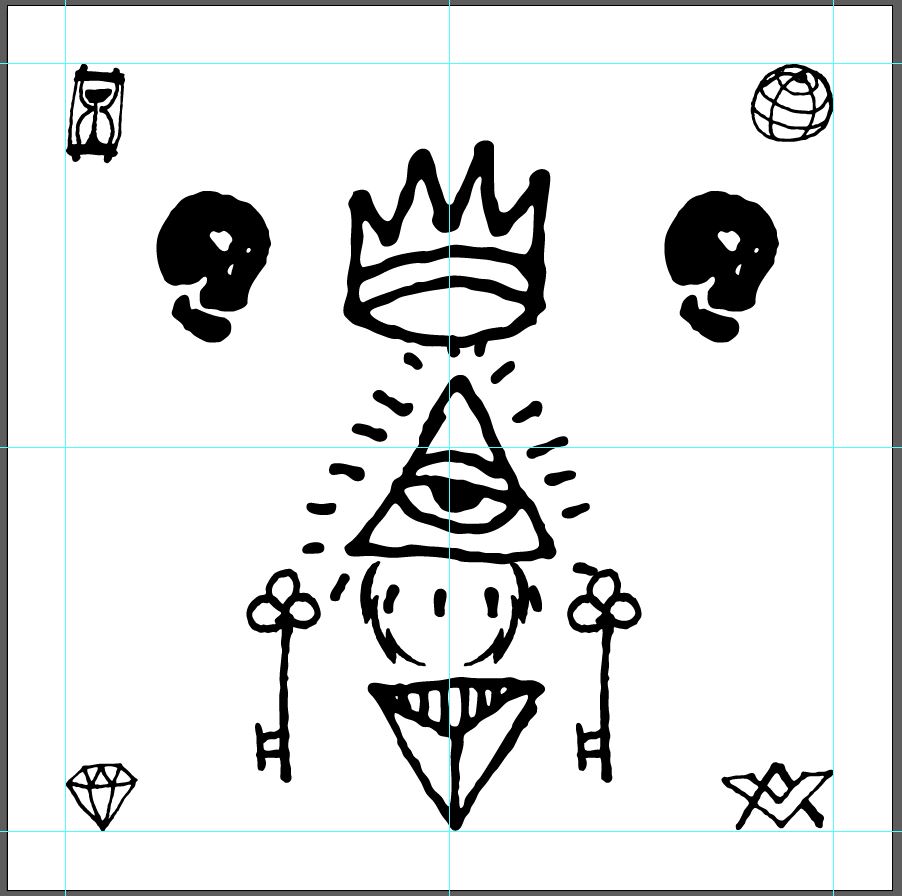
After chatting a bit with Heather, who agreed to play the role of the band, we agreed on the top right design. It looks like a complex design, but is accomplished with only a few elements. It speaks of time (the hourglass), of control and/or the divine and spiritual (the all seeing eye), of mysteries (the keys), of power (the lightning bolts, the crown, and the diamond), of death (the skulls)…
Now that we have a design, we should execute it, don’t you think?
Step 1: vectors
The design will be assembled and colored in Illustrator, and then textured in Photoshop. This will allow us to get the best of both worlds, when we need it. We need Illustrator’s flexibility and vector manipulation tools to quickly build our layout, while we need Photoshop’s unparalleled abilities to manipulate textures.
File setup
Obviously, that’s where we start. It’s like putting the foundation for our final piece in place. Start by creating a new 15″x15″ document in Illustrator. Most record art is usually delivered at 12.5″x12.5″, so why 15″x15″? The reason why is easy: even though we’re working in vectors, working at size 1:1 (or slightly bigger) helps when you’ll place all of that in Photoshop. Working at 15″x15″ could also help you/your client to quickly re-purpose the art as a print of some kind.
Assets gathering
Next, we need to go through the various packs in the occult collection, and to get all of the assets we’ll need in our Illustrator document. From gma_all-seeing-eyes.ai, we need the bottom left element (all seeing eye with small burst).
From gma_esoteric_spiritual_symbols.ai, we need the thin diamond asset.
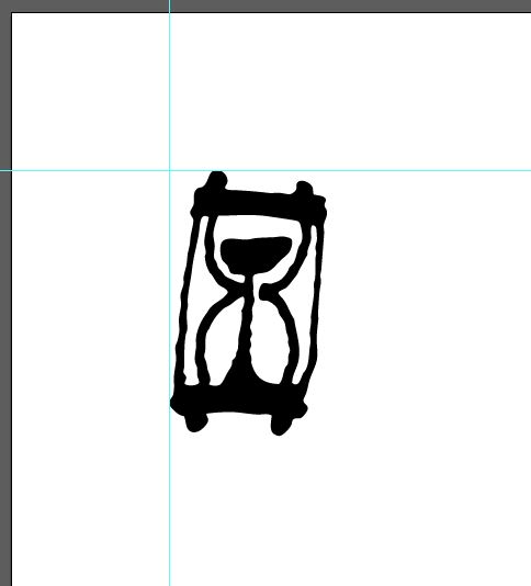
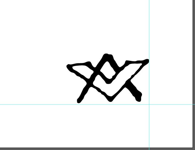
From gma_esoteric-misc.ai, we need quite a few: globe, masonic symbol, crown, and hourglass.
The triangular element comes from gma_hand-drawn-shapes.ai
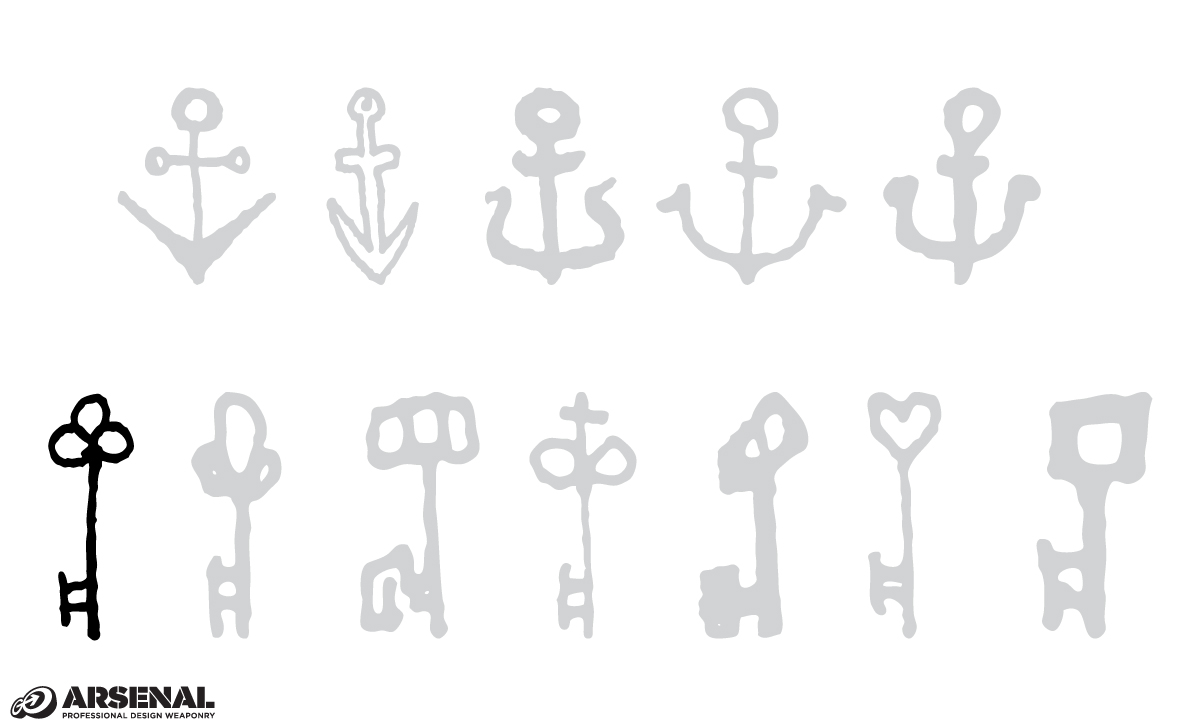
The key asset comes from gma_keys-anchors.ai.
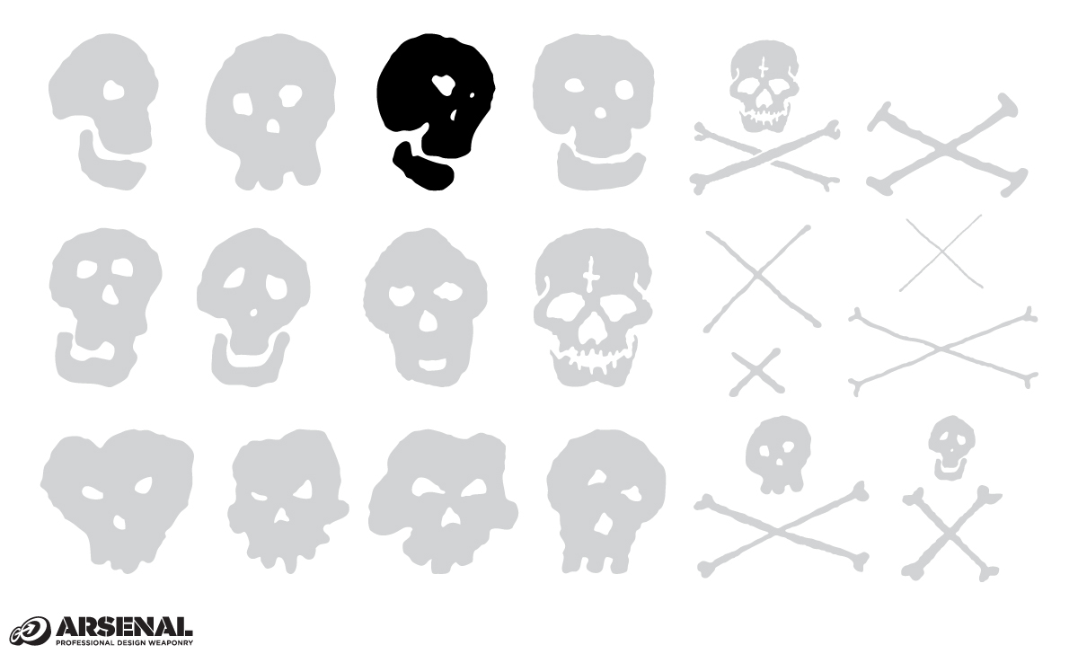
The skulls are from gma_skulls-crossbones.ai
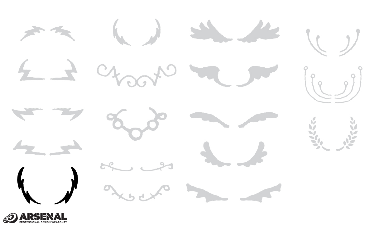
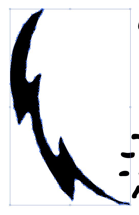
And the lightning bolts are from gma_wings_laurels_lightning.ai
And here are all of our assets
Layout building
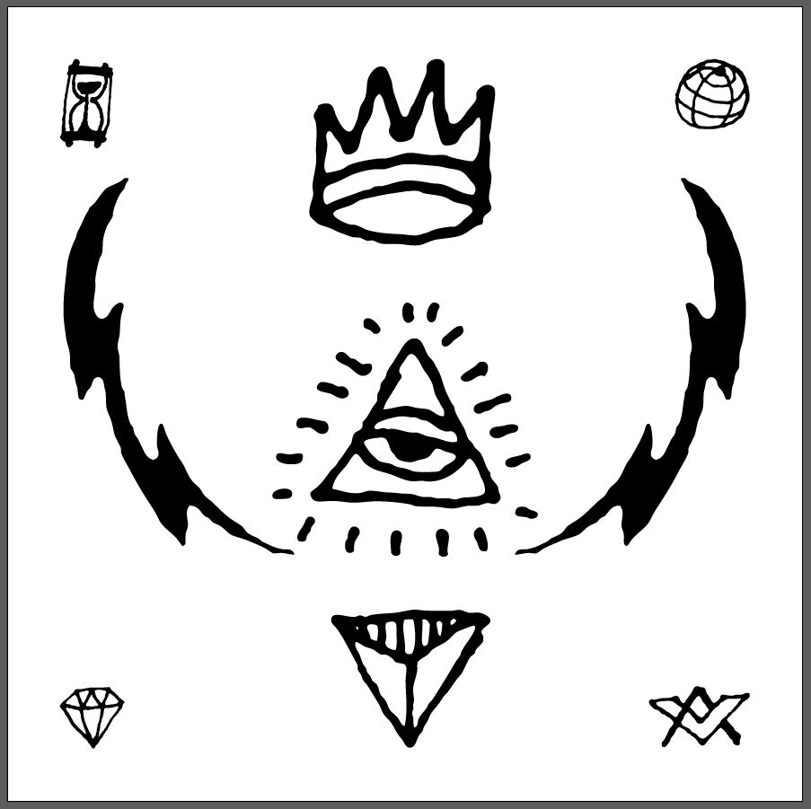
Building the layout itself is simple: we’re just sticking to the sketch. Start by organizing the elements as the sketch as them. I also placed guides in place to assist in the process: a series at 1″ of the canvas’ edges, and some to indicate its center. Don’t worry about proportions, or orientations just yet.
From there, having your sketch in front of you, it’s easy to place and resize elements appropriately. Let’s start with the corner elements. I have them all placed within the guides at 1″ of the piece’s edges. I have up-sized the hourglass slightly, increasing its width to 1″, and also flipped the orientation of the globe (Transform > Reflect > Vertical).
Next is the “center piece” of our design: the crown/all seeing eye/triangular element combo. I started by increasing the width of the all seeing eye to 5″, and adjusted both the crown and triangular element’s sizes from there. The logic I followed was to give both elements a line thickness comparable to the all seeing eye, which makes them elements of a same ensemble. The crown ended up being 3.5″ wide, and the triangular element 3″ wide.
In order to make the visual flow of the piece more dynamic, I also turned the triangular element upside-down.
The top of the crown is aligned with the top horizontal guide. The all seeing eye is aligned so the top of the eye lines up with the horizontal center guide.
Our center piece is ready.
Let’s put the lightning bolts in place next, as they’ll be our cue to align both the skull pair and the key pair. I’m using them to create a visual link from the crown to the triangular element. Each bolt is aligned to its respective guide close to the frame’s edge, as well as roughly vertically centered in the piece. That combination of constrains place the new dimensions of one of the bolts at roughly 4.5″ wide.
I like the result, but the bolts are too thick and overpowering compared to the rest of the elements. A quick trick is to give them a stroke (aligned to the inside of their shape), and to subtract it using the pathfinder. Let me show you how.
Start by assigning a stroke to both bolts, in order to make their thickness visually more satisfying. I’m using a white stroke, in order to right away get a sense of the results. I’m using 5 points for the stroke thickness.
Once we’re happy with the amount of lightning hidden by the stroke, it’s time to actually delete it. Start by expanding the stroke to make it a vector element (Object > Expand appearance).
Proceed then to use the Pathfinder’s Merge functionality to effectively fuse the white outline and the black bolt together.
What the Pathfinder will do is merge the various shapes, and “clean out” the hidden paths.
Once you have done that, you can delete the white shape after selecting it with your direct selection tool (A).
Apply the same process to the second bolt.
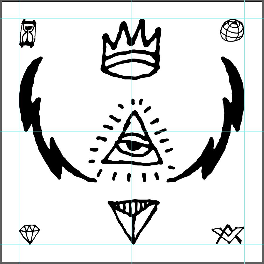
From there, you can rearrange the bolts to fit the layout better visually. Here’s the before:
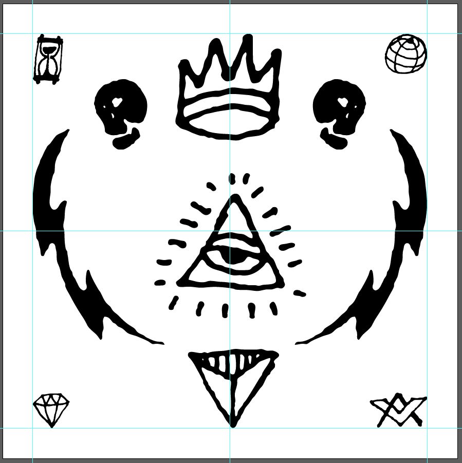
And here’s the after (with guides). The bolts have been lowered, in order to line up with the triangular element.
From there, it’s time to finalize the placement of the skulls. I’ve located them between the bolt and the crown. I’ve also flipped the skulls appropriately so they are directed towards the outside of the piece.
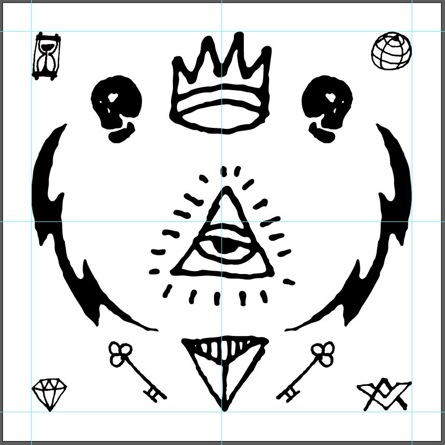
The last piece of our layout puzzle is the pair of skeleton keys. These are rotated 45°, and aligned with the edge of the bolts, as well as with the first “module” of each bolt.
Step 2: colors!
The color palette I chose comes from COLOURlovers, and is called Kabbalah ², which fits right in with our theme.
The palette features 5 colors, but we’ll only use 4 of them. From left to right:
- Off white (Yesod), #CCD0BB
- Tan (kether), #BDBA85
- Blood red (Kabbalah), #903024
- Dark purple (gothik kabbalah), #14061D
- Purple (Kabbalah), #221847
There are quite a few ways to apply a color palette to a piece, and I’ve selected two of them that I sent to my “client.” One features a light background, and the other one a dark one. Both already have an unsettling feel to them, that we’ll further emphasize with textures.
In the first one, the background is our off white, the corner elements are dark purple, the skulls and keys are purple, the lightning bolts are tan, and the center piece elements are blood red.
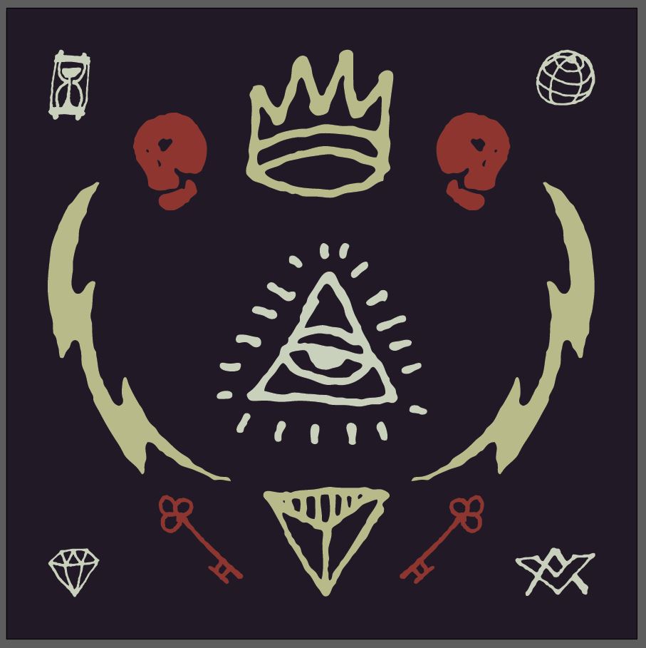
In the dark version, the background is dark purple, the corner elements are purple, the skulls and keys are red, the crown, bolts, and triangular element are tan, and the all seeing eye is off white. This helps to give it a bit more prominence in the composition.
The “band” – Heather – preferred the dark one. The only change we made was to make the corner elements off white, because they were getting lost on the dark purple background. The resulting composition is below.
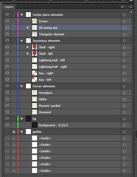
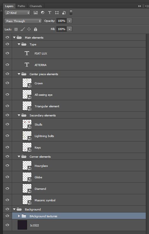
Finally, before moving forward in any way, it’s time for some file cleanup. Organizing and labeling your layers properly will save you (and anybody else that has to work with your file) a lot of time in the next stages.
I gave the center piece elements their own layer, then moved on to the secondary elements, followed by the corner elements, and finishing with the background and the guides. I also labeled all of these for what they are.
Step 3: textures!
This is going to be the step where we’ll bring our carefully constructed layout to life, by adding substance and depth to it. All but one of the textures we’ll be using here are free.
Assembling the textures
Start by making sure you have the resources handy, which will be helpful and speed up the execution. Let’s assemble them.
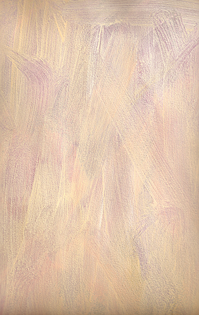
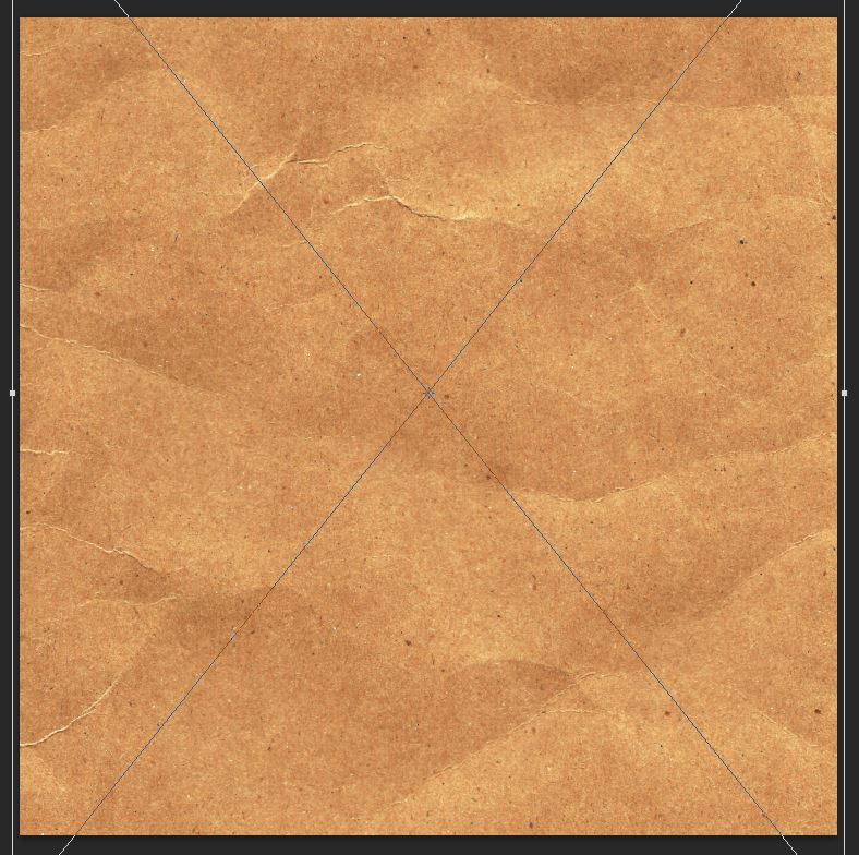
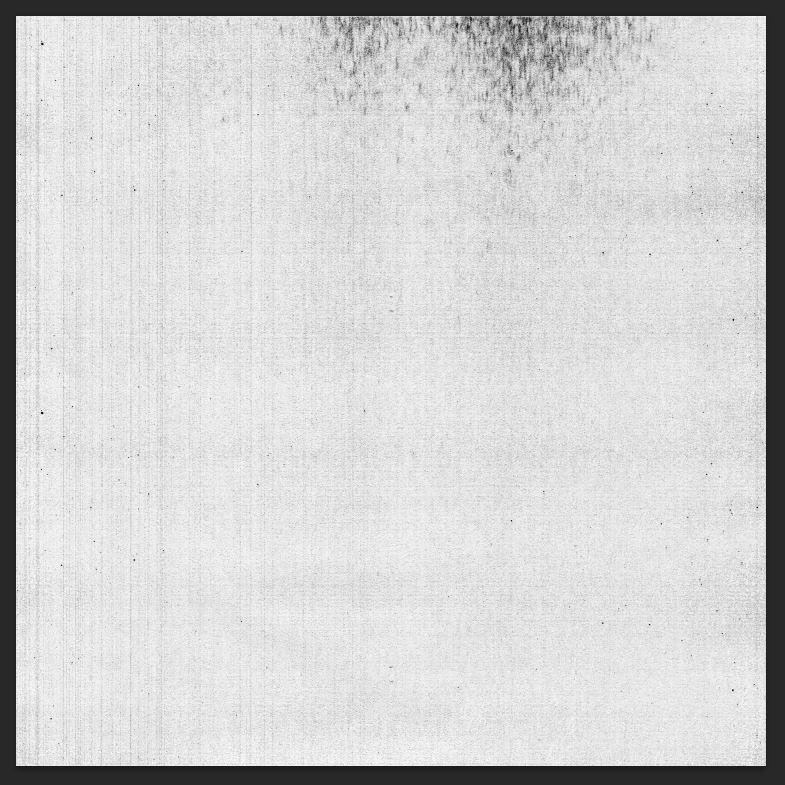
Valleys in the Vinyl’s antique envelope texture
I’m gifting you a texture from my personal vault, because it felt so right to use with the piece. It was generated from one of these sheets of very heavy paper, that got slightly creased. Save it by following this link.
We’ll use photocopy-noise-textures-sbh-005.jpg for some subtle masking.
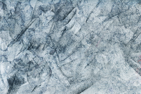
Lost and Taken’s remixed chalk and pastel textures, #7
StarNet blog’s painter’s effect texture pack, #4
This brush stroke effect texture, by Chank Diesel
This photocopy texture by clarisaponcedeleon
This film texture by JakezDaniel
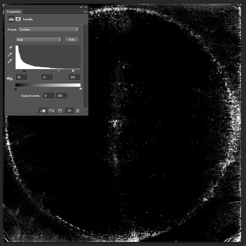
Finally, this tough to find record wear pattern texture (see link in video description), from whichever dark corner of the internet I found it at. I suspect it’s a scan of an old copy of the Beatles’ White album.
Please note: This record texture was originally found on the web here, but since then has been removed. We are providing this file here. If you are the original creator of the file and would like to see yourself credited in another way, or removed, please get in touch.
Preparing the Photoshop document
Before we start adding textures everywhere, you need to create a new Photoshop document, and to transfer all of the vector elements into it. Because we’re going to independently affect the elements from the background, you need to at least have the background and the elements as separate smart objects into it. I actually transfered everything as independent elements, as you’ll see below.
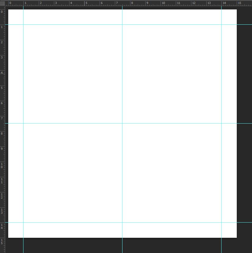
First, we create that 15″x15″ canvas in Photoshop.
Putting the same guides in place.
Placing the corner elements.
Placing the center piece.
Adding the skulls and the keys.
And organizing and labeling the layer mess.
Quick notes
Quick note #1: in this tutorial, the term “clipping” or “clipped layer” is used a few times. This means that the layer is only visible/applies to the layer directly below it. You can very quickly do this by holding ‘Alt’ down on your keyboard and clicking between the two layers. Photoshop secrets created an handy animated gif demonstration.
Quick note #2: every time we’ll work with textures, we’ll follow this simple process: place as smart object, sharpen, desaturate, enhance contrast with levels, and modify the blending mode.
Placing the textures as smart objects, and using adjustment layers to tweak them, allows us to stick to a non destructive workflow. I’ve explored in depth the numerous pros and few cons of such a workflow in a past tutorial for the good peeps at Design Cuts: “How to Use Textures The Right Way.”
Actual texture work, part I
We’re going to start by texturing the background. We’re going to give it some coarse paper grain. Place BB_AntiqueEnvelope_04.jpg in your document, right above the background layer. Sharpen it (Filter > Sharpen > Sharpen).
Desaturate it with a clipped hue/saturation adjustment layer.
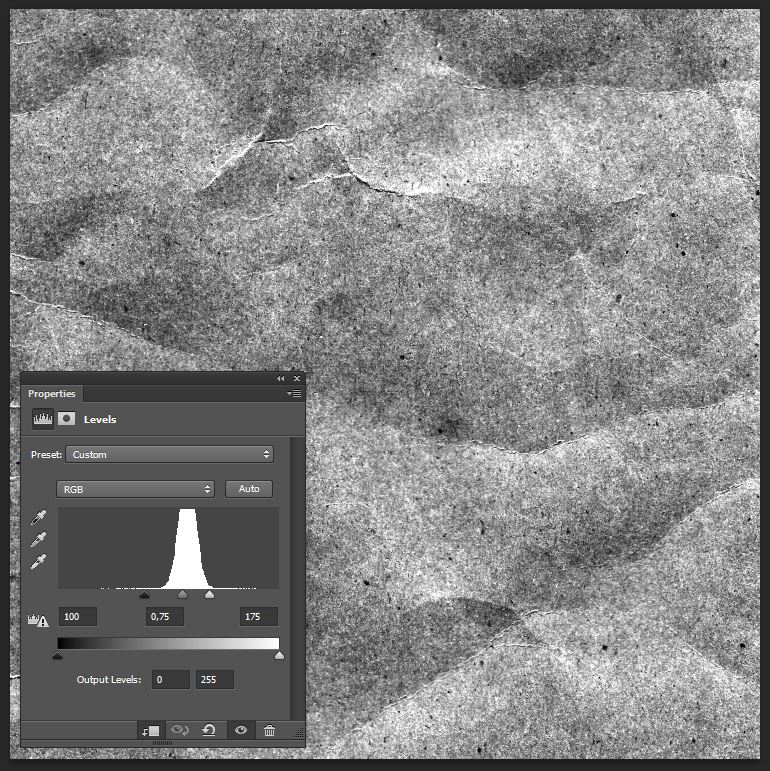
Emphasize the texture’s unique features with a clipped levels adjustment layer.
Change the texture’s blending mode to Soft light @ 100% opacity.
From there on, and I’ve said in my Quick notes, the process will be the same for most textures: place as a smart object, sharpen, desaturate, adjust the levels, and change the blending mode.
The next texture is the creased heavy paper texture I’ve passed on to you as a freebie.
Levels
Blending mode: Soft light @ 75% opacity.
Adding type!
Now that the background is textured, we can turn the other elements back on. And we can notice something rather embarrassing: I haven’t added the type elements for the artist and album name! Since we’re just about to texture the various vector elements, it’s just the good time to add them in. We’ll be using League Spartan, a free and beautiful typeface by The League of Movable Type.
As stated at the beginning, the band is called Fiat Lux, and the album’s name is Æterna. I’ve set my type 36 points tall, and set the kerning to Optical. I’ve simply placed the band’s name at the top of the crown, and the album name below the triangular element.
Before we can proceed with the aging/texturing of the type, we need to do some layer organization. Start by giving the type elements their own layer group.
Proceed then to group all of the various vector elements layer groups and the type elements into a master layer group.
Next, add a layer mask to the master layer group. Make sure it’s unlinked from its content. This will allow us to edit the layer mask content independently from the layers themselves.
Proceed to open photocopy-noise-textures-sbh-005.jpg.
Copy its content, and paste it into the layer mask. You can do so by clicking and pressing the ALT/OPTION key on the layer mask’s thumbnail. This will give you access to the layer mask’s content, in which you can copy, paste, resize, paint, erase, etc, just like the rest of the time. You’ll just be limited to black, white, and gray hues when doing so.
This is what you’ll see once you’ve pasted the texture in the layer mask.
Place the comet at your taste. I’m trying to bring as much of its white artifacts in the frame.
After sharpening the texture, proceed to invert it.
Simply click back on one of the layers to see the result.
Should you be unsatisfied, you can use levels (CTRL/CMD+L) to tweak the texture’s impact on your piece.
The result wasn’t as intense as I wanted to the first time.
This below is much better.
And here’s the result.
Actual texture work, part II
We can now move on to the rest of the texture work. We’ll follow the same process as when texturing the background.
Let’s start with LT_RemixedChalkPastel_07.jpg.
Levels
Blending mode: Soft light @ 50% opacity.
Next in the texture stack is StarNet blog’s painter’s effect texture pack, #4.
Blending mode: Soft light @ 35% opacity.
The following texture in our piece is the brush stroke texture.
Blending mode: Soft light @ 65% opacity.
Next is the photocopy texture. It’ll help us to create a nice, organic vignette effect. Place it without fear of distorting it, so it cover precisely our canvas.
Note how we’re using levels to reduce how light overall the texture is in this case.
Blending mode: Overlay @ 100% opacity.
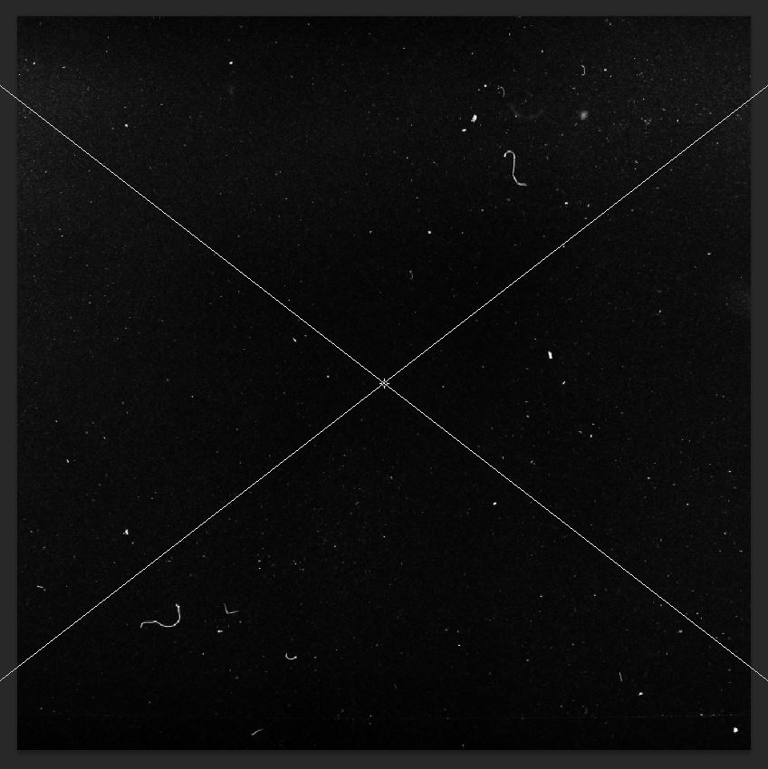
It’s time to add some dust speckles and artifacts with JakezDaniel film texture.
Other than sharpening, that texture doesn’t need any desaturation or levels tweaking. We can simply change its blending mode to Screen @ 35% opacity, and we’re done.
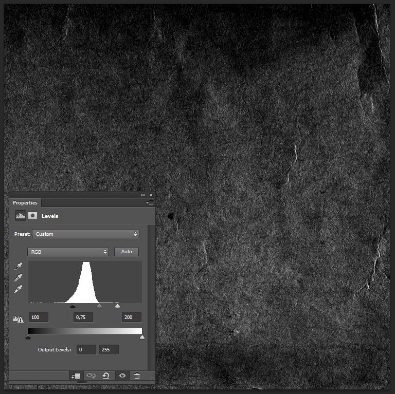
Next up is the texture that’s going to emulate the wear pattern you’d find on an old record sleeve. While we’re using the same technique to display its artifacts as the film texture (Screen only lets white pixels show, while black ones are shown as transparent), we’ll use levels to tweak its intensity.
Blending mode: Screen @ 50% opacity.
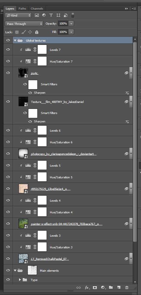
Here’s a look at my layers:
Step 4: finishing touches
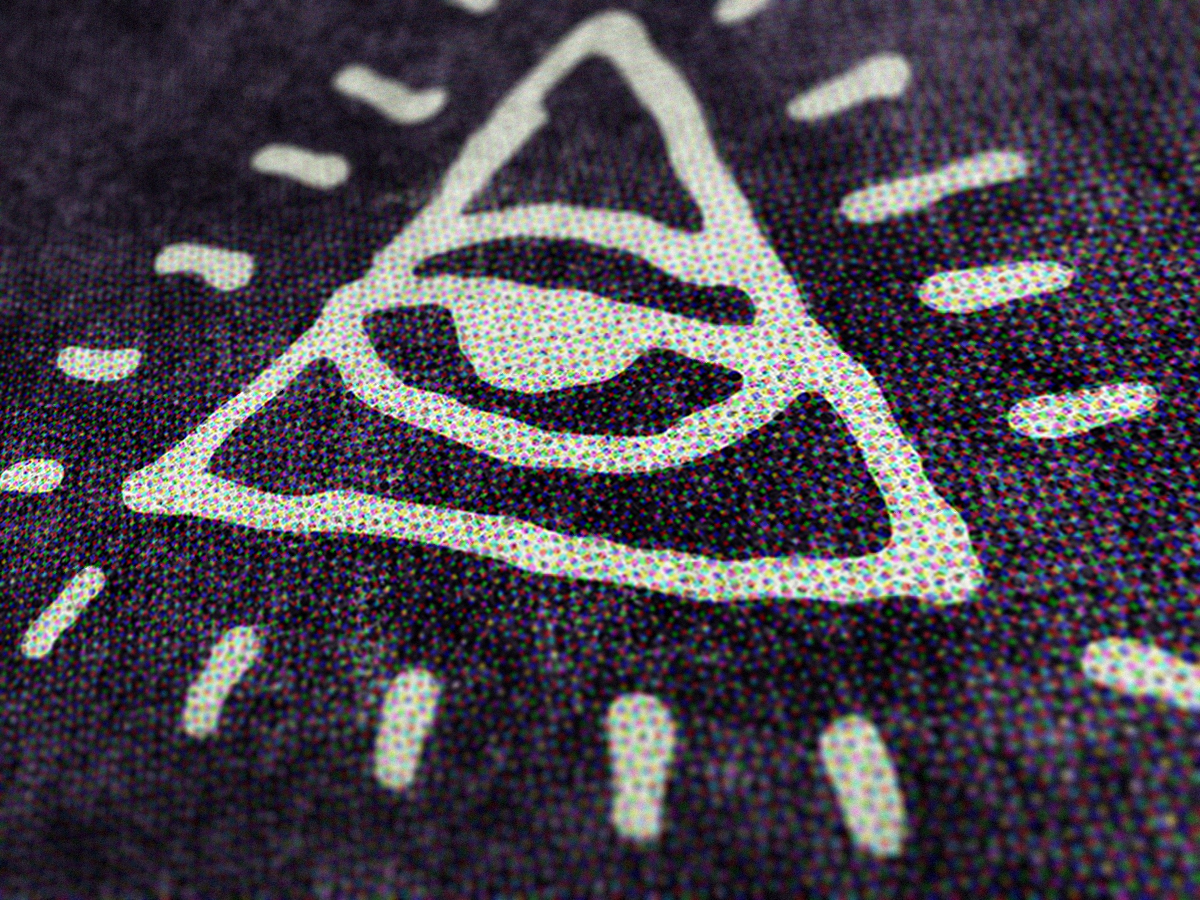
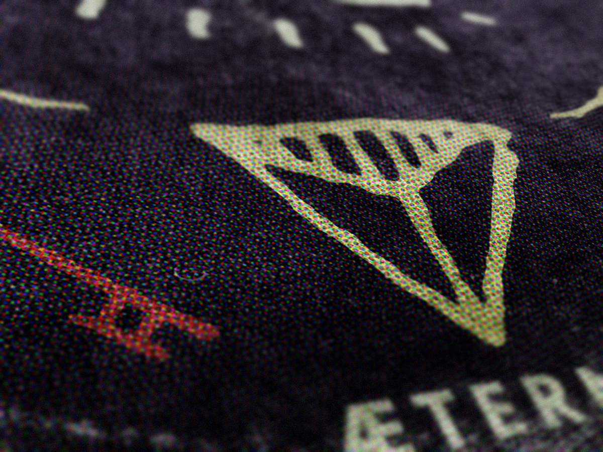
We’re going to add a halftone effect to our record sleeve art. It will emulate the cheap print job that this band had to rely on to be able to afford publishing their record. Start by creating a merged copy of all the visible layers (CTRL/CMD+ALT/OPTION+SHIFT+E). It’ll create a new layer at the top of your layer stack. I renamed it “Halftones.”
Convert the layer to a smart object (Filter > Convert for smart filters on Photoshop CC).
Go to Filter > Pixelate > Color halftone. The value that matters here is the Max. radius of 12 pixels. It determines how big my halftones dots will be.
Since the effect is quite strong, simply lower the layer’s opacity to 35%.
Our piece is finished!
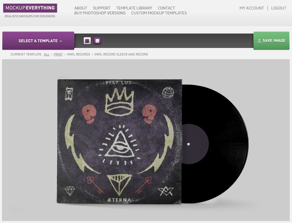
We can now quickly head to MockupEverything to create a photo-realistic preview of what the record will look like, and land that art approval much better than with simply a “flat” JPG would.
You have to admit that, being able to get a realistic preview of what could be is quite appealing!
And that concludes our tutorial. I hope you had as much fun following it as I had writing it.
We’d love to see your own outcomes! Please share them with us, either in the Go Media Flickr pool, the Go Media Pinterest guest pinner board, the Go Media Facebook page, or even our Twitter feed.
And that’s all I have for today. Until next time, cheers!


