Blog
Create a stunning undersea painting using Vector Packs
So Set 10 is out. It’s sort of sentimental because I remember when Set 1 was released and wondering to myself, “Wow, if people dig this and find some real usability out of it… we could keep cranking out sets… one day we’ll release Set 10… I wonder what that’s gonna be like!â€

Well here we are. As Jeff mentioned before, we took some of the popular suggestions and created the set with them in mind. And if that’s not enough, I’ve whipped up this tutorial as well.
TAKE NOTE GUYS: There are things that are not covered in this tutorial that we’ve already covered in previous ones. An intermediate level of knowledge is recommended in Illustrator and Photoshop to fully catch what I’ll be explaining here.
Today we’re gonna be focusing on using many vector pack elements to comprise an entire illustrated piece. On top of that – we’ll be touching on a lot of my coloring process (a fun but rather unorthodox method to say the least) that I use throughout a lot of my illustrations. Now without further adieu… I present the Set X Celebratory Tutorial! …Because I really have no idea what else to call it.
So below I have on display the supplies that I’ll be using throughout the tutorial. Set 10’s “Nautical†pack, my trusty Wacom Tablet, Illustrator and Photoshop CS3, and a computer – sans kittie.
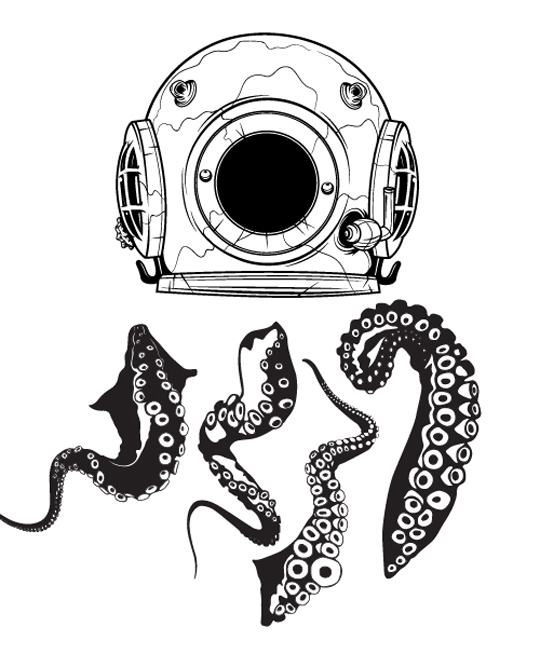
Now I’ve opened up the Nautical pack in Illustrator. I took the old school diver helmet and the tentacles because I thought, “Hmmm… an Octopus living inside of a diver helmet… pretty coolâ€. They are shown below.
Now after some adding and subtracting of objects, knocking out some of the black that overlaps some of the other objects with white, I’m left with this focal piece:
Now I’ve opened Photoshop and created a 4†x 6†file @ 300 dpi, kept the color mode at RGB because I like the layer blending effects in that color mode better.
Here is where we set the background color to medium blue. This will come in handy because I’ll be able to see the colors better when coloring the focal piece.
Here I’ve copied and pasted the Octopus Diver into my Photoshop file. I placed it where I wanted, and because there was some white in the transfer – I switched the layer mode to “Multiply†that way the darkest colors are the only ones showing. In this case – the black.
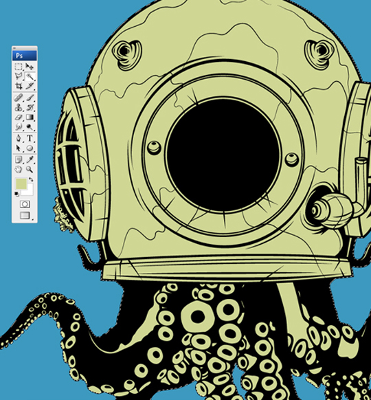
So now I’ve taken my magic wand, selected all the negative space in my focal piece, inverted it by holding Shift+Ctrl+I, contracted the selection by 1 pixel (so my colors don’t crowd the black), created a new layer beneath the inked piece, and filled it in with some funky green color.
Now I’ve split this layer’s contents to two layers – one for the tentacles and one for the helmet. You can do this a number of ways. I pressed Ctrl as I clicked the particular layer’s box to select all of it’s contents and used the polygonal lasso tool cut the top from the bottom and paste it into another layer. I removed the remaining part by pressing delete so I wouldn’t have anything unnecessary left over. These two layers are crucial because they set your guidelines for coloring inside of the lines for each half. Once these are seperated, pick a portion (I’m going with the helmet), fill it in with a nice golden/brass type of color.
Time to start coloring. Get that Wacom handy. A mouse will do just fine. I use a Wacom out of comfortability and better control – if you don’t have one – I recommend you scoop one up. Once you get used to it, you won’t regret it. A little bit of preparation is needed before we go bat-shit crazy on coloring.
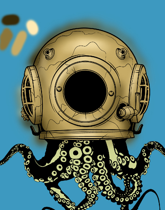
Create a new layer, use the eye dropper tool to select the color of the helmet, take your airbrush tool (with 100% opacity and flow) and make a little square with it to the side. This is your palette. Repeat this like I did with your lighter and darker colors.
I use the airbrush tool and keep the diameter relative small but still large enough to cover broad areas. In this case I kept it in between 60 to 120 pixels. I only go smaller when I’m fiddling with the itty bitty details and highlights. This, however, is all a matter of preference. I set the opacity down to the 30-ish neighborhood and the flow in the late teens to early 20 percentile. This allows me to keep layering the color on without making it look too deliberate.
And now I just hop back and forth between colors and sizes until I have a result that I’m proud of. If you’re inexperienced with coloring pseudo-realistically, Google some comic book illustrations that are all dolled up and jazzy. They follow the same principles… it might help you out a little.
After this is done, I ctrl+click the helmet shape layer (while making sure the layer that you just colored is still selected) to make my selection of the helmet itself. I invert the selection so I get everything that’s over-sprayed onto the sides, palette included, and delete it. I’m left now with a clean and colored helmet. I merge the color of the helmet, and its color tones together to one layer.
I repeat this process with the tentacles in the following photos.
Now I’m gonna add some detail to this piece here by creating a layer on top of the inked layer, selecting a dark teal green color, and going to town similarly but significantly less on the black areas of the tentacles with that color. Don’t go overboard because they don’t need too much.
Now I decrease the size of my brush, select a far lighter version of that teal green color and dabble some highlights on top of the teal green. It’s a small but very fun detail to implement because it gives life to the tentacles.
I select both the helmet and tentacle shape layers (ctrl+click and shift+ctrl+click each additional layer to add to the selection) and inverse it, then delete the over spray. There it is.
I repeat this process similarly to the glass window of the helmet… but the look I’m trying to achieve here is that of glare streaks in the glass.
I make a bunch of speckles and such with medium blues all the way to white on a new layer above the black circular area on the center of the helmet at 100% opacity and flow with the airbrush tool. I then apply a motion blur with the settings in the following pictures (filter > blur > motion blur).
I duplicate the streaks and merge the layer. I then take the circular selection tool and select a perfect circle (by holding shift as you drag) over the glass area almost but not flush to the edge. I feather the selection by 5 pixels (select > feather) and inverse it to delete the excess. There’s the glass effect we’ve been looking for. Select all the layers that make up the OctoDiver and group them together (as desired layers are highlighted – press ctrl+g).
Now I’m ready for the background. So here’s where things can go a lot of different ways. Because I’m not sure how this will look once the layering effects and textures that will go into this take place… I’m pretty much improvising and playing around until something looks good. I know I want to go for an underwater feel… so I start by airbrushing the background like so.
Now that looks kinda cool. I’m pretty sure that whatever texture I place over it is gonna darken it, so the loud colors don’t bother me so much. I sift through some of the stock textures from The Arsenal and find one that looks pretty interesting in the “Oddshots†pack.
I place it one layer on top my background and transform it (ctrl+t) to fit into the document but not reveal the edges. I want the arched dirty lines to set the motion for the background so the goal is to get that much of the photo in view.
Now I think the texture needs some random chaos thrown into it. Maybe if I distort it some, it could work well with the flow of everything. I applied the wave filter (filers > distort > wave) and chose randomize as you see here below.
I transform it to fit into the composition a little better…
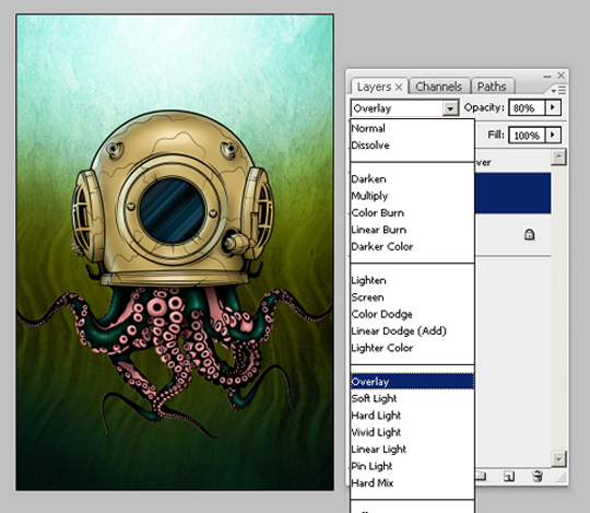
I choose the “Overlay†layer mode on the texture, knocked the opacity down to 80% and it’s starting to looking more like how I envisioned.
So I sit and stare at it for a while and start to realize that the water might look more dramatic if I made it look slightly brackish. So I pressed Ctrl+U and opened up the Hue/Saturation options. I fiddle around till I see a combo that works really well. Here are the values I used below.
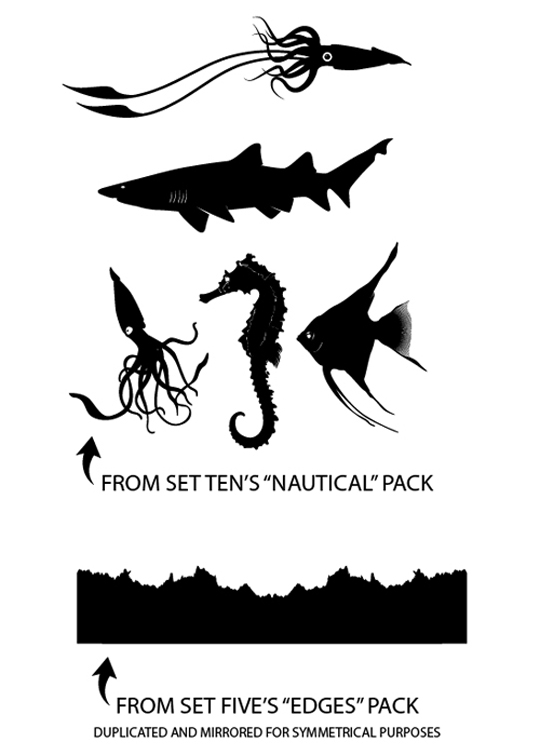
I’m content with the overall background. Now I have to tackle scenery. So I venture back into the nautical pack and look for some stuff that would work well. I also revisited an older pack to find something that would be suitable for the seabed.
This first thing to head over is the floor I made from the “Edges†pack from Set 5. I make sure it’s in proper layer order above the texture. It looks bland standing alone so I decided to apply a subtle glow around it. The settings used and final result are below.
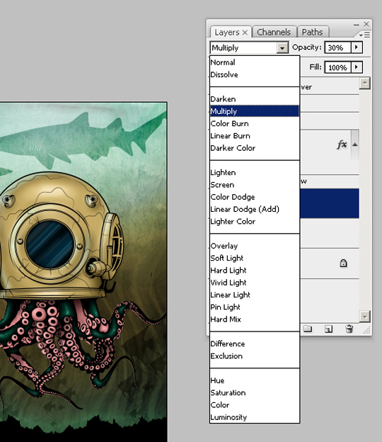
Now after some trial and error, the only pieces I could use comfortably were the long finned fishes and the shark. I played with the layer modes some – mostly “Overlay†with supped layers set to “Multiply†with the opacity toned down to about 20% but this is another thing that’s left to depend on personal preference. Here’s what I came up with.
So I’m almost to the finish line. I need to add some more subtle chaos to the background. I’m a big fan of watercolors and I grabbed one from one of our Texture Packs.
I chose this because it fits well in the composition. It can’t be all these crazy colors though, so I colorized it (ctrl+u) with the settings below.

Now it gets thrown into the background, right above the texture layer and right below the sea floor. I change the layer mode to “Multiply†and the opacity of the layer down to 30% and it does the trick just right.
I add a few bubbles that I made in Illustrator with some knocked-out circles, faint the opacity some, and I think it’s safe to say that I’m done.
I hope you guys learned something from this and recieved some encouragement to use the stock vectors for more than just slap-it-on, grunge it up, send it on it’s way graphics. They can be used for so much awesome stuff to implement into your designs. And combined with techniques that you might think are weird combinations – you might be surprised with what you can come up with.
Well that’s all for now, Take care folks.
-Dave

