Blog
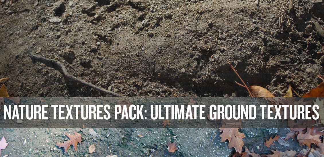
Introducing the Nature Textures Pack: Ultimate Ground Textures Pack & How to Use It!
Introducing the Ultimate Ground Textures Pack
Hey Gang!
As you well know, textures give a sense of life and depth to an otherwise flat design. On a recent trip to Italy, I had the opportunity to capture my own gritty, grainy and one-of-a-kind images. I’ve found these to be perfect for roughening up those pieces that need a little punch.
You know I couldn’t keep them to myself.
Today I’d like to introduce to you the second in my series of six Nature Texture Packs.
Say hello to the Ground Pack!
This pack includes 10 carefully crafted photographs from my recent travels and 11 images I vectorized, all of which are available for your use roughening and dirtying your designs.


You’ll need to grab it now, because today I’ll be taking you through a step by step pamphlet brochure design using a few textures and overlays in Photoshop.
What we’re making:

I am featuring a picture of a marble bust from the Uffizi gallery in Florence, Italy. My wife and I had the opportunity in May 2013 to do some traveling with friends and take in a ton of gallery sights and the beautiful country side.
So let’s get to it.
Buy Ultimate Ground Textures Pack now!
Here is the statue of our character in Photoshop. I wasn’t 100% sure what I wanted to do at first so I just started experimenting.

I’ll go ahead and place him on a document for print that will crop him nicely.

Next I’m going to grab the actual photo that is included in the pack and set it over the character.


Next I’m just going to see what happens and play around with some options to see what kind of effect I can get.


I love this look so far but I want him to look like he is coming out of the ground. I’ll grab some brushes from my Godmachine pack I downloaded and see what happens.

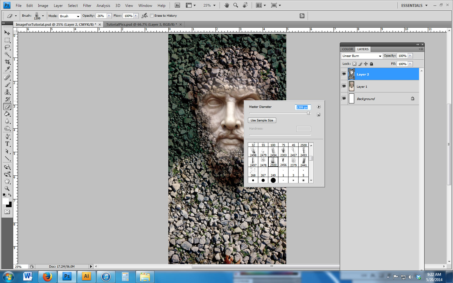


Ok so from here I want to utilize another texture so I’ll grab a different one. Here is an important tip, set the texture on a large document and make it that size so it covers the character.

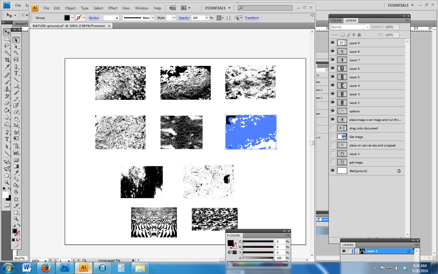


Once again I’ll start experimenting and see what happens and add some color.


At this point I want to see how this looks with text and I’ll experiment with stroke colors, drop shadows and size of the fonts.
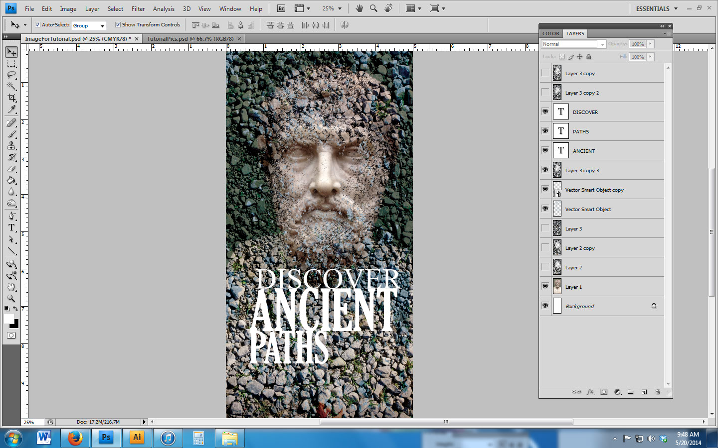
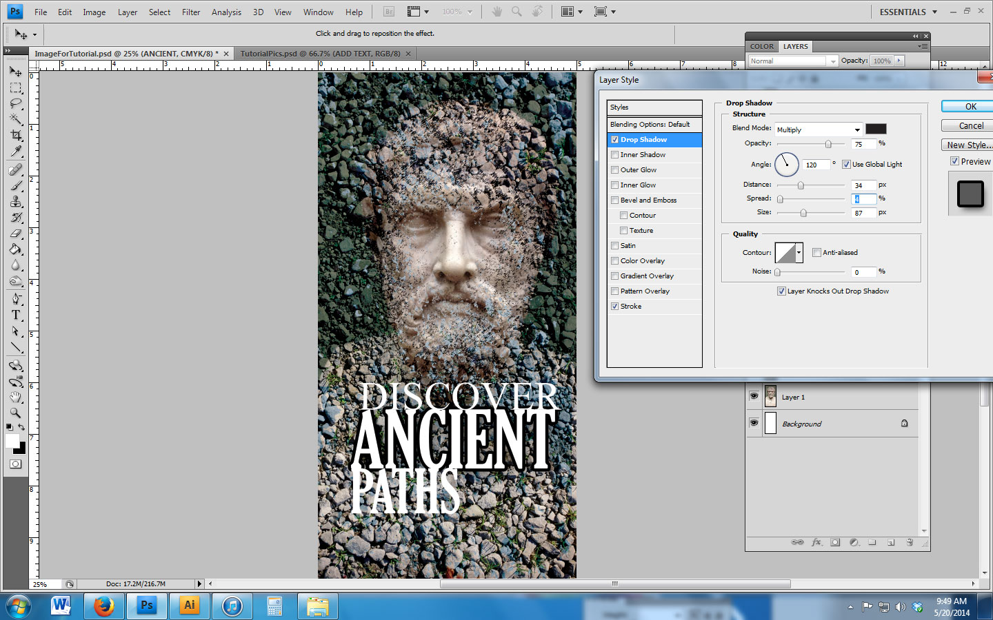


I’m liking it so far but not thrilled with the color….so let’s see what happens.


Very cool! I decided to add effects to the words as well. I feel the words go with the image now. It’s very important not to just slap anything together and expect it to work. Make the image balance with the text and colors.
Last item I thought is to change “History” to “Italy” and add the Uffizi Gallery Florence, Italy to make it look like an actual brochure when you walk into this specific exhibit.


So there it is. This has a complicated look but made simple by experimenting with layer effects, a photograph, a graphic, text and design. It’s like cooking where each ingredient needs to work together yet stand on their own.
Thanks for checking this out and purchasing the packs and set!
_______________________________________
For more of Steve’s work, check him out his site or chat with him on Twitter.