Blog

An E-Commerce Guide for Better Navigation and Categories
E-Commerce Navigation Best Practices & Site Navigation Guidelines
Running an E-Commerce business has its own perks and obligations; the perk of access to a wider audience and the obligation of meeting the latest E-Commerce trends. Both these aspects have an impact on how your online business website is going to perform.
Several studies have shown how weaving together the fabric of an E-Commerce business involves taking care of the site’s usability through enhanced navigation and well laid out product/service categories. So, what are the guidelines for enhancing your site’s navigation and making the site categories more efficient?
Let’s find out.
Fast loading website
A speedy website is a compulsion, regardless of the kind of website you are running. And when yours is an E-Commerce website, the need for speed is even more because you simply can’t afford prospective buyers abandoning your website due to a website that lags. Every time you make a website, it is important to keep in mind that if your website fails to load within 2 seconds, its abandonment percentage will be high.

If you want to improve the loading time of your website, you must put the following measures in place:
- Use a reliable web hosting service. Before you square in on a particular service provider, always go through the reviews. You can rely on reputable web hosting services such as 000webhost.
- A Content Delivery Network (CDN) makes it easy for your website to show up swiftly on all geographical locations.
- Optimize your eCommerce website to clear the clutter.
- Since an eCommerce website requires high-quality product images for display, consider compressing them to save the bandwidth.
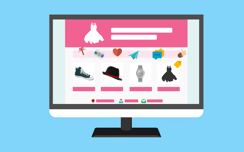
Compact yet comfortable product listing
The traffic to an eCommerce website is determined by the user-experience offered by it. Since everyone is on this website to look for a product of their choice, the product listing is certainly the most important thing. However, the catch with an online shopping website is that it needs to furnish the maximum information about a product on the same page, without making the visitors go to a next page for the same. Hence, the target is to make the product listing compact yet comfortable for easy viewing.
Robust Internal search
There are two kinds of online shoppers that visit an online store; the ones that know the actual item they are looking for and the others that like to surf through several product categories. The first kind is quick to put the product in the cart and check out. However, the second kind of visitors need a little help and an internal search serves the purpose just right.
At least 50% of shoppers prefer to use an online business’s internal search function to find products. If your website is offering a robust internal search, it can do more than just increase your sales.
Clear product organization under categories
Categories mark the product differentiation on a website and make it easy for the buyers to make a purchase without clicking too much. If you run an eCommerce website or are planning to start one, make sure that you think the way your buyers are going to think and act. This will make it easy for you to segregate the products into different categories without leaving a chance of putting a product under a wrong category.
Descriptive product information
People make a confirmed purchase on an eCommerce website only when they are fully satisfied with the way the product has been described. Fuel this content with SEO keywords, high-quality images that are large enough to identify a known item and show the differences between variants, and maybe a video for usage tutorial.
Other parts of this information include the available variants to an item, colors, styles, or options. Displaying customer ratings and reviews for the items also helps buyers make a choice. This information is a purchase enabler and must be considered as a guideline for better navigation.
Seamless Navigation through Breadcrumbs
A guideline to seamless eCommerce website navigation is to let the visitors know their point in the journey while they are browsing through your website. Doing so will help them reach a particular point in their purchase journey and improve the find ability of website sections and pages.
To achieve this, you must introduce ‘Breadcrumbs’ on your website. Breadcrumbs are a visual aid that indicate the location of the visitor while they move ahead, clicking on higher-level pages. They reduce the number of actions a website visitor needs to take in order to get to a particular page they would like to go back to.
Drive out the complexity of the Checkout process

A great eCommerce Checkout process must flow without any hiccups. Hence, your site’s checkout page optimization must be a commitment for you. To eliminate all the negative factors that lead to cart abandonment, try these tips:
- Shipping, taxes, and fees must not be very high or hidden. Put them under the buyer’s attention right from the time they go through the item description.
- Display the total order cost up-front.
- Offer guest Checkout and don’t force the visitors to create an account for making a purchase.
- The checkout process must not be too long or complicated.
- Secure your website and make it apt for handling sensitive user information by getting an SSL certificate for your site.
- Be very clear with the returns and replacement policy
- Integrate all the popular payment methods and gateways.
- Display trust seals throughout the Checkout process.
Seamless Mobile Navigation
Of all the online searches conducted, 60% of them come from mobile devices, with over 30 billion mobile queries driving Google’s market advantage. This makes the importance of mobile navigation for an eCommerce website even more prominent.

Follow these mobile navigation guidelines for a seamless navigation experience:
- The Mobile header must have your site’s icon and the internal search bar.
- Your mobile site’s menu is your primary call-to-action.
- Skip the social icons from the header.
- A pinned menu at the bottom makes your mobile website more like an app, adding more information on the page without cluttering it. They are evidently visible and enhance the site’s user experience.
- If the website budget permits, consider creating an app for your shopping website. If you are planning one, you can revamp your entire website and even create an app for it using WordPress.
- Always add a link to the desktop site.
There are several other guidelines as well that can be gradually implemented on your mobile site as you go ahead adding the above changes.
Conclusion:
A site’s robust navigation and sorted categories make up for an excellent user-experience on an eCommerce website. With the implementation of the right guidelines, an informative Homepage, and a follow-up with the latest eCommerce trends, you can run your eCommerce website effectively; thereby boosting your sales and growing your customers.