Blog
Creating an Illustrative Monogram

Creating a Monogram
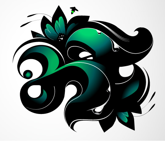
Monograms are an interesting way to go about making an identity. By nature they can be straight forward or extremely ornamental and illustrative. In this tutorial I’m going to walk you through the steps I (Chris Comella, designer at Go Media, hi!) took to making Go Media’s own Heather Mariano (formerly Heather Tropp) a monogram for her business card.
What follows is a series of animated GIFs. Each show the steps I took toward executing my concept. They all loop, so if you miss something the first time, don’t sweat it. It’ll be back in a few seconds. Also, below each animation you’ll see the corresponding notes.

Step 1: Creating the H
I start off making the general form of the H with basic shapes. Then I add in the negative I’ll be using as guides to ‘carve’ away any excess form. After I draw out the shape, using the pathfinder I unite all the white shapes together to create one solid piece I can use to subtract from the black base. To polish off the H I add a swirl at the stem and carve out a point on the leg.

Step 2: Creating the T
We start off again by creating a basic shape from which to work with. I basically create two circles with a square joining the middle to create an elongated circle. Merge the three pieces and start on the negatives. The two white circles again act as my guide for carving out an unwanted form. Once I’m done drawing out the shape on one side, I duplicate and rotate the piece to fit the other side to keep it symmetrical. Lastly, combine all the white shapes and subtract it from the black base.

Once I have that initial piece (the Arm) done, I end up squashing it a bit as you can see. I finish off the T by using two circles to create a a curved stem and adjust the angle a bit with a third shape. I merge those together along with the arm, and the T is set.

Step 3: Rendering the type
So now that we have the foundation of the monogram set, we can start thinking about how to render it. I wanted it to feel a bit more tactile, so what I did was create some contours that help define the shape spatially. I set the standard in my mind with the first line you see made above…following that precedent I just go ahead do the same around the letters. Next, I decided to take another look at the letters themselves. I end up adding in some open lines to two of the primary curves in the pair, giving it a more decorative, floral vibe. Also, you can see I added a horizontal line connecting the two letters.. here was something I kind of stumbled upon and decided to elaborate. What came to mind at this point was adding another aspect to the piece, I wanted it to appear ‘juicy.’
So in that vain, I decided to add in some water droplets. I liked this because it was in line with the piece’s theme and created some more visual appeal. Following the contour lines I layed down previously, I used those as a jumping off point for the droplets. Drawing them with those curves in mind, I rendered an initial droplet and then elaborated further by adding a couple more throughout the type.
Next up is the color. This step turned out to be very important, because not only is it making the leap from black & white, but it also defined the unique shapes of the letters themselves. What I did here, similarly to the contour lines, was set a precedent with the first piece and moved forward from there…essentially, winging it, but with a sort of mental guideline.
Step 4: Complimentary imagery
To emphasize the monogram’s theme, and to help round out the composition, I decided to make a flower to pair with the type. I started with the petal and finished by drawing the body out. This needed to be simple as it’s purpose is to fit in with the type.
Step 5: Putting it together
I pasted in the flower behind both the letters and trimmed it down to size (erasing any unwanted parts). Next I drew in a highlight and filled the flower with the same gradient from the type highlights. Taking it one step further, I decided to add in some (what I believe are called) Pistils… aka, antennae things. Finally I duplicate the flower and add it in at the bottom of the T to balance it out. From here I simply tightened the piece up, making any minor revisions or tweaks that were left. I decided to add a stroke on the T, a simple gradient to the water droplets, and create a small lightning bug riffing on Heather’s passion of photography (I always thought of lightning bugs as nature’s paparazzi). And there you have it!


