Blog
Retro Modernist Poster Design with 3D Typography
What you will learn
In this tutorial, you’re going to learn how to create a vintage, retro-modernist poster in Photoshop. You’ll also learn some vintage coloring techniques, retro photo effects, and some cool 3d typographic effects. You’ll also need Adobe Illustrator to create vector paths that will then be imported into 3ds max. This won’t be a typical step by step tutorial, but more of a walkthrough of how I created this poster for a real client.
The design brief
The poster is for North Coast 99, an annual recognition program that honors 99 great workplaces for top talent in Northeast Ohio. Every year they have a unique design that is used as a poster and magazine cover for Inside Business magazine.
The concept behind this year’s design was to honor businesses in Northeast Ohio who were able to grow even during the recession. Themes that the client provided were the words “Pioneer & Persevere”, a plummeting line graph to symbolize the recession, and green/nature elements to symbolize the environmentally conscious.
Preliminary sketches
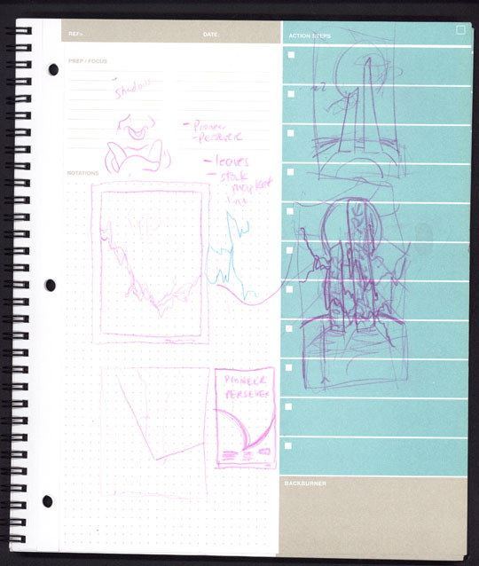
I am a firm believer in sketching out some ideas on paper before you start. This helps get your mind going and the pressure is off. Here’s a list of things to make sure you think about when sketching your ideas.
- Does your sketch include the themes or subject matter provided by the client?
- Is your sketch the right proportions of the final design?
- Does your sketch properly convey the meaning behind the design?
Create your type in Illustrator
The first step is to use Adobe Illustrator to create your type. Choose your fonts wisely. How do you know what font to use? In this particular case, I used Fritz Quadrata because it is classy and has a slight flare-serif characteristic of many retro typefaces made popular in 80’s movie posters.
But you can use your favorite font, as long as it helps you achieve the vibe you’re going for. Other fonts great for vintage and retro design are Serif Gothic, Kaptiva, Garamond Ultra, Windsor, Korinna, Liberty, Tango, Flange, Springfield, Seagull, Legothic, or Scentogram to name a few. Lay out your type and go to Type > Create Outlines. Save your document in AI 8.0 format. This is key! You must save as AI 8.0 in order to import your paths into 3ds Max, otherwise, you’ll get an error.
Set up your scene in 3ds Max
Open up 3ds Max (if you don’t have this, Cinema 4d will do the trick as well). I use 3ds Max simply because I learned it in college and am more comfortable with it. I can get results I want quickly.
What is the final output size of the poster? In this case it’s 11” wide by 14” tall. Or 3300×4200 pixels at 300 dpi. Eventually you’ll need to set your render settings to this, but for now, let’s just lock that aspect ratio and make it 500×636. This is good for speedy renders while working.
Then create a camera and set it up at the proper angle. One shortcut I like to do is manipulate my perspective view to get my desired angle and then create a camera in top view. Then select my perspective viewport and press Ctrl+C to automatically position my camera to the same view. Cool huh! Now I can switch to camera view and keep the angle I originally had in the perspective viewport.
Then right click on “Camera1” in the upper left of the viewport and select “Show Safe Frame” and this will give you the correct proportions for your poster.
Import your paths into 3ds Max
Go to File > Import > Paths and select your .ai file that you just saved. You’ll be presented with a dialogue box that asks if you want replace the scene or merge with current. Just click OK to merge objects within the current scene. It will ask if you want to import your paths as single or multiple objects. In this case, just select single object because you’re not going to need to edit these letters individually.
Once they’re imported, you’ll see they came into your document very small. I usually like to scale my letters up some with the scale tool. After you’ve done that, proceed to the next step.
Extrude and Bevel your type
Apply a Bevel Modifier to your type and use my settings as reference. You can tweak them to your liking to get a deeper bevel or a more rounded bevel.
I prefer the subtle bevel that’s barely noticeable but it helps add realism. Why? Because a standard extrude with no beveled edges has a hard time looking realistic. In reality, every single object has some sort of corner to it, not matter how subtle. With a simple extrude, you don’t get any corner. It’s an exact 90 degree angle from one side to the other. You need that subtle beveled edge to catch light that gives your letters that sexy specular highlight along the edges for added realism.
Once your bevel is set up to your liking, rotate your text 90 degrees so it’s on its side reading from bottom to top.
Create the line graph
Go back into Illustrator and create a line graph similar to the one I have shown here. In this case, you see the graph goes down and then steadily rises to the right. This is supposed to symbolize the businesses that overcame the recession.
Once you are happy with your line graph, expand your strokes and save your file in AI 8.0 format and import into 3ds Max. Just like we did before.
This is where it can get tricky. I wanted my line graph to come in from the left side of my type, wrap around the letters, then exit on the right side. It’s more of an abstract representation of the line graph rather than making it so literal. It makes the image interesting.
You’ll need to rotate around your scene to make sure you don’t accidentally intersect the line with your letters. It’s not hard, but it just takes some time.
Add an extrude modifier on this line and check the settings below.
Once you’re satisfied with the result, we’ll create the ground that the type is sitting on.
Create the ground / hill
Create a new geosphere and positioned it under your letters. Adjust the size to your liking. Crank up the number of polygons to make sure you get a pretty round edge. You don’t want to be seeing any blocky edges that scream “hey, I’m CG!”
Apply Textures / Materials
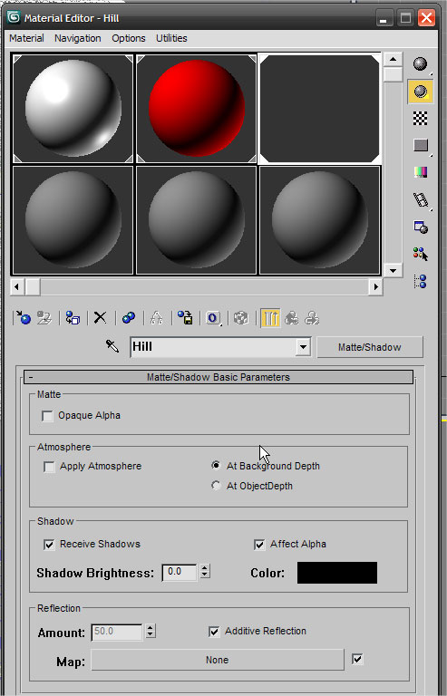
With your hill still selected, you can go ahead and apply a new material to it. Instead of “standard”, select Matte Shadow. This will essentially make the hill render ONLY the shadows cast by the light and NOT the hill itself. This is going to be useful later when compositing the scene together in Photoshop.
For the type, apply just a standard blinn material to it. Adjust the diffuse color to white and you’re set. You could play around with the specular highlights and glossiness if you want as well.

For the line graph, just apply another standard blinn material but make it red. Check the box that says “2 sided texture” because otherwise, the backside of your “ribbon” will be invisible. Again, you could adjust specular and glossiness to your liking. Remember, specular is how much light is reflected on the surface and glossiness is the size of the highlight. The higher the number, the smaller and more precise the highlights.
Set up your lights
First create a skylight in the top viewport. Adjust the intensity to something like 0.8. You don’t want it too bright, because we’re going to be adding more lights next.
Add a targeted direct light next. AIM it from behind the letters as if it’s about 3pm in the afternoon. In my initial concept, I wanted to have the sun behind the letters so I could give it a glowy feel. Later, we’ll be compositing a real sun photo to get a more realistic look. Turn on cast shadows.
And lastly, clone your direct light and turn off the cast shadows. Position this light more in front and lower the intensity to something like 0.4 for a subtle effect. This light will act as a fill light so it’s not so dark in the front. Typically if you take a photo of a subject with the primary light source behind them, they come out silhouetted. We don’t really want that so much in this case. This fill light helps. Feel free to adjust the settings to your liking.
Environment and Render Settings
Go to Rendering > Environment and give your scene a light blue background color. This is only for the render, not the final scene. In Photoshop, you’ll be adding a new background later.
Turn on Advanced Lighting – Rendering > Advanced Lighting and select Light Tracer from the drop down menu. If you’ve got a fast computer and some extra time, feel free to turn up the bounces to 1 or 2. I usually stick with 0 or 1 bounce because I cannot wait for the extra render time. This gives me results that I like just fine.
If you’ve been rendering as you go at the smaller size we mentioned in step 3 and you’re ready to do the final render, then follow these steps. If you’re still not happy with your result, keep tweaking and making changes as you see fit. Once your happy, set your render output size to be 3300×4200. This is 11×14 at 300 dpi.
Render and Save as a .tga file with Alpha Channel
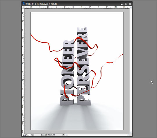
Render your image. This may take a while so grab a cup of coffee or take a break. Once it’s finished rendering, save the file as a TGA w/ Alpha Channel. These are typically your default settings for TGA files so I just let them be. TGA files are uncompressed and we can use the Alpha Channel to remove the background seamlessly. It’s brilliant!!
Setup a new document in Photoshop
Create an new document in Photoshop. 11” wide by 14” tall, 300 DPI, and RGB color. Even though this will be a printed piece, I like to work in RGB sometimes and then convert my colors later. Sometimes the effects I apply might look funny or not at all in CMYK mode. So start in RGB in this case.
Open your rendered .tga file
Open your .tga file that you just rendered. Check out the channels tab and Ctrl+click on the Alpha Channel to make a selection around it. Go back to your layer, copy and paste the art into your new document that you created in step 12. Now you’re officially ready to start the post-production editing in Photoshop. This part gets fun.
Create a retro stylized grassy hill
To design the retro looking hill, first just create a single ellipse as your ground plane. Remember how your original geosphere looked in 3ds Max? Try to make it exactly the same. Line it up with your letters and shadows so it looks real.
Then apply a gradient overlay from green to red to purple. Tweak to your liking.
Then duplicate the layer and scale it vertically from the top down ever so slightly. Duplicate it again and do the same. Each time scaling it down from the top. Once you do it 3 or 4 times, you’ll see it gives the ground a more rounded, three dimensional look that also has this retro faded gradient effect.
Add Clouds and a Glowing Sun
Go outside and snap a photo of the sky, with a good bright sun. If you’re not inclined to do this yourself, you can find plenty of good sky photos on stock photo sites. I chose one that has some clouds, but it’s most got a bright sun with nice rays shooting off.
Once I had my sky photo in there, the sun was not as big as I had envisioned. So I made a selection around it and copied and pasted it on top and made it bigger. Much bigger. I faded the edges with a soft eraser brush to get rid of the hard edge.
Add birds in the sky
You can surf some stock photo sites for a nice flock of birds photo or grab one quickly from the Flock of Birds Vector Pack in the Arsenal. If you’re using a photo, make sure the sky behind the birds is white so you can set it to multiply to get rid of that background easily. The birds are there to show scale of the letters. It helps give the type that “monumental” look.
Now duplicate the bigger sun from earlier and put it on top of your text and birds. Set the blending mode to “screen” to give it a nice glowing effect. You might want to adjust the levels or softly erase the edges of the layer to suit your fancy.
Add some cloudy smoke textures
Any nice photo of smoke or clouds could do the trick, but we’ve prepared a special set of ready-to-use Smoke and Cloud textures. You can buy them here. I set the layer to “screen” to give my clouds a little extra oomph behind the text.
Add some Dust Textures
We recently released an awesome new Dust and Particles Texture Pack that are perfect for this job. I pasted in one of the dust textures and set the layer to screen and it’s literally like a magic bullet for adding some subtle aged effects without looking grungy or too dirty.
Boost Contrast and add a vignette and border
Increase the contrast by creating a new Levels adjustment layer on top and tweak the settings to get a little more contrast. Then Copy > Merged and paste a new layer on top. Duplicate that layer and apply a Filter > High Pass on it. Then set the opacity to something like 40%. This will give your image more contrast.
Next, create a nice subtle vignette on your image. But first, merge the high pass layer with the original. Then go to Filter > Distort > Lens Correction. Change the Vignette amount to -100 and press ok.
Achieve that vintage, worn, and analog look.
One major characteristic of retro and vintage photos is the grain. The easiest way to add some of that grain is to add noise, blur it, then sharpen it.
To be more specific, Copy > Merged and then paste your image on top of all layers. Add some noise, roughly 25-30%. I find that this number can vary a lot depending on the size of your document. Select “Gaussian” and “monochromatic” and press ok.
Then you want to run a Gaussian Blur on it to tone down that fake looking noise. Simply adding noise is never enough, it always looks fake and too sharp. Blurring it with a radius of 1-3 pixels is key.
The last part is using the Smart Sharpen filter. Set the amount to somewhere between 100-140% and a radius somewhere between 10-35 pixels. This is really up to you. This will boost the contrast and give everything a slight glowing edge or halo between the lights and darks. I have found this is a tiny detail that you’ll see on truly aged and worn posters. If you look closely, especially at some letters on old movie posters, you’ll see there is some grainy noise in there, but also a slight halo around the edges. The higher your amounts here, the more contrast and more halo you’ll get. You don’t want to overdo it here, but do just enough to get the look you want.
Add your copy and logos
The client wanted to make sure their logo and sponsor list were present on the poster. As well as a few other required lines of copy. I originally made these smaller, in the corners to further emphasize the massiveness of the type monument.

Use your judgment and eye for typography to place the copy in an aesthetically pleasing way. I avoided using drop shadows on my type, even if that sacrificed some of the readability somewhat. Sometimes drop shadows look tacky and fake.
Quick and Easy Retro Color Treatment
It gets even more fun. To truly achieve a retro, vintage look in Photoshop, we’ll need to treat the colors. We’ll make them look washed out, faded, and bleached by the sun. There are many ways to achieve this look digitally, but I’m going to show you one of the easiest and fastest tricks to get that retro, 70’s or 80’s look.
One characteristic of those photos is that the darks tend to be bluish and the lights tend to be yellow.
First thing is we’ll make a new layer on top of everything you’ve already done. Fill this layer with a pale yellow color and set to “multiply” and 50% opacity.
Make another layer on top of that and fill it with a deep purple. You can try leaning more on the red side or more on the blue side. Either one will work well. Set this layer to “lighten” and you could tweak the opacity to somewhere around 50-100%.
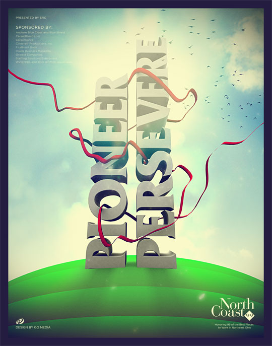
Final Poster
Here is the final poster. If you want, do a copy > merged and paste the new layer on top of everything. Then duplicate it, run a high pass filter, and set it to hard light. Adjust the opacity to your liking to achieve a cohesive fake HDR sharpening look.


