Blog

4 Lessons In Minimalism
Because minimalism is so spare and simple, it’s a common misconception that it would be easy to do it well. But if you really take a look at why good minimalist designs make such an impact, you come to realize that a sophisticated use of the style takes even more experience and understanding that the most maximal of designs.
The layout and aesthetic choices should all be made so that the content shines and the user experience is clear and simple. At its core, minimalism puts a premium on communicating ideas and creating experiences in the simplest way possible. Take the minimal music quiz as an example; not only is the layout minimal in design, so is the imagery that accompanies it. Every part of the site demonstrates how interesting and versatile simplicity can be. It looks effortless, but in order to pull it off, you need to make sure that you’ve learned these essential lessons:
1. Simple doesn’t mean easy or plain.
To the novice, one of the most confusing characteristics of minimalism is the idea that the end result is the product of just as much (or often more) thought than any other type of aesthetic. But the truth is that refining a concept down to a visually pleasing and multifunctional minimum takes a lot of work. This process is what enhances the effectiveness of the visual and interactive experience, and what makes minimalism such an important style to learn more about.
For example, it’s the smallest details used in Teacake’s site that make it such a pleasure to interact with. There are several uses of a flat, round elements, which a user will subconsciously but quickly learn are indicators of interactive possibilities. There’s the scroll to top indicator that pops up with just enough emphasis on the right-hand corner to take note of it without it disturbing your experience. There are the buttons for revealing and hiding further information about each project, and the arrows for scanning other images. They are all immediately understandable, and their sleek design brings the site to life, as well as directing focus where it needs to go.
Similarly, simplicity should be used to highlight the innate purpose or elements of the design. For example, take a look at this uniform quiz. Design’s like these don’t need to be complex to communicate their message.
2. Designs should be cohesive and tell a story.
Despite the recent popularity and many advantages of minimalism, no one should just jump on the bandwagon because they want their designs to be on trend. Minimalism isn’t the best idea for every type of site or target audience; the choice needs to be made based on practicalities as well as trends. This is why there are so many design portfolios, specialized eCommerce sites, and blogs that are done in the minimalist style. Because their topics are usually restricted and visually engaging, and their audiences are often more attuned to aesthetics than the average user, it makes sense to choose minimalism for these types of sites.
Apart from being simply the right choice for your site’s direction, minimalism also works best when it’s used to tell a story. This interest in giving an overarching experience is probably why so many minimalist sites use same-page scrolling effects, rather than breaking up their content into multiple pages. By creating a consistent experience throughout the site, businesses like the Josh Cohen School of Music make their products or services (along with their company) feel more specialized, personal, and appealing.
3. Focus on the user experience and the design will follow.
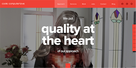
You’ve already seen a few examples of minimalist sites that have a very unified color scheme, which shows up in the use of a consistent color on all objects of interest, like logos, links, and rollovers. Code ComputerLove is no exception; a bright persimmon color is used to highlight every important piece of information throughout the site. The large fields of the color that pop up to identify a grid of rollovers make for a particularly eye-catching and satisfying user experience. The reason why this example and many other minimalist sites often put such an emphasis on just one color is because this provides a wonderful user experience; there are no other bright hues to distract users from the goals the site wants them to achieve. But it’s a welcome side effect that the site also benefits aesthetically from these restricted color choices.
4. Achieve a balance of alignment and contrast.
Although the previous lesson shows what makes the solid backbone of a good minimalist design, sometimes a little more spark is needed to really ignite the design. Often it’s as simple as adding great imagery or type (or both) into your layout. But the best minimalist designs would look great even if these dramatic effects were stripped away.
Take a website like Peter Hook and the History of Joy Division; it is completely monochromatic, and has utterly simple typography and iconography. But the layout achieves a wonderful balance of historical and modern elements, in the textured background and serif typeface and the flat icons and line treatments. And the contrast between black and white and large and small elements is quietly enticing. Despite having absolutely no flashy elements, the site draws you in and makes you want to explore.
With all the advantages that well-executed minimalism can confer on the right kind of website or portfolio, it’s no surprise that the style has exploded in popularity of late. The design community should look forward to seeing work that really pushes the envelope and continues to make the web a more robust and mature medium.
Subscribe to the GoMediaZine newsletter


