Blog
Create a Rockabilly Poster With Vector Set 22 – Part II
A bit of background information
Hello all! Simon, the Arsenal manager here. Today, I finally have time to release the 2nd part of the vector set 22 inspired poster tutorial Steve Knerem poster a while back.
<Fair warning> the post is fairly long (6000+ words), but I deemed it necessary to take the time to meticulously explain the process I went through to re-design this poster. For instance, I took the time to detail my research and mood-board steps, which are often overlooked in tutorials. I also detailed as much as possible my “trial and error” style approach to choosing typefaces, and to constructing typeface arrangements. If you are a seasoned veteran, these extra steps will definitely seem boring, if not frustrating. Just skip them!</fair warning>
For those of you that haven’t been following, we released our 22nd vector set a few weeks ago. Steve Knerem, the artist behind the set’s content, decided to create a rockabilly themed poster to demonstrate the set’s potential. He then proceeded to write a tutorial about it. We said that we would expand a bit on Steve’s tutorial to bring his design to the next level, and to make it a tad more truthful to the rockabilly vibe.
What are we going to do?
First, we’ll be doing some research. There’s plenty to be learned from gig posters of the 1950s and 1960s, in terms of typefaces, composition, color palettes, etc. Our goal will be to identify some design elements and patterns from that era, and to improve Steve’s design based on them with the tools we have available now in the second decade of the XXIst century.
Second, we’ll see how we will recreate the patterns we’re seeing in our research to improve Steve’s original composition, while respecting his original concept. I’m anticipating mostly type work at this stage.
Finally, Steve’s original goal was to work towards a screen printed poster, hence his limited color palette and work primarily in Illustrator. I’m going to show you some of the techniques I use to texture and weather artwork, to make our clean and digital vector art look a tad more analog, and just like if you had pulled the poster out of your parents or grand parents’ attic after all these years. Sounds fun? Then let’s do this!
Research, research, research
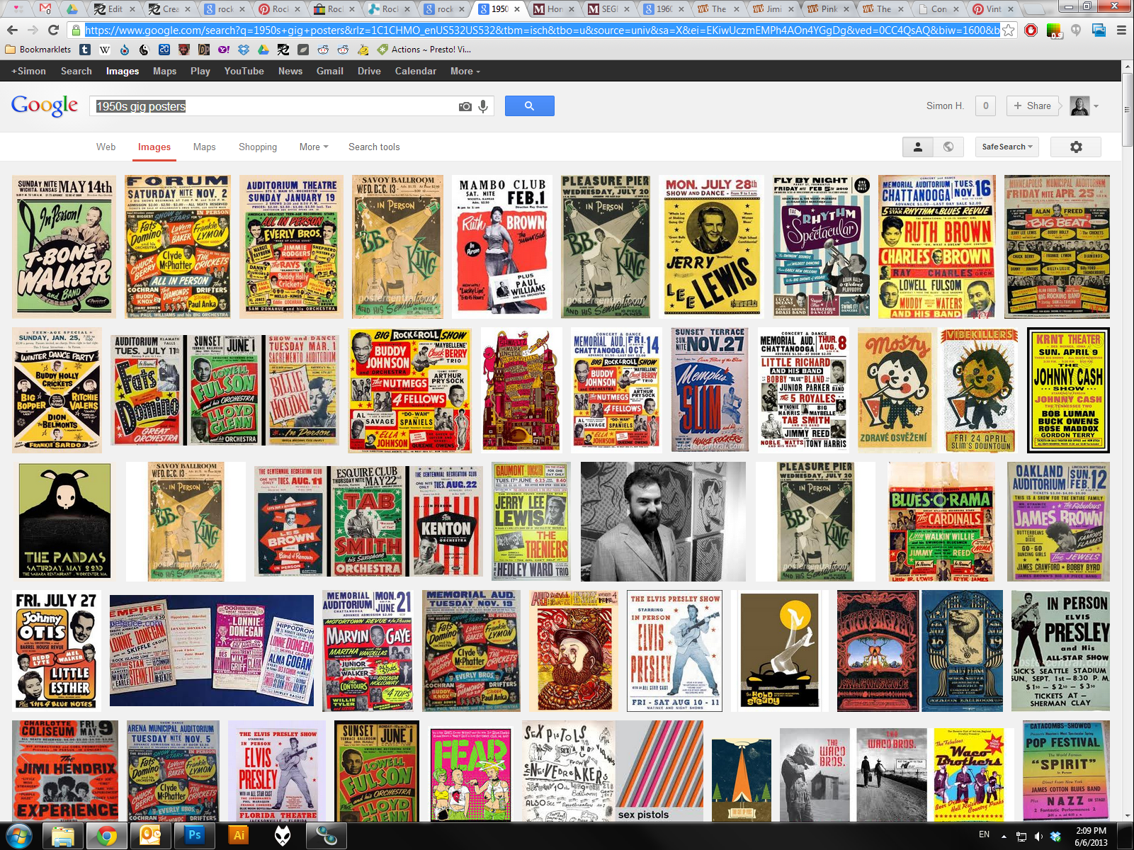
Well, the easiest way to search for something these days is to google it. So I went ahead and researched using the following keywords:
Follow the links to see the results I encountered. I was hunting in the first couple links of the web search, as well as in the image search results.
There are already a few things that jump right to my face just by looking at these:
- The vibe difference between the 3 styles (rockabilly, 50s, and 60s) is pretty strong
- The rockabilly posters draw a lot on the Kustom culture
- The crazy gig posters with a bunch of colors and eerie designs started more in the 60s. This probably comes from psychedelic rock starting to be mainstream, printing techniques improving, and full color printing becoming cheaper
- Condensed, bold or extra bold sans-serif are among the most readable typefaces
- And Steve’s poster is even showing up in the search!
A look up-close
Let’s start with the rockabilly search. I ended up also exploring some of the links the web search turned up. There’s a pinterest board in particular called Rockabilly, Greaser, Pin Up, Posters & Art that was pretty rad. Just look at these:
While the Go Johnny go poster is cool, I prefer the Gene Vincent/Eddie Cochran one. This was a rather cheap poster to design and print: I count only 2 colors (black and red), and there’s no custom illustration. The eye gets attracted by the typeface relationships and color variations. One of the ways to add a few graphical elements is to use that star symbol. I see you coming already by saying that there are some other, way cooler looking other pieces on that page. There’s that Coney Island rockabilly festival poster, that Viva Las Vegas poster, and these 2 Social Distortion pieces. Well that’s the whole problem: a lot of the Rockabilly art that we see nowadays is contemporary art with a flair that’s inspired by the culture behind that music, the Kustom culture, etc. And the faithfulness of their emulation of the original design codes of the gig poster artists of the 1950s and 1960s varies greatly. That being said, looking at the typefaces they use, we can still see the affinity for either the hand painted sign type vibe, or the whole Sailor Jerry/tattoo vibe, or the condensed, cheaply printed, sans-serifs I was talking about earlier. Steve’s art matches the Sailor Jerry tattoo vibe pretty well, so that’s definitely a direction we can explore.
A look at the 1950s posters
These have a bit more color, and feature performers portrait. The “vintage diner” style of type seems to come from there. Looks at the BB King or T-Bone Walker type treatments. There are frames and not-quite-accurately-square color rectangles used as supports for content blocks, among other little design elements that immediately make us associate these posters with that era (stars, horizontal dividers, etc.). More to keep in mind.
1960s posters
And here are the 60s! Enter the psychedelic scene… There’s also that cut paper look. These are getting away from the style we’re trying to emulate for sure.
Let’s recap
So, it looks like we’re trying to find a happy medium between the boxing style posters of the 1950s and the modern interpretation of the Rockabilly/Kustom/Sailor Jerry approach. We’ll pay a special attention to type, and might modify or add to the borders already put in place by Steve in his original art. Finally, we might give some hierarchy to thew type with some box elements or dividers. And let’s go!
First: the type elements
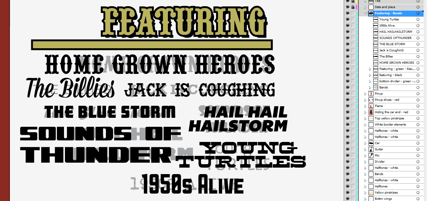
Here are the type pieces from Steve’s design:
The title features a type midway between western and country. That’s the good part. The main issue I have with it are these pre-made grunge scratches on it.
The band names features some solid options (The Blue Storm, Hail Hail Hellstorm, maybe Jack is coughing), and some less solid ones (Home Grown Heroes, The Billies, Sound of Thunder, Young Turtles, 1950s Alive).
The gig information space is written in that condensed slab serif. I like it, but maybe we can find a more fitting one. And here are type pieces from our references:
I think it’s time to start looking at our typeface collection, at the Lost Type Co-op, and at Dafont.com. Working at Go Media as its perks, as they’ve accumulated a solid type library over the years. But since it’s not the case for everybody, let’s see what we can find before digging into the secret vault here.
The Lost Type Co-op
Lost Type has quite a few candidates: Mission Gothic, Dude, Mission Script, Sullivan, Bemio, Arvil Sans, Oil Can, Outage, Aldine Expanded, Duke, Onramp, and Tightrope. The cool thing is that you can get a personal license (and sometimes even a commercial one!) for these typefaces for free. But you should totally give a few $$$, as these are so amazing.
(Images via Lost Type Co-op and its various contributors – © all rights reserved)
Dafont
Let’s be honest, Dafont is a place listing cool typefaces but also some very lame ones. That’s why I’m very wary of using that site anymore. But maybe just for today we can find some good surprises. Remember, not all of these are free! Most of these, in fact, are free for personal use only. You’ll need to get in touch with the font creator if you want to use them on a commercial basis. The two categories I focused my searches on are western and retro fonts. And I have quite a list there too. Anderson Four Feather Falls, Anti Hero, Laredo Trail, Pointedly Mad, Regulators, Alpenkreuzer, ARB-218 Big & Blunt, ARB-66 Neon JUN-37, Franklin M54, HFF Sultan of Swat, NPS Signage 1945, Phat Phreddy, Super Retro M54, and Tattoo Ink.
(Images via Dafont.com – © all rights reserved)
But aren’t we supposed to design something at some point?
Agreed! But at the same time, all that research process is necessary to make sure that you’re producing relevant concepts. A rockabilly poster wouldn’t look rockabilly with the Matrix typeface on it.
There, it starts
So, now that you have downloaded and installed all the typefaces, that you tracked down the file you created when following the first part of the tutorial, and created a mood board with all your references, let’s do this. I wrote earlier that I only wanted to improve on what Steve did. So the pinup, the car, the guitar, and the microphone are going to stay. They form the core of Steve’s composition, and while they’re not really looking like a vintage multi-act gig poster, I think their impact is undeniable. First step: track down your Ai file from the first tutorial, and save a copy with a name clearly labeling the fact that you’re going to alter your design. For example: if my first file was named gma-vector-set-22-rockabilly-poster-tutorial-c1r1.ai (Go Media’s Arsenal – Vector set 22 rockabilly poster tutorial – Concept 01, revision 01), my new file will be named something like: gma-vector-set-22-rockabilly-poster-tutorial-c1r2.ai. You get the idea.
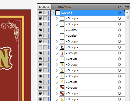
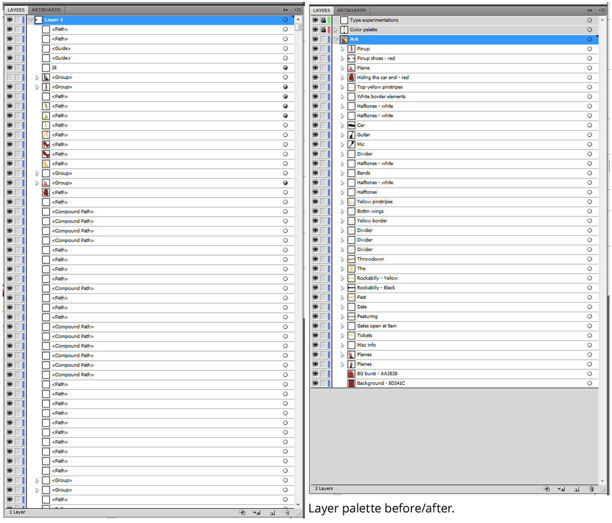
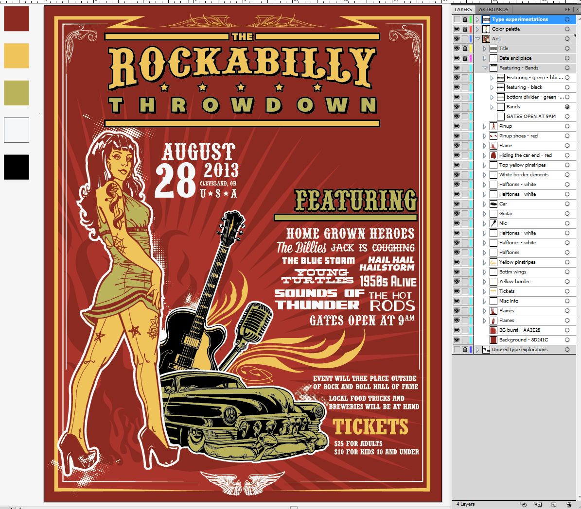
Now might also be a good time to clean out and to organize these layers, groups, etc. This will make your life so much easier in the long run, I promise.
I mean, check this out: isn’t the sight on the right a bit more pleasant?
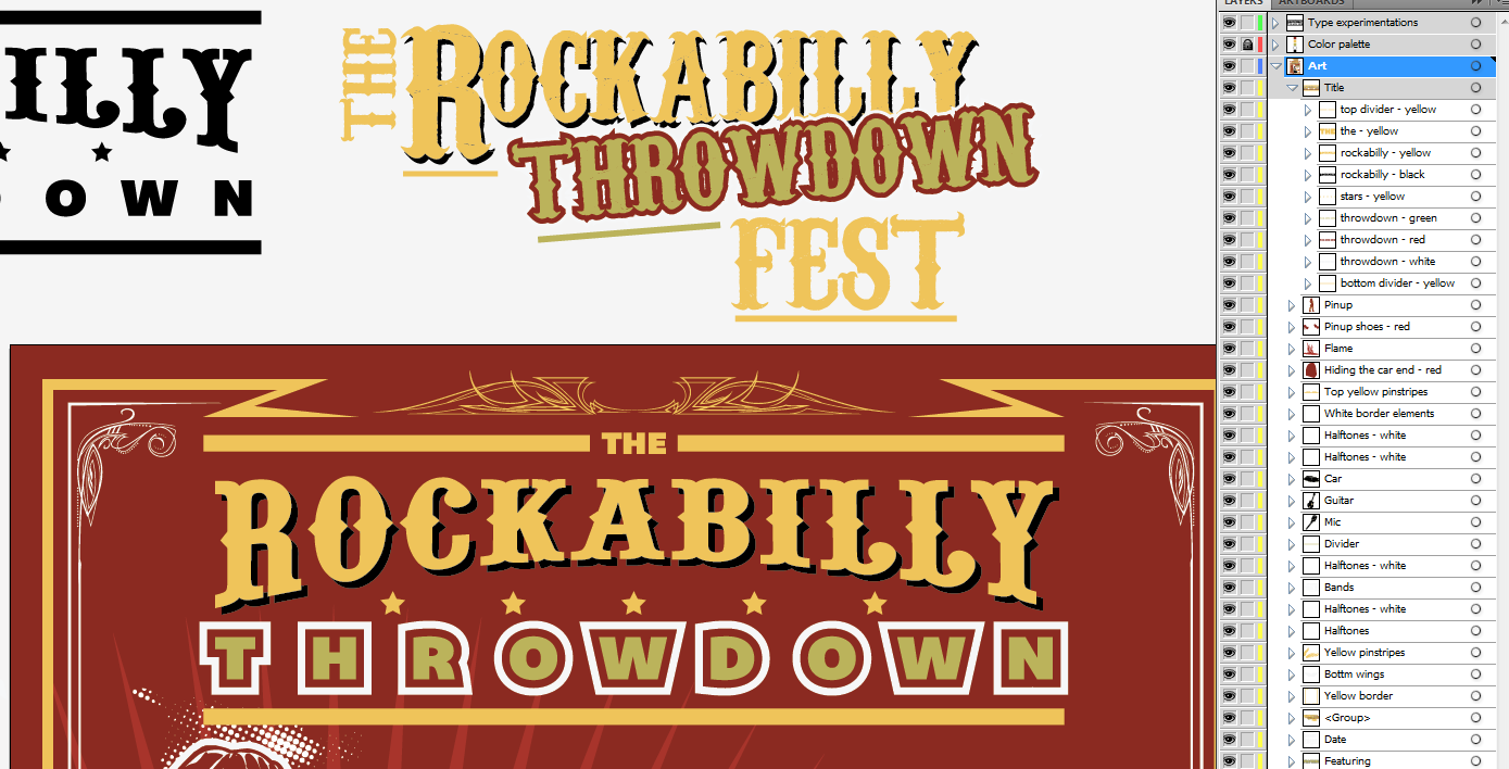
Also, since we’re going to move elements around, I can tell that having them properly labelled is super helpful to keep track of them. Also, I’d like to point our something in my newly organized file: I have created 3 layers: art, color palette, and type experimentation. Art could end up getting some sub-layers (which allows to add hierarchy without having to group elements together). Color palette is a layer that just features 5 squares, one of each of the colors we’re using. It’s super useful to quickly switch an element or series of elements to the same color, since even when the layer is locked you can still use the eye dropper on its elements.
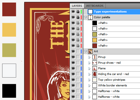 Type experimentation is obviously where the fun is going to happen. Let’s tackle the title first, shall we?
The rockabilly throwdown
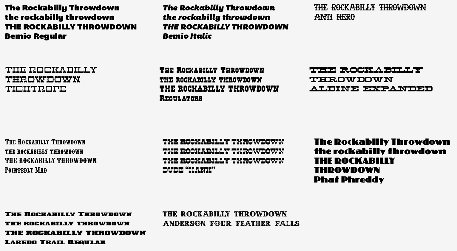
Let’s start by pointing out the typefaces we’re going to try from that bigger list of contenders we’ve assembled. I typically start by typing the text I’m trying to format in uppercase, lowercase, and in a mix of both to see what character combinations look like. I’ll also add the typeface name in there for you to follow. And make sure you’re on the right layer and that it’s unlocked.
Once that’s done, we can start eliminating a bunch of these. It’s pretty clear to me that we should keep that western vibe in the title. Think about the Coney Island Rockabilly Festival poster vs. the Destination Unknown poster. The tattoo type looks great, but the sailor/pirate vibe is too strong and gets us away from the rockabilly feel in my opinion. Let’s weed out whatever doesn’t fit this declaration of intent.
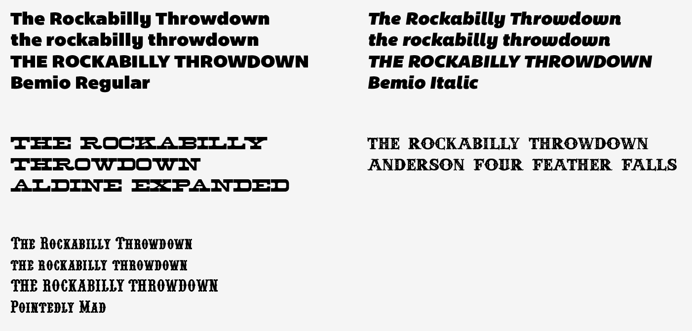
We still have too long of a list, but it’s better. Other than the obvious western typefaces, I’ve also kept Bemio (both regular and italic), because it has the retro vibe we’re after, and a very dynamic quality. Combining these two (italic for “the” and “throwdown,” regular for “rockabilly”) would be swell. Phat Phreddy has also that distinct retro feel, but it doesn’t seem to sit well with that restrained list. Phat Phreddy is then out. Anti Hero is sweet, but it has a “raw” hand drawn vibe that doesn’t match Steve’s clean and detailed hand drawn vector pinup. Out. Tightrope looks sweet, but feels like too much. Out. Regulators seems a bit plain. Out. Aldine is a tad too expanded, but I’ll leave it in to try. Pointedly Mad seems perfect (think of the Coney Island poster again). Dude is simply too much. Laredo Train seems a tad bland, like Regulators. Out. Anderson Four Feather Falls seems like a solid candidate too. This leaves us to the final four (well, five, but I’ll combine both Bemio styles together).
It’s now time to create title treatments based on these typefaces. I used Steve’s as a base, as his was solid. I just didn’t like the typeface he chose. The other thing I’ve kept in mind is the treatment of “rockabilly” on the Coney Island poster. All of the work happens on the type exploration layer, and outside of the main canvas. I’ve also locked my art layer, just in case. I typed each word individually, and moved them around as needed. I’ve also used the effects arc lower and/or arc upper quite a few times (Effects > Warp > Arc upper/Arc lower – use a negative value for arc lower). The stars are just simple 5 point stars, straight out of the shape tool (radius 1: 25px, radius 2: 50px).
Don’t hesitate to heavily rely on your alignment palette to go faster, and to fine tune the overall feel by nudging the words and elements little bit by little bit. Finally, to make sure that my star groups would be well spaced all the time, I made a proficient use of blends (Object > Blend > Make and Object > Blend > Options). You can read more about the blend tool on Vector Tuts+ and on Bittbox.
The results
Letting a little bit of time pass between these iteration and the moment of having to choose which one I will go ahead with is helpful. I realized along the design process that the Pointedly mad typeface is the one used on the Coney island festival poster. While I don’t want to recreate what the designer of that poster did, I’m currently more attracted by the iterations made with that typeface. There’s also one made with Anderson Four Feather Falls that could be a contender.
I’m going to tinker a tad more these 3:
- For the Pointedly mad option (left), I’ll make sure to visually center the stars, and that the spacing is consistent all around
- For the Anderson Four Feather Fall options (top and bottom right), I’ll make sure to
- Mimic the layout of the Pointedly mad option (add a divider, change were the stars are, etc.)
- Add a divider to the current layouts
Bemio alone wasn’t rockabilly enough. Mix it in with either Pointedly or Anderson, and you have a way stronger result. Aldine looks super rad, but it doesn’t nail the vibe right on the head. It’s somewhat there, but there’s a better option available.
Ah also, I’m going to quickly create a new layer and archive the unused type experiments there. I’m just selecting the type combos I don’t want, and cutting them (CTRL/CMD + X) and pasting them in front on the newly created layer (CTRL/CMD + F). Like that, they’ll stay at the same visual spot, but not on the same layer. Once that’s done, just lock and hide the layer.
After playing a bit, I’m once again in front of quite a few variations on the same theme. My goal is to choose the final one out of the group (minus the final alignment adjustments and other touch ups). If I were to be designing this poster for a client, I’d have to be much more careful about how much I’m spending on just that text piece, in order not to blow the budget. Let’s have a look at the options I came up with.
While the choice is difficult, a winner seems to emerge. First, it looks like option based on a type combo have more impact. Exit for options 2, 4, and 5. The lines are way too thick in option 3. This leaves us with options 1 and 6. I wrote earlier that I didn’t want to recreate my Coney island poster reference, but it looks like my preference goes to the Pointedly mad/Bemio based option. Four feather just looks too complex with all the carved out shapes, and more “western” than rockabilly to me.
After a little bit of clean up (alignments, centering, expanding the typefaces to object, etc.), I have my final title element!
And here’s a comparison with the concept I quickly jotted down:
The concept is on top, the final at the bottom. You see that the spacing isn’t the same, the dividers are thicker and extend further, etc.
Time to remove the old title, and to put the new one in place:
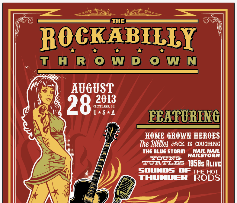
Steve’s title (visible above my art board) used 2 colors (our green and our yellow), as well as outlines and shadows to stand out. Time to get some of that magic working.
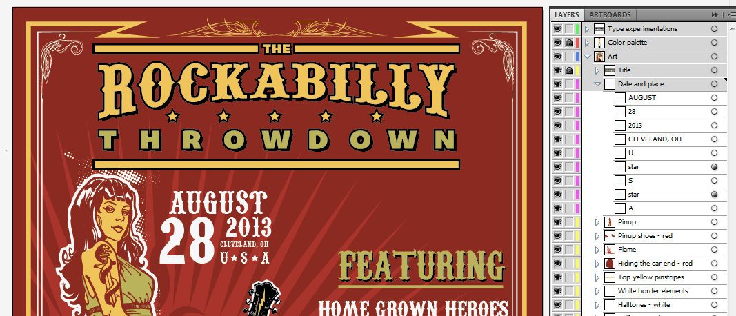
Steve used a black shadow behind “rockabilly”, and multiple outlines on “throwdown.” Let’s see what a similar treatment would give. But before that, the first thing you want to do is to create a sub-layer on your Art layer, and to call it title. Then cut and paste your title object in front in that “title” sub-layer. It’ll make the editing much easier, as it will separate the title from the rest of the art. To create the sub-layer, just select your art layer, and click on the new sub-layer button. Label it properly, and place that title in there. We’ll that process of separating elements as we go through the edits, and we’ll have a wonderful layer structure at the end.
Let’s start by doing the black shadow.
Let’s have a look at the layer palette to understand how I created the effect (once again, please label your layers and groups!). I have 2 instances of “rockabilly” there, a yellow one and a black one. I simply copied (CTRL/CMD+C) and pasted in front (CTRL/CMD+F) to get my copy of it. I renamed the bottom one, switch its color to our black, and manually offset it with my arrow keys (6 taps down and 6 taps to the right to be exact). I’m pretty happy with how it makes rockabilly stand out. Next up, the treatment of “throwdown.”
First, we want to switch the word to green. Then, if we look at Steve’s original treatment, there’s a red outline, then a white outline to be able to overlay “throwdown” over “rockabilly” and neutralize what would be a clashing color combo (the green of “throwdown,” the red outline, and the yellow and black of “rockabilly”). I’m not overlaying the words on each other, but for the sake of sticking to Steve’s layout, I’ll redo both outlines.
Let’s paste a copy of “throwdown” in front of itself. Switch the bottom copy to the red of the background, and relabel the layer properly. Then, let’s offset the path to accomplish the outline (Object > Path > Offset path). I used 0.1 inch as the value, and left my joins on “miter” to keep their sharp edges.
Then, by using the pathfinder (the unite function, first option of the top row), I made sure to just keep the outlines of the letters. This simplifies a bit the paths the computer has to calculate.
I followed the same process to get my white outline.
And here’s our result, compared to Steve’s treatment:
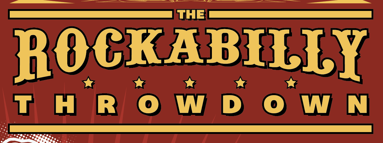
Let’s be honest, it’s not great. We loose a lot of the dynamism of Steve’s angled words. And his multiple outlines were motivated by overlapping words, which we don’t have here. So I decided to experiment in a different direction. I selected my top, yellow copy of “rockabilly,” and applied a 4 point black stroke, aligned to the outside of the shape. This gives a lot more punch to the word.
Since I liked the effect a lot, I went ahead and removed the outlines and switched back “throwdown” to yellow. I then gave it the same treatment.
The result is nice, but slightly overpowering the rest of the title’s elements. Time to unify everything.
Four points of stroke on the stars and on “the” was too much. Same of a 6 by 6 arrow taps offset. And the offset on my horizontal dividers was too much too.
 After tinkering, my final values are as follows: the offset on “the” and the star group is of 4 by 4 arrow taps. I have them configured to be of 0.1″ in Ai’s preferences. The stroke thickness I used on both is of 3 points. I nudged the stars a bit for a better visual alignment, and grouped my elements together for a cleaner layer hierarchy.
And finally, I’ve decided to switch “throwdown” back to green instead of yellow. It’s closer to Steve’s original title treatment, and puts “rockabilly” forward.
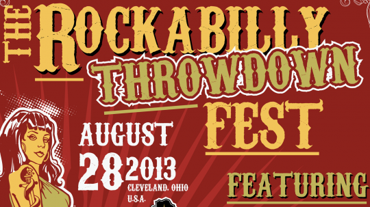
Taa-daa, we have our title in place. The reason why I’ve spent so much time detailing the process for the title is that it’ll be the foundation for the treatment of the rest of the text elements. We’re going to use similar values for offseting what will be offset, similar stroke values, and so on.
The date, time and place
These elements are secondary to the title in the original design.
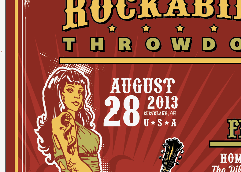
I’m going to make my version close to the original design, I’ll just be using Pointedly mad for the typeface instead. I might also change the layout of the words a tad.
The layout and typefaces are very similar. I chose to make the date more preeminent than the town. I’ve also used resized stars taken from the title to space “USA”, it’s a cool little detail. In terms of sizes, I started with “August” written at 72 points, and “28” written at 144 points. The other sizes come from there. As you can see, I also gave the date and place their dedicated sub-layer. Time to place the date block in the poster.
And here it is. This updated version takes a bit less room, which I don’t mind. Note the object organized in their sub layer, which you can lock (at least for now).
Featuring…
Time to tackle one of the most important piece of the puzzle, the band list.
I’m going to tap in the typeface list we got on Dafont and Lost Type, as most of these have the vintage qualities we’re looking for, and will probably fit better than the ones Steve used.
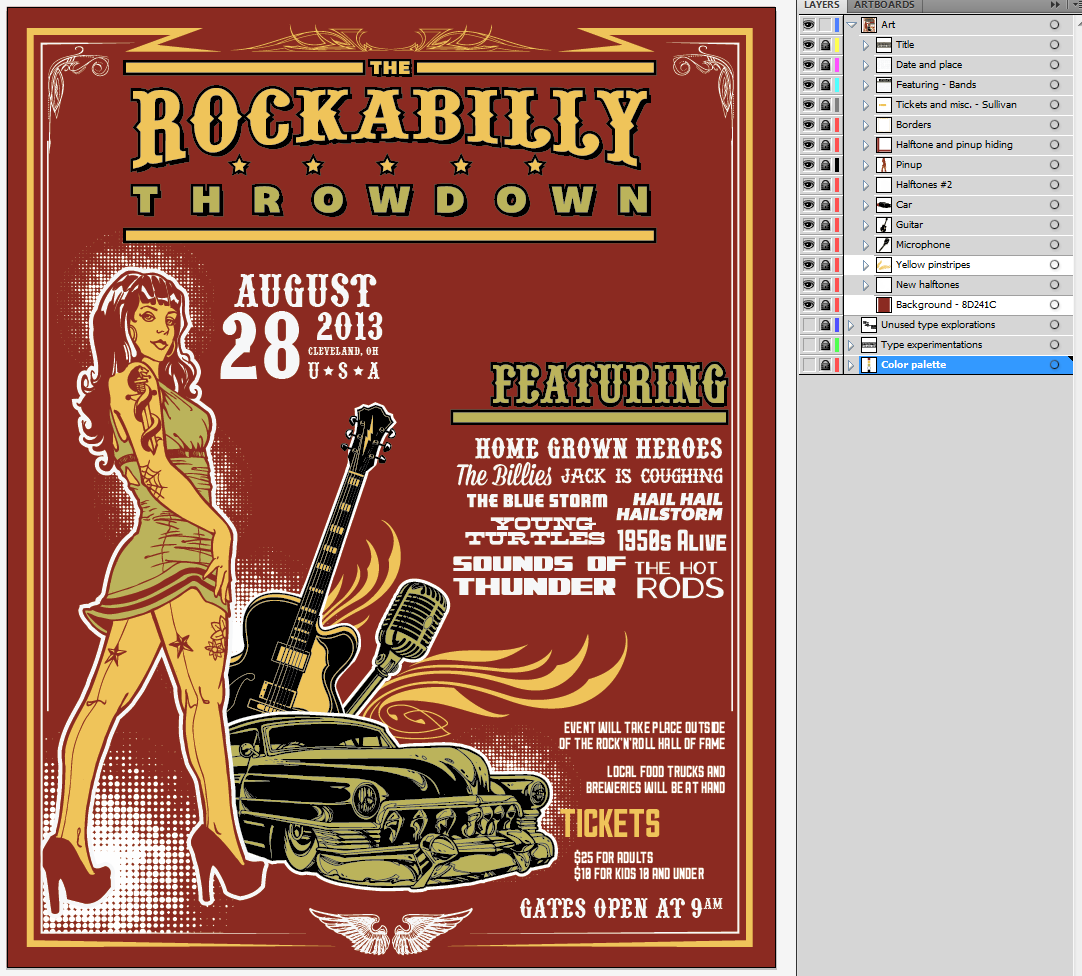
Here’s a side by side view of the current version of the list, and of my work-in-progress list. I just copied, pasted in front, and slide on the side the original one. I’ve also created the band list specific sub-layer.
Step one, the “Featuring” title. Like I wrote above, I’m going to take my cues from the main title type element. I used Pointedly mad, and went through the same duplication, outline adding, and offseting processes to get the type element. I then quickly unlocked my title sub-layer to steal one of the dividers over, and just switched its color to green rather than yellow. I resized it using my direct selection tool (A) to fit the width of our band list, and taa-daaa.
Time to tackle the band names themselves. I first started by switching the old list to gray, like that I can write the new version above and use the former as a guide.
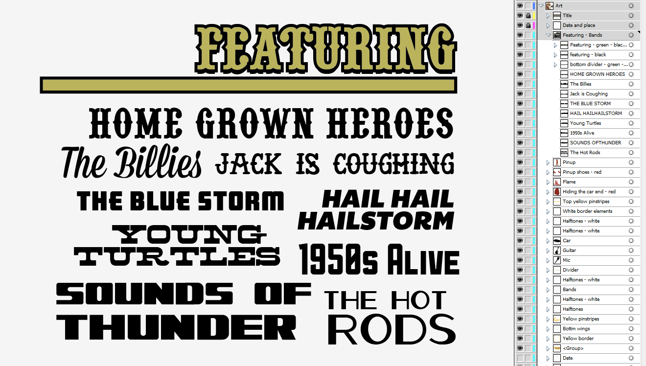
Here’s my first complete draft. I’ve used Pointedly mad for Home Grown Heroes, Mission Script (Lost Type) for The Billies, Anti Hero for Jack is coughing, ARB-66 Neon JUN-37 for the Blue Storm, Bemio Italic (with a custom line height value) for Hail Hail Hellstorm, Alpenkreuzer (center aligned, with a custom line height value, as well as a slightly bigger second line) for Sounds of Thunder, Aldine Expanded (with a custom line height value) for Young Turtles, and Sullivan Fill for 1950s Alive. Now, it’s time to remove the old list for good, and to clean up the alignments.
I know for a fact that this list is going to be aligned on the right edge of my poster. So I’m going to cleanly align to the right all of the band names that are on the right side of the list, make sure that the vertical distribution is a bit better, and manually place the names on the left of the list to make a visually compelling band name group. Finally, I’ll make sure that the divider under “Featuring” extends a bit more than all the way to the left of the list (cf. how the dividers of the title block extend).
Here’s my almost complete take on the band list. I’ve moved the name around a bit more, but as you can see, there’s still a weird gap at the bottom right. It looks like I’m going to have to add a band name to visually balance stuff out.
Let’s call them the Hot Rods. I’ll use that Oil Can typeface (Lost Type). I sized “Rods” bigger, centered the text, and used a custom line height value to make sure it looks not too spaced out.
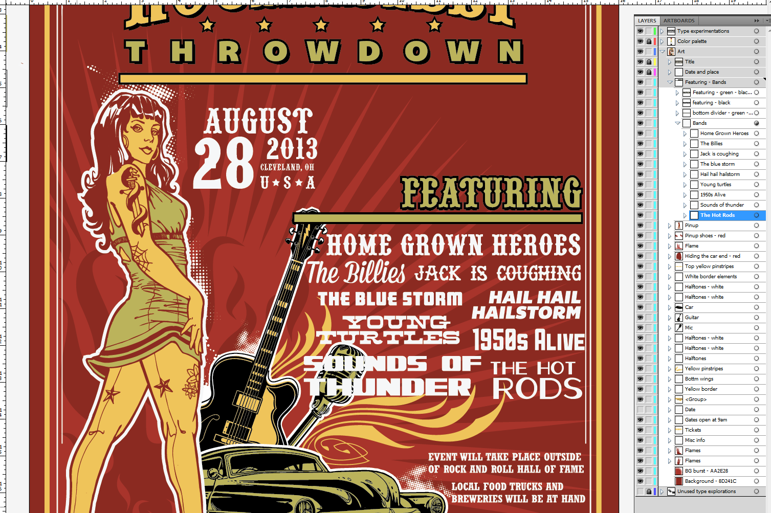
Once you’re happy with the placement, it’s time to switch the text to outlines (make sure there are no spelling mistakes!), and to switch our brand new lineup for the evening with the old one.
And it’s pretty clear that we’re having a problem here. Not only is the list too close to the border on the right, but it’s also obliterating the guitar and the microphone on the left. One remedy: let’s take the size of the band names down a notch. I still want to keep the “Featuring” title and divider to the size they’re at right now, to match the main title better.
And voilà, we have a better fitting band list! There’s a little bit of room won at the bottom of the list, which is where I’ll be sticking the “Gates open at 9pm” information. To stay consistent with the original design, I wrote it in Pointedly mad. My type is sized at 42 points, with the kerning set on “optical” (like most of the text blocks throughout this poster). I also switched the “AM” mention to superscript on the character panel’s options. Time to also remove the old “gates open at (…),” and to move forward.
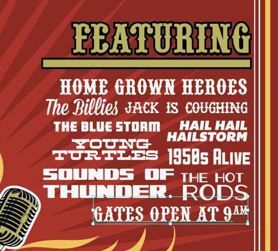 A check-in point
Where are we at?
With this super long tutorial, it seemed a good idea to take a quick step back, and to see what else we are going to finalize. We’re so close to the end I can feel it, but there are still a few details here and there.
- Finalize and touch up the look and feel of the “tickets” text block
- Check if downsizing the pinup just a bit to give more breathing room to the title is a good idea
- Maybe move the “Gates open at 9AM” mention back where it originally was?
- Potential background simplification
- Potential borders touch-ups
Now that the road map is set, let’s go for the final stretch.
Tickets and other miscellaneous information
The main change I want to make happen here is the typeface. I haven’t used a slab serif at all in the design so far, and I think it feels a bit out of place. I might use Sullivan or Bemio from Lost Type to have a certain sense of unity. Sullivan appeals more to me at this stage, but we’ll see as I go.
Here’s my first draft. The type is Sullivan Fill, set in 24 points. The line height is set at 24 points as well. “Tickets” is set at 60 points.
 Just to make sure, I made an alternate version in Bemio. You can see the Sullivan version in light gray underneath. Given the somewhat condensed nature of Sullivan, I think it’s a better fit given the space I have available. Bemio looks clean and good, but it would take so much more room.
 So Sullivan it is. It’s also time to align my copy to the right, since these text blocks will be aligned in the same fashion than the bands list. I also did some minor adjustments to the pricing block. Let’s put this in place in the poster, and remember to switch the “Tickets” title to our yellow.
 Well, just placing the new type above the old one made me realize than my potential layout correction for the pricing section will look too weird. Time to revert that.
 Much better, isn’t it? Let’s align everything the way it’s supposed to be (location information on the bands list, the ticketing information on the “Ticket” word), and delete the old type.
I also made a minor alignment alteration for the ticketing information, as it seems to fit the contour of the car better than way.
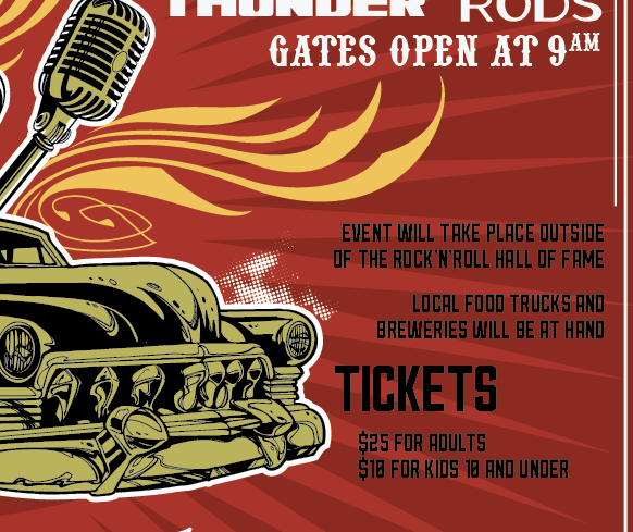 I decided to also move the gate information back down. The colors are switched over. The ticket and miscellaneous information block is done!
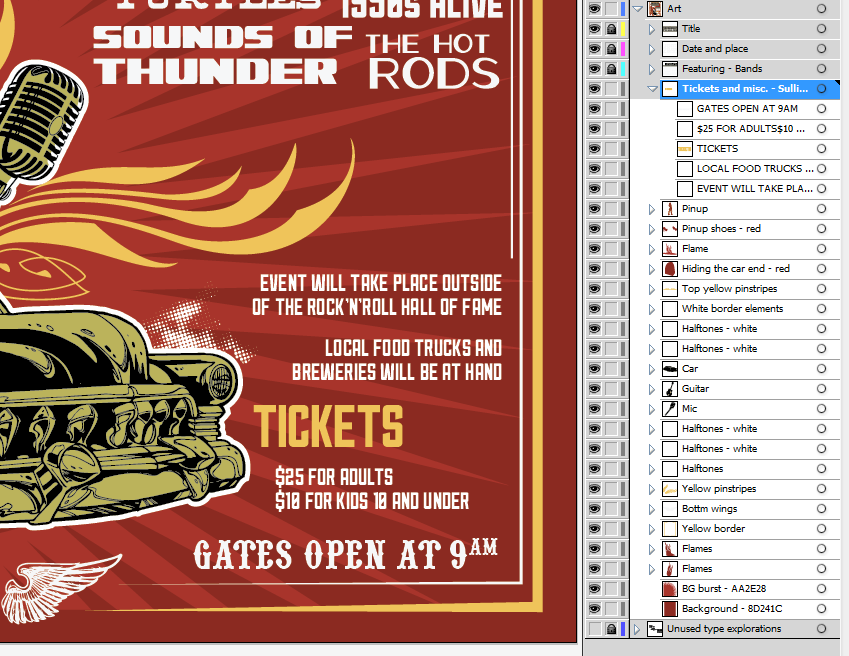 The pinup’s size
Next on our list is the pinup’s size issue. In its current state, I believe her head is a tad close to the title. That’s the only thing I want to act on: the width of the stroke around it, the colors, the placement of the halftones, all of these are good.
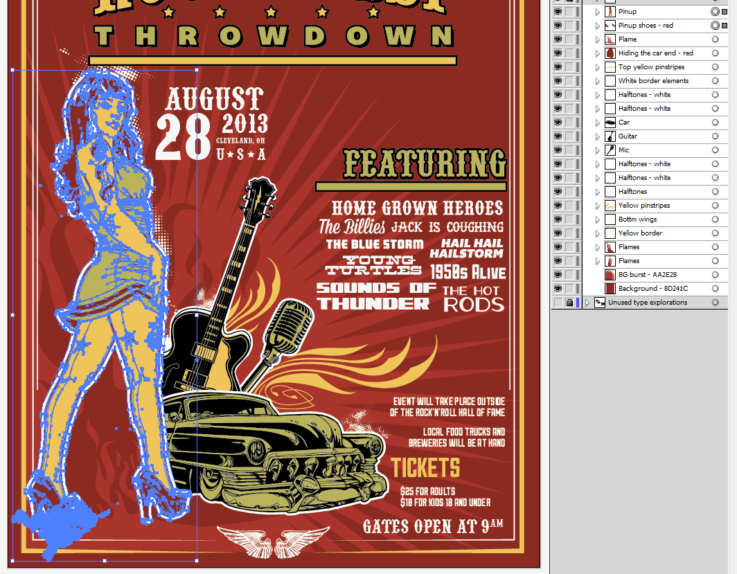
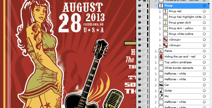
First, we need to select all of the pinups layers: the line art, the colors, and the outline. Thankfully for ourselves, we already grouped all of the elements together at the beginning. We can see that we included one of the halftone elements (bottom left, under the shoe) with the group.
I’m going to move the pinup on her own sub-layer, and un-group everything there, for better control. It’s just a game of cutting and pasting in front.
Once the pinup is in its own layer and the elements are un-grouped, we can have a better understanding of what needs to move and what can stay as is. I also managed to track down the halftone element as hidden in the outline group. I just slid it, out of there, on the main art layer for the time being.
What we want to do now is to select all of the pinup’s element, and to slowly size her down to leave something like half an inch of extra space. And sizing the pinup down by holding the SHIFT key and from the center top handle allows us to size the element down proportionally, while keeping it in a very similar spot. This avoids me to have to replace the pinup manually afterwards.
 When checking in closely, it also looks like the outline is sensibly similar to the other outlines in place (see around the car, the guitar, and the microphone). So we don’t even need to worry about adjusting it.
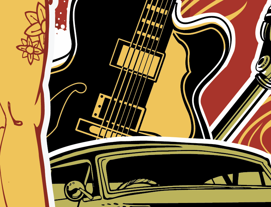 Last little thing about the pinup: I used the same pathfinder technique than when creating the first version of the title’s outlines to clean up the shapes composing the pinup. The white shapes, once united, becomes a clean silhouette shape, rather than a shape made of multiple shapes. Grouping the inner shapes of the same color also helps to clean things up.
If you feel like it, and while you’re at it, why not applying the same cleanup process to the car, guitar, and microphone?
Background cleanup and simplification
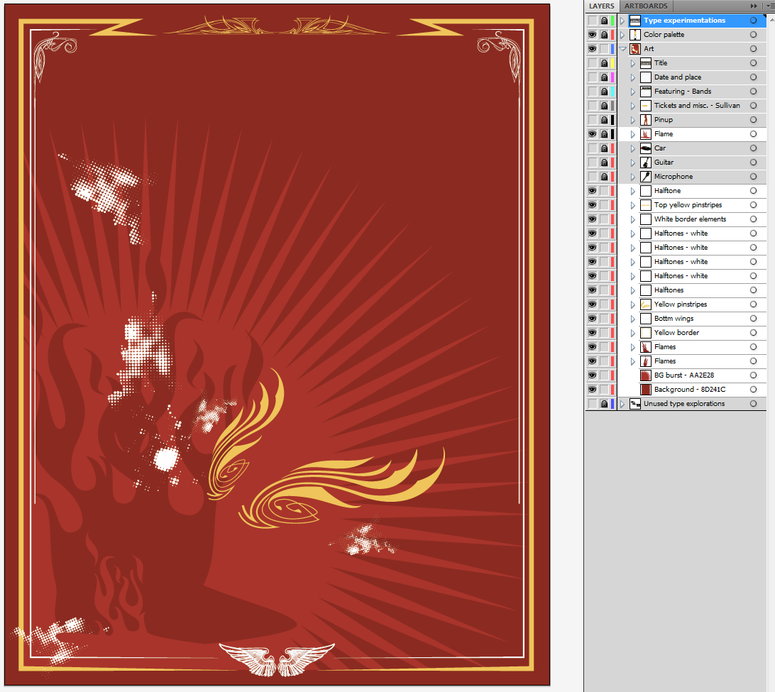
Steve’s background (shown here without any of the type or main illustrative elements) features a star burst, flames, and the borders. First, I’d like to clean up and organize my layers further. Then, it looks like we have to simplify this background, as we’ve added a color (the burst’s light red) to our original color palette, and this will explode the budget of the hypothetical project. Finally, I think we can touch up the borders to make them visually centered.
Removal of the background burst
Select the burst shape, and hit delete on your keyboard. Done. Time to bust out the “That was easy” button.
We have a problem, and it’s the flames. They are also in the light red, and don’t fit there anyways since we removed the burst. Let’s remove them as well.
 More cleanup and organization
Now that the extra elements have been removed, we can organize our leftover visual ornaments into a sub-layer as well. I choose to create one for the borders, one for the halftones, and one for the pinstripes.
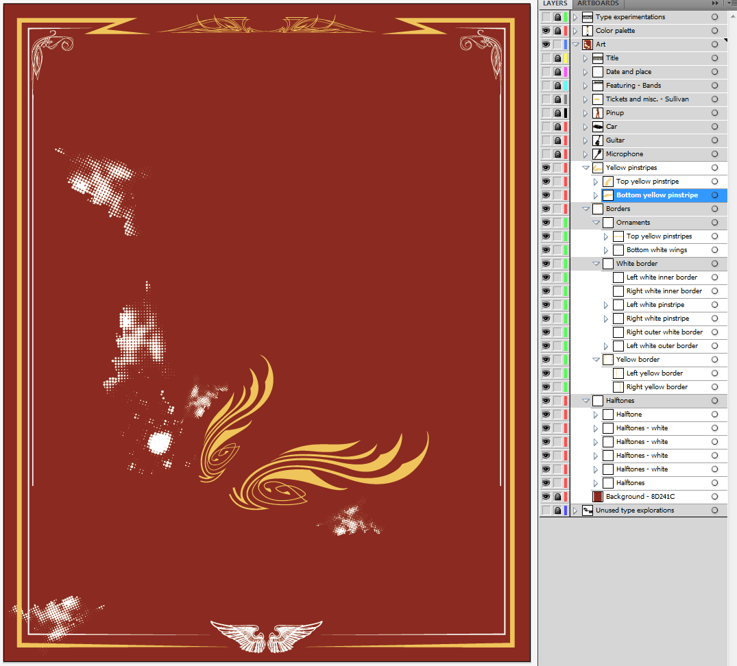 Border fixes
The borders aren’t fuller centered, and it seems that some of the spacing could be enhanced as well (see my highlights below). I’m going to use my direct selection tool (A) and the alignment palette to make sure the yellow and white borders are horizontally centered, and to make the bottom gap between the white and yellow borders identical to the one side gap between.
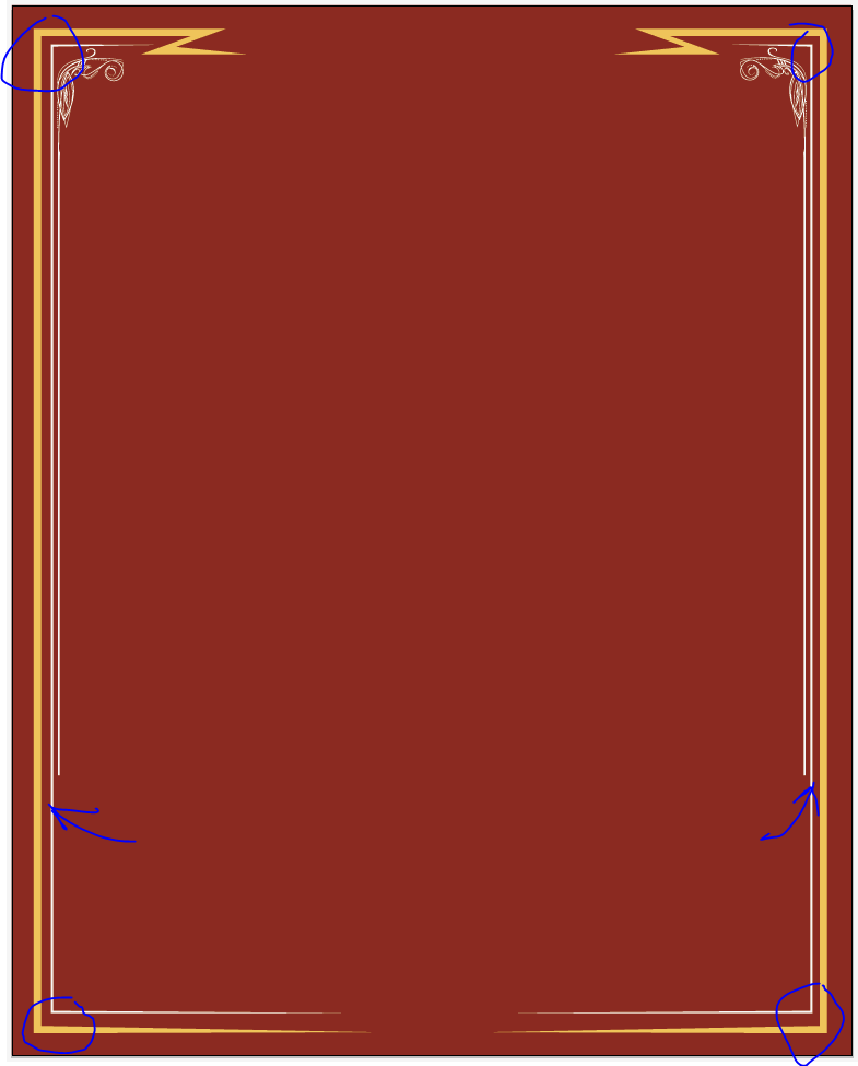 While I was at it, I’ve also made sure to center and align the top yellow pinstripe and the wings.
 Taa-daa, we have a fixed background!
Last overall touch ups
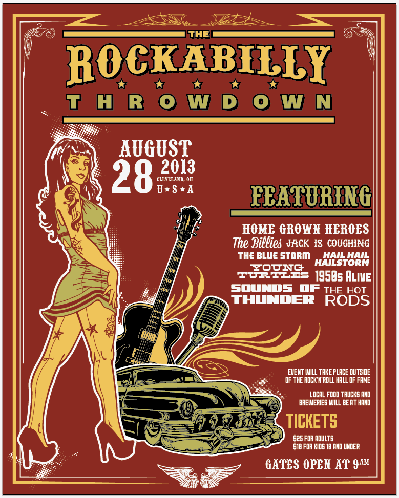 I’m pretty happy with the changes so far. Last but not least, the background still seems empty, or missing something. This is because we removed the burst and the flames. Elements like the halftones were arranged around these, and they left gaps.
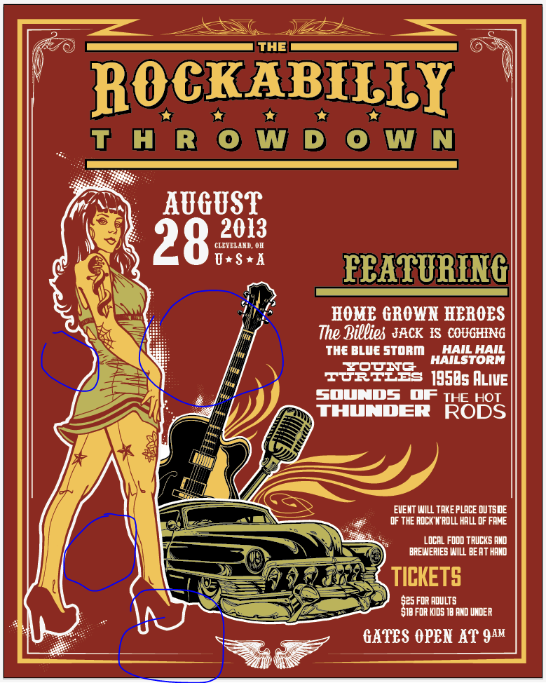 Instead of putting the burst back in place, I’m going to use the halftones already in the design, as well as some new ones, to “fill” the gaps. The trick for the new arrangement to fit is to keep a maximum dote size consistent with the dot sizes already in the design. Unless you start the halftones placement from scratch. Finally, some halftones elements can be found through your symbol panel.
The button I’ve highlighted in red will give you access to an option menu. From there, navigate to Open symbol library > Dot pattern vector pack.
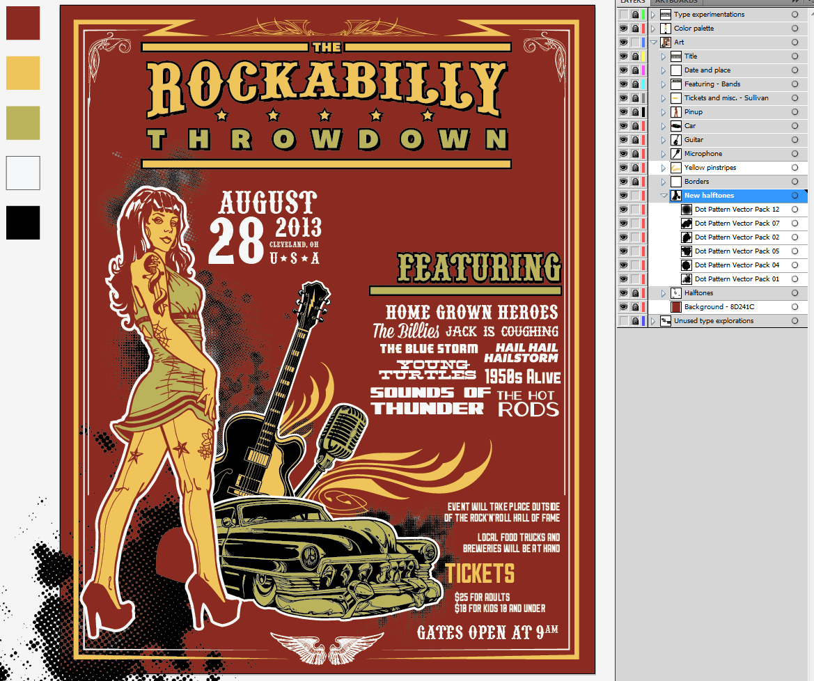
I created a new sub-layer named “New halftones,” colored the old ones in gray (to keep them visible as a non-intrusive reference), and started placing my new ones.
 Symbols are super easy to place: just drag and drop them from the palette into your design. Here’s my first draft after tinkering a bit with placement and sizes. You can see which ones of the pack elements I’ve used in the layer palette. It’s time to turn the old ones off, and to switch the new ones to white.
Since these are symbols, we’ll have to expand them before we can change their color to white. Let’s do so by selecting them all, and going to Object > Expand.
And here are our white halftones.
I don’t think I’ve accomplished the consistency I’m looking for. The one I’m happy (in terms of scale particularly) with is the little one in the back of the pinup. Let’s see if we can reuse it to fill the other gaps.
I’m happier with this second attempt. I basically used Dot Pattern Vector Pack 12 multiple times, after grouping it. In order to not break the scale consistency, I only sized it up very cautiously (check the bottom left corner, under the left shoe). It’s time to shuffle our layers a wee bit to make sure that the halftone at the bottom left covers the void left were we hid the back of the car. I just created a “Halftones #2” sub-layer, and placed it above the car layer. I then proceeded to cut and paste in front the halftone that’s behind the shoe in that sub-layer.
 Once that’s done, I moved my “borders” layer up, in order to have the border above the halftone. Time to delete the halftone that’s outside the limits of the borders. Just use your direct selection tool to select the part you don’t want, and hit delete on your keyboard to remove them.
It seemed clear that the gap between the yellow and white borders needed to be cleaned up as well, both from the halftone and from the outline of the pinup. To do so, I created two red rectangles that I placed high enough in my layer structure to be above the girl and the halftone, but not over the borders. I also made sure to size them properly to not go over the edge of the artboard, and gave them their own sub layer.
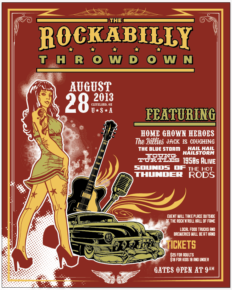
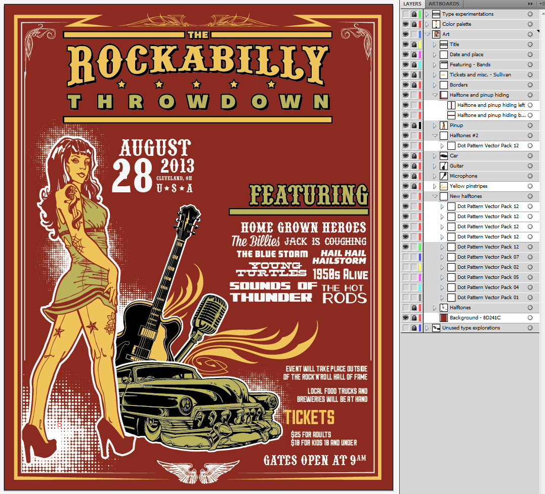 A bit more layer clean up, and we’re done! Delete the unused halftones, delete Steve’s old halftones, get the type explorations and color palette layers hidden and tucked underneath everything, and taa-daa, you’ve got yourselves a cleaner Rockabilly Throwdown poster.
What’s next?
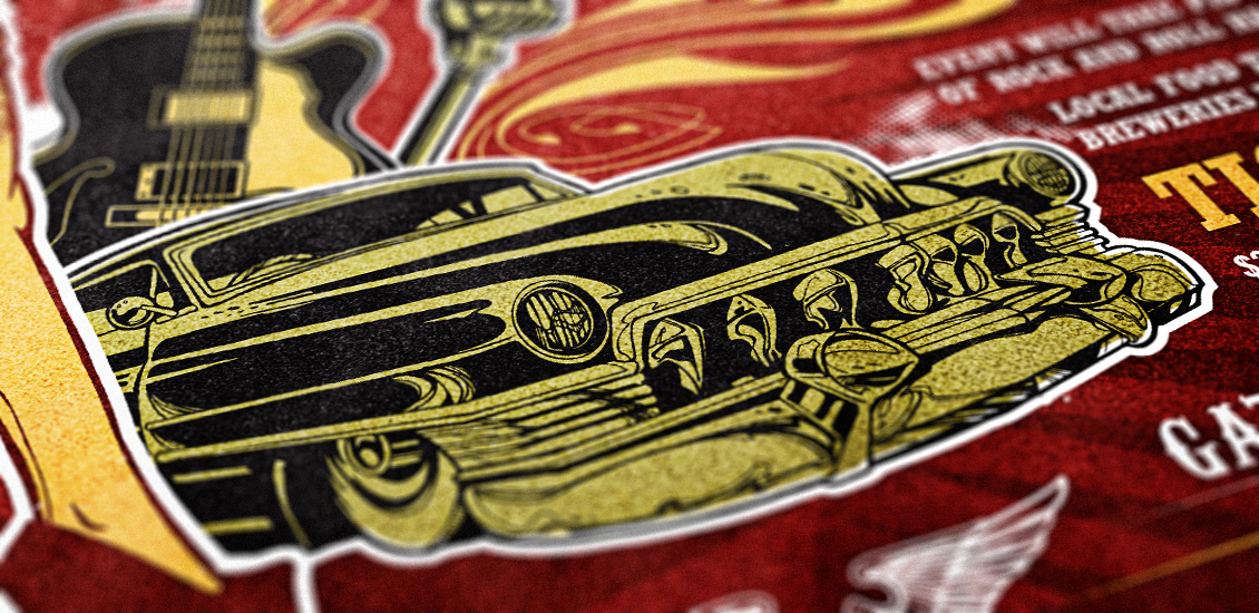
The next step will be to take this design in Ps to add texture to it. Imagine yourself in your parents’ or grandparents’ attic, and finding it after all these years. We’ll manipulate paper textures, aging Ps actions, noise, stains, fake folds, etc.
Until it’s written, cheers!


