Blog
Print Poster Tutorial – Bringing Doodles and Sketches into Your Illustrator Workflow
Time taken: 1 hour 10 mins
Difficulty: Beginner to mid-level
Resources used: Blobs font

The assigned project was to create cool and fun gig poster prints for a student union nightclub event – a big campus shindig before the kids go back for the holidays. Out of ideas and inspiration, I thought I’d raid my sketchbook for inspiration – something that I often do when faced with designer’s block. I happened upon a couple of doodles and sketches that I figured would be ideal for a winter, holiday design with a bit of an edge to it.

A few character sketches that I figured would make fine subject matter –

The doodle that gave me the main idea for the piece –

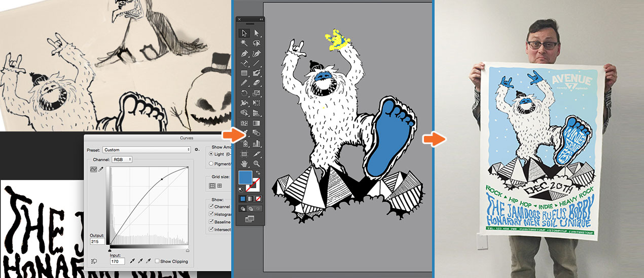
After scanning the sketched page, I brought the first sketch into Photoshop .

I cropped the scan, selecting the character I wanted to use.

I painted out the unwanted areas, cleaning up any loose pixels. Using the (⌘M, Ctrl M) curve function, I created contrast and more consistent blacks, while whitening the negative space.

I opened up the doodle sketch in Photoshop and repeated the curve clean up of the scanned image (⌘M, Ctrl M). I then created a new work path (path menu, new path) and pathed out with the pen tool (Option-click + P, Alt-click + P) the specific area I wanted to use.

After selecting the chosen path layer (path menu, make selection, “0” feathering) I cut and pasted this path into my original scanned layer.

After joining the two sketches into one file, I applied a darken mode (layers menu) on my overlapping layer. I then used the eraser tool to notch out some of the pixels to join the two sketches together.

To prepare the sketch for Illustrator, it was important to close off any open pixels.

Choosing the brush tool, I meticulously closed off any open areas. Once this was completed, I merged all layers (⌘E, Ctrl E)

The next step was to bring the cleaned-up file into Illustrator. After creating a new file in Illustrator, I pasted the sketch image into my workspace and using the live trace function (choose “image trace” in head menu) I chose the “3 colors” setting. I chose this because although it picks up the odd gray areas in a black and white image, it recognizes details that default tracing often ignores. In this sketch that was highly–contrasted, it generated a pretty even and solid image result and it wasn’t difficult to tidy up the odd grey path at a later stage anyway.
(It should be noted, that the live trace feature doesn’t work with all sketches and it’s sometimes better to path out the sketch, this particular sketch happened to be pretty “loose” and “sketchy” in appearance anyway, so it lends itself to live tracing, plus I made sure that it was correctly prepped for live trace in Photoshop.)

Once the sketch had finished tracing, I expanded the object and fill (object, expand, expand appearance).

Once the file had been expanded, I went into the image with my Direct Selection Tool (A) and deleted the background white and inner-white areas (for the purposes of this tutorial, I have illustrated this using a grey background).

After taking out all unwanted white areas, the sketch was ready for more detailed clean-up. The image actually required little clean-up. There were a couple of paths that needed closing and merging but no need for anything super-accurate due to the sketchy nature of the artwork. To clean up the missing line-work on this sketch, I used my favorite brush the “blob brush” to replace any incomplete and broken lines with clean black lines.

With all paths closed, it was easy to select areas with the Direct Selection Tool (A) and fill with a specific Pantone color (swatches, open swatch library, color books, Pantone + CMYK Coated).

Upon completion of the character coloring process, I created a new layer and drew a rectangle (M).

Using the eraser tool (Shift+E) and choosing a rounded shape, I notched out the rectangle to give it a “snowy” look.

This is a very easy trick to do and creates a nice illustrative effect.

To add some snowdrops to the design, I selected my blob brush with a left- angled brush.

After adding some snowflakes, I went into the blob brush again, and selected the opposite brush angle and added the rest of the snowflake effect.

Getting to this stage of the design gave me a better idea of how I could integrate the copy. I think in design there’s often a “natural order” when it comes to composition and by trying things out, opportunities for copy placement often arise naturally and without meticulous planning.

Having seen the design evolve, I also saw an opportunity to add some dynamic copy without having to resort to simply picking a font from a hat! So, I went back to the drawing board and sketched out some copy elements to place into the design.

After scanning the design into Photoshop, I repeated the curve adjustment process to prep them for bringing into Illustrator.

I brought the copy sections into Illustrator and live-traced each one, expanding and removing the white areas.

I added color to the copy-shape paths and roughly re-sized it to fit the space, then repeated this process with the other copy elements

I planned this design to include copy in the central area of the composition. After discovering the perfect font online called “Blobs”, I drew a simple curve shape with my pen tool (P) to add copy along the path.

Using the “type on a path” tool in the pen tool sub-menu, I added copy to the path.

After laying the central copy down, I used the pen tool to draw simple triangle shapes as word-dividers.

The copy was working out well, but I wanted the copy to fit the design shape better.

Using the free distort tool in the head menu (effect, distort and transform, free distort) I added distortion to the copy segments – expanding the appearance after each distortion (object, expand, expand appearance).

I repeated this process with other copy areas.

Once the main copy areas were finished, one of the final design touches was to add footer copy with social media info.

After creating the footer copy in white, using the Blob font, I copied and pasted the green rectangle shape I created earlier, transforming the scale and shape.

With the design almost complete, I just needed to add the club’s logo to my design.

The design was complete.

A quick checklist I always make sure I do before taking the illustrator file to large format print:
- Ensure that my artwork/artboard is cropped specifically sized for my poster requirements with plenty of bleed clearance around the edges between edge and artwork
- Convert all font elements into shapes (object, expand, expand/fill)
- Ensure all paths I want spot-colored are attributed a specific Pantone color (swatches, open swatch library, color books, choose swatch color specific to your printers requirements)

How the finished and printed poster design, printed for Roland DGA, looked.
Share your designs with us on our Flickr Pool Showcase and as always, feel free to leave any comments and questions below!