Blog
Photoshop Tutorial: Easy to accomplish VSCO Cam effect in Photoshop
Hey designers, attend our all-inclusive soul-fulfilling three-day design retreat, WMC: Off-The-Grid, this October 5 – 7th. To learn more, head to wmcfest.com.
A little bit of context
Hello all, Simon here. Welcome back to the design blog built by Cleveland’s finest graphic designers. You know me as a designer that loves to create posters with a lot of textures. I mean, just check the Lost and Taken poster tutorial, or the Do androids dream of electric sheep one. I’ve also used similar techniques in the tutorial I wrote when we released the Go Media building texture collection.
Well today, I want to talk about another one of my hobbies: photography. More specifically, iPhonography. I’m an avid Instagram user. But even better than Instagram is VSCO Cam. Purchasing the whole set of filters in that last app was so worth it. I’m a sucker for these often over-the-top film vibe images. Knowing that I don’t shoot too much film these days (despite owning a couple of Polaroids and an old Fujica ST 705), it’s kind of the closest I’m getting to it.
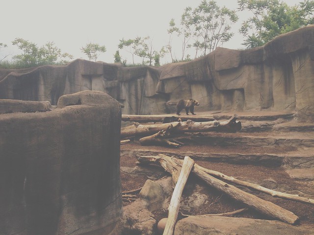
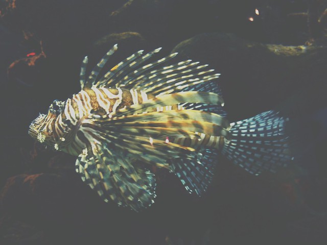
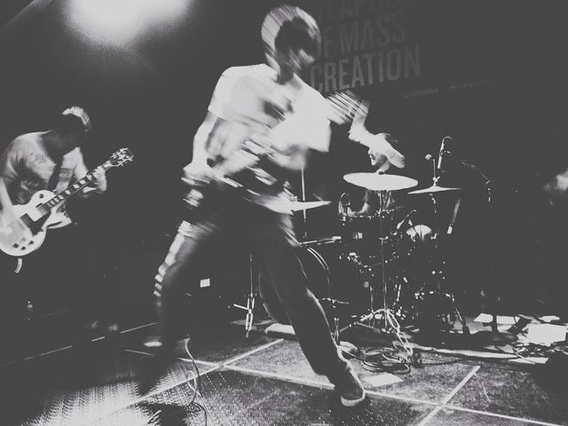
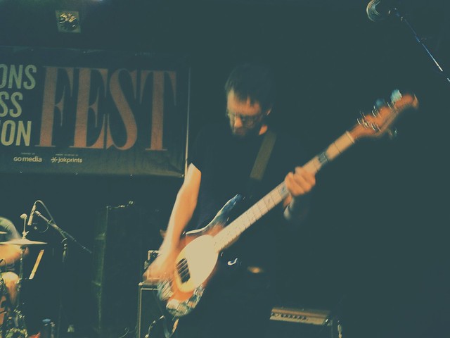
Been living under a rock for the past few years and don’t know what Instagram and VSCO Cam are and what they do? Here’s my Instagram profile, and my Grid™ profile. I’ve also shot images at the Cleveland Zoo, at the Aquarium, and during Signal Midwest’s WMC Fest set.
But editing images on a small screen isn’t always the best and most practical. So, our quest today will be to create an editing workflow that brings us similar results, but by using Photoshop. I personally use Photoshop CC, but I’m fairly certain that you’ll have access to the same tools than I do starting with Ps CS3.
Oh, and it looks like the folks at VSCO Cam like it:
Let’s have a look at what kind of effect VSCO Cam produces
I’ll use some of my own images here as examples:
As you can see, we get a “faded” look (“crushed” colors), some grain, and some strange saturation mixed with cross-processed tones.
The faded look is the signature feature here. We’ll be exploiting the power of curves to accomplish some of that stuff. The grain can be either generated by Photoshop’s noise functionality, but we’ll probably use a real film grain and/or dust texture for added realism, and the saturation and cross-processing will be done using adjustment layers. The adjustment layer bit is crucial in order to keep a non-destructive workflow. This will allow us to, by turning a few layers off, to always get back to the original image.
Let’s get to it, shall we?
Source images
I’m using three images that I’ve grabbed from sxc.hu. They’re called Path in forest, Misty morning, and Tuscany farm and fields. I’ll start with the Tuscany image. After that, I’ll apply the same effect to the two others to see how transferable it is.
Step one:
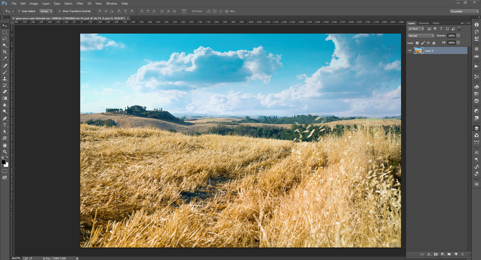
This is very straight forward: open your image, and double click the background layer to make its own layer.
Step two: lightening the image a bit
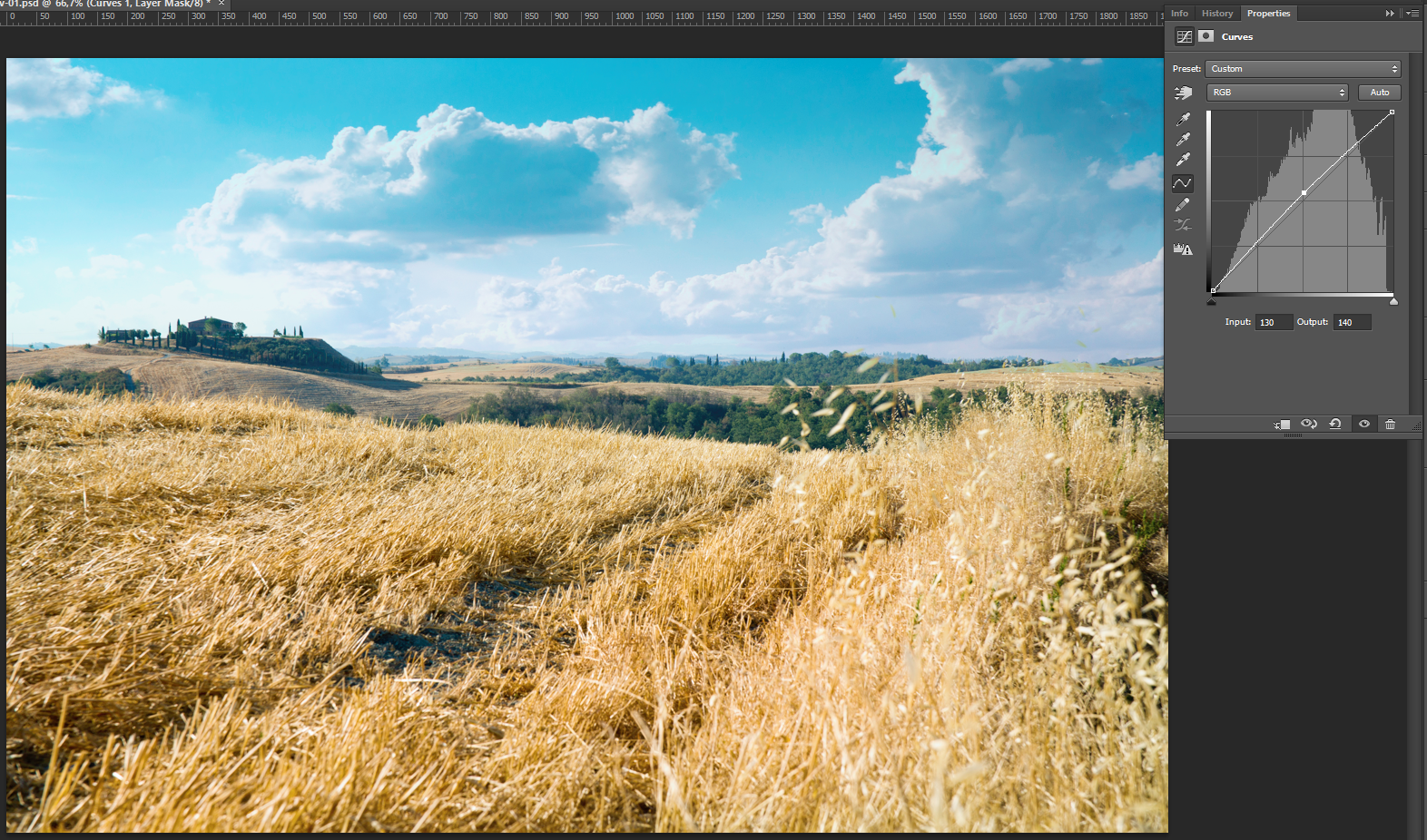
The second step consists of lightening the image a bit. You could use a Brightness/Contrast adjustment layer, but I decided to use a Curves layer instead. Curves are much more flexible and powerful.
Just click on the center point of the curve, and drag it upwards. I’ve dragged it until my input value reads 130, and my output value reaches 140.
Step three: boosting the contrast
The contrast adjustment might not be necessary, depending on your starting image. Doing it here allowed to bring more intensity in the hay, and in that building in the left of the image. I could have used a curve adjustment layer to execute this step, but since I didn’t need much refinement, the Brightness/Contrast one works just fine.
Step four: let’s spruce up the colors
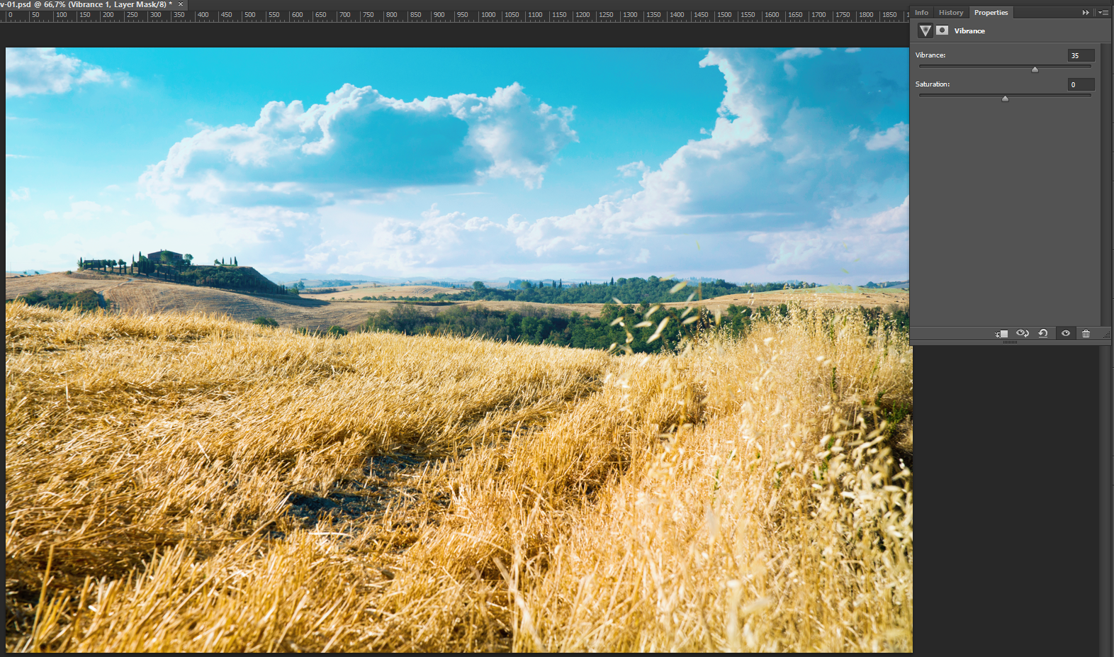
In my opinion, here’s where we really start to “cheat” with the digital image. A lot of cheaper digital cameras have sensors that don’t render a color spectrum as extended as, say, a pricey high end DSLR. By adding a Vibrance adjustment layer, we can fix this a little. I pushed the slider to 35. If you feel happy with the color rendition of your image, feel free to skip this step.
That being said, the various films brand that became iconic rendered colors differently as well, and the specific way some of them reacted (more saturated, more green, more blue, etc.) got them really sought after.
Note: you can read much more about the vibrance functionality over here, along with visual examples.
Step five: emulating the “color profile” of film
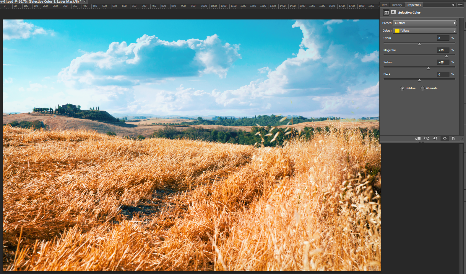
This fifth step is where we twist the colors around to give them the film feel. We’re using a Selective color adjustment layer. We’ll be touching up the yellows, the greens, the blues, and the blacks. See the values below:
- Yellow: magenta +75, yellow +25
- Greens: yellow +50, black +100,
- Blues: black +25,
- Blacks: black +10
If you know how certain type of films render colors (shadows greener, highlight yellow-ish, etc.), this would be the step to apply their “color profiles.” Looking at my result, I’m going to venture that we’re trying to emulate the M4 or M5 preset of VSCO Cam. But you should experiment here. For instance, try reducing the magenta to -25 or so in the blacks. You’ll see that your shadows will take a green-ish hue. Following that logic, you could easily recreate a lot of different color palettes.
Step six: the all powerful fade
As we saw when we looked at the example images earlier, the “faded” look, with the washed out and “crunched” colors is key to emulate a VSCO Cam image. After tinkering with using the Exposure/Gamma correction adjustment layer and a Curve adjustment layer, it seemed that using a fill layer (Layer > New fill layer > Solid color) of the color #4e4e4e put on Lighten for the blending mode gave me the best result.
Want more fade? Duplicate the layer, and toy with the opacity of the copy. Want less fade? Reduce the opacity of the original layer.
Step seven: a hint of cross-processed colors
Cross processing “is the procedure of deliberately processing one type of film in a chemical solution intended for another type of film. As particular chemical solutions are optimized for specific kinds of film, you will get unpredictable and interesting results when they are combined differently” (read more about real cross processing on the site of the same name or on Wikipedia).
Luckily for us, the Curves adjustment layer has a “Cross process” preset. Select it.
As you can see, the effect is quite strong. But it brings that interesting green hue in the dark and black zones of the image. To make this a bit more presentable, I just lowered the opacity of the layer to 10%.
Step eight: a bit more saturation
After all this color craziness, I’m going to add a Hue/Saturation adjustment layer to my layer stack. The slider is at 5, but this is enough to give a little “kick” to our image.
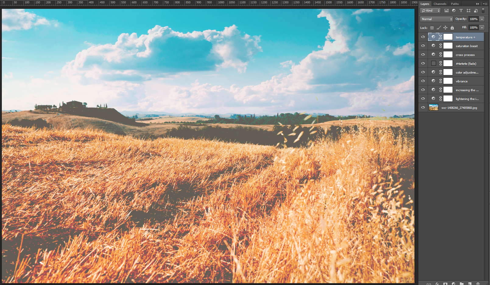
Step nine: let’s amp the temperature up
Another trick that VSCO Cam lets you do is to toy with the temperature of your image. So I went ahead and added a Photo filter adjustment layer, using the Warming filter (LBA) preset. I’ve left mine as is, but there’s plenty of head room in the Density slider and layer opacity to refine the effect. Just make sure that the Preserve luminosity checkbox is checked.
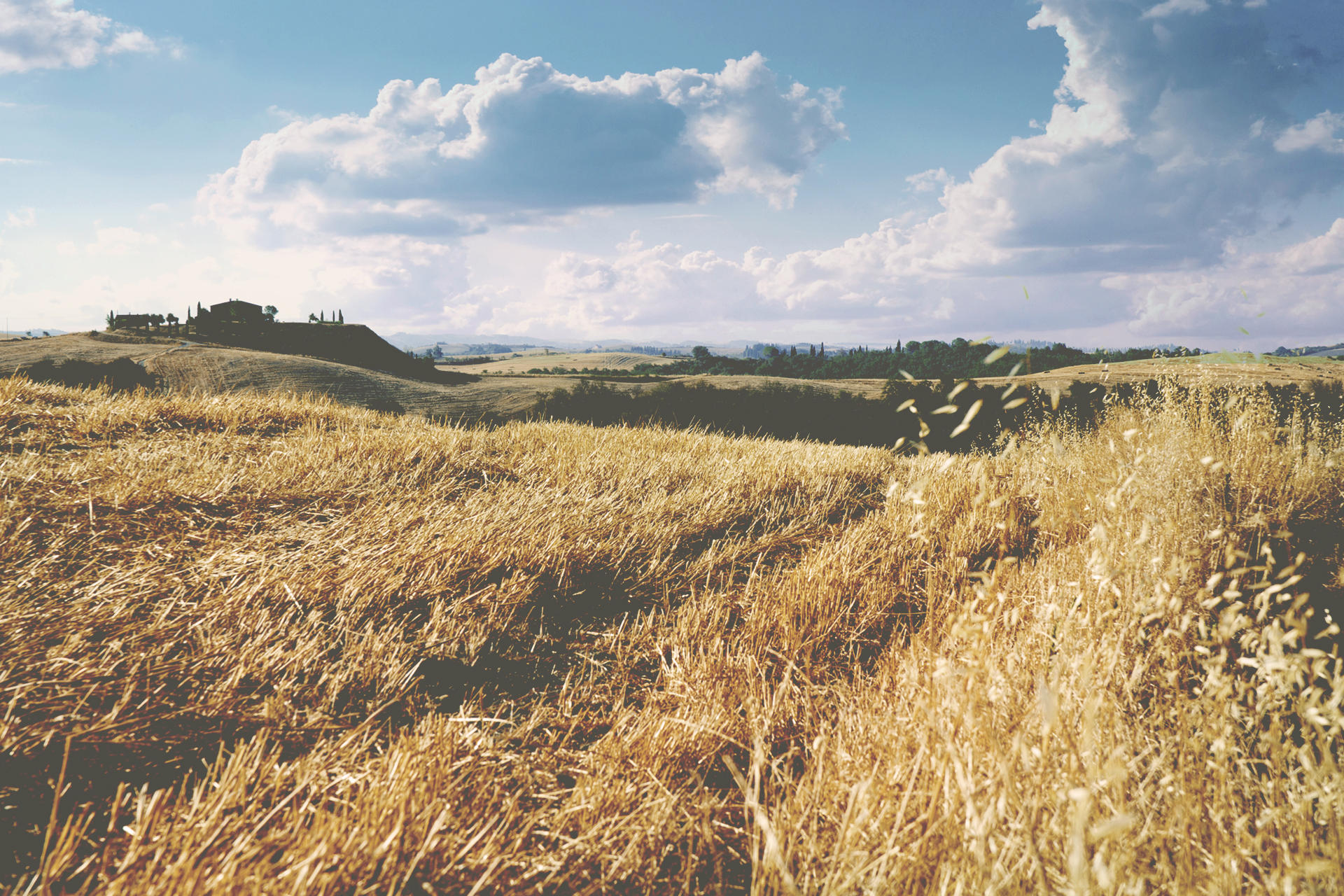
This is technically it
This is it! If you’ve followed the tutorial until now, you’ve emulated the look and feel of (one of the presets of) VSCO Cam. Just look at the source image, and at the result side by side:
 But you know me. I love texture, grain, and dust speckles too much to stop there. The next two steps, that are absolutely up to you, will show you how I added some grain and dust speckles to my image.
Step ten: grainy
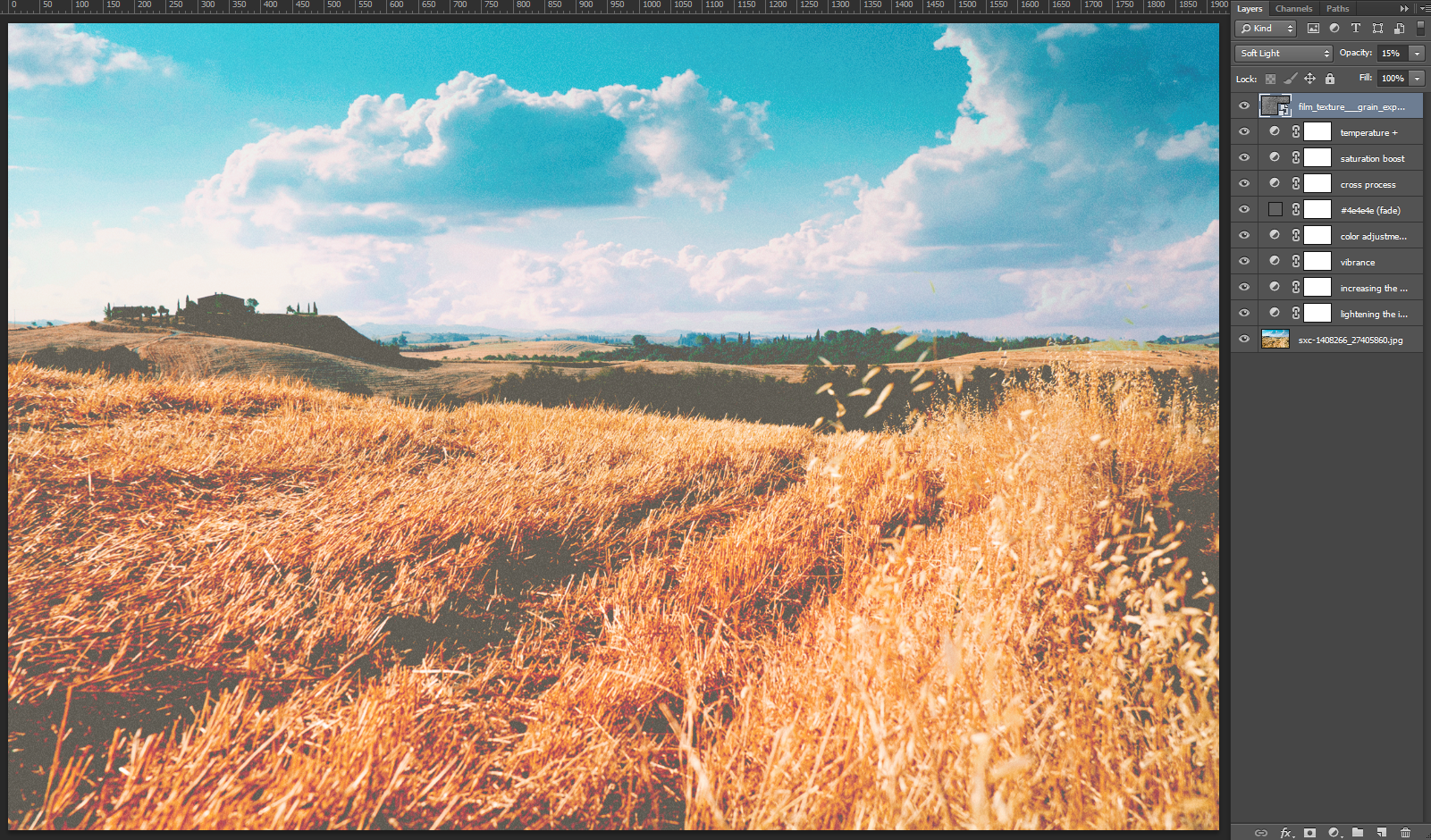
As I wrote earlier, you could just fill a new layer with white or a neutral gray, and add noise to it (Filter > Noise > Add noise). But real analog grain will be so much better. So after scouring the internets for cool grain textures, I found this fantastic, high resolution one (9000 x 7200 pixels @ 300ppi) on DeviantArt, called Grain explosion. It’s been provided to us by JakezDaniel. Careful though, as it’s apparently only for non-commercial use (unless you get his permission).
The process is quite simple: import the texture in your design (File > place), and size it appropriately to cover your whole canvas. This one is so high resolution, that even at 26% percent of its size, it did the trick. Put the layer on Soft light at 15% opacity, and you’ve got yourself some sweet film grain.
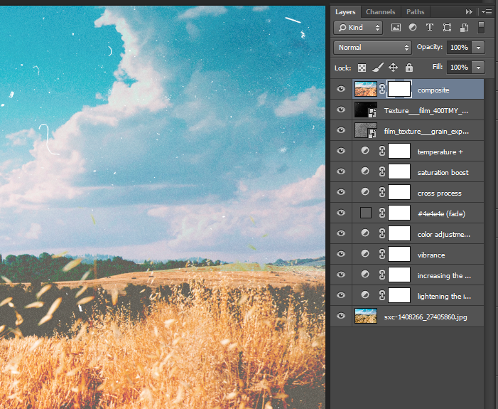
Step eleven: dusty
Another bonus step is to add dust, scratches, and other artifacts to the image. Well, JakezDaniel strikes again, because he has another sweet texture in his library called Film 400TMY. Same restrictions on its use, so don’t come and pretend you’ve not been warned. This texture features some subtle grain, and plenty of speckles of all sorts of dusty goodness. I also placed it in my document, sized it at 45%, put the blending mode of the layer on Screen, and tadaa!
 And there you have it! First with textures, and then without them.
Now what?
Well, the whole point is to see if this is an editing workflow that could be reused for a whole set of images. See below the before and after comparison of the other source images I’ve mentioned at the beginning. The layer stack has been moved as-is to them. The only thing that changed is how much I’ve resized the grain and dust textures. Their opacities and blending modes remain the same. These are at 100%. Just click on the image to see it in very big.
On that foggy landscape picture, you can see that the result is very satisfying. The fade works wonders, probably even too well. I suppose that the color edits could be different to fit the mood of the image better.
 For our second image, the result is a bit more intense, if not too intense. So I think that the color manipulation step is going to be the one step to adapt every time to the source image.
Note: this image had to be resized down to be able to upload it through WordPress. You can see the full size image over here.
Bonus: “tilt-shift” blur
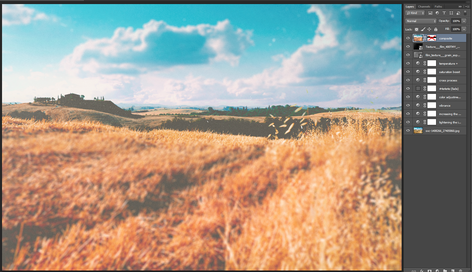
Editing images using VSCO Cam is great, but only Instagram allows you to do that quick blur effect. It can be used either to recreate that sweet “tilt-shift” effect, or to highlight a specific part of your image. After a little bit of play time with the lens blur effect and documentation reading, I think I managed to create a satisfactory Ps equivalent. In our Tuscany fields scene, we’re more going to highlight a part of the image rather than do some tilt-shift goodness.
Step one: preparing the document
The first step I’ve taken is to create a composite of all my layers so far. The shortcut for this is CTRL + ALT + SHIFT + E (CMD + OPTION + SHIFT + E if you’re on a Mac). This creates a new layer at the top of your layer stack with a merged copy of what your document looks like so far. This is an immensely useful shortcut. You’ll notice that I renamed my layer “composite.”
Step two: adding a layer mask
This is pretty straight forward. You can either add the layer mask from Layer > Layer mask > Reveal All, or from the handy little layer mask button at the bottom of your layer palette, with the correct layer highlighted.
Step three: painting the layer mask
This step is where you decide what will be blurry in your image, and what won’t. You can either use the gradient tool to paint on your layer mask, or a big, soft brush.
The gradient tool will help you to nicely emulate real depth of field. Just be remember to choose the right gradient type for the shape of blur that you’re looking to accomplish (radial or reflected). The brush will allow much more control in zoning where the blur will happen. Since my image doesn’t have a very straight line of things I’d like to highlight, the brush made sense for me over the gradient. My brush is 250 pixels wide, and its hardness is at 0%.
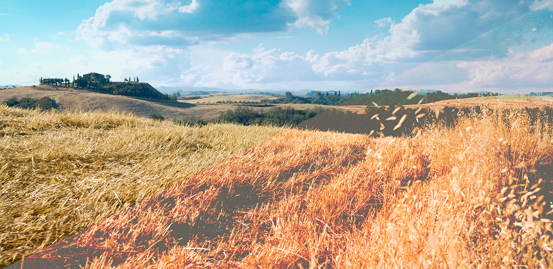
Time to paint away! Note that what will be white, will be blurry, and what will be black will be left as-is. I’ve chosen to highlight that zone at the middle of the image, and to make the sky and field right in front of us blurry. I followed roughly the hills’ edges. The brush’s soft edges allow to somehow emulate a gradient. The second image highlights where the blurred out areas will be.
Step four: lens blur!
This is where the real fun happens! Go to Filter > Blur > Lens blur. You’ll see the following screen:
The following image shows my settings. I’ll explain below what they mean.
You obviously want to have Preview checked. It’ll allow you to see the effects of your tinkering.
The depth map part is why we actually created that layer mask before. You’ll want to use the drop-down menu to highlight Layer Mask. And at that point, you should see the blur starting to follow what you’ve painted in the layer mask. If you’ve painted in reverse (it happens often when using the gradient tool), you check the Invert box to reverse how the filter will read your layer mask.
The Blur Focal Distance slider should be set at 0. This one works as follows: 0 is in focus, 255 is fully blurry. Since we have a predefined depth map, we do have to worry too much about it.
The Iris set of settings is where you can how the blur will look like. I chose my shape to be an octagon, but I noticed that an hexagon works as well. I do believe that this emulates the shape of the shutter in a real camera, but don’t quote me on this. The Radius slider is where you’ll determine how blurry the blur gets. For this example, 15 seems just right. The Blade Curvature and Rotation sliders produced very subtle changes when I played with them. I assume that would be where you could recreate the “profile” of a lens and/or of a shoot’s circumstances by matching its physical characteristics.
The Spectacular highlights settings are where to tinker if you want to play with bokeh. They seemed to me to react exponentially rather than in a linear fashion, so I’d say they are to be used with caution.
Noise is pretty straight forward. It adds noise to the blurry part of the image. I chose to put that slider to 2, and to have the distribution set on Gaussian. You could have some RGB noise in there, but Monochromatic looks better in my opinion.
Once you’re happy with the settings, time to hit that OK button at the top and to render the lens blur effect.
Tadaa!
And we’re done. Let’s not forget to turn the layer mask off (Right click > Disable layer mask) to truly appreciate the result.
One thing that I’m noticing now is that the blur also blurred the dust and other film artifacts that I’ve added to the image with the help of the textures from JakezDaniel. The solution is quite easy: let’s recreate my composite layer in order to only include the stack of adjustment layers, and not the two texture layers, copy the layer mask over, and re-apply the lens blur effect with the same settings. And here you’ll have a lens blur effect and preserved textural effects.
Something to note is that how the layer mask looks like is really what makes or breaks the effect. My painting was really rough and quick, mostly to demonstrate the effect. A more refined job would have made things a bit more subtle and believable. A gradient truly is what will emulate depth of field the best. Here’s a visual demonstration of this:
It’s a bit softer, and much more believable.
On that note…
That’s all for today folks! If you have suggestions, comments, or ideas to perfect this, please let me know in the comments. And don’t forget to share the results of your experiments in the Go Media Flickr pool!
Lastly, make sure to check out our Arsenal Membership, which hooks you up with our huge product library for only $15 per month. Yes, seriously.
