Blog

How to Make Your Website Mindful of Your Audience Needs
Crucial Elements of An Engaging Website Design
Most elements of good web design are reliant upon one another. For example, higher engagement and more interactivity usually mean lower bounce rates. Compelling content and visuals translate to higher engagement ratings. Fluid and convenient navigation is conducive to the user experience, encouraging visitors to move around your site more freely. And, of course, all of this is what factors into whether or not your site is successful, along with whether or not your design is a good one for you and your customers.
Customers who are satisfied and enjoy their experience(s) tend to stick around. The longer they stick around, the more they’re willing to buy your products and services. It’s a cyclical pattern that feeds into the success of your business and the growth — or decrease — of your bottom line.
Creating a Website That’s Mindful of Audience Needs
The trick is getting to the point where your website serves your audience efficiently. To build a compelling site, you first need to understand what it is your customers and audience want from you and the experience you have to offer. Then, it’s a matter of delivering, which is never as simple as throwing up a live site with random elements and design components.
How do you get there? To the point where your site is ideally functional so that it’s serving the demands of your entire audience?
1 – Navigational Flow
You know what a sales funnel is, right? Even if you don’t, the concept is relatively simple, and you probably understand the foundation. It’s essentially optimizing the flow of a site, a page or navigational elements so that your users end up where you want them to. More specifically, a sales funnel is leading customers to the point where they either reach out for more information from a sales rep, or they flat out buy a product.
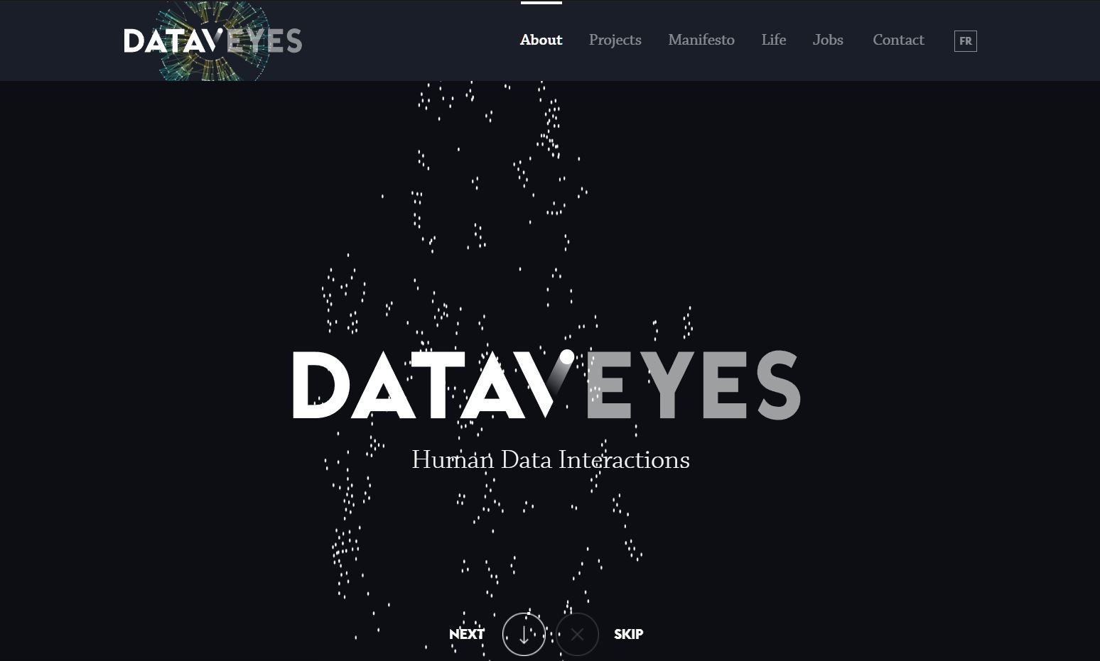
Customers get around a site using the navigation. They move from page to page through a concept called the flow, often designed using an initial sitemap. It all ties back into the concept of “navigational flow” or how freely they can move about your online portal. Take a look at how Paris-based Dataveyes presents their site navigation panel and important content.
Step one to ensuring your site needs the needs of your audience is fine-tuning the flow. Can they find your most important pages easily? Are they landing on the right pages or content? How long does it take someone to find what they’re looking for when they reach your site?
2 – Keep It Simple and Responsive
Online users have an eight-second attention span, sometimes even less if they’re browsing on mobile. You only have a small window to hook them and keep them engaged. If you take too long, they’ll leave and may never come back.
That’s exactly why your main landing pages should be simple and responsive. Not just responsive in terms of operation — where they adapt to meet the viewer’s device resolution — but responsive regarding how fast it is to move around and find what you’re looking for.
A viewer should land on your page or site and immediately see what they’re looking for or how to get there.
3 – White or Negative Space
Minimal, understated designs are all the rage these days, and for good reason. Negative space is invariably used not just to make a page aesthetically pleasing, but even to highlight important elements and other content. Don’t clutter your pages with content, visuals, buttons, elements and everything else that goes into a design.
In our example from the La Farfalle site, you can clearly see how their use of whitespace works to bring attention to the rest of the page and site content.
4 – Avoid Autoplay Content
Unless the visual content or media you have showcased on your site is innovative, don’t set it to autoplay. The exception would be something like a video background on a page or a catchy animation to start up the experience.
One of the best examples of this is music. When used appropriately, music can add a lot of atmosphere to a site or design, especially in certain industries. But not everyone enjoys loud music blaring through their desktop or mobile speakers. It’s even worse if they’re out in public or somewhere they need to remain relatively low-key. Even more annoying is when a track or video is set to autoplay on a loop. While you’re browsing the rest of the page, it just continues over, and over, and over, and over, and over — you get the idea.
5 – “Above the Fold” No Longer Matters
Keep in mind, putting your most relevant content above the fold is still a good idea. The main reason is that you want your most important and highly popular elements front and center. That said, there’s nothing wrong with putting more content below the fold, especially on mobile. Viewers are more willing to scroll an entire page now, especially since doing so on mobile is carried out through a quick swipe gesture. In fact, that’s exactly why we’ve seen a huge influx in infinite and endless-scrolling site designs lately.
6 – Ask for Feedback
One great way to discern what your audience wants is to simply ask for feedback. You can do this many ways, the most common of which is including a customer feedback page or form on your site. You can also ask regular questions or host polls on social media. Consider maybe even getting in touch with additional design agencies or development teams to see what they’re doing differently.
The reason this is important is because you don’t exist in a bubble. Sure, you may be focused on current trends and following popular design concepts. But just because something is popular doesn’t necessarily mean your audience wants it, or cares for it. Before rolling out new designs, themes or content, get a feel for what your audience wants. Ask them directly and find out how it’s going to impact their experience.
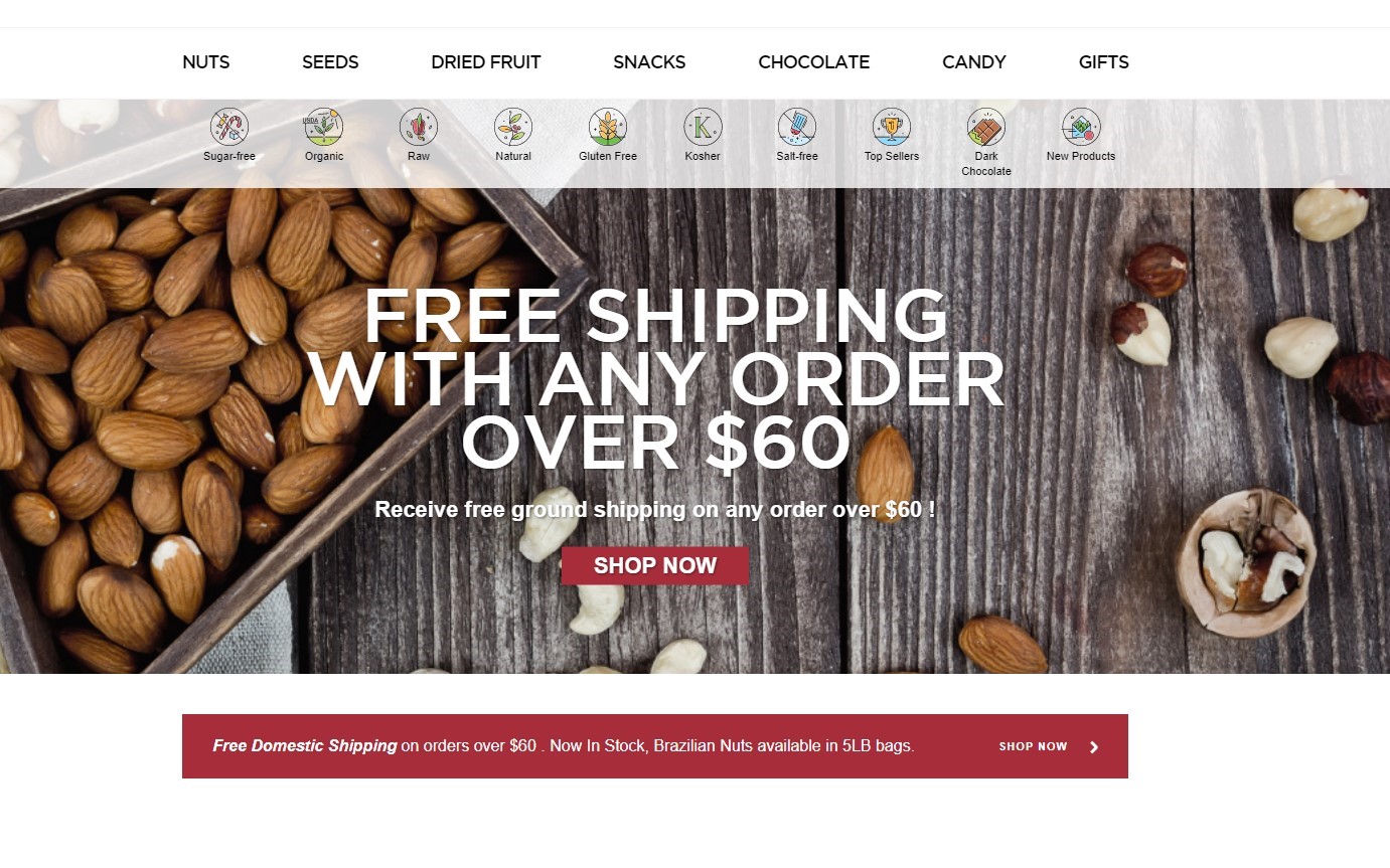
Check out how mindful SincerelyNuts is of their audience’s potential allergies and dietary concerns. It’s
clear they honed and optimized this experience for their customers, through feedback, research — maybe even years of it — and maintenance.
7 – Choose the Right Content
Most site admins and owners assume that text-heavy content is the way to go, but it’s important to remember it’s not the only form used today. Visual content plays a huge role in the current landscape, too, including videos, images, infographics and even live video streams.
You’ll see a lot of marketing teams highlighting the importance of running a company blog or news-feed, and they’re not wrong, but you don’t always have to go the conventional route. Vlogging — or video blogging — is just one incredibly popular medium you can use to your advantage.
Take some time getting to know your audience and viewers and find out what they resonate with most before delivering a steady stream of new content. You’ll quickly find that you’re developing material your viewers actually want to consume, meaning it’s not going to waste. You can thank us later.
8 – Colors
Fonts and typography are a big deal. The layout is a big deal. The visuals and content you choose are a big deal. But none of them have as much impact on the overall feel and experience of your site as the colors you choose.
Choose the wrong background and font colors, and guess what? No one can read your content or web copy. Choose a theme that uses horribly meshed colors, and your viewers will run away screaming. There’s even the opposite problem, where if you choose images that are too subtle and bland, no one will stick around.
To drive the point home even more, look at this study done by Joe Hallock which reveals how people feel about colors. They are actually associated with different character traits, such as trustworthiness, fun and even security.
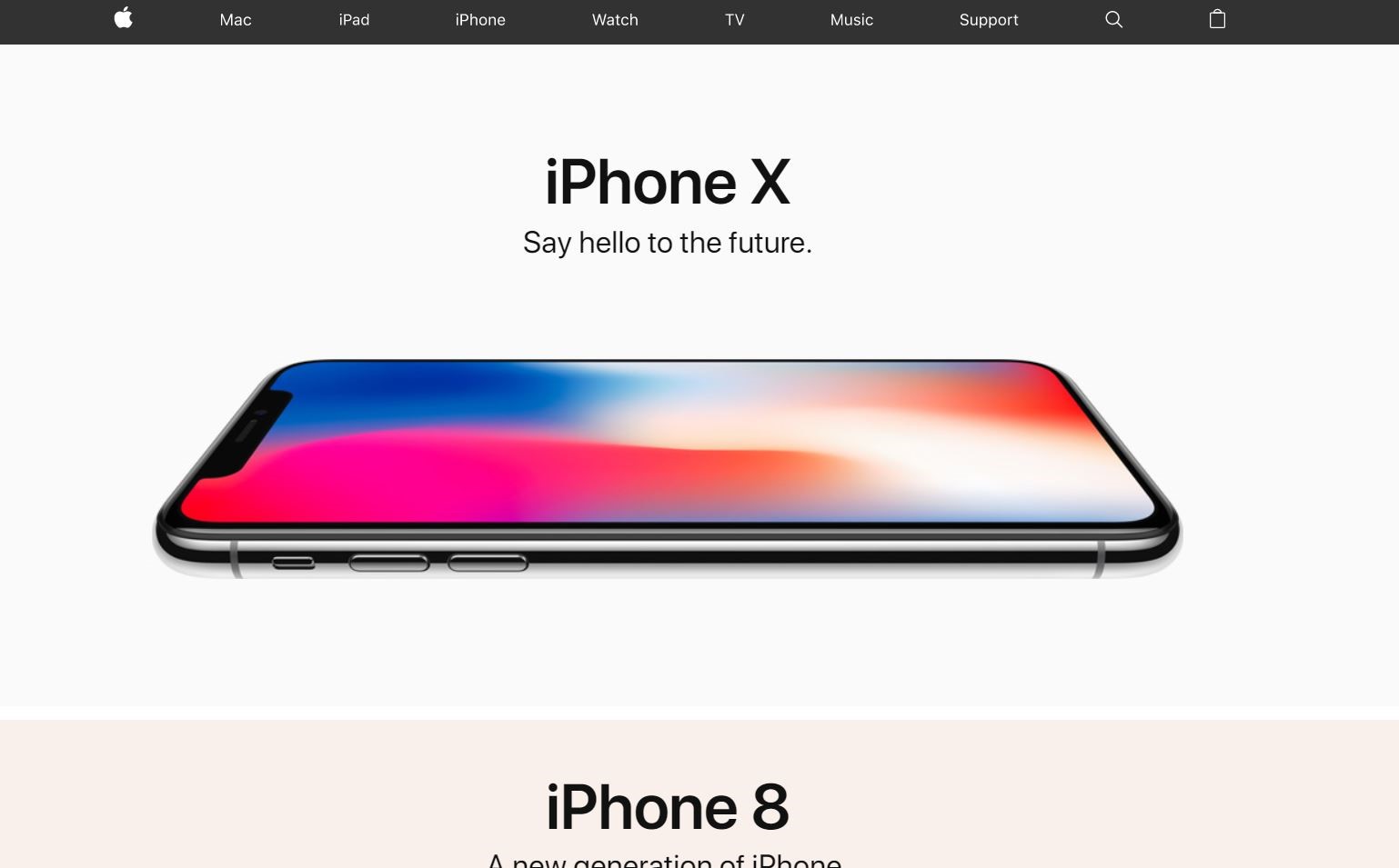
Notice how Apple uses muted colors for the rest of their site but incredibly vibrant and vivid colors to highlight the products they want to sell.
Stick With Me If You Want to Live
That’s a bit excessive, but your website deserves the best, right? Here’s the bottom line, it all boils down to one question. Do you want to create a compelling and effective website that meets the needs of your audience or customer base? If the answer is yes — and it should be — then following the steps discussed here will put you on the path to success.


