Blog
How to design a t-shirt on a budget and a tight deadline
Monday morning. You’re walking into work (or in some of your cases, waking up in your undies and walking 10 feet to your desk). You pound some coffee and peruse your inbox. You have a present. One of your regulars needs a t-shirt designed for the band Vomit Whistle, but can’t spend much money. To add to the chaos, they needed it last week so your deadline is within the business day. What do you do? WHAT DO YOU DO!?

You know damn well that drawing some hyper-magical illustration is out of the question. You’re not gonna go balls to the wall on some typographic masterpiece either. You need a solution that’s fast and looks good. You need to take some design detours because this design is on a time constraint and a BUDGET. You need stock vector art, and you need it now.
As you may very well know, we offer a solution to this dilemma over at the Arsenal. We’re one of many different choices for theme-driven vector artwork, but since this is the GoMediazine… we’ll be using objects strictly from our packs to show the power of stock art when dealing with projects such as these.
Author’s Note: This tutorial does breeze by at a pretty brisk pace, but doesn’t require a black belt in Illustrator-jutsu. Any questions with the tutorial, please place in the comments following it, and I’ll answer all of them to the best of my abilities. Please be somewhat familiar with how adding and subtracting from objects works and the layering structure within Illustrator. The pathfinder and alignment tools will cover a lot of these nifty little tricks. When duplicating objects or grouped objects – alt+drag will handle that. To paste in place – ctrl+c and ctrl+f. If you’re still confused, these subjects are covered in numerous previous tutorials we have here in the zine. Read ’em if you need ’em.
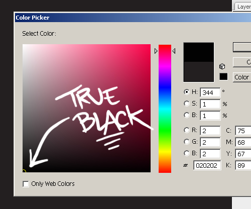
We’re gonna make a new file in Illustrator. 11” x 11” and RGB color mode should do the trick. Make a black square that hits the edge of the artboard (true black, not that cmyk off-black) and lock the object in place. This will be our black t-shirt background.


Now let’s double check what your client had in mind for the design. They mentioned that the design shouldn’t exceed 3 colors, and gave you creative freedom because they like your work so much. They just want it to look gruesome and crazy and all that brutal stuff. This is good because the edge of having to reinvent the wheel on a pressure-filled job like this is relieved. I’m gonna start digging through the design weaponry.
Here’s a list what packs I think will be good for the job, and why. We have stuff that makes amazing background elements for just about anything brutal, focal pieces that can bring just the right attention to the design, and decorative add-ons that help bring everything home as a whole piece.

So now I pick some colors to play with. The main thing I keep in mind with this job when choosing colors is if it will look good on black. Black makes all sorts of colors pop way more than on any other color… so I like using some pretty intense stuff, but not to the point where it’s seizure inducing. Know what I mean? On 3-color designs, I go with a dark, medium, and light tone. That’s the general rule with most designers. Below is what I settled with after some trial and error.
Author’s Note: Experiment with colors, you’ll surprise yourself sometimes. For added inspiration in the color selection process, visit Colourlovers.com – a great community site with all sorts of color schemes and patterns.

So now I start dragging objects that would complement each other into the Illustrator file. Below is what I ultimately ended up using, once again, after some trial and error.

Colors? Check. Objects to use? Check. Now let’s get on with the design.
We’re starting with the abstract halftone first. This will be our background. I applied the darkest swatch from our color scheme to it because it’s in the background. I’m not a huge fan of the negative space that gets left behind on this so I duplicate the object and flip it upside down so it fills out more.

I add the two together and expand them. Lock this object into place (like we did with the background) and we’re on to the next step.
Now I took a bunch of those wormies from the doodle pack and made the fill color on them our lightest colors (while maintaining the true black inked outline. I also did this with the eyeballs we took from our first anatomy pack. I chose a handrawn skull from the pack of the same name, made the fill color our medium turquoise-ish color, and assembled everything how you see here.

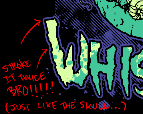
Now notice above that I took the entire skull with worms piece and duplicated it. I ungrouped everything and added it together and expanded it. I made it a stroke with the background color (stroke weight of 3 and positioned to the outside of the shape) and expanded the appearance (object > expand appearance). I aligned them together to the middle and center, with expanded stroke being on the bottom of the skull, and grouped them. Added it appropriately to the design and voila!

Author’s Note: I added this stroke because it helps isolate the skull more from the background. This approach to object isolation in design isn’t always a great thing and should be used tastefully. You give strokes to every single object and you’ll have something retarded as hell on your hands – no bueno.
So we need some text dammit! Vomit Whistle. Hmmm, well… The Arsenal does have a gnarly-as-hell font called Goatbeard. We’ll use that!

So I typed out the band name. I duplicated the text, right clicked it and converted it to paths. I then ungrouped it and moved all the letters closer together to my personal liking. I kept the words Vomit and Whistle as seperate objects (I did add them and expand them, however). I then applied an arch to them with a more positive vertical distortion on the “Vomit”, and a more negative distortion on the “Whistle” (because they’ll be going around the top and bottom of the skull). If you’re totally lost to what I just said .. effect > warp > arc. Play around with the settings. That should get you back on track.

Now remember the splatter we put aside? Here’s where it becomes useful to this piece. We’re going to duplicate our band name’s layers, drag them to the side, and make them the lightest color we’re using on the design. Copy and paste them in place (ctrl+c and then ctrl+f). Take the splatter and throw the sucker right on top of one word and size it appropriately. Duplicate the splatter and do it to the other one. Now select the word (this should only choose the second layer of the word you pasted in place, not the original) and then hold shift and select the corresponding splatter. Intersect them using your pathfinder tool and you should have the splatter cut out into the shape of the word. Do the same for the other and you should have about the same result as I have shown here below.


Now I applied a black stroke using the method I explained on the skull, and then once that was grouped into the text, I repeated it again with the background color.
I then placed the text appropriately into the design, and we’re done!

Now be professional – mock up the shirt for your client and send them a decent sized proof of the actual design too. Wait for them to approve, collect your earnings, send them their final files, and keep your eyes peeled for when it hits merch stores internet-wide… FOR YOU ARE THE DESIGN CHAMPION!!!

… and this only took you about an hour.