Blog
Starting Your Own Shirt Line. PART II: The Creation of Your Art and Working with a Printer.

Hey Guys,
Welcome to the second article in the series ‘Starting Your Own Shirt Line’. In the first article, Start – Up, we covered the topics:
- Originality
- Research
- Who will like it?
In Part II I’ll take you through my process of creating the Octolady and my experience working with a printer.
CREATING THE ART
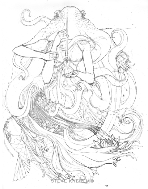
Here is where I start: paper, pencil and a vision for the shirt.

Sketching/Brainstorming
The best part of the creation is stage 1: brainstorming and your first thoughts. This is as raw as it gets. Your first thoughts are often your best ones and it’s good to run with them. I knew I wanted a style for the overall shirtline. I thought of using my logo in all my designs but there was more creativity I wanted to pour out. (Johnny Cupcakes is a great exmple for branding your logo.)

For this shirt I wanted to draw a person of some sorts. So why not have this person be engulfed in an octopus? I figured I’d throw in some water, a koi fish, and my love for art nouveau. I loosley sketched out my thoughts, while keeping design principles and content in mind.

Tip #1: REFERENCE
I’ve been around various artists that look down on reference and I’ve been around artists that always use it (not for tracing but a visual!). If you want to be a carpenter what do you do? You take an apprenticeship, study the trade and other carpenters’ work. Same goes for art. I took pictures of the arms and looked at octopus pics. How else will you know how something looks? Use it, become better!
From here I need to enlarge my sketch to the size of the shirt. My method might be a bit tedious but this is what works for me. I scan in the drawing, configure the actual size in Photoshop, print out on multiple 8.5 x 11 paper and trace onto the final paper using my light box. *Make sure you know the largest screen size your shirt printer uses so you know how large to make your drawing.


Tip #2 DRAW FOR THE MEDIUM
It took me a few shirt illustrations to understand that when you draw for apparel you have to draw for the medium. My background is in print so whatever I would draw on paper is what I see in the final print for the most part. I found out I needed to start drawing bolder lines and understand that what I see on paper doesn’t translate to clothing 100%. I don’t have to sacrifice anything, just make adjustments with my linework.
Inking
There are so many ways to ink and many tools to ink with. Work with what feels comfortable to you. There is no “by the book” way. I started out about 5 years ago using a calligraphy pen and would dip it in ink. My results were thin lines. I would have to go over my lines multiple times to produce thick enough line weight. I currently use Micron pens. These help me make consistent lines and I’m most comfortable with them. As far as paper choice goes I use Canson/Bristol Smooth/100lb.

Tip #3 INK METHODICALLY
Be methodical when you ink. You need to think a few steps ahead of yourself before and during the inking stage. Think about your coloring stage. Will it be a 1-4 color job? Keep in mind the color shirt you will be using. Will the art be on a dark or light shirt? Your drawing may have to suit that color.
For this piece I wanted color toned paper because I planned on framing the piece. After going to multiple art stores I found a nice parchment toned paper at Utrecht. The paper itself had alot of tooth to it like printmaking paper. It dried up my pens pretty fast fortunately the result turned out fine. Stick with paper that is smooth.


Inking is a fun process because your drawing comes to life and line work becomes crisp and bold. I always document my work for later use, like this article.
Tip #4 LINE WEIGHT
Look at how different artists use line weights. Thick line weight defines and makes parts pop out. Thin line weight pushes content back.

Understand where line weight should be thin and thick. A few of my favorite artists Alphonse Mucha, J.Scott Cambell and Frank Cho all demonstrate excellent pencil and ink stages as well as awesome line quality.

Tip #5 Art fundamentals ALWAYS apply
Design/composition, lightsource, perspective, color and being a good draftsman is essential. It’s best to figure these parts out in your pencil stage.
I follow a lot of artists in tattoo, film, gaming and comic industries. In March 2009 I met Shawn Barber (www.sdbarber.com), an awesome painter and tattooist from San Francisco. As an artist and teacher he stresses how vital it is to balance the fundamentals of art. Learn from many sources.

Alright, the ink is done! I’m feeling good about it so let’s talk color.
WAIT!
How did I get this 30×26 piece on my computer so I can color? Forget the camera unless you have a studio. In my opinion the best solutions are either flat bed scanners or using a copier company. In my case I use Kinkos. Most flat bed scanners are great for 8.5×11 pieces but anything after that I recommend drum scanners because they scan evenly.
MAKE SURE THEY CLEAN THE ROLLERS! Many people use these scanners and I have had oily streaks bleed onto original art that will never come off (Please insert Incredible Hulk!). Scan at least 300 dpi in color even for black ink. Color scans can be changed to grayscale in Photoshop. If you scan your image in black and white the lines look pixelated.
Color
You know it, you love it, it’s your best friend, the color wheel. If you are not sure what colors to throw down, research. Research the master painters, fashion trends and other successful apparel companies. I’ve found awesome color combos in Japanese prints.

When I got to this stage I knew I wanted to up my coloring game and style. I wanted to do something different than what I been producing. I did probably 20 color samples in Photoshop trying to find the right combinations.


Eventually I opened up Illustrator and started using brushes. I understood where I wanted the light source to be, so that was my guide for the darks and lights. I also wanted colors that worked with the mood of the drawing.
Now here comes the tricky part. You need to understand a little bit about silk screen printing. There are advanced screen printing methods, but let’s keep this simple with spot colors. Spot colors are assigned their own screen. You have to color for the medium. Unless you want to pay $30 a t-shirt for a 12 color job, think about color application. Figure out ways to manipulate a 1 color job to look like a 2 or even 3 color job by using half tones and utilizing the shirt as a color. There are multiple forums that are answering these questions. Remember T-shirt forums.com, How to Start a Clothing Company.com, and Google your brains out.
I used multiple brushes, half tones and utilized the shirt color for shadows. I truly believe originality comes from experimentation. Remember in the first article, originality will set you apart from the competition.

Tip #6 LIVE TRACE
Live trace in Illustrator saves time and file size. When you apply the live trace option (and expand) to your art all your lines become vectorized. This means you can make your art any size and it retains its shape and quality. It also makes your lines super crisp and ideal for apparel printing because it will burn through a screen better.
WORKING WITH A PRINTER
I finished my piece. Now I need a printer. There are many awesome printers in the US I’ve found. Jakprints in Cleveland, Store Envy in Chicago, Groovy Graphics in St. Petersburg, Fl just to name a few. Ask them questions and learn a little bit about the process and what kind of ink applications are available.
I am fortunate to have Jakprints in Cleveland (www.jakprints.com) so I can meet directly with the sales rep and explain my vision. Remember, this is your creation and your hard earned money; be involved as much as possible. I really didn’t know much about the process when starting out, but they were very patient and now I know what I am talking about.
Tip#7 FILE ORGANIZATION
One of the best things you can do is keep your files organized. SAVE AND MAKE DUPLICATES OFTEN. Always send at least a 300 dpi flattened image and a low res jpeg mocked up on the apparel to give the printer a visual of placement. Check out out Go Media’s shirt mock up website to do this. www.shirtmockup.com

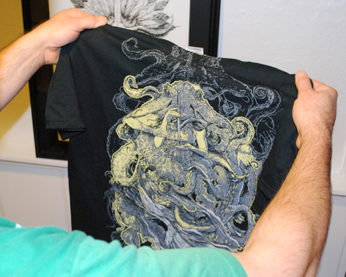
I found out Jakprints offers many methods to print the Octolady. I could get straight plastisol ink, dye sublimation, a hybrid technique, softs inks, etc. If you can go to your print shop, ask for samples of these different techniques. Grab some of your own shirts. Become a feeler. Feel the print. Is it kinda crusty, smooth or soft? Find out what technique it is.
For the Octolady I used a hybrid technique. The print feels like part of the shirt. It feels soft and I didn’t want heavy ink on the shirt. I can run it through the washer and dryer multiple times and it holds up. It turned out amazing! I also added a custom tag where I placed my logo, website and contact information. I also included my signature to add originality to it so people can say “I own a Steve Knerem.” (pronounced ken-air-em) Remember marketing, promotions, and advertising during the final production process.


This wraps up Part II. Remember: create something original and have fun with it. Be true to yourself.
I’ll end the article with a last thought. I read through the comments from Part I and some readers were hesitant to actually produce a line meaning cha-ching from your pockets. You can create the art for free. When you talk to the printer you are making a commitment. Sometimes it’s hard to pull the “financial trigger.”
I know it’s just clothing but here’s the cool part. There’s anticipation, there’s the financial turn of the stomach, but when you hold your product in hand it’s an awesome feeling of accomplishment. “This is awesome!” It’s an even better feeling of accomplishment when someone buys it and wears it because they appreciate your art and that you wanted to bring a quality product to them. This leads into the final article, Business. ARM YOURSELF!
View my work at www.steveknerem.com
View Tshirts at www.steveknerem.bigcartel.com
Follow me at www.facebook.com/steve.knerem
![]()

