Blog

The Go Media Logo Design Process: Bunny Paige Made Better
Jewelry Brand and Packaging Inspiration: Bunny Paige by Go Media
Every day here at Cleveland graphic, web and logo design firm Go Media, my understanding of what this company does grows. And everyday I am amazed by what we accomplish.
I am lucky enough to have my hands in much of the company. I work as social media manager, on Mockup Everything, Shirt Mockup and the Arsenal, as well as Weapons of Mass Creation Fest. My duties, however, lay outside the design services side of Go Media – so I view it from afar and admire it from the outside. The past couple of months, however, I was treated to a view from inside the world of design services.
I was able to be a part of the Bunny Paige Branding Process.
Bunny Paige Rebranding
Bunny Paige, a handmade jewelry and accessories company from the heart of Cleveland, reached out to Go Media to help fine tune the company’s current brand. Owner Lauren Tatum and her team have done an amazing job of building brand recognition and gaining loyal fans. Now that the business has successfully grown, Lauren is ready to take the brand to the next level. The goal of the project is to refresh the current identity to create a more sophisticated, refined, and professional brand.
Here’s what she came to us with:

A huge fan of Lauren Tatum’s jewelry line, Bill and Lauren here at Go decided to pull me in to the project. After all, I have an investment in Lauren’s brand and obsessive knowledge of all things related. (Think Tokidoki, Japan, Kawaii, skulls, loads of sparkle!)

Let’s Rebrand!
Kick-Off
First, we met with Lauren to nail down her needs. We had a lively kick-off, where we got down to the nitty gritty with Lauren. We learned about the inspiration behind her intricate designs, where she came up with the name Bunny Paige (her childhood nickname), the incredible audience supporting her, and where she wants the Bunny Paige brand to go.
Lauren also shared her Pinterest board with us, which gave us a feel for her aesthetic – some textures she enjoys and her dream packaging.

Brand Direction
The meeting with Lauren was enlightening and exciting for all of us. We were ready to get down to business. The next step in our process was the brand direction included in Lauren’s package – a proof including thoughts and visual examples to explain the ideas behind the aesthetic.
I immediately got down to business to compile this style board. The images I pulled together emphasized the sense of dimension we wanted to bring to the Bunny Paige character – as well as the color and texture we imagined playing with.

Design Exploration
The style board was sent to the client, who gave an enthusiastic thumbs up. This cued Bill, the designer on this project, for take off. Bill referenced the style board when creating Lauren’s logo. He also contributed his own very specific ideas to the concept. So, off he went.


Design Refinement / Feedback
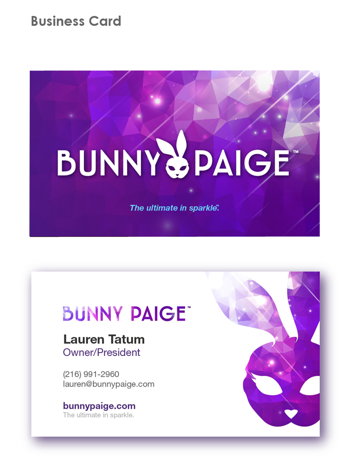
After cautious exploration and illustration, Bill sent over his first round of proofs to Lauren for her feedback. This included a logo redesign, type treatments, logo/type lockups, color scheme + textures, rabbit head (logo) redesign with color scheme and textures, business card design and gift bag design.

Feedback Round Two
Lauren was thrilled about the direction Bill was headed in, but had some feedback regarding the proofs. We decided to get together for another face-to-face meeting for so that we could clearly communicate what she wanted to move forward with and what she would like to see modified.
Lauren loved elements of Bill’s design, including –
- The tuft of the rabbit’s ears
- The small stitching of the rabbit’s mouth
- The oval shape of the rabbit’s face (option 2)
- The chosen color schemes
- The fonts
Here is what Lauren wanted Bill to further explore:
- Harder textures
- The angle of the rabbit’s face
- The emotion (or lack of emotion) the rabbit may project upon the viewer
- A cat eye shape
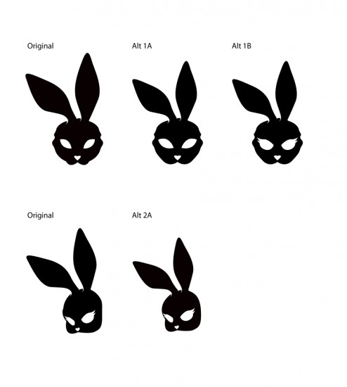
With that, Bill got back to the drawing board with much enthusiasm. Here he is seen trying to focus on the direction of the cat eyes shapes Lauren was referring to.

After working up about 20 new and different looks, narrowing those to about 10, then 3 finalists, Bill put the new eye shape in a new and improved face shape (akin to a masquerade mask motif), added a new nose and POOF! Magic happened!

A Few More Revisions!
Bill continues to refine the bunny and font, according to a few more bits of feedback. Here are his next round of revisions –


Getting Close!
Lauren’s last email proved Bill’s design almost hit the mark. A few emails back and forth lead to final revisions, which include the final touches – smaller cheek bones, slimmer eyes, modifications to the chosen deco type treatment. New textures also emerged.
![]()


Final Design Approval


We were so thrilled when Lauren gave us final approval on the designs. She wrote, “I love it ALL! The font, logo, texture – they all feel cool, cohesive, and very Bunny Paige. I’m so in love with how this whole process turned out! :) Thank you so much for all of your hard work, dedication, and passion, Bill. You, Heather, and Lauren have made this whole process a really enjoyable and exciting experience and I sincerely can’t wait to continue working with you in 2016!”
Last Stop…Pulling it all together!
Fellow Cleveland printing company, Jakprints, got involved to print Lauren’s business cards. We also connected Lauren to local packaging company Tap to work on her packaging. Lastly, Lauren’s business partner Dan integrated the logo into her website, bringing the branding process full circle.
Over the coming months, you’ll see the branding process reveal itself, so stay tuned to Bunny Paige’s official website and Instagram. Until then, here’s a peek at the reveal!


To get the full Go Media branding experience yourself, please contact us!