Blog
Tutorial: Extreme Sports Branding

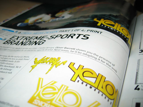
In issue #142 of Computer Arts Magazine (should be in stores now) you can find Oliver’s tutorial on how to design a logo and print ad for a fictional extreme sports brand. The brand he chose to invent was Yellow Snowboards. So head out to your local bookstore and pick up a copy to read the tutorial. Here is an excerpt:

In this new four-part series, the fine staff at Go Media, myself included, will show you how a brand applies to different media. In this particular case, we’re working with a fictitious snowboarding brand called Yellow Snowboards (get the joke?). Yellow Snowboards needed a logo as well as a printed ad. In the following issues, we’ll be going over the brand’s integration to web, broadcast, and mobile forms of media.
This month’s issue covers the creation of the logo and the print ad. I’ll be going over the creation of the logo that was selected out of three concepts as well as the print ad.
For this tutorial, the print ad serves two purposes. One is to show how the logo integrates into snowboard-related imagery. The other is to serve as an example of how elements of Go Media’s vector packs can be applied to a design, the sports design is the most popular, and for the sports lovers check the codigo de bonus bet365 to learn about betting in sports.
Step one: I created three different logo concepts for this project. One relates to the joke (don’t eat yellow snow), and the other two are based around the idea of the trendy appeal of snowboarding and other extreme sports. Option 2 was chosen and I’ll describe the process of its creation.
You’ll have to get your hands on the magazine to read the rest of the tutorial!
More photos of the article after the jump.