Blog

Tutorial: Create a Torn Paper Effect like Eternal Sunshine – Smart Object Template Available
One of my favorite movies of all time is Eternal Sunshine of the Spotless Mind. I also really love the movie posters that featured a torn paper effect across the person’s eyes with some text underneath. Nice job by BLT on the original posters. I thought it would be cool to make my own version and show you how I did it.
If you want to skip this whole thing and make it easy, I’ve made a Smart Object Photoshop Template so you can easily add your own photo and text. Just double click the smart object layers, paste in your photo, save, and voila! You can even swap out the torn paper images if you’d like. This message brought to you by the keen minds behind digital marketing in Cleveland, Go Media.
Purchase Torn Paper Effect – Smart Object PSD Template – $2.99
On with the tutorial! You’ll need Photoshop CS5 or newer for this.
1. Set up your Photoshop Document
I just started with new document at 486×755 pixels. It’s not high res, but I have no intentions on printing this. It’s mostly just to display on the web. 
2. Create your torn paper layers
You can create these from scratch, but I found it easier to just find some torn paper vectors online. If you create your own, you can use the pen tool in Photoshop or Illustrator and draw your own torn paper edges. Be sure to create several variations. Create two parts for each torn paper piece. One will be the “edge” and the other will be the “mask.” The edge is white part with the drop shadow and the mask is the grey part of the paper that will act as a clipping mask for the graphics we want to place on the paper itself. 

3. Paste in each torn paper layer into Photoshop
I copied the white part of the torn paper first into Photoshop and enlarged it to fill my document size. Then I copied and pasted the grey part of the torn paper and enlarged it enough to look good with the edge. Place them a little bit apart so there is enough white edge visible. Do this for each “piece” of torn paper. Remember, you want a “mask” and an “edge” layer. Then add a drop shadow to each of the edge layers. 
4. Create a top and bottom piece for your portrait photo
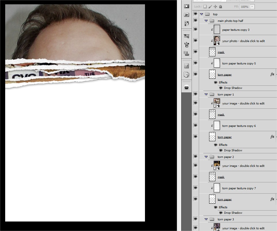
You will take one of the pieces of paper (2 layers each: mask and edge) and use it for the TOP layer. The TOP most layer, you’ll need to extend the paper to the edges of the document. It is within THIS mask you will add your headshot photo. Notice how I arranged the paper pieces so they are closer together? See below: 
5. Paste in your own photo!
Now this is the fun part. You can paste in your headshot photo above the top piece’s “mask” layer. And then right click on the mask layer and select “create clipping mask.” See how I have my layers set up below. I have also put in a paper texture for a more textured effect. 

6. Paste in more photos for each piece of torn paper
I wanted to go for the “torn magazine” look so I sought out some old vintage ads online. I pasted them in each piece of paper group and set the clipping mask just like I did for my top photo above. This is the effect I get below: 
7. Do the same for the bottom part!
You’re going to repeat the steps to the same for the bottom section. One quick way is to simply duplicate all the top layers and flip them vertically. Then swap out all the photos with new ones so they are different. One suggestion is to rearrange the order and positioning of the torn paper pieces so it looks different from the top. 
8. Add text
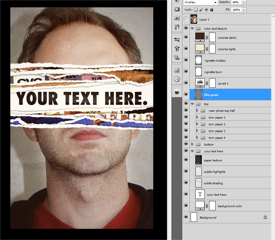
See the space in between? That’s where we will add our text! I also added a dark paper texture set to “screen” to and some additional shadows using the paintbrush tool so I could get a more realistic effect. See my layer structure below: 
9. Add textures and final effects
One thing that will tie the whole thing together is some colorizing and textures. You’ll notice I have a dark reddish brown layer set to “screen” to color my darks. And a tan color to colorize my lights. Those are set to a reduced opacity to not have an overpowering effect. I also had a couple vignetting layers to bring more of a framing/focus to the image. There’s a levels adjustment layer to brighten and boost the contrast of everything all together. And finally there is a film grain layer set to “overlay” and reduced to 40% opacity. A film grain layer is just a layer filled with 50% grey color with a noise filter put on it. Tweak the settings to what you think looks good. 
10. You’re done!
Bonus: Download the PSD
Or just download the PSD template and make it easy on yourself. Again, you don’t have to go through all these steps if you don’t want to. Just download the PSD file yourself. I set it up with Smart Objects so you can just double click on the layers that you are supposed to swap out with your own photos. Purchase Torn Paper Effect – Smart Object PSD Template – $2.99
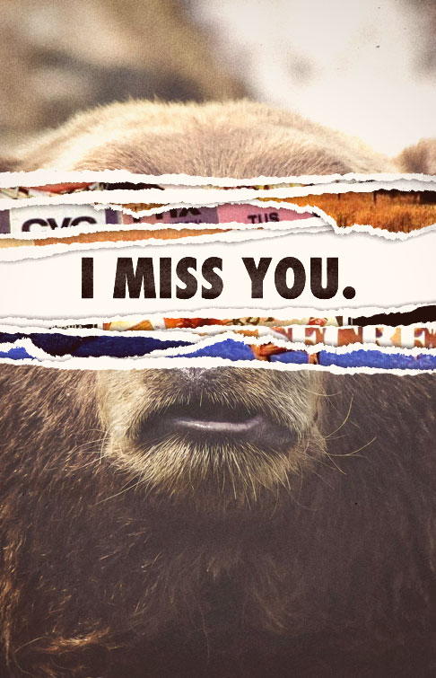
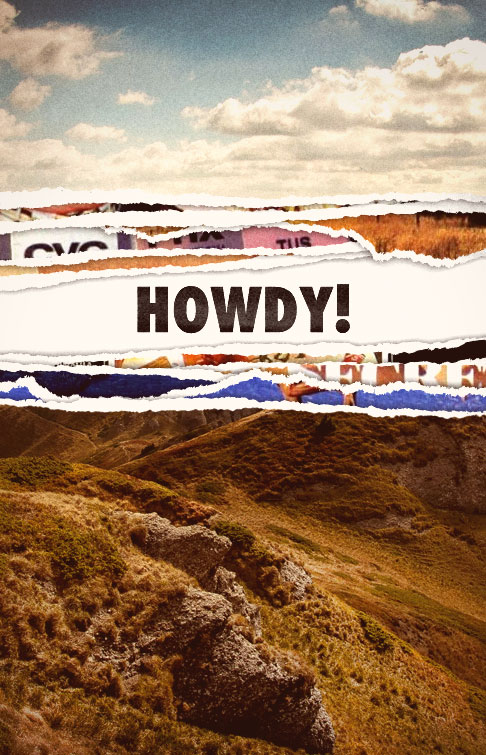
Here are a few examples!
Have fun!


