Blog
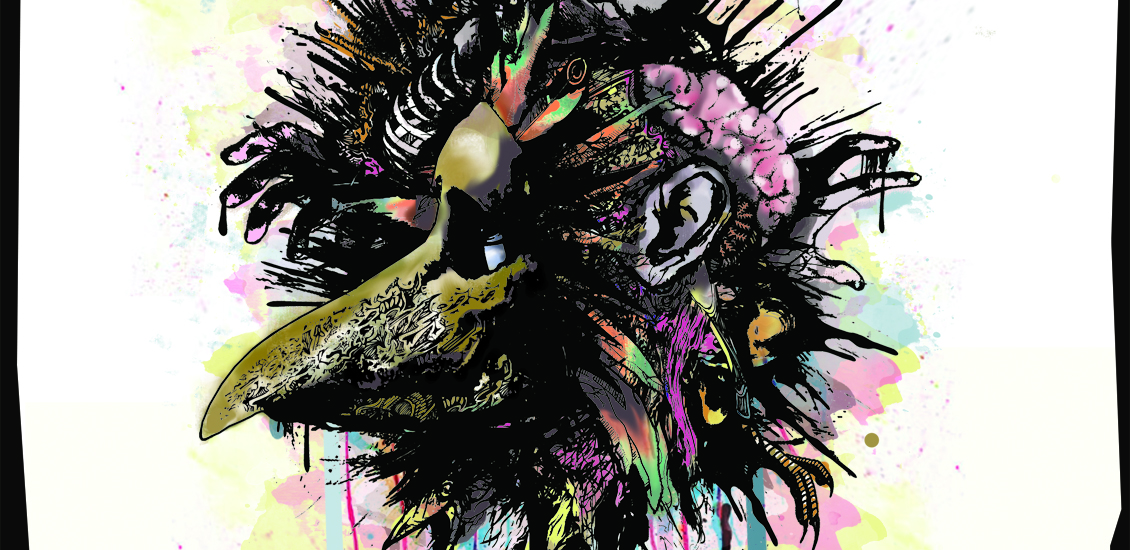
Illustrate & Design an Alternative Gig Poster in Photoshop
Fonts Used:
Brushes Used:
Introduction
Last year, I was commissioned to create a poster/flyer for a heavy rock venue in the UK. The instructions I got were that they wanted something “edgy” and “hardcore”. Punk rock artwork is something that I typically do and I had created similar images for bands in the past, so it was the perfect project for my particular skillset.
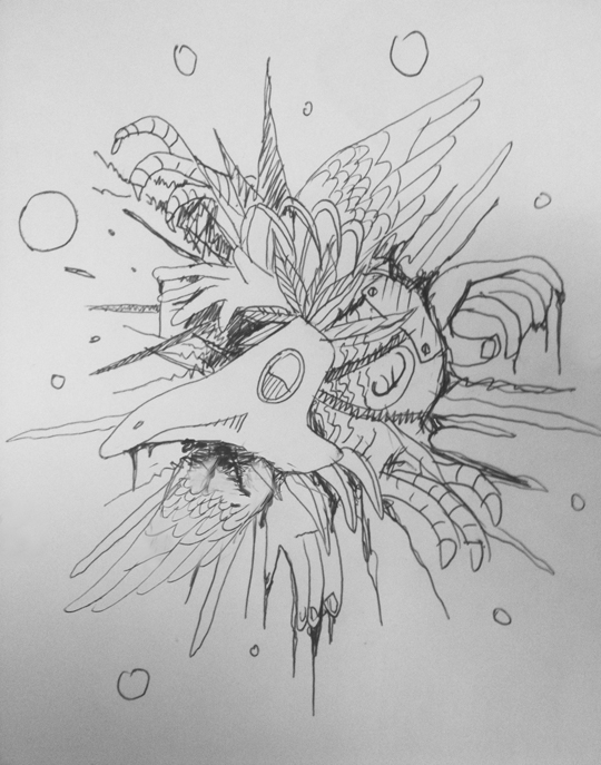
The Ink Stage
I started the project with a few thumbnail sketches of a man in a mask surrounded by various surreal and bloody elements. The band had just released a record called the Nightwatchman and I wanted to create my image based on this plague era image of a masked man. I always produce my illustration projects in this manner; creating the rough layout and concept idea before jumping headlong into any ink drawing. It helps me to cement the idea in my mind before I start any inkwork. I have little concern over “how good my thumbnails look.” I merely need to put some ideas down on paper. In fact, I don’t even use a pencil to sketch and create most of my thumbnails in biro on whatever bit of paper I have handy!
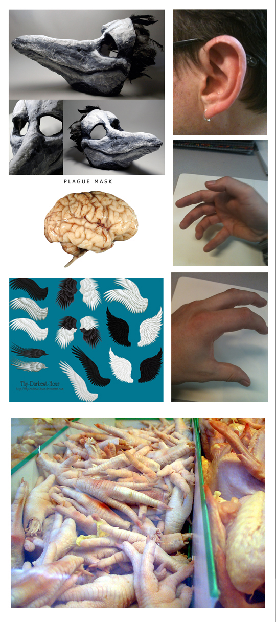
The next step in my process is to gather all the reference materials I need. Because I barely do any pencil sketching apart from a very basic outline, I rely on solid reference materials. Some of these I find online and some I create myself (an iPhone is a seriously useful tool for taking reference shots)
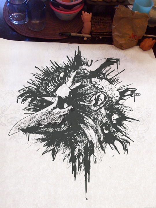
The reason why I don’t pencil sketch is because I like to ink on a clean canvas without the distraction of pencil marks. This makes the need for good reference more important and I always have the copies of my reference materials in constant view. To ink my artwork, I use three kinds of ink pens; a Paper Mate Flair pen, a medium Sharpie, and a Pilot Fineliner for the finishing details.
Illustrating directly in pen creates a particularly “energetic” style. The fact that you are forced to edit and rethink the composition as you go is very liberating; if I make a mistake and I have to adapt the artwork to incorporate the mistake. The errors you make become as much a part of the illustration as the intentional ink lines. It also generates the thick, black, and “dirty” style that I like.
The Digital Paint Stage
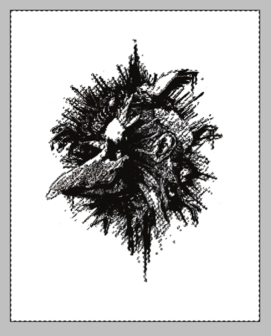
After creating my Photoshop canvas as an 8.5”x11”mini-poster (300dpi in CMYK mode), I scanned, dropped, and resized my ink drawing onto my Photoshop canvas.
Once the scanned image was on my artboard I used my curves menu to consolidate the black and white in the layer and get rid of any loose grey pencil lines and uneven black (insure that the channel is set to CMYK and use the settings below as reference.)
The next step was to knock-out the white in my black layer. I used my eyedropper tool to sample the white in this layer. I then went to select>color range and brought up my color range menu. To select all the white in this layer, I used the fuzziness toggle bar to ensure that all the white areas in this layer were selected.
After okaying my color selection, I deleted the selected white from my black layer.
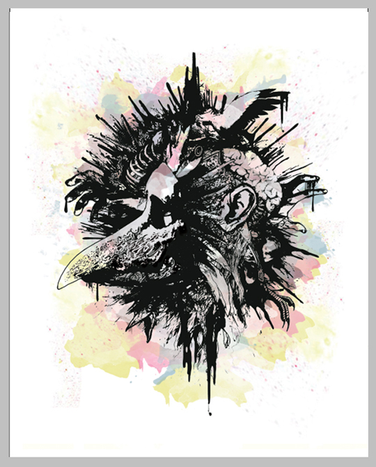
The next step in the process was to start painting the piece. For this project I used a pack of watercolor splatter brushes (see top of article) – adding them to my default wet brush menu. I love this brush set that very closely mimics a loose watercolor paint style. I also find the wet ink brushes particularly useful for digital painting in a very natural paint style.
I used a limited color palette of yellows, pinks, blues and browns to create my image; using the lightest to darkest tones first, and gradually moving into the central face image. Each major color layer was separated, starting with my “yellow layer”. Once my yellow layer was created, I used a selection of my watercolor splatter brushes to add random splatter shapes. I set my brush opacity to 70% to mimic a more “watery” effect
The painting process I use is very “free” and “casual” I separate each color layer and try to put colors down as fast as possible without thinking about it too much. The watercolor splatter brushes are ideal for building this type of loose paint texture. I ensured that each color layer was set at least to 50% opacity in this artwork and built realistic textures by turning the opacity down on particular brush strokes.
As well as using the watercolor splatters, I built texture using various wet brush effects to add splatter details in each individual layer.
To finish the background portion of my digital painting, I added a very opaque white layer (27%) and brushed in some white to tone down some of the harsher paint areas and knock-out the darker shades in the central character area.
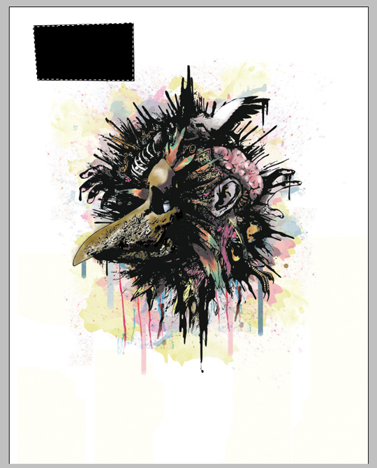
For the main mask and face image, I created a new layer and painted my central character.
Once the central character was painted and the white highlights added, I wanted to add some finishing touches of dripping ink to complete the illustration. After creating a new layer, I drew some basic lines with a wet brush.
I selected these lines with my magic wand and using the warp tool (edit>transform>warp) bent and curved them to mimic the flow of dripping lines.
I then created a new layer called “small drips” and using the same technique as before for individual lines, drew and warped thinner lines to finish the paint project.
The Copy and Info Design
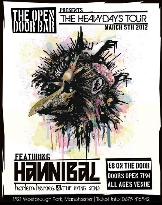
The big challenge in this particular project was the amount of copy they required on the poster; the client’s intent was to use the artwork as both mini-posters and flyers and they were very adamant on the copy elements they wanted to include.
With this in mind, I figured that I’d create a simple layout that compartmentalized all the copy elements in the head and foot of the artwork.
After re-sizing my artwork to free some space up in the head and foot of the piece, I created a new group and added a new layer. In that layer I drew a simple square with my polygonal lasso tool.
I then simply flooded the marqueed area with a solid black using my bucket fill tool to create a cut-out “punk-rock” style graphic.
I created a new text layer and used the font Boston Traffic to give my copy that stenciled punk rock vibe – laying the copy element inside the cut out shape.
The other font I used in this design was Birth of a Hero to further the destroyed and distorted look. After creating a new layer, I then continued this design approach by creating another cut-out shape with my polygonal lasso tool.
Again, I flooded this shape in black with my bucket fill tool. I then copied and flipped this same shape (edit>transform>flip horizontal>flip vertical) and placed it below my copyline.
I then added new text layers to finish off my header copy.
After creating a new layer, I repeated the process of drawing a shape with my polygonal lasso tool and bucket-filling with black. With this particular shape, I went back to my polygonal lasso tool to draw and delete a section from the top of my shape.
I then added new copy layers using my stencil font.
Using the band font styles I was supplied, I added new layers and built a text treatment in the lower left of my design.
I then copy and pasted the cut-out layers from the design header and used them in the footer copy to add some design synergy.
To complete my punk rock layout and to create some extra-footer space, I added a new layer to create a border around my design. Using the polygonal lasso tool again, I drew a cut and distorted shape around my design.
With my selection still active I then flooded the border by first inverting my selection (shift+ctrl+i) and then using my bucket fill to make it a solid black.
To complete my design, I added the remaining copy to the foot of my layout.


