Blog
50 and 50 – The state motto project
Hello hello! Today, I’d love to start a “new” series of posts about inspiration to talk about one of the great collaborative design efforts currently going on in the design community (no, it’s not the Weapons of Mass Creation Fest). Today, I’m going to talk about The state mottos project.
What the heck is The state mottos project?

About 50 and 50
50 and 50 is a collective, curated project where fifty designers are invited to represent their state by illustrating its motto.
This project was initiated by Dan Cassaro, aka Young Jerks. I reached out to Dan to know more about the project, and here’s (part of) our email exchange:
GoMediaZine:
Hey Dan, My name is Simon and I would love to do a feature about the 50 and 50 project on the GoMediaZine. Could you give us some background info about the project, how it came to life and so on?
Dan Cassaro:
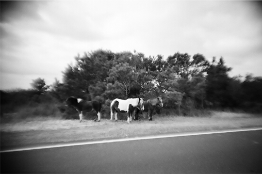
I can tell you that the idea for this project was born out of a trip taken almost 2 years ago. My girlfriend and I took a road trip to California on a whim 2 summers ago. We didn’t know each other and essentially our first date was a 2 week trip in an RV that week rented, driving around Northern California and panning for gold. We have been taking trips across the country to various places since, trying to see as much of the country as we can. We recently purchased a camper of our own (seen below) and have plans to work out of the back of it while traveling this summer.


I began noticing the mottos on signs when we crossed the borders to different states and was very taken with them. The original plan was to do type treatments for all of them myself, but I eventually scrapped the idea, thinking it would be better to have it be a collaboration with all the people from the different states. It helped to vary the project and now I have friends in every state!

GMZ: Could you give more info about the various directions and/or constraints you gave to the designers that worked on the project?
Dan Cassaro: The direction was really simple. I gave everyone the sizes and the 2 colors and told them to go for it. I didn’t want to have to do too much art directing so the easiest way to do that was to just pick people whose work I knew i already loved. It’s really an awesome team of some of the best young(ish?) designers working right now. The colors were chosen to unify the project, and for obvious reasons, had to be red, white, and blue. I wanted to make them subtle though, didn’t want to hit people over the head with a bald eagle or whatever.
With all that said and explained about the project, I’m going to now share some of those great illustrations with you!
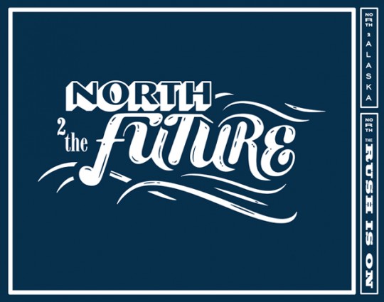
Alaska

Connecticut


Delaware


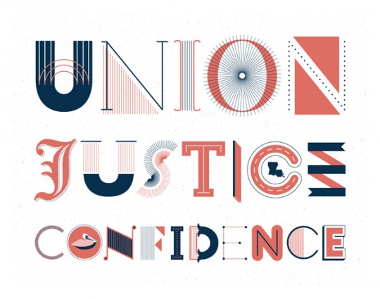
Louisiana


Massachusetts

North Carolina


North Carolina by Matt Stevens
Nevada

New York


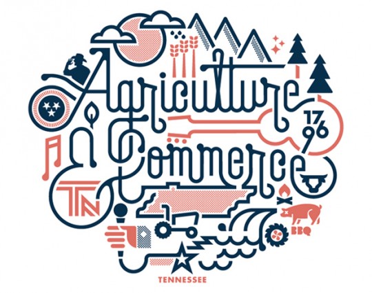
Tennessee

Don’t leave now, there’s more!
Don’t forget, there are many more to be seen on the 50 and 50 website’s gallery. The ones I selected here are part some of the ones Dan provided material for, part personal (and quick) selection. And what would be YOUR interpretation of your state’s motto?
Links
If you want more updates about The state mottos project and/or Dan’s work, you can check the following links:
- 50 and 50, the state mottos project – http://statemottosproject.com
- YoungJerks, Dan’s creative side – http://youngjerks.com
- Dan @ Twitter, where he posts the updates about 50 and 50 – http://twitter.com/youngjerks
- Also, Dan is on tumblr – http://number34.tumblr.com/
I’d like to thank Dan for his kindness and all the material he provided us to do this post. Also, even if it seems obvious, all the content here belongs to their respective authors.