Blog
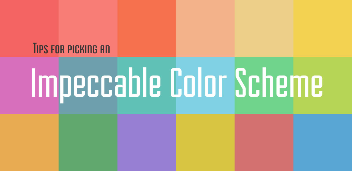
Tips For Picking An Impeccable Color Scheme
Anyone will agree that color has power. It affects how comfortable you feel in your environment, influences your opinion of the way clothes look, and is a key characteristic in describing objects. What some people don’t know, however, is that color can sway the way people perceive a brand, and even influence their buying decisions. The study of the way that color affects viewers’ states of mind is known as
color theory, and knowledge of this subject can greatly enhance the effectiveness of your work as website designers. Tapping into the power of color opens the opportunity to develop a solid brand with a website that thoroughly communicates its identity to users.
Using Color Theory
Those who have studied color theory have categorized color into a logical structure, known as the color wheel; it is from this that color combinations are formed. The key to using color to your advantage in web design is to understand the different effects colors have on viewers, and to create a harmony among your color choices. Here is a breakdown of the different impressions colors have on most viewers.
Red

Classically associated with passion, urgency and anger, this hot color can promote quick action or excitement in a design, or act as a powerful and eye-catching accent.
Orange

With much of the same vibrancy as red, orange is a bit more subdued and can indicate energy, change and vitality. It is often used to emphasize calls-to-action.
Yellow

Thought to be the most energizing color, yellow can invoke a feeling of happiness, youth and hope; it is often applied to websites dedicated to children’s brands.
Green

Green represents health, growth and renewal. Its cool hue can provide a great balance for more vibrant colors, making the viewer feel relaxed and peaceful.
Blue

On the cold end of the color spectrum, blue is often used in websites that need to uphold a sense of trust and reliability, as it reflects integrity and advocates calmness.
Purple

Traditionally associated with wealth and power, purple can be implemented into designs to be soothing or to convey creativity.
When designing a website, take stock of the foundation that the brand is built on: its mission, values, goals and principles. Make your color choices based on the subconscious effect they have on viewers and the visual stability they create together. Some color harmony formulas include analogous, complementary and triad. When you achieve color harmony in your designs, you create a pleasing arrangement to the eye. Harmony engages the viewer, and allows the mind to create an inner sense of balance and order. When users enjoy the colors in your design, they are more likely to continue interacting with your site – leading to more conversions and improved user experience.
Sites That Use Color Well

Melonfree features a scheme with color that has been toned down in vibrancy to reflect a natural and comfortable atmosphere. Harmony is created in the complementary balance between the orange and green. Orange is used to guide the eye around the page by calling attention to different aspects, while green provides a softer, cooler hue that colors the more subtle elements. The colors are held together with a cream background that further softens the pop of the accents without detracting from their effectiveness.

This digital security guide uses a bold, full color background to immediately attract the attention of the viewer. It dulls an otherwise bright color – yellow – to be easier on the eyes, since it’s used in such a large amount. This design is successful because the content creates a stark contrast with the background, making it readable. Plus – because the yellow is effective on its own – no other decorative colors are needed. The page is bold, but not chaotic.
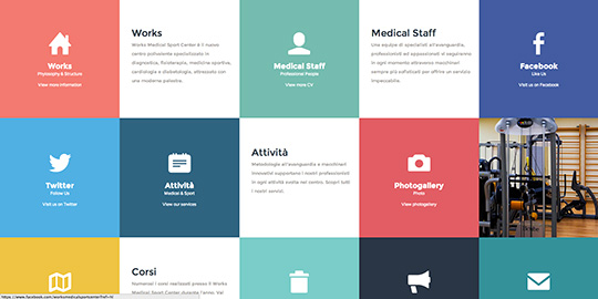
Works Medical has gone the opposite direction by choosing a scheme with several different colors. Representing a large portion of the color wheel, the design portrays a fun, creative feel. The risk of looking messy is overcome by prominent color blocking. The layout also makes the colors pleasing to the eye by showing a gradual change, instead of drastic contrasts.

Many contemporary web designs are using color very sparsely, which emphasizes how much power it has in even small quantities. Like
Kitchen Sink Studios, a beige or gray and white background forces the user to focus on the page’s content. The intentional accents of color are extremely successful in placing importance on certain elements, as well as guiding the eye’s path so that it sees everything.
Tools to Help You Implement Color
You’re not on your own when it comes to choosing your color scheme. There are plenty of tools to help you gain color inspiration, brainstorm and implement them into your design.
Shutterstock Color Spectrum
Unlike other stock imagery sites, this one has an interactive interface that allows users to discover images based on color, which differs from typical search queries based on keyword phrases. This tool is particularly helpful in the brainstorming phase of design, and it can take you to new areas of ideation with real-time feedback.
Color Hunter
If you already have an image in mind for your design, this is a great tool for building a color scheme by extracting colors from the image. It finds the main colors and fills in the hues between them to develop a solid, cohesive palette. It provides you with the Pantone numbers of each color, so you can be sure to apply them accurately to your design.
Colrd
This hands-on tool enables you to search images and graphics with corresponding palettes for inspiration. You can also browse gradients, patterns and images to extract a palette from yourself, which you can then manipulate to your liking. Colrd is perfect for ideation and experimentation, because it allows you to have control by editing and saving your work as you go.
Color theory facilitates a whole new realm of intentional design. Now that you know the basics of the psychological effects that color has on viewers and how to build a solid scheme, you can be confident that your choices accurately reflect your brand to achieve your goals.
Other posts you may enjoy: The Colour Wheel: Using Colour Theory in Design