Blog

Life Without Limits: Constructing Creative Realism with Cinema 4D
Design and motion graphics studio, Already Been Chewed, cooks up a fresh rebrand for Malibu Boats.
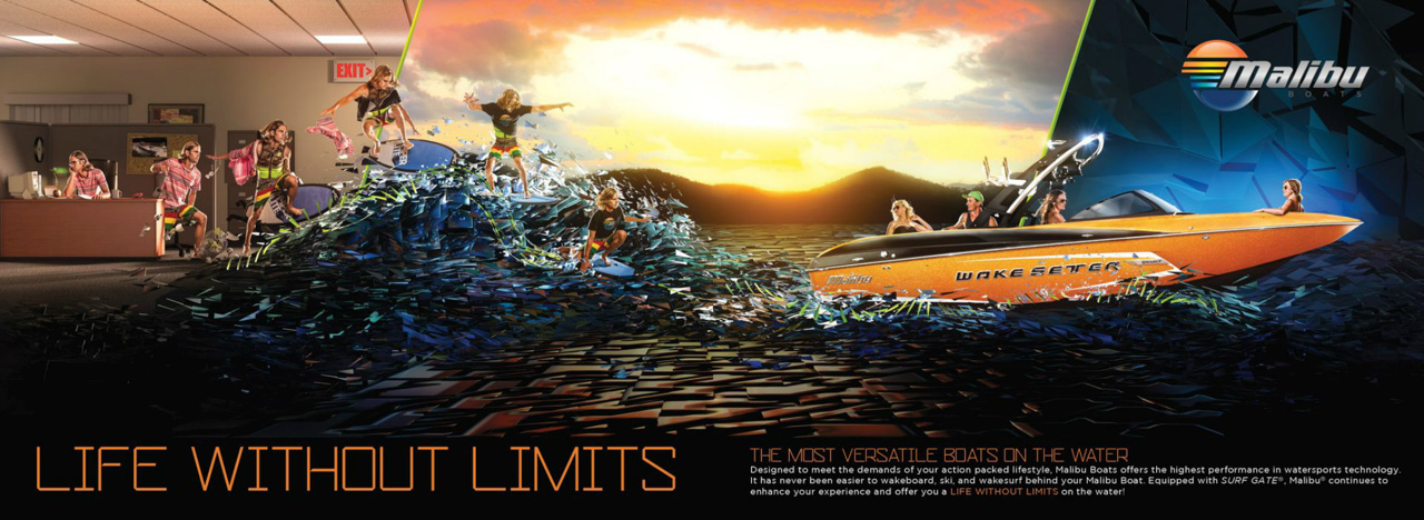
When Barton Damer was given a tour of the manufacturing facility belonging to Tennessee-based Malibu Boats, his imagination went into high gear immediately. His design company, Already Been Chewed (ABC) had been tasked with creating and implementing a rebranding effort across numerous media platforms for Malibu and its sister company Axis Wake Research. The goal was to illustrate the slogan “Life Without Limits” and accentuate the active lifestyle that Malibu and Axis can offer their customers.
ABC was chosen for the project because of the company’s history of working with other action sports brands, including Nike, Street League Skateboarding, and Supra Footwear on creative campaigns. “We analyze what the competitors are doing and then try to do something totally different,” Damer explains. It was a bold approach, and they didn’t know if Malibu would go for it. But ABC figured, if they won the year-long contract to create a series of catalog images, print ads and online videos using Cinema 4D, After Effects and Photoshop, it would be best to have presented ideas they would be excited to work rather than playing it safe.
Creative realism
Damer and ABC’s art director Brad Wolf used Cinema 4D for both the print and animation portions of the Malibu/Axis rebranding project with the final looks and compositing completed in Photoshop for print and After Effects for video. For the Malibu boats campaign, Life Without Limits, ABC developed a visual that depicts a cubicle-bound office worker transforming into a wake surfer and escaping the limits of his 9 to 5 job into a surreal wake surfing experience behind a Malibu Wakesetter.
ABC set up a photo shoot with professional wake skater, Brian Grubb, to capture the sequence needed for the campaign artwork. After isolating the photos off of their background, ABC set them up in C4D as textures that were applied to vertical planes. “We used the luminance channel of the texture, as well as the alpha channel of the layer in Photoshop we cut out,” Damer recalls. “This allowed us to place the pictures of Brian into true 3D space within the scene and have the C4D lights interact with the cut out photos.”
That strategy gave Damer a good head start on some pretty realistic shadows, which helped because it was a flat plane, so it wasn’t going to look perfect, he says. “But depending on where the light is positioned and where the shadows are cast, that technique really helps in certain areas.”
Cinema 4D was also used to match the lighting from the original studio shot. To do that, Damer placed a light behind the actor and cast shadows forward, creating a real light source and a real shadow on the side of the desk where the side of his leg is popping up. “I did that same thing for every image in the sequence,” he says, adding that there is a real light source and shadow being cast on the desk and the computer monitor.
Graphic style
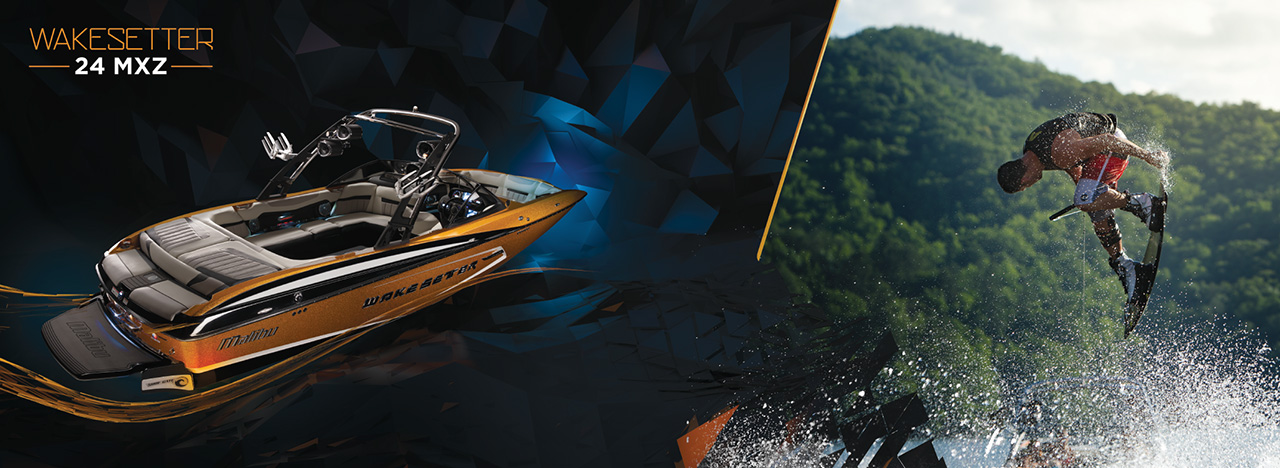
Already Been Chewed opted to introduce a more graphic style for both the Malibu and Axis catalogs after seeing the approach used for the footwear and auto industries but not for boats. One technique they used was to introduce the use of shard-like images that are repeated throughout the branding for Malibu. To create the shards, Damer used a cloner object in C4D to replicate a triangle shape. After cloning it along a low-poly version of a wake that they modeled, renders were composted together in Photoshop to create the scene.
“C4D allows you to use an object as the basis for your clones,” he says, explaining that a low-poly representation of a wake was created to serve as the basis for the clones to be duplicated across. Random effectors allowed the wave to take on a more organic feel combined with plane effectors that allowed the transition from smooth “water” to the large wake that was created.
For the background graphics that were used to highlight each boat model in the Malibu catalog, Wolf used a primitive landscape that he made editable and then triangulated. Next, he used an explode effector to pull some of the image apart. A melt effector was used to enable different geometries. Streaks coming off the boat were made with a spline wrap, taking the geometry of a tube and using an explode effector to explode it out, then wrapping it along the spline effector and applying a custom texture.
Axis Catalog
For Malibu’s sister company, Axis, a completely different look was created using C4D for the most part. Based on ABC’s tours of the factory, this concept put the focus on the craftsmanship of each boat and how they are made by hand. Damer says the white-suited workers and futuristic factory were inspired by the actual boat creation process. “Obviously, it’s an artistic representation of the process, but the workers were wearing those uniforms as they sprayed gel coat into the hull of the boat,” he recalls. “That’s where I got the idea to have the spray coming out of the worker’s hose take the shape of a boat.”
Damer used Cinema 4D to create the futuristic-looking factory and composited the final boat and workers into the shot. Unsure about whether they would be able to get the liquid to do exactly what they wanted it to do through fluid simulation, Damer ended up combining 15 or 16 individual models of liquid rendered out of C4D and using Photoshop to make them all form the back of the boat.
To highlight Axis’ A22 Vandall Edition boat (a pro model for Randall Harris—aka Randall The Vandall), Damer used a similar technique. This time, though, he used C4D to create a darker feel. Though the overall campaign shared the consistent theme of simulated water making up the rear of the boat, the Vandall got a slightly different treatment that set it apart from the crowd.
“We thought we would make it look like it was in the exact same warehouse with the same camera angle and everything, but with the factory lights turned off and some moonlight spilling in, just to give it more of a mysterious look since Randal The Vandall has that kind of a vibe going,” he says. Additional shots of the white factory were made using Global Illumination to get clean lighting. For The Vandall Edition’s moonlit version Damer used spotlights in C4D to keep the factory dark and only light the areas he wanted to people to focus on.
In addition to the rebranding effort, which will continue for Malibu and Axis throughout the rest of the year, Already Been Chewed has also done several animated features for internet broadcast with television versions coming out in 2014.


