Blog

Introducing our brand guidelines template
A few days ago, I mentioned at the bottom of an email campaign that we were working on a little something that would make delivering new brand assets to a client easier. Well, this is it.
Adding value to the brand you deliver
When you design a logo for a client, are you including a Brand Style Guide? You know, a document that tells the client how to use their new logo? If not, you should be. A well done Brand Style Guide provides tremendous value to your client and can earn you more money on logo design and branding projects.
It’s also a wonderful tool that, if respected, ensures that your client will respect that painfully crafted brand you’ve just sent him. Isn’t it frustrating to sometimes see that branding system of yours completely destroyed by a client that replaced that carefully chosen set of typefaces with Comic Sans?
But how do you know what goes into your Brand Style Guide? And designing it takes up a ton of extra time, so wouldn’t it be nice if someone like us did all the work for you so you just have to replace all the content with yours and be done with it? Yes, that’s what we did.
A simple, yet robust product
We simply set out to prepare a boilerplate version of our own brand style guidelines. We also took the time to look at various style guides released by big and small brands alike, to see how we could improve our own stuff.
We then threw all of that at our very own Chris Comella (the man behind the Freelance Survival Kit), and he created this great template. It will be the perfect starting point for a great, clean, and to the point presentation of your client’s new visual assets.
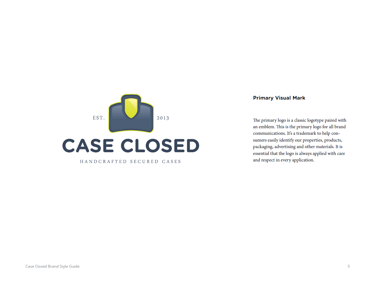
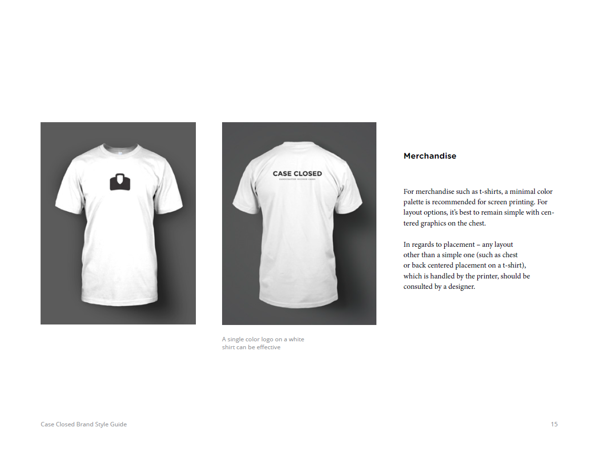
We’ve also included an example brand guidelines document, so you can see what the template can become. It’s based on Case Closed, a fake brand of handcrafted secure cases designed for our internal needs by our very own Carly Utegg.
The product itself comes in the shape of an InDesign template, and of a PDF example. The InDesign file includes 18 pages, from cover to cover. We chose InDesign because you can easily add or remove pages if your sections need to expand or contract. The template also includes notes by Chris and Jeff on each sections, and on how to make the most of each of them.
You should head over to the product page to learn more!


