Blog

The Elements of Great Poster Design
Great Poster Design Tips:
Recently, we received an email from a Go Media friend asking a simple, yet incredibly complicated question: “What are the qualities of a good poster design?”
And while we’ve done many a blog post about posters that inspire us, we haven’t covered why they have done such a great job of doing so.
So today we are going to do our best to answer that question – as simply as possible.
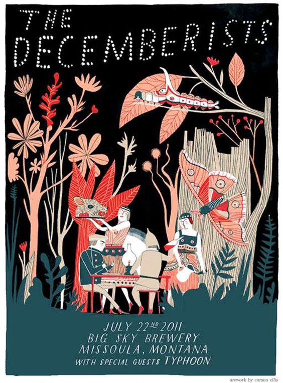
As we all may know, a poster’s job is often three-fold; it serves to advertise and communicate information while acting as a piece of artwork.
A great poster communicates a message clearly.
Of those three tasks, the poster absolutely must deliver a message as clear as a bell, so that it is as digestible in as little time as possible.
To accomplish this, make sure your poster flows well to do that:
- make sure it is easy to read from a distance
- grabs the viewer’s attention with a main image or headline, then
- answers the questions who, what, when, where and how and
- leaves the least important details to the fine print

A great poster is simple.
In order to communicate your message, your poster should be relatively simple. If you bombard them with too much information, they’ll leave overwhelmed.
Remember:
- Less is more.
- Let it breathe! Leave enough white space so that the viewer can absorb the information.
- Choose complimentary color palettes
A great poster captures your attention.
When designing your poster, certain elements will capture the attention of your viewer above others. These include playing with:
High contrast
Dominant images
Bold and/or playful typefaces

Extreme minimalism
Bold color palettes
A monochromatic theme

A great poster motivates your viewer to take action.
Many posters serve to advertise shows, concerts, movies or other events. Your goal is to entice the viewer to respond to your art in some way, shape or form – by making a call, hitting up a website or heading to a show. Can you think of an out-of-the-box way for them to take action immediately, such as with a coupon code, QR code or by enticing them to enroll or sign up by a certain date for some wonderful reason?
A great poster knows where to call home.
When designing, it’s vital to keep in mind where it will call home. If it will exist in one environment only, you can cater its size and color to that environment. If not, make your choices understanding that this poster could live almost anywhere. Picture it both living in a dark dingy club or a on a bright red gallery wall.
A great poster starts a conversation with your viewer.
Most folks are on the move when they encounter a poster. If it’s clever in concept, they will be more likely to take time to interact with it. So, take the time to start a conversation with your viewer. Evoke an emotion in them. Make them laugh, think. Take them on a journey – if only for a moment.
A great poster is just plain lovely.
Yes, posters serve to communicate and call your viewer to take action, but they also serve as pieces of artwork. This only helps to reinforce their message. Enjoy the process!
Follow us on Pinterest for more posters we love!


