Blog

Become a Master Typographer: How to Choose the Perfect Typeface
Choosing the Right Type: 10 Considerations
A critical question we often ask ourselves and know other designers contemplate when working on any given design is, “How do I choose the right font?”
So many factors go into this decision, however thanks to the help of some friends, including Creative Director Michael Prewitt as well as Art Directors Craig Weiland and Harley Peddie, we’re here to share with you ways you can choose the perfect typeface for every project.

How to Choose a Font
1. Ask yourself: “Is the typeface appropriate for the subject?”
Before venturing into your design, investigate the mood, personality, and attitude of the project.
Then, as Michael Prewitt notes, ask yourself, ‘Is the typeface appropriate for the subject?’
“This question,” he finds, “is the king. Every typeface conveys certain ideas, emotions, and associations — even fonts that are not display faces, designed for body copy. Typefaces may be strong, graceful, elegant, brash, businesslike, quirky, playful, traditional, understated, fierce, etc. They may convey a certain period or historical/geographic context, such as Old West, Roman era, Victorian, Art Deco, 1950s, Art Nouveau, High-Tech/Sci-fi, etc. They may be designed to look very geometric/precise, flowing and curvy, hand-written or calligraphic, distressed or grungy, or traditional serif or sans serif type for copy. So it’s important to ask what you want the font to say, and what do you not want it to say. Think clearly and fully about this point, because you don’t want to be one of those designers who picks a font because it’s informal, but fails to consider that the job calls for ‘elegant and informal,’ not ‘drawn while smoking weed informal’ — or maybe the other way around.”
Adds Craig Weiland, “A designer has to be aware of the basics of type usage. Serifed type is often used for long copy, like books and magazines. This is because the serifs make the characters more recognizable, and the text easy to read in bulk at small sizes. Serif body copy usually pairs well with sans-serif display type. There are mountains of exceptions, but you have to understand the rules before you can effectively break them.”

The process of choosing the perfect typeface not only comes from experience and education, but also through trial and error.
Weiland continues, “I test a lot of fonts when I design a logo. I’ll sometimes go through 20-30 different faces looking at how the characters relate to each other, the overall mood presented by the forms, readability at large and small sizes, how I might use color, how the letterforms create negative spaces and how I might use them, and so forth. I have to have a solid understanding of the attitude I want to project. For instance in the massage logo example above, the attitude communicated is strength, confidence, power, pride. A massage parlor should be welcoming, warm, relaxing and soothing. The typeface chosen must broadcast these attributes, or at least not be in conflict with them.”
2. And…Is the typeface technically appropriate?
Another aspect of being appropriate is technical, Prewitt points out.
“Some typefaces are too thin for the size at which they will be used, or maybe too heavy for the ink level on a medium that could allow bleed-through. Thin fonts will tend to choke (plug up) when printed reversed out of a dark background. For web fonts, readability on screens and devices is important. A font that will be screened onto a small object like a pen needs to have enough thickness that it won’t quickly deteriorate when the item is used.”
3. Be aware of trends and clichés in type.
As with any other design, trends and clichés should factor into the design decision making process. Great designers can stay up to date by hungrily consuming the world of type around them, following fellow artists, social media sources, inspirational blogs, etc.
Prewitt notes, “Every decade, there are fonts and type styles that become popular and that become passé. There are trends in type that are affected by many things, including styles of clothing, popular movies, cultural movements, and more. The more you are in touch with trends in society, the better you will be at choosing typefaces that will resonate with current thoughts and feelings. This does not mean you should focus only on the fonts everyone else is using; but if you understand why those fonts are popular, it can help you find new typefaces that will stand out and still look contemporary. In the same way, you can avoid typefaces that have become synonymous with past fads.”
“In the 1990s, a font called Officina Sans was quite popular,” Craig Weiland recalls. “It was used everywhere someone wanted to project ‘contemporary office chic’. Today, I can’t use it at all. It’s worn out… it only projects ‘we think it’s still the 90s.’ You can’t pick up things like that if you aren’t paying attention to the design world around you. As a designer, you are (or should be) always paying attention to design in your environment and media. If you notice a cool typeface in something, like a movie poster or a billboard, see if you can track it down later using Google searches or WhatTheFont, so you can add it to your arsenal for future use.”
4. Look for a typeface that excels in the small details.
Prewitt begs designers to ask themselves, “How well do the letters flow together? Is there some little flourish, or ligature, or other detail that would give this typeface some extra class, without going too far? If you are designing something like a company logo where you are using just a few letters, a font that has a really nice letterform for one or more of the letters you are using could really make the design. Look at the punctuation and non-Latin characters. A well-designed font will include many glyphs besides the Latin alphabet, and they will be well-designed and not generic-looking (the punctuation will be in the same style as the letters, etc.).”
He notes, “People without a background in design will sometimes say that every roman typeface ‘looks like Times New Roman,’ or every sans serif font ‘looks like Arial.’ But the more you study typefaces and become familiar with them, the more you will see that even the most basic typefaces can be great designs or poor designs. The details make all the difference.”
5. Think about how different typefaces will work together.
When marrying typefaces, designers should tread carefully. Like coupling two people (or more) together, typefaces have personalities, and these must mesh well together in order to live in perfect harmony.
Prewitt agress. “Most designs involve two or more different typefaces. Some fonts work really well together, others are too similar and clash, or too wildly different. The fonts should complement each other, and they should all support the message of the piece.”

6. Make use of your options.
“On my work computer I have over 3,500 fonts,” reports Prewitt. “I have my favorites, and there are some I have never used and probably never will use. But it’s great to have a diversity. Many designers, especially beginners, tend to use a lot of the fonts that came with their system — such as the fonts that come with Adobe products. There is nothing wrong with many of those fonts, except that they are sometimes overused. When a font is overused, people may connect your design with other designs that are completely unrelated, or they may see your design as clichéd. Besides that, when you use default fonts, you have to realize that lots of amateurs are also using the same fonts, and that can give an amateur feel to your work.
Even though I have lots of fonts, they are all sorted into groups and styles, so it is fairly easy for me to find just the font I want, without perusing the whole collection.
It is also helpful to collect pictures of good fonts for future reference. Probably you don’t have the budget to purchase every font that catches your eye. But if you save it to Evernote, or Pinterest, or some other place, you can refer back to it later when you have a hot project that needs a great typeface.”
7. Consider the cost
Designers should considers clients pocketbooks when choosing an appropriate font, as Harley Peddie reminds. “Unfortunately, clients still squirm paying $100 to license a typeface when they’re so used to getting this stuff for free, especially with webfonts from our good friends at Google.”
8. But…avoid freeware fonts.
Per Prewitt, “Although professionally designed fonts can be pricey, they can also be exceptionally well designed. With commercial fonts, you usually get better kerning pairs (very important), more alternates, more ligatures, and more styles/weights that pair well together. With freeware fonts, you often get very bad kerning and sometimes even font errors such as overlapping paths that can cause problems in production. Also, many freeware fonts come with usage restrictions that will prevent you from legally using them in some projects. This is not to say that all free fonts are bad. But you have to be careful about which ones you use. Also be aware that there are often deals where you can get pro fonts for cheap or even free. Some free fonts are designed by professional designers or foundries, and so you could expect them to be high quality.”
9. Time
Time, too, can be an issue in choosing the perfect typeface. Peddie adds, “Sometimes you just gotta get it out the door, so instead of spending hours lost in the wonders of independent foundry sites, you dust off Univers one last time.”
10. Pick something (appropriate) from your arsenal.
What exactly to start with?
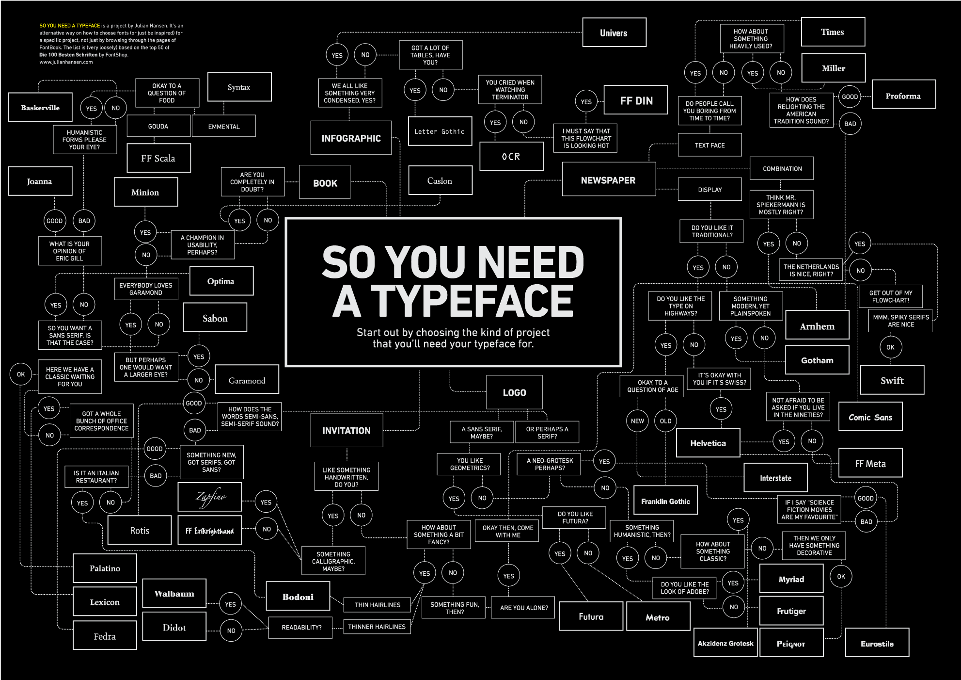
Prewitt comments, “The ‘starter fonts’ question is difficult, because everyone has their own taste in fonts, and different styles of projects that they do. Personally, I like Minion and Myriad quite a lot, although these fall into the category of somewhat overused. They are neutral enough that I find they are good base fonts to start a new project with, and I might replace them with other typefaces later in the design process. Besides those, I would recommend any of the following: Adobe Garamond (or the Premier Pro version), Arno Pro, Chaparral Pro, Chronos Pro, Didot, Encore Sans Pro, FF Absara, FF Acanthus, FF Milo, Gloriola, Helvetica Neue, Rayuela, Ronnia, Vista Sans and Vista Slab, and Warnock Pro as good starting points. None of these are display fonts and are not particularly exciting; but they are good sturdy fonts with a wide range of supporting roles.”
He adds, “I would recommend against using any typefaces that have been heavily overused in desktop publishing: Algerian, Avant Garde, Benguiat, Bank Gothic, Bradley Hand, Brush Script, Cooper, Copperplate Gothic, Curlz, Impact, Kristen, Mistral, Souvenir, Times New Roman, Papyrus, Vivaldi, Zapf Chancery, Zapf Dingbats, etc. Always use Helvetica (or Helvetica Neue) instead of Arial.”
And last but not least:
“Don’t ever use Comic Sans.”
Cover Photo credit: Brenda Gottsabend | Flickr
How do you find the perfect typeface? Add your thoughts in the comments below!
For further reading:
100 Top Resources for Typography and Hand-Lettering