Blog

All About Logos
I am passionate about branding and have learned a lot while helping businesses develop their brands. There is a lot more to a logo than just your company name and there are some important factors to keep in mind when branding, or rebranding, your business:
Trust a professional
Don’t go into the logo design process blindly. You should have a clearly defined idea of who your company is, where you’re going, the audience you’re serving and the vision you’re trying to convey before venturing into the logo design process. Once you’re ready, it may be tempting to go with a designer who’s the least expensive, because identities are pricey, but it’s important to hire a professional. We’ve been trained to do more than push pixels and can help you narrow down ideas, show you new options and help you maintain your brand direction.
There are 7 different types of logo marks to consider.
Discuss with your designer the option that works best for you.
1. Lettermarks (monogram logos)
2. Wordmarks (company name logos)
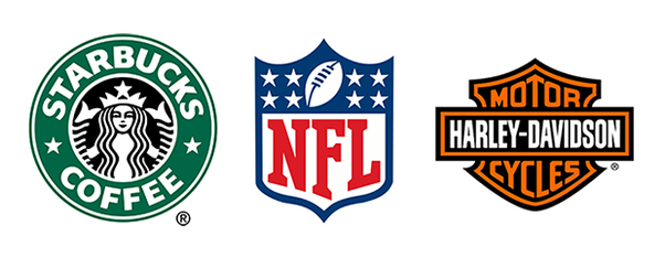
3. Pictorial marks (logo symbols, no words, works best for large companies)
4. Abstract logo marks (a specific non-recognizable abstract design that represents your business)
5. Mascots (think sports teams)
6. The combination mark (logo comprised of a combined wordmark or lettermark and a pictorial mark, abstract mark, or mascot)
7. The emblem (badges, seals, crests etc.)
Consider whether or not your idea can be executed.
Your logo might look great on a billboard, but when we shrink it to a postage stamp size, is it still working? Answer some of these questions before choosing your mark:
1. Does it translate from small to large & vice versa?
2. Does it work in black and white? (Your logo MUST be able to translate to greyscale!)
3. Can it work as a PNG? (transparent background)
4. Does it convey my brand’s identity?
5. Is it balanced or is it too detailed?
Lets talk details…
It doesn’t matter if your logo is unique or intricate if nobody can tell what it is. Have you thought about adding your tagline, address or other information to your logo mark? There are times you may want to have those extras on your mark, but they should not be on your standard, every day logo. You can have these ‘companion pieces’ created as extras to compliment your logo and use them as needed.
Stop Following the Fads. Be a Trendsetter.
Fad is, in one word, short-lived. Trends have a much longer lifespan than fads. In fact, they can continue to be fashionable for years and even decades. Digging into what is now and fun is fine, but consider how will it impact your business in 1 to 2, even 5 years. What does a watercolor splotch have to do with your business? Why is there an ilustration on your mark that has nothing to do with your business? Is there a reason for the over the top flourishes at the beginning and end of your name? Your logo should mean something to you. Avoid adding things just to add them; know when you know it’s time to edit yourself.
Setting trends and setting yourself apart means you don’t have to be overly obvious with your mark. If you’re a preschool, your logo does not have to look like it was written by a child. It should convey childhood and immediately let you know it is for children. Keep in mind, it is not targeted to children, it’s targeted towards their parents. Know your audience!
Avoid simply using your business name.
Think you don’t need a logo and can get by with just typesetting your business name? Think again. This gives off an unprofessional air and doesn’t translate across all media. Your name will be written in so many different types, that it will not be instantly recognizable like it would be if your logo mark was standard across all materials.
Are you guilty of being a fad follower or are you more of a trendsetter? Help drive your client’s specific direction with these helpful logo tips. Have more to add? Let me know!


