Blog
Draw a Windy Sunset Illustration
Introduction
I’ve always loved Asian art and particularly Japanese illustration. While Asian art is the main source of inspiration for my design, the point is not to create a traditional Japanese illustration, but rather to filter design inspiration such as this one through personal style and experience. Today, we’re going to create something new based on something old.
You will need a pen tablet to use these techniques, and standard Photoshop settings will do just fine (most important – keep pen pressure enabled).

Inspiration
Blogs posts on design inspiration are very popular, and I too love to see bits and pieces of what people are creating without having to scour the web looking for art. But often, inspiration is lost soon after closing the page, because it’s not put into practice, or properly harnessed.
Think of it this way: you find a piece done by some designer that you really like. You’d love to be able to create something as cool his work, so you either choose to imitate his technique and style or adapt it to your own concept, and / or style. You’re facing two problems.
One, the other guy spent hours, days, month perhaps even years developing a technique and style for himself that you are only now trying to achieve in a matter of hours. Your design will be inferior because it lacks experience.
But there’s another problem. Chances are that the design you were inspired by was born out of many sources of inspiration, and is a result of personal research. Though he may have used a wide knowledge to put together his design, you base your entire inspiration on a single source: his piece.
While this is not at all a magic formula, it’s a method that has served me well so far: I suggest you bookmark your sources of inspiration and analyze them. Find things you like, dislike; think of possible improvements and write your ideas down. They’ll soon be gone otherwise.
Don’t limit your sources of inspiration to design work. Read on the topic and listen too. I use music a lot as a source of inspiration, and a part of this tutorial’s design is listening to Hans Zimmer’s “The Last Samurai” Soundtrack. You don’t have to be a music connoisseur, to notice that Hans took traditional Japanese music and instruments and put them in a modern context through his own style and technique. This is exactly what I tried to do in this design.
What I’m talking about here is not spending months of study for something that’s just a personal project, but if you tackle a theme blindly without any research, you’ll probably find yourself halfway through the piece, all out of ideas. In an effort to finish the piece, you may end up going back to your inspiration and copy ideas directly. Well, that or you abandon the whole project thinking it’s just not good enough.
I think there should be a moment where you cut yourself off almost completely from your sources of inspiration and start working based on your own experience and style, even when it comes to something as representative as Asian art. Eventually you’ll get used to working solely on what you know.
Here are only a few examples of Japanese illustrations I looked at for my research. I liked the rich detail and flat look combined with a fading background. Depth of field is achieved through contrast and stroke width.
I love using color in my work, so that was an early decision- finding ways to integrate artistic and sharp lines with richly colored gradients.

Now let’s get to work and begin this illustration. There is a lot of detail that won’t be very noticeable in the screenshots, so there are occasional close-ups to help.
Create the misty background
Make a new document and fill it with this color: 35293c. I’m using a custom size (42 x 21,15 cm), which is basically a narrowed down A3 document.

Choose a very light pink (d4ccd8) and while using a large, soft brush, click a few times around the bottom of the canvas to create an imperfect horizon line.
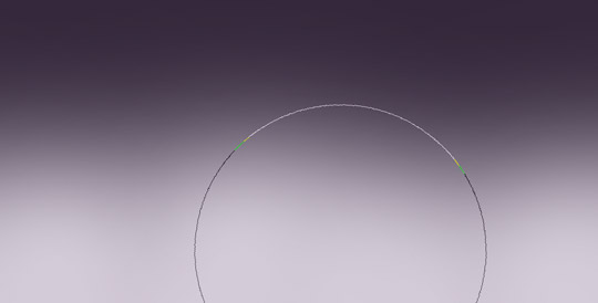
Transform (Ctrl + T) the light pink layer and skew it upward into a thinner surface.

Now, grab the brush again and paint a few larger spots in certain areas so the line won’t be perfectly straight anymore.

Repeat this process to these next few colors. Start by adding a dark purple (same as the first) on the bottom.

Add a red part to the sunset using this shade: da564b. Put its layer behind the purple ones and over the light pink.

Add a red part to the sunset using this shade: da564b. Put its layer behind the purple ones and over the light pink.

Now add a darker purple (1a121f) on top of all the layers.

And now yellow: f9e16d.

Draw a line art tree
The trick to creating the line work in this style is to use a larger sized brush than the actual stroke you intend to create. All the lines in the image below were drawn using the same brush size, seen in the right top corner.
For those of you that do not own a pen tablet, I can sympathize. For about half a year I convinced myself that I don’t need one. I was wrong.
A pen tablet does not make you an artist. Your shaky hand and uneven lines won’t magically go away with your first purchase. Actually, it will probably get worse at first. Since the surface does not absorb pressure just like paper, it’s more difficult to draw on it. Also, you can’t turn the tablet sideways to get the best angle for long strokes if you don’t have a tablet with that added feature (Most don’t).
When I gave in to buying one, I blindly convinced myself to get an expensive tablet, at the very least something like 6×8 or 6×11 in size. Luckily I listened to the advice of one of my college professors and started out small, without taking any risk of buying something expensive that by the time I’d master, I’d need a new one. I bought a tiny Wacom bamboo that I can practice on. Perhaps a year later, I’ll buy a nicer one and slowly work my way up the ladder once I’m ready.
A bamboo, all three kinds, is pretty cheap. If you think it would be an advantage to your work, go for it. If you can already draw art well on paper (the kind you’d make on a computer), then consider moving to Intuos for the sake of a better resolution and pressure sensitivity. See the differences here.

Begin by drawing a general orientation of the tree trunk, as well as positioning it in the scenery. Use this purple: 6f6575.

Now, add the main branches. I suggest you make a separate layer for each of these steps.

Now change the brush size to a much smaller one, and draw the tree bark.

Repeat the process for the branches.

Choose the previously used light pink (d4ccd8), and draw underneath all the tree layers. Those will give the impression that the tree is highlighted.

Now add a new layer (Ctrl +Shift + N) on top of all the tree layers and with the same color draw more depth lines toward the center of the tree. That will make the tree look more 3D.

Make a windswept tree crown
The shape of the crown is not only made to look like it’s swept by the wind, but also gives a resemblance to Japanese bonsai trees, which is in relation to our theme.
Underneath all the tree layers, add a new layer and draw the first large stroke of foliage. Use this orange: c87f56
Keep your orientation in mind at all times. Make it look windy, but try to give it a certain elegance too. The point is not to make it look skewed horizontally from side to side, but carried away with the wind. It needs to be continuous, so it doesn’t give the impression that the crown will run out of leaves just as you’re watching it.

Continue these lines by creating thinner and very thin lines. Basically, make them match the aspect of the tree. Don’t add to much detail though, so that it doesn’t look overcrowded.

Again with the light pink, paint a highlight over the orange strokes on a separate layer.

Add a new layer, this time over the tree and create strokes that go from side to side with this yellow: d2ad65.

Add smaller strokes, just as before.

Finish them off with highlights, using the same shade of light pink.
Create a grassy crest
Draw some light pink grass, and make the dark edges of the mountain on a separate layer using the darker purple (same as the tree color).
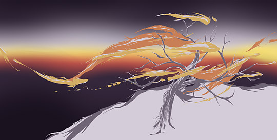
On a new layer above these two, add some light pink strokes that follow the wind pattern.

Now add some more detail with thinner strokes.

We’ll now start to create depth in the grass. First, draw a few thick dark purple lines across the space.
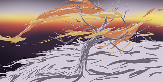
As usual, use an increasingly smaller brush to add details.
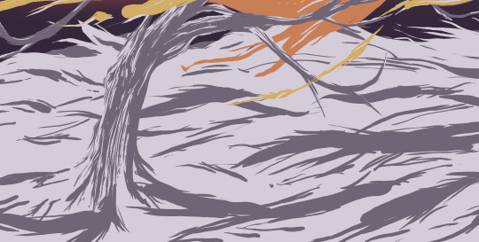
Now make a new layer and add another layer of light pink streams that resemble grass. Make sure that they cover the dark purple areas.

Create a new layer over the tree layers this time. Add very thin dark lines in the same way, but at a much smaller scale.

Make yet another layer, and just as the previous step, paint thin strokes but with light pink this time.

Draw a few distant mountain tips
Create a new blank layer underneath the grassy hill and draw the outline of the two mountains, left of the tree.

Make a layer beneath the mountain outline and draw a purple background for them. Fade out the end by using a soft brush with the same color. That part will later be hidden under fog, so don’t worry about making a very smooth transition, as long as it goes down enough.
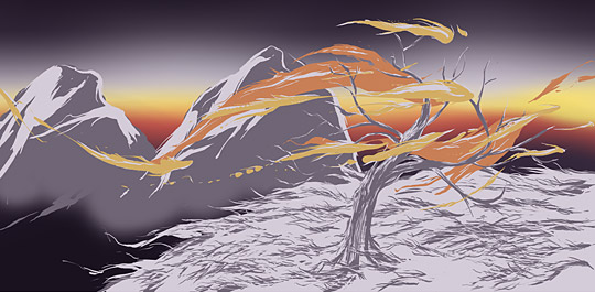
On top of the right mountain, add another tree.

Add two more mountains in the distance. Simply draw all the colors on the same layer and erase the bottom with a soft brush.
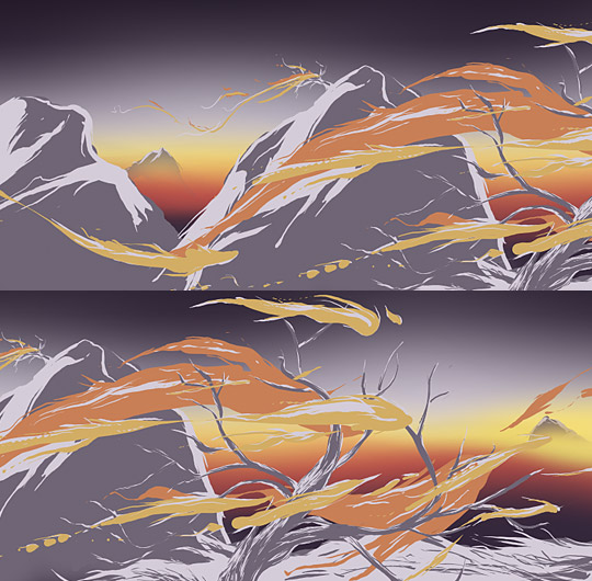
Create some more mist
Now create another new layer on top of the mountain layers and draw a stream of yellow using this shade: d3b766.
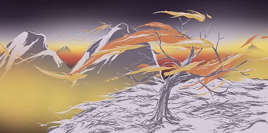
Add a red shade too: d9564b.

And finally, add the really dark purple we used originally to darken the sky.

Download this texture and paste it on top of all the layers. Set its layer’s blending mode to Soft Light.

Go to Layer > New Adjustment Layer > Gradient Map. Use the light pink and purple as colors. This will define the luminosity, though we’ll eliminate the saturation in the next step and add contrast too.
Make it a clipping mask for the paper texture, so that the gradient map only affects the photo and not the whole image.

In the same way, add a Channel Mixer (Layer > New Adjustment Layer > Channel Mixer). Use the Black and White Infrared setting, which is the first option in the drop down menu.

Now we’ll create the worn feel for the illustration by using the bittbox Grungy Watercolor brush set. Select the first brush, and while using the light pink, paint on a new layer on top of all the other layers. Cover almost the entire canvas, and choose the Eraser tool (E). Load the same brush and start to erase main areas, as well as portions that are too bright. We don’t want it to interfere with the design too much; it’s just to age it and to give it a texture.

And finally, slightly adjust the color to a more intense red by adding a Hue and Saturation Adjustment Layer. Change the Hue to -5.

Your new color scheme should look something like the one below. The close up might help you with drawing the tree too.

The Finish Line!
Well that’s it! Our illustration is now finished. While the outcome of such a design completely depends on your own skill, style and, well, patience… always choose to take your inspiration one step further and adapt it to your own style.
What do you think of these techniques? Share your own in the comments. Thanks for reading!

