Blog
Become a Master Typographer: Playing with Your Food (and Other Ways to Get Creative with Type)
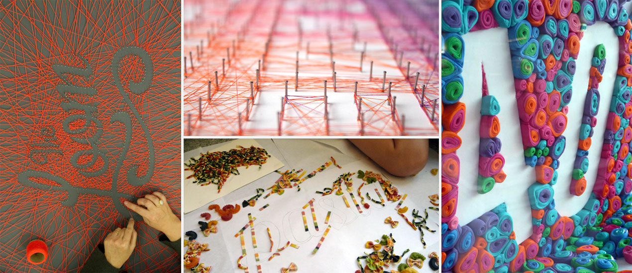
Header art work by Dominique Falla
Become a Master Typographer:
In this, our Become a Master Typographer series, we’ve discussed:
- How to Choose the Perfect Typeface
- 19 Expert Secrets to Creating Custom Lettering
- and Pro Tips – Making and Breaking the Rules
We’ve also shared 100 of our favorite Top Resources for Typography and Hand-Lettering. And today, we’re here for what may possibly be our favorite subject of all (and what we touched on in our Pro Tips post.) Yep, today we’re throwing all caution to the wind, thinking outside of the box and getting down and dirty with type. Just because we can.
Join us.
Think beyond type.
Now that you’re getting comfortable examining and experimenting with type, it’s time to put the pen down and think outside of the box. Today, we’re chatting with some artists who have found success in typography with other, more creative mediums. These amazing designers include tactile typographer Dominique Falla, typographer/letterer Joseph Alessio, and graphic designers Alex Timokhovsky, Michael Mahaffey, Echo Chen and Maria Pisoni. Crafting letters with materials like food and other goodies. Here’s what they recommend:

1. Find your inspiration, Follow through
“Sometimes the inspiration can come from the words and sometimes materials. If I see a new material I haven’t used before, I will often generate a project based around the textures or colours of the material so I can use it for a project. If I’m given words from a client, or a phrase jumps out at me, I will look at how those words can best be expressed through materials.
I always keep a notebook handy and I engage in a regular daily process of stream-of-consciousness writing, and this way I can record ideas as they come to me, or mine my subconscious for ideas if I can’t “think” of anything directly.
In the beginning, I was creating pieces based on personal interest, I would enter competitions and generate work for fun. Now most of my work comes about because a client has a specific project where they need a piece of tactile typography. I did a piece for Google last year where it was all about the branding for their conference. We used the Google colours and their conference tagline “Here’s to the Curious” so that was mostly pre worked out for me, whereas I did some illustrations for a Seattle University Magazine where they provided the word and it was up to me to decide how to best communicate it.” – Dominique Falla, Tactile Typographer
“Concentrate on your word or phrase first. My inspiration often comes from music. Spend a lot of time thinking about this phrase and how could it be realized. Make a lot of sketches, search letterforms. After that comes researching: make drafts, analyze and fix faults. When everything is okay, make a final version.” – Alex Timokhovsky, Graphic Designer

2. Start with the Sketch
“The medium always informs the process, but for me, everything starts with pencil and paper. Small sketches, usually just a couple of inches across—starting tiny helps to solidify the overall composition. For a typical type treatment I’ll stay on paper for a long time, fleshing it out, and sometimes I do 90%+ of the work on paper; other times I do it more quickly on paper and then take it to vector. For a physical piece, though, I make sure to test out the medium—how will the paint interact with this surface? Will this substance maintain its shape after I place it?—and it often takes a few iterations to get it just right!” – – Joseph Alessio, Typographer, Letterer
3. Emphasize Letters, Follow the Rules
“Care about every letter awareness. Materials should emphasize letters. Typography first!” – Alex Timokhovsky

“I’m a strong believer in fundamentals. Sometimes a creative medium is interesting enough that it can distract from a poor understanding or execution of typographic principle, but that’s never ideal. Having the knowledge and skillset to bring quality letterforms into new media is definitely as important; otherwise it’s not doing justice to the message you’re conveying! Sometimes the message might include a vernacular and handmade quality, which offers more flexibility in regards to precision, but that’s never an excuse for poor fundamentals.” – Joseph Alessio
Dominique Falla—Tactile Typographer from Camille Santiago on Vimeo.
“Mostly the “rules” around typography tend to apply to large blocks of text. When I’m laying pages out in InDesign, this is where the balance, weight, proportion, multiple families, visual hierarchy, clarity, leading etc all come to play. Generally my tactile typography pieces are one or a few words so the rules applying to legibility, clarity, balance and kerning all definitely apply, but paragraph styles and layout tend not to. The other thing to bear in mind when creating custom type pieces is that if you’re basing your design on an existing typeface, they have worked out a lot of that for you, but if you are creating custom type first, I would spend a lot of type refining that before you then render it in non-digital ways because you tend to lose legibility when you make type out of cheese for example, so you need to make sure the type is rock solid as a vector or hand drawing before you mess with it any further.” – Dominique Falla

4. Be Legible
“What I think is important, over rules of typography, is the legibility of the final product. As a designer, my job is to communicate for my client in (hopefully) a beautiful, thought provoking way. If you can’t read what I’ve designed, then I haven’t done my job and am doing a disservice to my client.” – Michael Mahaffey, Graphic Designer, Illustrator

5. Communicate Passion
“The crew at Niedlov’s Breadworks has more passion for baking bread than I think most people have for anything. They’re kind of into it. It would have been easy to grab a nice typeface, set it all tight and pretty on top of a sweet bakery photo and be done with the project, but I wanted to show the amount of painstaking work they put into making their bread. That started with hand lettering their tagline “We Love to Knead, We Knead to Love.” After I felt like I was in a good spot with that, I scanned and projected the layout facing downward onto a table and got to work kneading dough. Shaping dough into letterforms is in no way fun, nor easy. I promise. But in the end I felt like I had a beautiful piece that aligned with their brand and voice.” – Michael Mahaffey
6. Understand the unique challenges
“I think taking time to resolve the typography BEFORE you work with unusual materials is really the best advice I can give. If the typography is clean and solid and working well as a vector or clean drawing, then you introduce the materials, you’re less likely to run in to trouble than if you just pull out some materials and start playing. There’s certainly something to be said for experimentation, but I always resolve my letterforms first, especially if it’s for a client. It might be the most creative piece you’ve ever seen, but if you can’t read what it says, the whole project was a waste of time.
In terms of challenges with my work, the main ones are repetitive strain injury and boredom. My techniques, especially my string ones are very time-consuming and tedious. On the larger pieces, my husband helps out so we can talk to each other and share the load. I also work with camera operators on a regular basis so it’s nice to have them to talk to. I sometimes watch movies whilst I work, or listen to music as it can be very boring. This is why I like the onsite installations the best, such as the Google project, because there are always things happening around me and it keeps it interesting. I’ve had some very late nights alone in my studio winding string that can be very depressing, so more installations please! I like people and noise and movement around me.” – Dominique Falla
“I always approach food, paper, and other types of non-traditional typography with an open mind. It’s important to be patient and set aside a good block of time when working with these mediums. Food can be a bit difficult to work with, and it often doesn’t behave in the way you would expect it to.” – Echo Chen, Designer, Painter

“When working with some unusual materials there’s always challenges, for example in the project shown above, I wanted to make sure that every leaf was as big as the others and the same color. As you’re not working digitally, you can’t go back with a simple “ctrl+z”. In my case I first prepared all the leaves and left them there to take the picture the day after. When I came back I found that all the leaves were dry and wrinkled. I had to do everything again. It’s always a challenge working with materials, but when the work is finished the satisfaction is higher.” – Maria Pisoni, Designer
7. Be prepared for massive rewards
I grew up in the wood shop with my dad watching him make things with his hands. The design business generally happens in a “we need this yesterday” fashion, so it’s really gratifying when I can walk away from the computer and work. Making things out of non-traditional materials with my hands is nostalgic and meaningful. I was able to share my passion for typography by communicating Niedlov’s passion for making bread to the world and I think that’s pretty damn awesome. – Michael Mahaffey

8. Push the Limits
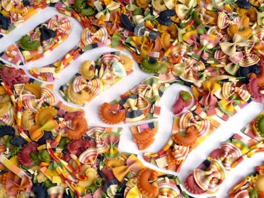
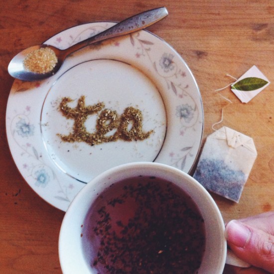
“So far I’ve worked with fresh italian ingredients for my Gusto piece, chocolate powder for Cappuccino, I’ve worked with cake and fondant for a 40th birthday cake, dried pasta, cake decorating gels, tea leaves and pizza ingredients. They all come with their own set of challenges and again, it’s like with anything, the ingredients need to reinforce the message. There’s no point making typography that says something different to what it’s made out of, it just doesn’t make sense, so if you can think of something that hasn’t been done yet, then do it.
I’d recommend experimenting first, food styling is one of the most difficult types of photography because you only have a certain amount of time before some ingredients spoil. You also don’t necessarily need to use the thing you’re talking about to convey the look of the thing. For example, I wanted a really bright sticky look for a piece about Gelato, but real gelato just wouldn’t work, so we used cake decorating gels instead. It gave the look l was after without using the real thing. There’s a saying in styling photography that the camera only sees the last coat of paint, which means, it doesn’t matter what it’s made out of so long as it looks real in the photo. Obviously if you’re making something for eating or installation though, then the thing needs to be real.
You should also be careful when making the real thing that it tastes good and doesn’t poison anyone. I made a typography cake in conjunction with a chef because at the launch, the piece got eaten, so we had to make sure it looked good for two hours then tasted great for two minutes!” – Dominique Falla
“There’s so much possibility out there, and so much fun to be had. Nail down your fundamentals, and then explore! Always stay away from copying—it’s simply being creatively negligent, but it’s also creatively unfulfilling and there are so many possibilities out there that you can find instead. Otherwise, there’s a world of interesting ideas out there!” – Joseph Alessio
– What creative materials do you enjoy working with? What challenges have you faced? Share with us in the comments below! –
More about:
Dominique Falla | Twitter | Dribbble | Facebook | Tumblr
Joseph Alessio | Twitter | Tumblr | Pinterest | Dribbble | Instagram
Alex Timokhovsky | Skilled in Letters Blog | Dribbble | Facebook | Instagram
Michael Mahaffey | Twitter | Dribbble | Vimeo
Maria Pisoni | Flickr
Echo Chen | Instagram