Blog
Vintage Typography Tutorial
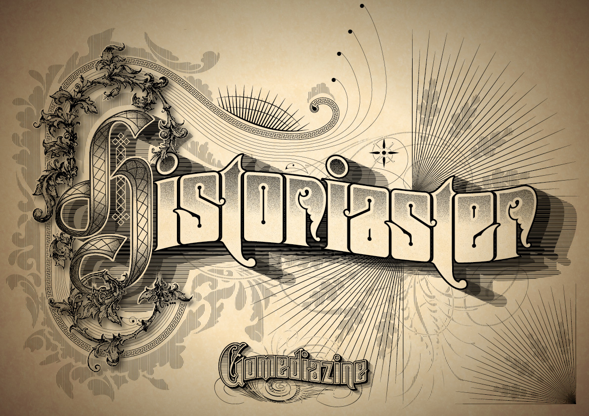
“Historiaster”
To illustrate the word “Historiaster” with the meaning of the word reflected in the design. The meaning of the word Historiater is a petty or contemptible historian, and my idea is to create a petty (yet respectable) attempt to recreate the vintage type treatments.
Research
As the idea is to make a petty remake of a classic styling of a historic lettering, it’s paramount to remain faithful to the styling of the period. The International Association of Mater Penmen, Engrosser and Teachers of Handwriting (or IAMPETH for short) has a collection of scanned rare books on penmanship and engrossing in their online collection that is free to the public.
One book in particular called The New Zanerian Alphabet has fantastic type specimens within it and we shall use a couple specimens from the book as the starting points for this piece.

Sketch
From those two specimen you can create a rough composition in Photoshop by cutting and pasting each letter together to see whether the combination would work.
I sketched out a rough of the composition to resolve the details and tighten everything. There is some legibility issues with the capital H and the lower case t.
A quick preview to the client and she recommended adopting some of the stylistic approach of the Sanborn Insurance Maps for the background. I quite like the look of this particular design for St. Joseph Missouri.


Ok, with references collected, we’re ready to jump on the computer.
Step 1
Open up a New document (⌘+N) on Illustrator and Place (File>Place) the reference image and change that layer setting using the option menu from the layer panel into template. Create another layer and call it “Type Build”, this is where we’ll construct the letters and general storing area for elements that we want to keep but remain hidden.


Open up the ruler bars (⌘+R) and place some guides over the top and bottom of the letters to help us trace the letters.

Step 2
Start with a red rectangle and set the transparency to multiply to trace the letter O and give it a round corners effect through the menu Effect>Stylize>Round Corners and give it a value of 2mm in this case.
*quick tip: You can give similar commands through the Appearance panel Fx option, and you can turn effects on and off here*

Draw a couple of small circles with the Ellipse tool (L) and with the line tool (\) draw a line between the centre of the two circles and set it 1.5 pt, now we roughly have the letter O. Make a copy of this letter by dragging and holding the option+shift key. Expand the line and the rectangle on one of the O’s you’ve just created using the menu Object>Expand and place it over the letter S here and draw a diagonal line using the line tool again to create the letter S and expand these line as well.
*quick tip: set up your keyboard shortcuts so menu commands are just a multi button press away to increase productivity. Expand is a command that I often use so this is assigned a keyboard shortcut*

Step 3
Erase part of the middle line by selecting it and using the Erase tool (shit+E). Tidy up the anchor points between the corresponding diagonal and vertical lines using the direct selection key(A), once you’ve done that select all the white elements and click Unite in the Pathfinder panel then create compound path out of them (⌘+8)
Select both the white and red elements and click minus front on the pathfinder menu to create the basic shape of the S. Copy this across by dragging and holding the option and shift key.

Step 4
Select one of the S’s and give it a rounded corner effect Effect>Stylize>Round corners (or through the Appearance panel) and give it a radius value of 1 mm and click ok. Expand this appearance Object>Expand Appearance.

Select the other S that hasn’t had the effect applied to it and with Erase tool (shift+E) erase its middle section by selecting it, holding option and dragging the selection you want to erase. Once you’re done select both S’s and with the Align menu click Horizontal Align Center to put one shape on top of the other. Select them both and click Unite on the Pathfinder panel.

Step 5
With the Pen tool draw up some accents on the tips of the letter S, the best thing about this is that if you add a rectangle on one side and delete the the accent I’ve just made and unite them using the Pathfinder menu I would get a letter a and e by simply reflecting them using the reflect tool (O).


Step 6
Copy another one of those rectangles with the Rounded Corners effect applied to them and place it over the i and expand it’s appearance Object>Expand Appearance in the menu. Using the direct selection tool (A) select all the points on the right hand side and drag it over to the left. Draw a circle right on top of it and you’ve got the letter i.
Note: I have to say at this point that it’s within the designer’s personal preference to add character to each of their letters. Each letter that we’ve drawn here are starting points, if you wish to alter any elements and can justify it then feel free.

Step 7
My solution to solve the problem of making the letter t legible is to work within the reference and add elements together. In my research folder I also came across another reference that has a solution that I’m quite happy with.

Draw a rectangle that corresponds with the letter i’s stem and copy that over to the letter t. Trace the ascender and descender of the letter using the Pen tool and combine them with the rectangle that we drew just before.

Grab one of the rounded rectangles and copy it across, make sure that they are touching and combine them using the Pathfinder menu. Draw another rectangle above them and click Minus front on the Pathfinder Menu.

Now rotate that shape and combine all of the elements together. I added some extra points to give it a bit of character, once you’re happy combine everything using the Pathfinder Menu.

Step 8
Copy the stem of the letter i over to trace the letter r, with the Pen tool trace the letter.

Copy the resulting shape (⌘+C) and delete a part of it using the Eraser tool (Shift+E), Offset the remainder shape with 0.5mm value.
Select the result and the stem and subtract the shape using the Minus Front button on the Pathfinder menu, Paste in front (⌘+F) the original shape. Use the eraser tool (shift+E) and delete a point, and combine everything using the Pathfinder Unite option.

Step 9
Combine all the letters to create istoriaster in the Artboard in your desired size, set the kerning here and give them a white fill and a black stroke colour (D). Set the align stroke setting on the outside, the corner settings on round, and the stroke 3pt.
Group everything and give it a flag effect Effects>Warp>Flag with the value on -16. Save your file if you haven’t.

Step 10
I wanted to create a more detailed filigree ornament so I printed the reference of the capital H and traced it on an A4 tracing paper with pencil and pens making sure that all the lines joined together. I scanned the sketch at 300 dpi and seeing the result in context I wasn’t too happy with the H because it looked like a lower case h.

Open the drawing in Photoshop and select the white area using the magic wand tool (W) you should be able to select the entire white area all at once. Create a mask layer from the selection, and paint using the the brush tool all the parts that you want to mask with black and in white to reveal.

Click and hold option on the layer mask and create a new colour fill with a grey colour, move the masked sketch layer to the top and set it to multiply. Create another layer and call it shading, option click the fill layer mask and with a soft brush draw the shading using shades of grey and black at 50% opacity.
You should end up with something like this, save the file as a tiff and place it on to your Illustrator file on a new layer called H ornament.

Step 11
Create a new Layer called main H, I used a typeface by Arthur Vanson through Letterhead Fonts called Hindlewood as reference. Create a new calligraphic brush through the Brush the window with the below settings.

Start with loose brush strokes to get the feel of the shape making sure that it fits with Filagree ornament, once you feel confident tidy up the lines or retrace it with a Pen tool as I’ve done here.

Step 12
Select certain points and Copy it (⌘+C) and Paste it in front (⌘+F) and delete the unnecessary points but keep the ones that would flow into the next shape. Reduce the stroke weight on the bottom curls to 0.25 pt to suggest some foreshortening and expand everything Object>Paths>Expand.

After that Simplify the paths to make it manageable through Object>Path>Simplify and tidy up the shapes. Copy the entire Shape (⌘+C), Paste it to Front (⌘+F), Expand Appearance, and Combine it all using the Pathfinder Unite option and give it a black fill. Send it to the back (Shift+⌘+[ ) once you’re done.

Once you’re happy with everything give it the default appearance (D) and change the stroke to .2 pt, give it a custom grey gradient and position it accordingly to suggest the light and shade.

Step 13
With the rectangle tool (M) option click the art board and create a 5x5mm square. Rotate it 90 degrees and copy the shapes using the squares and the line tool create these two patterns. Group them separately to have a long one and a short one. Make copies of these patterns and create an Envelope Mesh (option+⌘+M) with these settings.

Manipulate the Mesh by skewing it using the Free Transform Tool (E), click the middle right handle of the bounding box and then hold both ⌘ and option together. Then use the Direct Selection Tool (A) and the Convert Anchor Point Tool to wrap the patterns around the corresponding individual shapes that make up the capital H.

You can modify the shapes within the Mesh by double clicking it and coming back to the Mesh by clicking the Envelope Mesh Dialog. I made one of the vertical lines thicker in this case to further suggest foreshortening. You can also expand the Mesh altogether (Object>Envelope Distort>Expand) you can then manually adjust the shapes therein.

Once you’re happy with how everything looks, Copy (⌘+C) individual shape that Meshes are wrapped around and Paste it in front (⌘+F) and send it to the front (Shift+⌘+] ). Select the shape above and the Mesh and make a Clipping Mask (⌘+7). Repeat the process to mask all the Meshes and group everything together.


Step 14
Hide the H layer and open up the H ornament layer, Copy (⌘+C) that placed document and Paste it in front (⌘F). Click Live Trace and set it with the following settings, click Expand, convert it to compound path (⌘+8), send the result to the back (Shift+⌘+[ ) and fill it with red. You should be able to see a hint of red as shown below.


Step 15
Open up the H main layer again and extract the black filled H that we sent to the back a couple of steps back and copy it (⌘+C). Lock the H main layer and select the placed tiff file and create a mask layer through the Transparency panel. Double click the blank area on the right of the preview area and your selection should disappear which is what is supposed to happen.
Draw a white rectangle that should cover the image and your image would reappear. Paste to the front (⌘+F) the black filled H that we copied earlier and create a compound path out of it (⌘+8).

Go back to the H ornament layer by clicking on the left preview window on the Transparency panel, select the vector tracing of the filigree and Copy it (⌘+C) to take to the Clipping Mask.
Head back to the clipping mask and Paste to the front (⌘+F) the filigree vector tracing, send the black filled H to the front (Shift+⌘+] ).

Select both the H and the Filigree shape and click Divide on the Pathfinder Panel which will cut the shapes into sections. Ungroup the result and select the sections you wish to reveal by deleting them. After you’re happy with everything change the results the fill to black. You should have the following result where the vine seems like it’s curling through the H, once you’re happy hide the ornament layer.

Step 16
Create another layer called “Drop Shadow” Copy the silhouette of the H and the istoriaster text into this layer using the (⌘+C and ⌘+F) commands so it is placed directly where it is on the other layers and re lock their respective layers. Expand the appearance of the istoriaster and combine everything using the Pathfinder panel’s unite button .

Select the the entire Historiaster text and duplicate it using the Transform dialog (Shift+⌘+M), enter the following values and click copy.

Select both shapes and create a blend (⌘+option+B), with the blend tool (W) hold option and click the blend image to bring up the blend dialog or go through Object>Blend>Blend Options and enter the following. Go to the menu command Object>Blend>Expand then use the Unite command through the Pathfinder panel.


Step 17
Let’s clean up this vector shape as there should be ragged edges. With the Lasso tool (Q) select the unnecessary points and then remove the points with the menu command Object>Path>Remove Anchor Points.

*quick tip: set a keyboard shortcut for the Remove Anchor Points command. I’ve got (⌘+Shift+option+0) on my computer, you can set it to your own preference*

These are the areas that you want to concentrate on, once you’re happy with the result turn on H main layer and the istoriaster layer to see whether you’re happy with the result.

Step 18
Draw two horizontal lines on top of the shape we’ve just created and create a blend (⌘+option+B). Use the blend tool (W) to prompt the Blend dialog box again to select specified amount and enter 250.

Prompt the Move dialog box (⌘+shift+M) and enter the following and click copy. Hover the Blend tool over the result to prompt the Blend Setting Dialog and reduce the amount to 200. Repeat the steps and set the blend amount to 150.


Step 19
Turn on the H main layer again and select the H silhouette shape in the back and give it a white stroke, a 3 pt stroke width, and Align Stroke to the outside.

Turn on the H ornament again to grab the filigree silhouette shape. Keep it selected and drag it to the Drop Shadow Layer on the Layer Panel. Fill it white and add a white stroke with a 2 pt Stroke Width and set the Align Stroke to Outside.

Step 20
Create a new Layer called “Flourish” and draw a rectangle behind the H. Fill the Rectangle in red and give it a Round Corners Effect (Effect>Stylize>Round Corners) give it a 50 mm radius. Keep the rounded rectangle selected, right click>Transform>Scale enter the following values and click copy.


Open up the Brushes Library menu on the Brush Panel by clicking the lower left hand corner and select Borders>Decorative and select the Rectangles 2 brush.

Select the outer rounded rectangle and Expand its appearance, delete right horizontal path and create the following using the Pen tool and draw a circle to create this shape.


Step 21
Select the inner rounded rectangle and prompt the scale dialog box (right click>Transform>scale) to create another rounded rectangle at 94% and click copy. Select both rectangles and create a blend (⌘+option+B) between the two, I’ve put 5 steps on the Blend option dialog. At this point you can manipulate shapes to get the right spacing between them, once you’re happy Expand the appearance so you have the rounded rectangles permanently applied to the shapes. Expand the blend (Object>Blend>Expand) once you’re satisfied with everything.

Expand the outer most rounded rectangle and Expand its appearance. Give it a black stoke and your desired stroke width. Combine the ends using the Pen tool and create the following.
Delete the right horizontal path of the the inner rectangles and create these shapes. Try to correspond with the top shape as uniformly as possible. With the Pen tool and Ellipse tool create these shapes that were referenced from the Sanborn Insurance maps.

Step 22
Create a vertical line using the Linte tool (\) and in the Stroke panel select a width profile 1. Give the line a Zig Zag Effect Effect>Distort & Transform>Zig Zag with the following settings. Draw up this shape using the Spiral tool, Ellipse tool, and the Pen tool. Expand both results and group them together.

Draw a circle below the group and use it as a reference point to rotate 90 degree and copy the drawn objects. Rotate the result another 45 degrees. Create a tear shape by manipulating a circle and rotate it the same way and group everything together and give it a white stroke with the Corner setting set to Round and the Align Stroke setting set to Outside. Place this object on top of the red spiral we just made.

Create accents on the other end of the rounded rectangle shapes as well using the Pen tool, Spiral tool, and the Ellipse tool.

Still in the Flourish layer create a series of objects using the Line tool (\) and the rectangle tool (M), give it a white stroke and group it all together. Place it between the and the Drop shadow layer.


Step 23
Turn on the istoriaster layer and select the text. Open up the Offset Path dialog box Object>Path>Offset Path and enter the following settings. Cut (⌘+X) and Paste in front (⌘+F) the result and create a Compound Path (⌘+8).

Give it a linear Gradient Fill and adjust it accordingly using the Gradient Tool (G). Once you’re happy with the result give it a Grain effect (Effect>Texture>Grain) with the following settings and set the Transparency setting to Multiply.

Give the same effect to the gradient fills on the H main Layer.


Step 24
Go to the Flourish layer and draw a horizontal line and use the rotate tool by holding option clicking the lowest anchor point. Give it a 6 degree value and click copy, repeat this until you get the following and group it together (⌘+G).

Use the rotate tool (R) again and give it a 3 degree rotation and click copy. Use the Scale tool (S) and give it the following value. Select the lowest line using the Direct selection tool and delete it. Group (G) everything together. Compose this flare around the composition.


Step 25
Create a new layer called Background or Bg in my case, draw a couple of vertical lines at 1 pt weight and create a blend between them. Prompt the Blend dialog box using the Blend tool (W) I’ve got 400 at this moment, but I later changed it to 600.
Keep the resulting Blend selected and bring up the Transparency panel to create the Clipping Mask by clicking that empty area again.

Step 26
Access your Brush Library Menu and open up Elegant Curls and Floral Brushes Panel. Drag that flare shaped Scatter brush icon on to the working area, delete the bounding box around it and give it a white fill. It should also have lines within it, select it using your Direct Selection Tool (A) and give it a white stroke.

Select the unnecessary Elements of this shape and place the remainder behind the flares we’ve made earlier.

With the Brushes available from the Brush Libraries we’ve just opened draw around the letters, flourishes, and drop shadows.

Step 27
I use a font called Penman Birds and Ornament by Intellecta Design. I grabbed a couple of selected glyphs Expanded it, Ungroup (⌘+shift+G) and give it a white fill and a black stroke at 4 pt width and Align Stroke Outside.

Compose it around the layer and ended up with something like the following.

Step 28
Grab a copy of one of the flares and rotate it. Create the following shape using the Pen tool to mask the flare. Before Masking it use the Direct Selection Tool (A) to select and copy it (⌘+C).

Select the flare and masking shape to create a mask (⌘+7) paste the path (⌘+V) and give it a width profile 1. Add some more lines for character with the same width profile to get the following result.

Step 29
Create a new layer and call it texture to place a paper image. You can download it here. Set the transparency of the image to Multiply. Create a rectangle on top of the Placed image and give it a circular Gradient fill and set it to multiply to create a soft Vignette.


Step 30
I gave the filigree ornament the same grain effect as the H and the istoriaster offset path. On top of that I added a drop shadow on the filigree, this left to the last minute to keep from having illustrator to render it every time you switch between layers.

I also made a little mark for this fine fine zine. Good luck with it.