Blog
Create a Complete Apparel Tech Pack
So you just spent 10 or more hours creating a crazy t-shirt design and your client has officially signed off…so what now?
You may have created stellar photo-realistic mockups and used tons of really cool colors- but none of this means ANYTHING if your screen printer can’t clearly interpret your vision!
I find that many of my clients have had bad experiences with low-budget designers in the past who have been able to create great art, but don’t know the first thing about how to put it on apparel. This can end up costing the client a lot of time, stress, and additional set-up fees at the printer. Over the years, I’ve found that a client truly appreciates the fact that my designs come ready to hand-over to the screen printer that very same day – with no questions asked.
The best rule of thumb when preparing files? Leave nothing to chance and pretend that your screen printer is about 6 years old. (As you establish a working relationship, you may be able to edit out some of these steps once your screen printer knows your file ‘style’. Remember that, like designers, every printer is different!)
This tutorial will set out to give you step-by-step instructions for ensuring that your files are properly set up and ready to go to print! (AKA: Creating a ‘Tech Pack’) Hold on, ‘cuz it’s long, but once you get it down, your clients and printers will love you!
This Tutorial will Cover:
- File Preparation for Apparel
- Creating A Full-Size Blank Shirt Template
- Setting Up Your Tech Pack Template
- Completing Technical Callouts
- Full-Size Screen Separations
- Double Checking Your Work
Equipment needed:
- Adobe Illustrator
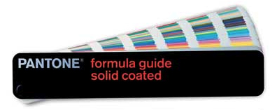
- Pantone solid coated booklet (or use Adobe Illustrator’s included PMS swatch set and take your chances)
- Any linked files or fonts
- Any additional artwork (neck labels, custom rivet art, pattern swatches, etc)
- An actual blank apparel body that your client wants to use, or a clear photo and accurate measurements (shoulder-seam to shoulder-seam and top to bottom)
- Digital camera
- Ruler
Step one: File Preparation
For this particular tutorial, I have decided to use a t-shirt design for one of my more recent clients- the Nastia Gold line by Olympic gold-medal gymnast Nastia Liukin for Vanilla Star Jeans. Though a little girly and basic for Go Media style, it works well for the purposes of this tutorial.

We are already assuming your shirt has been broken down into halftones, bitmap files, etc and brought into Illustrator.
The first thing that I like to do is to change my document size to be about the size of a real-life t-shirt. In this case, for a standard girls’ tee, I know that I need a document approximately 24″x 30″ in order to leave plenty of room for call-outs, headers, and all the other things we will go into later.

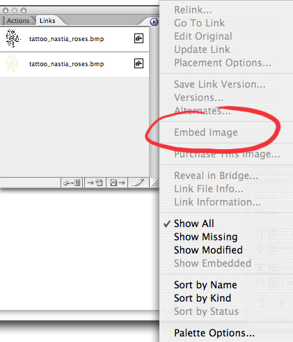
Before diving in, I go to my ‘Links’ menu and highlight all of my links, which makes sure that no layers are locked. Click the arrow at the top right, and select ‘Embed Image’.
If I had used any special fonts (mine happen to be hand-lettered), this would also be the time to make sure that you select them, go to the ‘Type’ menu and click ‘Create Outlines’. This ensures that your printer won’t be calling you looking for attached files or fonts later.

Next, in a separate file, I like to create an accurate template of the blank t-shirt or hoodie I will be using to gauge correct size and placement. This way, I don’t have to waste time trying to print out my artwork and re-sizing it until I get it just right. Instead, I take a clear photo of the blank garment that my client wants to use, or ask them to send me one. Keep in mind that you generally want to use a middle-of-the road size shirt (Medium is good), as your art has to fit on both a size S and XL.
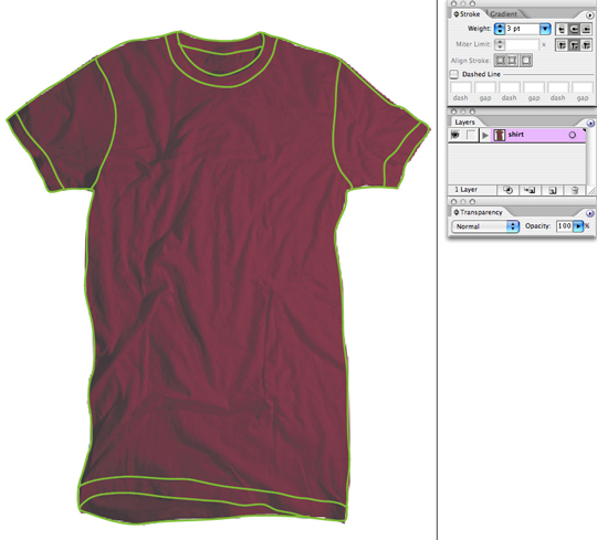
For this particular client, they didn’t have a blank supplier picked out yet, so I used an existing template that I had already traced from a photo. Simply drop your garment photo into Illustrator, set the image transparency to about 75%, and using your pencil tool, trace around your blank garment. (It doesn’t have to be super accurate, as different shirts will have different wrinkles and curves)
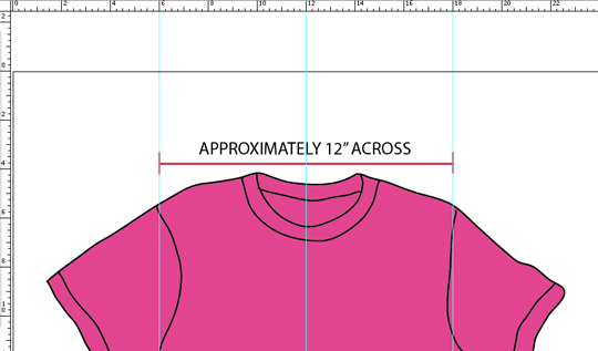
Once you have traced your shirt and created an accurate template, enlarge it to real-life size using a few key measurements. Measure the distance from the top of one shoulder seam to the other. You may also want to measure the distance from the top of the shirt (top of shoulder) to the bottom (hem). For this garment, my shoulder-to-shoulder distance is approx. 12″ as this is a juniors tee. I make sure that my “Rulers” are turned on, then size my template accordingly.
Save this file for future use as a shirt template, or click below to download the one that we have provided for you! Now you are really ready to begin!
Keep this template on it’s own layer called “Shirt” and lock it. Now in your layers palette, create another layer called “Art”. This is the layer that you will be playing in- doing all of your masking and sizing. Also create a third layer and call it “Details”- we will get into this layer last.
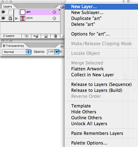
From here, copy and paste your original art into your “Art” layer. Begin playing with placement, seeing which parts of the design may run off the edges, how they might align to the collar or seams, etc.

Once you find a placement that you are happy with, unlock your “Shirt” layer, and using your white arrow, select only the main body area (not the lines representing seams) and copy and paste it into your “Art” layer. You can now use this as a clipping mask to make your art look like it is bleeding off of the edges. The main body area of the shirt should appear to cover the art in your “Art” layer. Under your “Layers” palette, click the little circle to the right of the layer named “Art”. This will select everything in your “Art” layer. Then simply hit COMMAND+7 or Object>Clipping Mask>Make to mask out your art.

Step two:SETTING UP YOUR TECH PACK TEMPLATE
Now that you have your art where you want it, lock both your “SHIRT” layer and “ART” layer. From here on out, we will be working only in our “DETAILS” layer until we do color separations. I like to start setting up my tech pack by copying and pasting my client’s logo into the top left corner of the document. I then align my type to the left and right underneath the logo I type in all caps:
SHIRT PRINTER
SHIRT BRAND
SHIRT COLOR
SCREENPRINT COLORS
Next, I align my type to the top right and type in all caps:
NAME
JOB #

From here, fill in any and all information that you know.
Your printer is the name of the client’s chosen screen printer (if you know it).
Your shirt brand would be, for example, American Apparel.
Color is self explanatory. Name is the name of that particular design.
Job # will most likely be given to you by your client, if they have one.
Once you get to screenprint colors, you will want to grab your trusty Pantone Solid Coated book to accurately choose your colors. In my experience, this is the book that most printers use to accurately show inks. There are also separate Pantone books just for metallics, neons, etc, but we will stick with the basic book for now.
After selecting my colors, I create little boxes with my rectangle tool to act as little swatches for each color. Next to each swatch, I list the name of the color- for example, my first color is PMS (Pantone Matching System) 7499 C (Coated).
TIP: if you use the Pantone swatches that Illustrator provides, they will look very different on the screen than in an actual Pantone book. Always go off of the book, and try to make the ones on your screen look like the book, instead of the other way around.
Also note that even though I can see that PMS 871 C is a metallic gold in my Pantone book, I made sure to note that I wanted it to be metallic foil, not just metallic ink. The more information you can provide, the better.

STEP THREE:COMPLETING TECHNICAL CALLOUTS
Now we want to really get into calling out any special art placements, special treatments, etc. I begin by calling out that it is OK for the PMS 7449 C color art to run off the sides. I show this by drawing a clean line using my line segment tool, and writing exactly that.
“PMS 7499 C ART CAN RUN OFF EDGES”

Next I want to point out that it is OK if the art runs off the collar and prints on the inside back of the t-shirt, since I know we will have a neck label sewn in over the top. So again, I call that out:
“INK RUNS OFF COLLAR. OK IF INK GETS INSIDE OF SHIRT.”
I also decide that I would like my art, for the most part, to appear centered. This is up to the eye of the printer, but lets him know that I will be looking for that. So I add that in:
“ART CENTERED”.
Hopefully, by this point you are starting to get the picture. The more info that you can provide your printer, the better. I also always like to provide at least one measured point of reference – in this case, I would like the top of the black screen (the top of the rose) to be approx. 2″ from the base of the collar. So again, I draw a line pointing to that place and write:
“BLACK SCREEN BEGINS APPROX. 2″ FROM BASE OF COLLAR”.

Finally, I know that my client has custom neck labels that they would like sewn into the neck of these t-shirts. So I copy and paste the neck label art, placing it in a red rectangular box so that there is no confusion about which label goes with which shirt. (You’d be surprised). If there is an associated ID# for that particular label, go ahead and include it. If your client wants to screen print neck labels, go ahead and include that art too, just in case. Or, at the very least, make mention of the fact that it needs to be there.

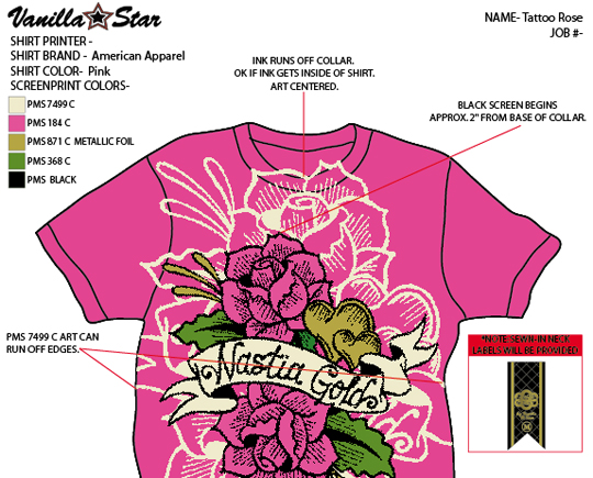
Don’t forget to include any other custom treatments such as: contrast stitching, various garment treatments and washes, rivet or rhinestone embellishments, embroidery, etc.
STEP FOUR: FULL-SIZE COLOR SEPARATIONS
Hang on guys, you are almost there! While many printers are smart and able to figure out how to ‘unmask’ your “Art” layer to make separations, many aren’t. To eliminate any confusion, I like to provide color separations at the bottom, off of the art board, but on my “Art” layer. Lock your “Details” layer, and unlock your “Art” layer. Select everything in that layer and copy it. Now paste that art directly below the art board and unmask it (ALT+COMMAND+7) Delete your mask, leaving just the art.
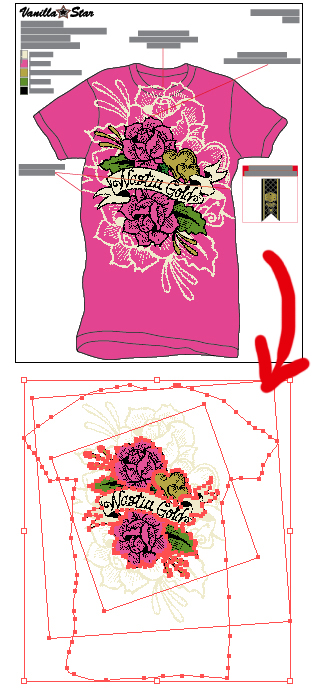
This next part gets a little tricky, so pay attention! Depending on how many colors your art has, this will determine the number of separations that you need to make.
My particular file has 5 colors, so I need to make separations for 5 separate screens. The way that I approach this (and others may do it differently) is to copy and paste the art that we just unmasked 4 more times in a row. I then write each Pantone color’s name above each separation, like this:

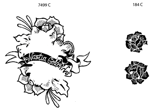
Now – PAY ATTENTION – depending on what color you are separating (my first color is 7499 C)- wherever that color is shown in the art, it needs to be made BLACK. Every other color in the art needs to be made WHITE (so that it won’t show up).

As you click on each piece of the art, turn it the appropriate color and then LOCK IT! This should leave only the areas that are 7499 C showing!
NOTE: This will mess with your brain, since you are used to thinking in terms of colors, not translating those colors into black-and-white. But I promise, it gets easier.
Proceed to do this for every color, leaving only the areas that are that specific color showing. IE: If you are on the ‘green’ screen, then all areas that are ‘green’ should be black when you are done with separating that screen. When you get through every color, you will have screen print separations!

STEP FIVE: DOUBLE CHECK YOUR WORK!
Double check everything, send a JPG to your client for final approval with all of the callouts shown (in case the client has any revisions), and off to the printer it goes! Send a copy of the final AI file to the client, and kick back until the samples roll in! Whew, you made it!
Conclusion
As a full-time art director for the new skate apparel line Self-Destruct (www.teamselfdestruct.com), as well as full-time freelance designer for my own firm (www.marenkellydesign.com) I know the ‘tech-pack’ can seem like a lot of extra work that you may not think you have time for. But once you get the process down, it really shouldn’t take you longer than 30 minutes, and it acts as a major selling point to your clients. In my experience, it even helps to justify a slightly higher, flat-rate per design, since the client knows they are getting quality, print-ready art!
Thanks to these easy-to-understand files, I have also gotten a lot of work over the years from screen printer referrals. Remember- everyone loves someone who makes their job a little easier, and it will payoff in the end!