Blog
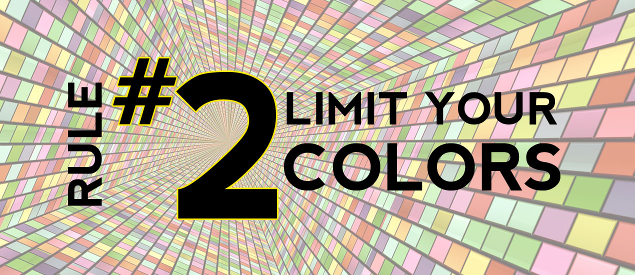
Become a Master Designer: Rule Two: Limit Your Colors
Rule Two: Limit your colors.
Part Two of Seven Easy Principles to Becoming a Master Designer courtesy of Cleveland logo designers, Go Media
Rule Two: Limit Your Colors. Sounds a lot like the last rule of limiting your fonts right? Exactly! We want to limit our colors for the same reason we want to limit our fonts. Reducing the number of colors we use in our design will make the piece feel consistent. Basically, everything will look like it goes together. Just like a sports team’s uniform or a company’s branding – we want a uniform over-all look to the colors.
As with the font selection, limiting the number of your colors is just a guide not a rule. You could very well have a rainbow of colors in your design and it will look great. But you need to start with a coloring strategy and stick with it. Use your color consistently throughout your design.
For starters lets talk about color values. A color’s value is how bright or dark the color is. A yellow for instance is fairly bright. A purple is fairly dark. Of course, a color can have a range of values. Purple for instance is a color that most of us think of as relatively dark, but you can also have a very light purple. Here is an example of some colors and their relative value. Then next to that you can see a range of values for one color.

So here is one rule I use when picking my color scheme: make sure you have a range of values in your color scheme. In any design you’re going to need some light colors and some dark colors to produce contrast. If for instance, the background of your design is dark, you’ll need a light color so that the copy can be easily read. Or conversely, if you have a bright background you’ll need a dark color for your art or text or whatever.
I will also typically only pick 2-5 colors to make up my color schemes. Reduce the number of options and you’ll typically have good results in the design. Here is a sample of a color scheme I put together. As you’ll see I picked One dark color, one middle-valued color and one bright color. Just to the right, I also set up a value range for each of these colors. It’s this collection of colors that I will use on my project as my palette. Once I have this color palette set up I will try my best to only use these color.

Ok, so now that we’ve addressed some technical color picking issues like how many colors to pick and what values they should be; what’s next? I’ll tell you what’s next, the hardest part; deciding what those 2-5 colors should be! I personally find this to be a somewhat difficult task at times. Here is a list of techniques I’ll use to help me pick my color schemes:
☛ Stick to a temperature range. As in… pick all warm colors or pick all cool colors. Warm colors are reds, oranges, yellows, browns, etc. Cool colors are blues and purples. I consider greens to be fairly neutral. If you pick all of your colors in one temperature range, they will probably go together fairly well.
☛ Use a website like www.colourlovers.com for inspiration. This wonderful site is all about picking color schemes. You can just click through page after page of color schemes.
☛ Keep an eye out. There are color schemes all around you. Look at packaging in the grocery store, look at the paint colors in your local Starbucks, look at Mother Nature! If you see something with a pleasing set of colors, just take a mental note and see if you can replicate it on your computer.
☛ Pay attention to pre-existing company colors. Frequently I am playing off of some pre-existing brand colors. I’ll look at their logo, color scheme and use that as my starting point. Then maybe just add a color or two.
Here are a finished design that I’ve done which show fairly restricted color schemes.
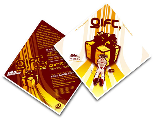
As you can see, the tight color scheme and limiting my fonts really pulls everything together.
I know these lessons are the basics… …but these remain cornerstones of design. So, it never hurts for a little refresher. 5 more rules to come. I promise the next 5 are a bit more interesting. Thanks for your time!