Blog

WMC Fest 6 Poster Design Process: An Inside Look
I had the honor of designing the poster for this year’s Weapons of Mass Creation Fest. For those who do not know, I am a recent addition to the Cleveland Graphic firm, Go Media and WMC Team, and when I started in February, I thought I would be working alongside the other designers in creating the promotional material for WMC. Nope. Instead: “It’s all you. We’re excited to see what you come up with.” Entrusting me with such important work had me both fired up and terrified. With the event poster being one of the first things needed done, I hit the ground running. One thought continuously played in my head: This poster needs to kick some serious ass.
Like with any design problem, starting with research is a good idea. I dug up the past WMC Fest promotional material, taking notes on aesthetic similarities and differences with each year. I also needed to understand the overall “feel” of the event, so I decided to chat with Chris, Aaron and Carly to receive some insight. The three of them wonderfully shared their past experiences at WMC, what it meant to them, as well as their opinions on this year’s event and the new changes it’s undergoing.
(Please excuse random doodles.)
With Jeff Finley stepping down, Heather Sakai stepping up, and a new venue ready to go, this year’s fest is bound to be a little different. With this in mind, I wanted to create a design that heralded the debut of Weapons of Mass Creation Fest Six. Yes, we are stepping up our game with a more sophisticated location. And yes, we are aiming to make WMC Fest more dynamic and inclusive by featuring creatives who are not necessarily just designers or illustrators. But above all, it is our every intention to preserve the tradition of being that grassroots-originated, premier art and design conference, focusing on community, encouraging others and defying the hand that is dealt.
I now had a more defined problem: What can I create that announces this year’s exciting changes, yet stays true to the WMC’s punk rock beginnings and foundational principles of inspiring and enabling the creative mind?
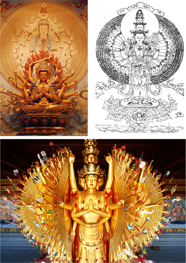
Because WMC Fest has a strong history of featuring illustration, I wanted the poster to pay tribute to that tradition by having it be detailed and illustrative, a piece that the viewer could spend time with. After perusing the internet, searching for inspiration from gig posters (which illustration has a heavy presence in) and anything related to design conferences, I arrived to the idea of using the image of Buddha.
More specifically the Thousand-Armed Buddha. According to Buddhist texts, this deity embodies the compassion of all Buddhas, having a crazy amount of arms to reach out to all sentient beings whom are in need of aid. From this I liked the imagery of multiple hands holding art tools, representing immense creative power. Also, the themes of compassion and helping others are parallel with WMC Fest’s philosophies of being a force of inspiration, support and encouragement.
Alright, cool, now I have a concept to work from. However, I did not want to lazily replicate (and bastardize) such a sacred figure by just depicting Buddha holding some paint brushes and pencils. I instead wanted to take that idea and expand upon it, resulting in a poster that is original and true to the WMC spirit. So I began to think about the term “Weapon of Mass Creation” and what it meant to me. For many of you who don’t know me or have not seen my work, galvanizing encouragement and invincible optimism have been major themes of my art. I am in love with the archetype of the “small” conquering the overwhelmingly “big.” (This concept was translated into large paintings I created in 2013 – The Power of Smallness.) I believe that being a Weapon of Mass Creation, specifically the concept of defying the hand that is dealt, very much relates to the universal experience of feeling inadequate, yet growing, pushing through, and achieving all that is enormous. Great! Another piece was added to the puzzle: the depiction of the seemingly small artist releasing the magnificently colossal creative drive that is within. So what would that look like?
An astral-projected, cosmic, robot Buddha (boy, that’s a mouthful). Of course.
(Robot reference photos)
Yes, a cosmic robot Buddha. But why the portrayal as a robot? There are several reasons, however the most honest one is that I freakin’ love robots. They’re super rad. But a more justifiable reason is that I wanted it to reference the computer and technology, which have had revolutionizing roles in art and design. The robot subject also works quite well for an illustrative poster – lots of lines detailing its mechanized form. Lastly, the notion of robots has strong ties with childhood (especially in the ‘80s and ‘90s) and the youthful imagination. They are the tools in taking on huge challenges – “I’ll just get into my super powerful, giant robot to fight the bad guy.” Perhaps we lose some of that wide-eyed, wonder-filled, childlike drive when we get older. But that does not mean it is completely gone.
So get ready to revive that drive and celebrate imagination at this year’s Weapons of Mass Creation Fest!
Continue reading “Creating the WMC Fest 6 Poster” tomorrow to see the steps of how this year’s event poster was created.


