Blog

How to Master the Art of Visual Web Design
The Aesthetics of Visual Web Design
Gone are the days when websites were just for information. Yes, the “content” aspect still rules but the modern genre also counts in the “style” quotient today and this is where visual web design comes in. As the name suggests, visual web design stresses on the visual appeal of a site, banking on the aesthetics part. The competition is sky high on the virtual world – your competitor sites too carry valuable content like that of yours but here only the most eye-grabbing would be able to capture the traffic.
Human eye is naturally drawn to anything aesthetically pleasing and a visually appealing website is your first step to compel your traffic to click on your link- over a sea of other websites. Visual web design focuses on strategic implementation and arrangement of fonts, color, content, images and other related elements that will altogether result in a pulling design. The article below focuses on best tips to master the art of visual web design.
Learn the Gestalt philosophy
One of the primary tasks of visual web design is to ensure that all the elements of your site are easier to find, understand and work on. The Gestalt philosophy is a vital point here which speaks of the best strategic way to group the elements in tune with our typical psychology. According to this age-old principle, you must group the related elements together so that your audience can easily grasp their relation and functions, even when they have not used your site before. One can take the example of Facebook here, where you have the “Like”, “Comment” and “Share” button side by side. This way, even a newbie on Facebook, would intuitively make out that these 3 elements are somehow related – which in turn, would make his/her experience with Facebook easier.

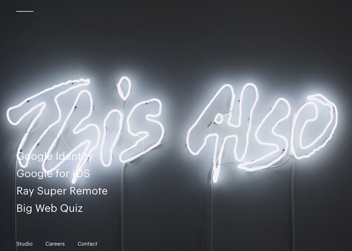
White space is important
If you want something on your website to stand out, bank on white space. Also known as negative space, the more you use it around your element, the better it would attract attention. Going by the contemporary flat and minimalist web design trends, adequate usage of white space makes your important elements visually distinguishable. However, do not go excessively large with white space as it will ruin out the desired effect. Besides, effective deployment of white space reduces clutter from your site and renders a subtle elegance that heightens the “appeal” quotient of your site by a great extent.

Know the color principles
Color plays a dominant role in human psychology and how you use colors on your web design would influence how your visitors would perceive your site. Certain colors invoke certain emotions and hence you have to ensure the right color scheme matching up with the theme of the website. So, you have to learn the connection between colors and the feel they bring out. For example, fashion sites would need funky shades like neon or fuchsia while green or navy blue would be more suitable for corporate websites. On the other hand, red, orange and golden would duly complement a restaurant website. As per the Visual Design Trends 2016, bright colors are reigning over muted shades. It beautifully complements another latest trend of minimalist design – where a vibrant pop of color would be enough to make the site stand out without being too elaborate. The stress is more on a duotone color scheme featuring 2 contrasting colors or two different shades of same color. If you are using duotone approach, maintain one shade as primary color that would bear the main essence of the website while the other shade would act as the secondary backup.
Understand typography
Much like color, the typography or font used also provokes certain emotions naturally. As a master visual web designer, you have to understand the impact of certain typography on the human mind so that you can assure the appropriate usage of font styles, in rhyme with the overall theme or essence of your website or business. For example, a retro font is great when you are designing a site for an esteemed business backed by rich heritage while a hand lettered font would be more appropriate for a site catering to teens and youth. However, whichever font you use, make sure it’s well legible. If you wish to demand more attention for a certain something- say a breakthrough trend on the website, you can use a font with all caps.
Rich animations
Motion has always been visually stimulating for the human eye and mind and hence is a great addition to modern websites looking for immersive experience. Unlike the static layout, an animated surface dons an interesting outlook with things popping, crawling, sliding and so on- that in turn keeps the gaze fixed and engaged on the website for a long time.
Finally, do not miss out on the responsive quotient of the website. The virtual world is getting steadily mobile today with 70% of online users taking to small screened devices for web browsing. Thus, a part of the visual appeal of the website will greatly depend on how it appears on the small-screened devices.