Blog

Become a Master Typographer: Pro Tips – Making and Breaking the Rules
As with life, rules in both the lands of lettering and typography are made for a reason.
In many cases, it’s best to stick to the books. However, in other cases, it’s quite alright to bend (and even break) the rules.
Illustrator and Hand Letterer Darren Booth points out that following rules too stringently can negatively affecting lettering work. He says, “I fear (rules) negatively affect my hand-lettering work. I typically approach my hand-lettering like a standard drawing – with shapes and forms, and I keep going until it feels right.”
Pro Tips
We asked some of our favorite hand-letterers, calligraphers and typographers which rules they love to follow and those they love to break. Read on for their pro tips and leave your recommendations in the comments below!

Do Mind Hierarchy
In any project using typography there will always be a hierarchy. Hierarchy is so important because it can completely change the context or readability of a piece if the wrong word or words are emphasized. I always look for ways to create a more visually interesting piece or try to communicate a message by using hierarchy, but you have to be careful that you are not sacrificing any readability or else your message can be lost or completely misunderstood. – Jeremy Teff, Designer, BLKBOXLabs

Experiment
I have more of an illustrator’s approach than a graphic designer’s approach to lettering. My words form a picture to me and I tend to go by eye rather than follow rules of kerning, etc.! I say, start loose and experimental – play with brushes and materials, make a mess before you hit the computer – there is time to tighten things up further down the line. – Kate Forrester, Freelance Illustrator & Calligrapher

Work towards Harmony
When customizing type, be aware of each letter and its neighboring letters. Making a few small adjustments to one letter can potentially disrupt the flow and balance of the word as a whole. The goal is for all the letters in the word(s) to work together in harmony. – Bryan Patrick Todd, Graphic Designer

Think: Less is More
The idea of “less is more” works on numerous levels, but it’s a rule I love breaking as often as possible. It’s wise for logos and branding, it’s ideal for effective speeches and slogans, and it’s necessity in many ways to product design – a specialized product that does less is almost always better than something that “does it all”. With all of that considered, less is not always more. When I’m commissioned for a label design or a t-shirt design, I absolutely love it when a client says to go crazy with it and make it as detail intensive, intricate and ornamental as possible. I’ve heard plenty of quotes that say good design should be virtually invisible and that things should be reduced to their most basic purpose and function which is fine most of the time. However, I also believe that design can and should be beautiful, toiled-over, and something that makes someone stop in their tracks when they see it. – Jason Carne, Freelance Designer

Keep it in the Family
I would say: If you’re not confident yet in your ability to judge a high-quality typeface from a bad one, check to see if it’s part of a type family that includes other weights or styles (Think bold, italic, light, etc.). Typefaces that have a family to back them up are not only more flexible for your projects, but they also tend to be better designed, so you’re less likely to look back at your choice and cringe in a couple years when your eye for type has improved. – Alison Rowan, Graphic Designer
Understand the difference between calligraphy, lettering and typography.
Calligraphy is the written letter, lettering the drawn letter and typography the arrangement of typefaces. Our written language has its basis in writing and different tools create different styles of letterforms, for example a chisel tip for blackletter, a brush for brush script and a pointed pen for copperplate. If you are interested in getting to know typography then the best place to start is with calligraphy, to establish what authentic forms look like and from there you can experiment with lettering and gain a greater appreciation of which style of typeface to use in a given context. – Ged Palmer, Graphic Designer

Begin with a Sketch
I always begin with a quick sketch on paper. No matter what the the project is, I find that this is the best way to establish whether an idea or composition works. – David McLeod, Graphic Designer

The one rule I always follow is to sketch and draw the idea always. Every visual in your mind translates into a drawing. And the one I often break is not sticking to the original drawing. The mind keeps getting ideas constantly and more often than not the final outcome is quite different from what was originally in mind. – Sabeena Karnik, Graphic Designer, Illustrator, Typographer
Make it Visible
At school I remember a teacher once telling me that the best typography is that which is invisible. Maybe this might makes sense when it comes to way-finding labeling perhaps and conveying sterile information. But on the other hand, when it comes to communicating a concept or an ideas with layers of complexity through type, its treatment can enhance the communication of a particular emotion or tone which to do effectively in many cases requires that the typography be anything but invisible. – Luke Lucas, Graphic Designer, Typographer
Keep it Loose
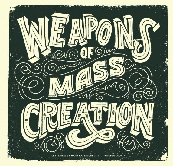
Over the years, with practice and research I’ve learned some basic rules that help with readability or where a letter’s thick variations should be, but I prefer to let the concept or composition drive the letters. Concentrating on rules to follow could make my work feel contrived. My one important rule to follow when it comes to lettering is to keep it loose and build a piece up more like a painting than creating perfect letters that spell something out. – Mary Kate McDevitt, Hand Letterer and Illustrator
Don’t Get Lost in the Details
Try not to get so lost in the details that the lettering becomes hard or impossible to read. Believe me, it happens sometimes. It sounds silly, but zooming out periodically to see how the details are affecting the piece helps keep perspective. – Bryan Patrick Todd, Graphic Designer

Don’t Stretch or Squeeze
Never, and I mean never stretch or squeeze type. Type designers by nature are super obsessive down to the smallest detail while remaining “big picture” thinkers. If type has certain proportions, it was made that way for a reason, even if it’s not readily apparent to you. Think of it this way – to everyone with a good understanding of type and how it should look, your stretched type looks about as good as a stretched out collar on a shirt. If a typeface isn’t working how you think it should for a certain application, either research more typefaces and find one more suitable to your needs or go the extra mile and create something custom for the job at hand. – Jason Carne, Freelance Graphic Designer

Consider cultural and historical meaning
Comic sans on a gravestone would look a little strange, no? Style of letterform carry a lot of meaning and these meanings are normally associated with the cultural and historical roots of where they came about. That said the 26 letters from the roman alphabet have gone largely unchanged in 2000 years. So by breaking down the essential nature of the forms and then experimenting with subtle changes you can adapt these ‘abstract forms’ to communicate an intended message. – Ged Palmer, Graphic Designer

Push the Legibility Rule
Given the opportunity I like to push legibility. As long as the message can still be read, I’ll manipulate character forms or break words over multiple lines if it will add to the image. – David McLeod, Graphic Designer
So. What rules do you live by? What ones do you love to break? Share with us in the comments below!
Learn more about our contributors:
BLK BOX Labs | Dribbble | Behance | Instagram | Twitter | Facebook | Vimeo
Kate Forrester | Twitter
Bryan Patrick Todd | Twitter | Instagram | Behance | Pinterest | Dribbble
Jason Carne | Behance | Instagram | Dribbble | Facebook | Twitter | Lettering Library
Alison Rowan | Twitter | Facebook
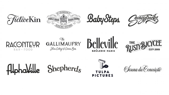
Ged Palmer | Twitter | Instagram | Tumblr | Dribbble | Behance
David McLeod| Behance | Instagram | Facebook
Sabeena Karnik Behance | Twitter | Facebook | Instagram
Luke Lucas | Behance | Twitter | Instagram
Mary Kate McDevitt | Twitter | Instagram | Pinterest | Tumblr | Dribbble
Darren Booth | Twitter | Instagram | Pinterest | Dribbble
All cover image photos courtesy of Ged Palmer