Blog

Illustration Tutorial: “The Man Who Knew It All” Technical Process & Design Philosophy
The Man Who Knew It All Illustration Tutorial
Today’s killer tutorial comes to us from Weapons of Mass Creation Fest 5 Designer Daniel Nyari. You’re sure to appreciate his thoughtful process. Enjoy! – Heather, Go Media’s Zine editor
Introduction
Today I’m going to be sharing the process I usually go through in creating my illustrations. Not the conceptual process but mostly the technical process. For this tutorial I will be working on a recent illustration for a book on the subject of “The Man Who Knew It All”. I was given this brief and told I have carte blanche to do whatever I wanted. I thought this would be a neat chance to play around with the process itself and use that as the subject matter. In short, peeling back the creative process as the concept of knowledge.
Before I begin, I would briefly like to talk about my general design philosophy so you can get a sense of why I make the decisions I do in the creative process. Firstly it’s largely based on my neurosis-inspired appreciation for logo design and its systematization of form with an emphasis on equal importance on every element, big or small. Secondly, my continuing fascination with innovation in digital technology and rise of the web as a new visual language, and the idea of its amalgamation with traditional illustration.
I like to give myself limitations in which to create and this is more of a personal choice as I’ve always been more successful in generating ideas when I feel like I am up against the wall or in this case am limited graphically.
- Follow the rule of eighths and create everything from it. (more below)
- Reduce elements to their essence. Only show what you need to show.
- Only use flat shapes.
- Never use gradients.
- Create depth from contrast of hues and colors only.
Rule of Eights
This is the root of my approach. It holds everything in place. Without it everything else would crumble. It’s based on the idea that every general shape can be created from the circle. We can naturally split it into infinite angles but because I like to limit myself and reduce elements to their essence, I settled on a convenient enough number of eight and ended up calling this my Rule of Eights. It’s very straight-forward. I take a circle and first divide it into quarters, then simply rotate it 45 degrees so we have broken the circle up into eight parts of equal size. Its angles will determine the foundation for every shape created.
Sketch to Digital

I create almost everything in Adobe Illustrator so I begin by opening up a new document, choosing a tabloid size and making sure it’s set to CMYK color mode because it will be used for print. I create a basic circle with outline mode on from the toolbar and start dividing it in eights. Using the scissor tool I cut along the intersections so we get the three basic shape generators; the ⅛ circle, the ¼, and the ½ or half circle. I make sure to leave these next to my art board and have them handy as I digitize my sketch.


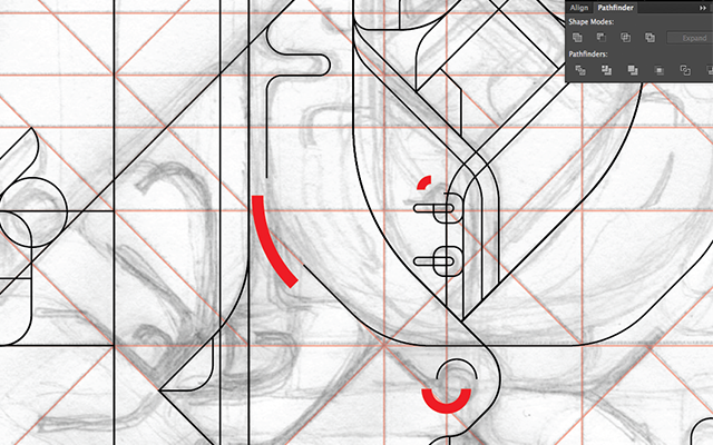
Next up, I import my sketch. For this project I created my composition based on Andrew Loomis’ informal subdivisions which allow you to break up the page in order to more creatively imagine an interesting composition that doesn’t feel repetitive. This is purely a conceptual endeavor and won’t automatically give you a great composition. You still have to envision the image and play around with it until you see a composition that works for you. I recommend trying multiple compositions and don’t be afraid to fail. I slightly tweaked this guideline in order to accommodate my rule of eights. In red, I laid out the structure of the informal subdivisions grid that will help me lay down the digital inks.

I begin digitizing by applying the aforementioned rule of eights shapes along the pencil lines using the red grid as a relative guide. This can look a bit cluttered and took me a while to get used to but it works for me. I lay down strokes instead of shapes to avoid any further visual clutter. In the image I highlighted the individual shapes in bold red to show how they will be placed. I repeat this process until I am done laying out the outlined part of the illustration using the pathfinder tool along the way to cut, trim, subtract, add, and merge various shapes to get as close as possible to the sketch.

Because this process can be very tedious and time consuming I try to be careful about how efficiently the strokes are laid down in how they will help serve when they are converted to shapes. There can’t be any major overlaps and since these are placed in layers, I try to make sure they are all relatively close to each other.

When I am finished the final “ink” or “stroke” stage looks like this.


Coloring
Next stage is taking the strokes and converting them to shapes one by one using the stroke to fill option in the bottom left corner of your tool bar. I usually start converting everything to grayscale because I usually don’t have a set color scheme in mind but it also allows me to lay down values and determine what areas should be emphasized. Since this piece will feature fill and outline portions in the final image. I collected the area of lines that will be strokes in one group while I convert everything else.


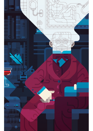
After that I begin to think about a color scheme. In this case I wanted to go for something simple and create three areas of interest. The subject sitting in the chair, the background, and the “unfinished” area around the subject’s head. I wanted to make this piece feel colder as if it’s set at night even though it’s indoors and it’s dark. As usual I make my Mike Mignola influence too overt.


Sometimes when I am not satisfied with the final color scheme, I export the image into Photoshop and apply some adjustment layers. In this case I actually ended up going a bit too cold and wanted to warm the piece up a bit by warming up the darker areas playing around with the Color Balance Adjustment Layer. Similarly I brightened the piece up with the brightness/contrast and Selective Color Adjustment Layers. I know I mentioned no gradients earlier but a trick I like to use is subtly apply a gradient layer, usually on lighten to further brighten the piece or overlay, then later bring it back into Illustrator and select a flat color from the gradient patch to give the illusion of a gradient. You can see the subtle but noticeable difference before and after color adjustment.


Finally I always like to line up the image with its original subdivisions grid and outlines overlayed.


The end!
To learn more about Daniel and his process, head to http://iamdany.com/