Blog
User Showcase Highlight Round 12
First of all let me say how difficult it is to pick just two pieces out of all the new and beautiful entries to the User Showcase. I’m pretty sure it came down to what I ate for breakfast this time around. The showcase keeps growing; it’s currently up to 630 members and 1142 submissions. By the way, I use the PicLens Firefox plug in to get a good look at all the entries and see which stand out to me.
Okay, here we go. This first highlight has nice colors, lighting effects, concept and awesome texture layering. It definitely stood out in the gallery.
justinvg

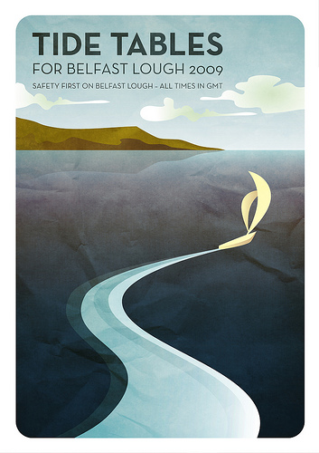
This second piece is simple, clean and purposeful. I really like how the style pervades the whole design. Even the overused wrinkled paper effect actually looks right at home. Sharp. This highlight is also a good example of how limiting your colors and fonts can result in a cohesive design. Check out Neal’s gallery if you have the chance.
Neal McCullough
Congrats to justinvg and Neal_McCullough! If you’ve got some sweet stuff waiting to get noticed, submit it to the Go Media User Showcase!