Blog
What Color Scheme Works Best for Your Industry
Website color choice is never an easy decision. Do you stick with your company colors or go with a color scheme that has maximum impact on site visitors? There is a science to figuring out the psychology behind various color choices and the impact they have on people.
The hypothalamus reacts to color, and hormones release which trigger emotions. The emotions, in turn, impact your behavior, including shopping behavior. Somewhere between 62 and 90 percent of the decisions to purchase something is based solely on color. Using the right colors can increase your conversions and help you make an emotional connection with consumers.
Of course, different industries should focus on different color choices. The right choice of color can create a tone, a sense of trust or even lend credibility to your website. While you can experiment with different combinations to stand out, it is important to know which colors associate with an industry and how to create a sense of trust in your brand from the minute a user lands on your page.
Here are five industries and the best color choices for those industries:
1. Restaurants
Most restaurant websites stick to a basic color palette that includes colors such as brown, red, white and black. You will see these colors appear over and over on food-themed sites. Of course, some trendy designers work in additional colors to grab interest, and this can work well, especially in such a crowded marketplace.
Food photographs tend to really pop on a black or white background, which is often one of the reasons for the choice of black and white. Red has long been associated with enticing people to hunger, although there is some debate about how effective that choice is today with more and more people aware of such tactics.
Experts advise staying away from the color blue for anything food related as it is a color often associated with poison. There are not many naturally blue foods, which may be why it doesn’t work well for restaurant websites.

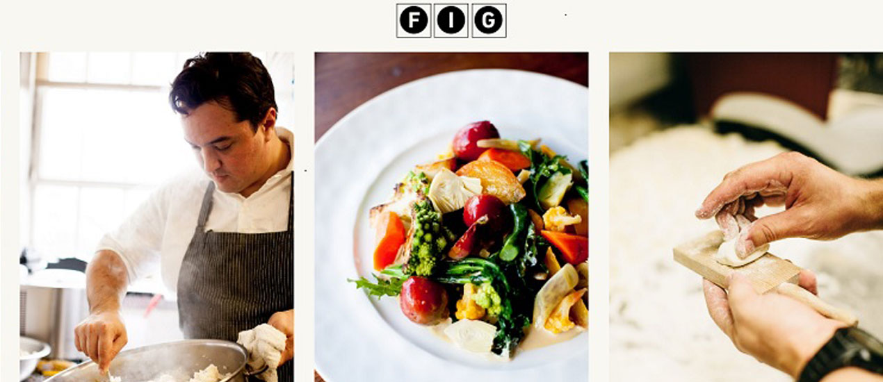
Fig restaurant in Charleston, South Carolina uses the basic approach of a black and white base. They add a pop of color through the image of one of their dishes and also show an image of a chef cooking and using a kitchen tool. The use of black and white lends a sense of trust in the establishment as it is a color scheme people are used to seeing and the pops of red and green in the food photograph draw attention.
2. Hospitality
Hospitality can encompass everything from hotels to salons. Hotels can actually increase bookings by using color psychology. The color brown lends a sense of comfort and home, but adding a pop of blue to the CTA button can draw visitors to book a room.
If creating a website for a salon or spa, using colors that put the person in mind of health and nature is a good choice. Consider using colors found in nature, such as green, brown and sky blue.
3. Medical
When creating a medical website, you want to evoke feelings of security and trust. The color blue is often seen as trustworthy. In addition, blue is a good choice because it’s a favorite color of both men and women. Many medical sites use white and blue color schemes. This keeps things simple, and the color blue makes the person feel secure.
For example, you wouldn’t use the color red, because people might associate red with blood. A color scheme of red and white might even scare potential patients away.

Beltone, a hearing aid provider, uses very traditional colors of white and blue with a touch of gray to lend a sense of credibility to their website. A visitor can immediately see that this is likely a medical type website. Even the colors in the photograph mirror the blues and grays in the overall design. This works well for a site providing a medical device.
4. Construction
Construction websites tend to gravitate toward brown, orange and blue. While you do have a bit more of a range of colors you can utilize, it’s smart to think through the message you most want to convey. If you want to convey energy and excitement, then orange is a good choice. If you want the site visitor to think about the earth, then browns work well. If you want a more generic color choice that is fairly safe, go with blue, which also lends a sense of trust in you and your work.
Don’t be afraid to add plenty of white to any design. The use of white is fairly neutral. You can then add pops of color with your headings, photographs and your CTA.
5. Financial
Have you noticed that a lot of banks tend to use blue and white similar to what the medical sites use? Again, this invokes feelings of stability and trust. When you place your money with an institution, you definitely want that feeling of stability.
Green might seem like a natural choice when talking about money, however, people tend to associate green with nature. So, unless you’re an environmentally friendly banking company, you might want to utilize other colors.

Note how T. Rowe Price uses a variety of blues to add a sense of credibility and stability to their website. Even the image that takes up the background is fairly neutral, which places the emphasis on the pops of blue and the single CTA in orange. Note that the orange used in the CTA is rather subdued instead of a bright color that might appear more youthful and less serious.
Best Color Scheme for Your Industry
To figure out the best color scheme for your industry, spend some time studying competitor websites. You’ll likely begin to see a pattern. Combine that knowledge with the psychology behind color choices to come up with a scheme that works for your target audience. Don’t be afraid to add a pop of color on a CTA button and to do split testing and see what works best for conversions.