Blog

Become a Master Typographer: 19 Expert Secrets to Creating Custom Lettering
Your guide to a custom lettering logotype
“Typography is indeed the most essential and powerful tool a graphic designer has,” notes designer Albert Trulls. “As designers, we have the possibility to add emotional values to the messages we compose by making them, for instance, more or less complex, more or less attractive. That is the reason why choosing carefully a specific typography to represent a message or word is fundamental, as it will strongly affect its perception.”
Creating a custom hand-lettered logotype.
One way a typographer can communicate a brand is through custom hand-lettering.
As Von Glitschka, Illustrative Designer of Glitschka Studios notes, “Few things can brand a product, business or service like a custom hand-lettered logotype. Illustrative lettering is the perfect balance between design sensibilities and illustration. A unique personality and identity can be imbued from illustrated letterforms that a standard typeface could never achieve.”
Just what should you consider when you’re creating the perfect custom hand-lettered logotype? Von and friends Jeremy Teff, Creative Director of BLKBOXLabs, Jason Carne, Martin Schmetzer, Albert Trulls Muntañà and Alison Rowan are here to share with us some ever important tips.

1. Start in analog.
“All of my hand lettered typography starts in analog and I solve the visual aesthetic in that stage before I ever attempt to build anything digitally.” – Von Glitschka

2. Break the Rules
“Custom typography is a great way to leverage illustrative skills in the context of a design oriented project. And don’t be afraid to break the rules that have been created for more rigid forms of typography like complete fonts. For example, I mix and match uppercase and lowercase all the time. Some people are very strict in their approach to typography and this would step on those sensibilities. Hand lettering should always have the freedom to do what ever looks best regardless if it makes a die-hard typophile cringe.” – Von Glitschka

3. Pay attention to color.
“Color is almost always last on my list of concerns when it comes to doing anything hand-drawn because it’s the sole digital step in my process aside from texturing occasionally. A general color palette or amount of colors should always be in the back of your mind when brainstorming and penning your rough drafts. This way, you can at least flesh out a certain vibe to the piece you’re creating. However, it’s not what is going to make your design a good design. Color choice can only enhance an already sound design, it can’t rescue a poor one.
In my work I try to attach time periods to my colorways to establish a visual foothold in a certain era; paints from 100 years ago had a different look to them than what you see in the stores today, and they were just as different in the middle of the last century. Researching advertising and home decor from certain decades can give you a good indication of what color styles were popular in the time period your design is trying to reflect.” – Jason Carne

4. Explore with Pencil
“My initial explorations are done very loosely with a regular pencil. A thin lined pass to set general proportion (The bones) then I do repeated passes beefing up each letterform and refining them as a whole. (The flesh) I’ll use several layers of vellum and a light box to continue to refine my design and perfect the details of it until I have a solid rough worked out.
Once I have a solid rough I’ll then re-draw my designs with a mechanical pencil in what I call a refined sketch form. This will serve as my road map for vector building. I draw it like I’ll build it and keep shape in mind.
I rough out pencils, refine those drawings so I know what I need to build in vector format before I begin building. My drawing always lays the foundation so I have a clear idea of what the final will look like before any bezier curve is created. I’ll of course improve things along the way when needed but I try to work out my design in analog first.” – Von Glitschka
5. Find what program works best for you.
“When we have a piece ready for the computer it is scanned, brought into photoshop and cleaned up. After some touch-ups in Photoshop it is brought over into Illustrator to vector. For some marks we use the live trace option to capture as much of the original artwork as we can, while other logotypes need a more polished vector feel like the Hero mark below. Depending on the use of the mark we will sometimes apply texture in illustrator but most of the time we apply texture in Photoshop if it is needed.” – Jeremy Teff, BLKBOXLabs
“I never use Photoshop for logo work. Resolution independent art is a must in visual identity IMO.” – Von Glitschka
“I vectorize my hand drawings using the pen-tool in Adobe Illustrator. A funny fact is that all the designs you see in my portfolio are traced using the touchpad on my laptop. I only recently bought a Wacom Intuos board which I´m not 100% comfortable with yet, but I realize it is just a matter of practice and patience.” – Martin Schmetzer

6. Get to know the company
“Understanding the company you’re working for very well is a must, but understanding what certain types of letters are meant for and knowing what effective layout is consisted of is equally important. Knowing that a heavy, industrial slab serif type letter is good for a tool or machinery company and not for a lingerie company is important stuff; style dictates impression. Even variety within a certain type of lettering can impose an array of different emotions with the viewer. For example, scripts can be equally effective for an automotive manufacturer (Ford, Studebaker, etc.) or a chocolate company (Russell Stover), but for different reasons that lay within their subtle nuances. You have to understand what makes a letter style elegant, or what makes it powerful or just what makes it tick before you can effectively decide what makes a good choice for the company you’re working for.” – Jason Carne

7. Explore with tools
“It all starts with a pencil and paper and spirals out of control from there. We have a box full of various types of brush pens, brushes, sharpies, markers, basically anything that you can make a mark on paper with. Tracing paper is very helpful when you need to make small adjustments to sketches quickly and refine a logotype. I would say a sketchbook, sharp pencil and a decent set of Micron’s is really all you need to begin with, the rest of the brushes, pens and paint are really about execution, variety, and exploration.” – Jeremy Teff, BLKBOXLabs

8. Integrate Symbolism
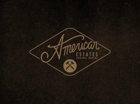
“Symbolism can add great value and meaning to a hand lettered logotype when done carefully and thoughtfully. A small amount of symbolism can go a long way. The supporting mark below we created for American Estates has some very simple symbolism in it, the brand is big on being American made and has a patriotic tone carried across it, we wanted to introduce that in a simple way. We sculpted the A to reflect a star, by pairing the star and the name itself the consumer instantly understands that the products are American Made and the company they are buying from is proud of that. The Onyx Coffee Lab logo was created to portray the same hand crafted feel as the coffee they roast, a small amount of symbolism can be seen in the “O” that forms a drop just over the rest of the the logotype.” – Jeremy Teff, BLKBOXLabs

9. Weigh your options
“The weight of the letters when creating a logotype can be very important to its personality. When you are thinking of how to portray a client’s image or brand you have to understand the message they are trying to convey. Thin lines can be delicate and give an image of softness, while bold marks tend to convey strength and stability. When we created the American Estates signature mark, we wanted a mark that projected simplicity and honesty, a mark that you could imagine seeing scribbled on the back of a pocket book from a generation ago. The line weight is fairly consistent but is very rough like you would imagine the signature of a man working with his hands all day would be. We felt the thinner irregular line weight really captured the essence of what we were trying to portray.” – Jeremy Teff, BLKBOXLabs
10. Keep evolving as an artist
“I turn to a huge amount of references, from classical to avant-garde periods, to find what is best for the project. I like to do this research process while I work on the concept / idea. I consider that, in this way, the concept, the references and the shapes come together seamlessly, strengthening the result.
This is just a way of working – a process among others. I firmly believe that having a creative process, being determined and self-critical, are the best ingredients to evolve, learn and find better solutions. Often, it is more important what you learn in the creative process than the final result.” Albert Trulls
11. Let Ideas Steep
“When I first get a project I’ll sit on it for a good week or so before I do anything. I have to let information and ideas steep. I call it slow boiling. Once I’ve done this I get a pretty clear picture of various directions I can go with it that would be appropriate and work well. I then start thumbnailing and drawing out ideas.” – Von Glitschka
12. Find a balance between skill and imperfection
“Many hand-letterers, including myself, will tell you that the minor imperfections are what truly makes the work we do worthwhile; it’s what distinguishes our craft from the work of those who rely on digital methods and software to create and design. However, imperfections due to laziness or ineptness are not what it’s all about. The design should look human, not sloppy, and there is a lot of work I see that walks a fine line between those two. There’s also a fine balance between being highly skilled and overly mechanical too, being too precise with hand drawn work while impressive, ultimately defeats the purpose of having the natural human element present in the work. Sometimes it’s better to put down the eraser and let the design evolve naturally without trying to dictate its course at an obsessive level. ” – Jason Carne
13. Observe.
“A form of research that we feel is absolutely necessary is observation, you have to experience what your client is selling, making, or creating, only then can you really understand their message. We spent an afternoon shooting photos and video in the American Estates shop and it really helped to develop their brand image. Much like the wood he uses the rough and scared hands of Jesse told his story. Their furniture is solid & strong, but not perfect and it’s those small imperfections that really make their products so unique. The two hours it took to observe and be a part of their process was worth a month of research.” – Jeremy Teff, BLKBOXLabs

14. Research
“Research plays a large part in any branding or logotype project. It is a very important step in creating the vision of a brand. We research design trends for that specific market or time and try to apply our own twist on them or stay away from them as much as possible. For many clients that want a very specific look and feel, it is important to research the root of that design style. Research is best done in books and in the real world, though some research online is necessary, we feel it is best to view original sources as much as possible. – Jeremy Teff, Blkboxlabs
15. Start with a blank page.
“Start with a blank page—no lines, no grids. Let the text influence the style you choose, and the form it takes. The most emphatic lettering isn’t always drawn in straight lines, and with ruled paper we have a habit of forgetting that.” – Alison Rowan

16. Look for inspiration
“When looking for inspiration, I try to gauge style based on the specific project at hand. For this one their whole personality was geared towards Rockabilly with a sinister twist so my solution has a flair towards gothic too.” – Von Glitschka
17. Value Simplicity
“Simplicity plays a major role in creating a great hand-lettered logo. Just like their super clean vector counterparts, logos that are simple and clean tend to be the most memorable. Less is always more. It is easy to over think or over draw a logo type, in the end what matters most is the mark is legible and conveys the message the brand is trying to represent. Most of the time the more simple mark will always be a better solution to the challenge you are facing.” – Jeremy Teff, BLKBOXLabs

18. Experiment with graffiti
“I’m a self taught letterer and came in contact with hand drawn typography through graffiti. I believe graffiti is a very good way of experimenting with the alphabet and learning how the letters are put together. You don’t have to follow any guides or rules and can twist and bend the letters ’til you tamed the word into something your own and unique.
When you draw the same name/tag hundreds, even thousands of times you also realize how you can modify/tweak each letter to make it look different every time. I´m sure this have been a big help to me in my lettering work today.
As a graffiti writer I always aimed for symmetry in my letters, something that follows me ’til this day in my hand drawn typography and logo designs, which you can see examples of in my behance gallery.” – Martin Schmetzer
Last, but not least:

19. Take your time.
“Sweat the details, spend the extra time and really dive head first into your work with the intent of producing work better than anything you’ve ever done before. Make that serif sharper, fix the angle of your shading, get the curves smoother. Rushing your work doesn’t benefit the client you’re cheating out of a better design and it doesn’t give you a better piece to put in your portfolio. Sweating the details doesn’t mean getting crazy with ornamentation and adding anything superfluous, it just means that you should be 100% certain that every part of your design is on point, consistent, and the best it can possibly be before delivering it. Also, proofread your sketches…that should go without saying, but it still needs to be said sometimes. There is nothing worse in the world of hand-lettering than spending 4 hours inking a word that isn’t spelled properly.” – Jason Carne
Thank you so much to my contributors! Please check out their work below:
Von Glitschka | Glitschka Studios | Twitter | Lynda.com | Behance | Full Project
Jeremy Teff from BLKBOXLabs | Twitter | Facebook | Instagram | Pinterest
Jason Carne | Behance | Instagram | Dribbble | Facebook
Martin Schmetzer | Behance | Facebook | Dribbble | Twitter
Albert Trulls Muntañà: Albert Trulls site | Behance
Alison Rowan | Twitter | Facebook | LinkedIn
Other GoMediaZine links you might like:

Become a Master Typographer: How to Choose the Perfect Typeface
