Blog
Distress type by hand in Photoshop
There must be something about digital type that we don’t like.
We put a lot of energy into distressing, aging, texturizing, and simulating letterpress techniques with digital type. There are a lot of cool techniques out there. So here I am, sharing yet another one that’s really good for distressing specific parts of letters that are subject to more wear & tear.
We’ll be using Photoshop and digging into layer masks & scatter brushes.
But first, let me show you an example of what we’re trying to achieve.

Okay, so a couple of things about the way this type looks that I can’t achieve using regular techniques:
- The distressing is not even. This is not just noise or a texture overlay.
- The outlines are not straight. Actual distortion of the letterform edge, from peeling, erosion, ink bleed, or whatever.
- Certain parts of the letter seem more vulnerable to wear & tear. This makes sense I guess.
Step 1: Prep your type
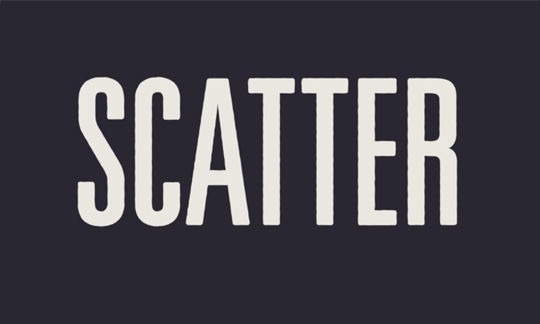
Create a document, 1000×500 pixels. Fill the background with #22202c. Make a text box, type something clever in #eae7e0, and rasterize the type with applied FX.
If you’re curious, here are my type settings:
Unviers LT Std, 49 light ultra condensed
370 pt
Layer effects: 7px #eae7e0 stroke, from center
Now let’s do some standard pre-grunge type tricks that I learned from Jeff Finley’s Wacom Illustration Video Tutorial. Blur the rasterized text by 1px. Now use smart sharpen with a 0.8px radius and at 140%. Remember these blur and sharpen numbers will depend on the size / resolution of your document.
Now let’s distort the edges of the text a little bit. Go to filter>distort>ripple, and choose a small ripple with a 22% amount. The edges should ever so slightly ripple. Here’s what mine looks like now:

Step 2: Make a grunge scatter brush
 This is the brush we’ll be using to paint away distressing on the type.
Open up your brush panel and check “Shape Dynamics”, “Scattering”, “Noise”, and “Smoothing”. This is gonna be a nasty brush! Push the sliders for Size Jitter (in Shape Dynamics) and Scatter up & down until you get a brush preview similar to the one you see here.
I generally like to keep my main brush very small & soft, usually between 1-4 pixels and 0% hardness.
Hit “D” on your keyboard to reset your foreground & background colors to default black & white. This means your brush will be black, which is what we want.
If you just swipe the brush around a little bit, you’ll see you’re now “painting noise”. Perfect!
Step 3: Paint the type mask with the scatter brush
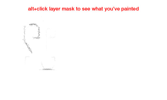
Make sure your layer mask is selected, and use your brush tool to paint inside this mask. Black pixels hide the rasterized type layer, and white pixels show it. The mask starts out all white.
As you paint in your wear & tear, think about the letters as physical objects. What parts look subject to distressing? Call to mind rusty old street signs and roadside ice cream shacks. Vary the size of your brush between 1 and 5 pixels. Use larger brushes for the edges of the letters. Use a little more distressing in areas that seem especially ‘rippled’.

See how the mask I’m painting looks noisy, like the brush preview above?

Just keep painting until you get a degree of distressing that suits you. I tend to prefer very mild distressing. Just enough to get the looker’s subconscious to think “not digital”. Be sure to make each letter different. That’s kind of the whole idea of this approach: more custom than a distressed font.

Cool, huh?! Once you do it a few times, this technique isn’t much harder than overlaying a texture – and it looks a lot better to me.
We’re basically done here, but I’ll add in a paper texture to make our image more closely match the “SHHH” image.

That’s it! Thanks for reading this quick tip, and let me know if you have ideas to take the technique further.