Blog
The “Words” series by Jim LePage

Some introductory words
As someone who’s far from being a believer, Jim’s series first caught my interest because of the beautifully crafted visuals. Did someone say textures?
That said, I soon realized that Jim also publishes comments about the design and the word he’s illustrating. After reading a few, I realized that Jim was actually doing a pretty critical reading of the Bible, sharing his personal conflicts about the pieces and the book itself. This critical thinking has been of the utmost importance in my adhesion to the project.

As you’ll see in the interview, not everyone was necessarily happy with his approach or with the results of his reflections. Pretty strong stuff in my opinion. You’ll also see some amazing pieces of art, with great details. And even some humor. In short: good stuff.

The interview
Hello Jim, could you introduce yourself to our readers that might not know you?
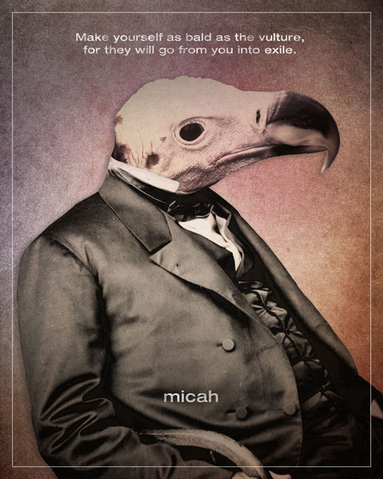
Jim LePage: I’m an artist/designer from St. Paul, MN. In early 2010 I started a personal project called “Word” where I create designs for each book of the Bible. My goal was to combine something that often bored me (reading the Bible) with something I’m passionate about (design).
I saw on your About Page that you’re a designer for a church. Can you talk a bit about your experience with that? Anything that makes it really special?
JL: I work in the Communications department at Woodland Hills Church, mainly overseeing our graphic/web design areas. My co-workers are awesome and there’s a real high value on good design which is pretty unusual for a church. Church design is usually pretty safe and is rarely the place you’d find art and design that pushes boundaries. However, Woodland Hills has a bit of a reputation for their challenging, and often controversial, teachings. I think that has given us in the Design and Communications area some room to push boundaries and try things that other churches may not be able to do. That culture of boundary-pushing has definitely played into my Word series. And if you still aren’t sold on Woodland Hills, you should know that last summer, the church even helped send me and my co-worker to WMC Fest. So yeah, it’s a pretty awesome place to work.
I’m also guessing that faith is an integral part of your design process in that case?
JL: Definitely. According to the Bible, God is the most creative being that has ever existed. He rarely does what’s expected and sees things in completely unique ways. He’s the ultimate artist and is most definitely an inspiration in that sense.

Let’s talk about the “Word” series. Can you talk a bit about the inception of the project?
JL: I’ve always believed that the Bible was a powerful book. I really wanted to dig into it more, but honestly, it bored the heck out of me. Every time I resolved to read it more, I inevitably got bored and gave up. I thought that if I combined Bible reading with something I’m truly passionate about (design) that maybe I could stick with it and actually get something out of it. Every Friday, I’d post a new design and do a short (and usually irreverent) write up with my thoughts on the book and design. Nearly 2 years and 91 designs later, I’d say it worked out pretty well. If you’re interested, I have spots on my site that go more in depth about the origin of the project and what I learned from it.
Were you expecting to make it last that long from the start, or is it a project that just kept growing on you?
JL: From the beginning I intended for the project to run 66 weeks (one for each book of the Protestant Bible). It turned out that some books had too many great passages, so many books ended up with more than one design. I also broke from my usual schedule during Easter 2011 to add a 7 design series based on Jesus’ death and resurrection.

As faith is so personal, I’m guessing some of your designs sparked some intense debate and discussions. Any examples of that?
JL: I’ll start off by saying that most of the feedback I’ve received has been and continues to be positive. In fact, I heard from quite a few folks that don’t consider themselves religious at all saying how much they liked the project. I’d like to think that my designs offer a different take on the Bible than most religious art, and it seems like there was an audience that appreciated that. That said, the main negative feedback I got was from Christians. Many of my designs and write-ups are irreverent and contain images and words you wouldn’t associate with church. My design for the book of Nahum features a close up of my hand giving the viewer the finger. Some designs are violent or depressing. There are designs and write ups that contain swearing and many others contain some very honest confusion and doubts. Like I said, most folks really seemed to connect with that, but there were some people who thought I crossed the line a few too many times. And I probably did, but for me, with design and faith, I think there’s a lot more opportunity for growth and honest discussion when you’re willing to cross a few lines than when you’re being so careful that you never get close to one.

The post that sparked the most debate and feedback was “Jesus Christ: Terrorist Killer?” It wasn’t part of my Word series, but was based on the stuff I was learning by doing the series. After Osama bin Laden was killed, many American churches participated in the celebration that followed and in some cases even endorsed the killing and insinuated that God was happy about it. My design and post questioned how so many churches that claim to follow a man who willingly died for his enemies could take part in celebrating the death of their enemy. It got a lot of reactions and not all of them were from people who agreed with me.

How did the work on “Word” influence the rest of your work?
JL: It influenced me in a lot of ways. Before the project, I never would have called myself an artist. I was a designer, someone who takes other peoples ideas and helps to communicate them. With Word, it was a very personal thing. I was the one coming up with the ideas and I was expressing myself. Having to do one every Friday also helped me hone my design and writing skills. Also, due to some publicity about the project, I got more requests for freelance work, which has been great.

Any favorites in the series? Why?
JL: I like different ones for different reasons, but I’ll go with a couple of the older ones here. I was going along pretty well until I hit the book number 6, Joshua. For those of you who haven’t read it, Joshua is an extremely violent book. God’s chosen people, the Israelites, regularly massacre entire cites (men, women, children, animals) seemingly at God’s orders. This was the point where I made the decision that I wasn’t going to do what I’d seen done so many times, which is to gloss over or minimize difficult verses, passages or books. When I read it, the book seemed bloody, brutal and ugly and so my design was as well. I didn’t like reading the book or creating the design and I said that in the write-up. Looking back, I realize that book was the one where I made the decision to value honesty over propriety. If there’s crap like that in the Bible, I need to acknowledge it.

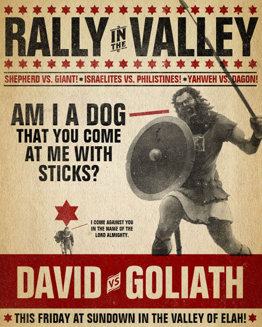
When I began the series, I planned to use the same font and background image all the way through. I thought that would make things easy, simple and keep the project from becoming so intimidating that I bailed on it. By the time I got to the eighth book, I realized that the parameters I’d set up to help make things easy were actually making things boring. The creative part of me felt boxed in. I decided to ditch those parameters and start making each design unique. The first design I did that with was 1 Samuel and the story of David and Goliath. As I read it, I was struck by all the smack talking that went on, which reminded me of how boxers will some use verbal sparring to hype things up before a fight. Before I knew it, David and Goliath became a vintage boxing poster. Looking back, I see how that design launched me in a direction that allowed me to explore and experiment visually.

Were any of them a problem to come up with, conceptually or design wise? Why?
JL: A book like Genesis is easy. There are so many great stories in there, the hardest part is narrowing it down to one (which why I did 3 designs for that book). But there were some really tough books too. In the Old Testament, there’s a series of 12 Minor Prophet books. In a nutshell, they are short and full of wrath (at least that’s how I was reading them). I thought I’d never get out of that section. It ended up being a really great exercise though. I had to learn how to create a design for books that were very short on content and that, frankly, I wasn’t very inspired by at the time.
Any last words before we part?
JL: Yes! Several last words, in fact…
First of all, a HUGE thanks to Simon and all the Go Media folks (From the editors: you’re absolutely welcome!). My designs were in many of the monthly Go Media Flickr showcases over the past 15 months or so. Plus, I was able to make it to Jeff Finley and Go Media’s WMC Fest in June of 2011 which was super inspiring and has definitely influenced my work since then. (You should all go in 2012.)
One of the most common questions I get now is what my next project will be. I’m actually working with my buddy Troy DeShano (AKA Strong Odors) to put together a collaborative design project called Old & New. What Dan Cassero’s 50 and 50 did with state mottos and Evan Stremke’s Momentus did with U.S. history, we want to do with the Bible. We plan to have a wide variety of contributors. From Evangelical Christians to Atheists to those who may have been burned by the church. My Word project had only one voice – me. Old & New will have many. We’re hoping to launch that in early 2012 so stay tuned.
Another question I always get asked is “Are prints available?” The answer is yes. All the designs are available as prints in the U.S. and Canada as well as internationally.
Lastly, since the Go Media community has given so much to me, I thought it would be nice to return the gesture and give away a 16×20 print of my Word Bible designs. They are museum quality Giclée prints. Follow the guidelines at the bottom of the post to enter.
The (selected) works
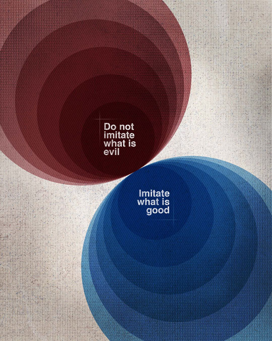
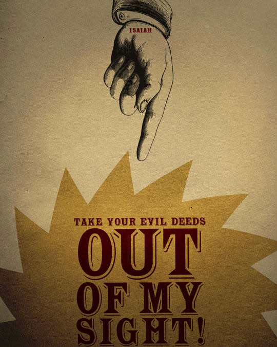
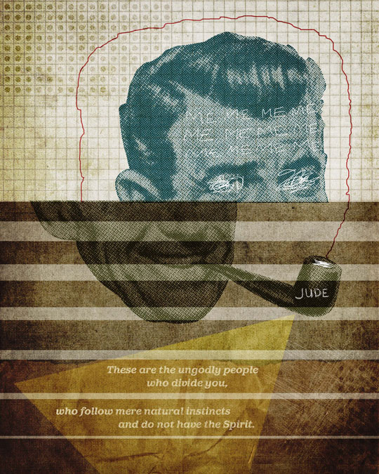
As Jim said, there are 91 designs in the series. You can go on his site to browse through the whole collection. Here are some of our favorites.






The icing on the cake: a giveaway!
As Jim just said, there’s a giveaway!
Pretty simple rule: leave a comment below to be entered, with a valid email address for us to be able to reach out if you win. The winner will be chosen at random one week after this post is published. The prize is one print of your choice, and it’s open to readers worldwide!
We also know for a fact that Jim loves to hear your feedback on the project. Don’t hesitate to comment below, or tweet him, or email him about it!