Blog
A review of LetterMPress

LetterMPress, or the art and craft of letter press design… On your iPad!
Some explanations
Huh, what? I guess this quote deserves some explanation. Through intensive web browsing, I came across this wonderful iPad app: LetterMPress. Then I found this amazing Flickr group.
I was sincerely blown away by what this app can do. I knew drawing apps could be amazing — just look through George Coghill’s Flickr stream, he has some sweet preliminary sketches done with Sketchbook Pro — but simulating letter press design?
Another fact of interest is that the app’s development was funded through Kickstarter, like the last WMC Fest.
After a series of email with John Bonadies, the co-creator of the app, we got a chance to get the app for both the iPad and for Mac OS. My goal here is to offer an overview of the app and a series of observations I made while using the app on the iPad and on Mac OS on a MacBook Pro from early 2008.

The app
The application simulates a letterpress; it’s a simple as that. And, it’s beautifully done, even the sound effects.
The main screen is the composition screen. This is where you’ll actually design and place the letter blocks to compose your project. The second screen is the print screen, where you’ll generate the digital output of your composition.

A little disclosure: I’m here using the screenshots provided by the LetterMPress development team. They’re able to showcase the abilities of the app way better than I would.
Aside from these two screens, users have access to drawers (sub panels) full of goodness:
- The type and art panel where you select the blocks you want to use in your design
- The furniture panel where you can find the elements for spacing and alignment purposes
- The lockup panel where you can access the elements that can lock the blocks you have on the press bed
- A digital ruler
- The gallery tray where you save and can retrieve for later use the compositions you’re working on.


These were for the compose screen. The print screen gives you access to:
- The paper tray where you select which paper you’d like to output your composition on
- The paper rack where your outputs are stored
- The ink palette where you’ll be mixing your primary colors to get the one you want (RGB or CMYK)
- The coverage panel to decide where the ink will be applied. You can also do multiple impression on one sheet, to play with color/symbol layering and overlays.
Since I’m probably forgetting a few things, here are two overview videos (one for iOS, one for OSX) of LetterMPress, created by the LMP team.
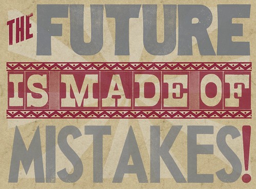
Some examples of what you can do with the app


There’s also an official Flickr group where people upload their designs:


Some conclusion notes
Well, first of all, the app is wonderful and produces beautiful results. The output is usable as an element in another design software (the Mac app can output up to 8192 pixels, around 26″ at 300 dpi). I surprised myself smelling the air around me for the really peculiar fragrance of the printing ink sometimes. With headphones on, this app can transport you into a virtual print shop.
I definitely favor the Mac version over the iPad version simply because of the additional precision given by the use of the keyboard and mouse combo.
With that said, I still must admit that the iPad app is one of the most beautifully crafted apps I’ve seen to date. It takes patience to place elements correctly, but the result is always worth it. The app also renders the fact that these blocks are physical objects and that when hitting other elements with a block you’re trying to place, everything that’s not locked in place will move — and mess up the carefully crafted kerning and spacing you just spent an hour perfecting. Luckily, the undo button goes up to 20 states back.
The paper and typefaces are amazingly well rendered. The ink textures (or the absence of ink for that matter) too. The interface can be overwhelming at first, but after reading the extensive help file and a bit of “trial and error” experiences, there shouldn’t be too many dark areas left.
This app is not a toy though. It’s a real design app. But well worth the $5 to $10 it’ll cost you.
Meanwhile, you can go visit the app’s website, get the iPad version via iTunes or the OSX version via the Mac AppStore.