Blog

15 Best Video & Motion Picture Techniques for Web Designers
Video & Motion Picture Techniques for Web Designers
Video integration is becoming a popular web design trend in 2016. From simply embedding videos to creating alternate realities, here are a few of the techniques used to incorporate motion available to web designers:
Background Videos
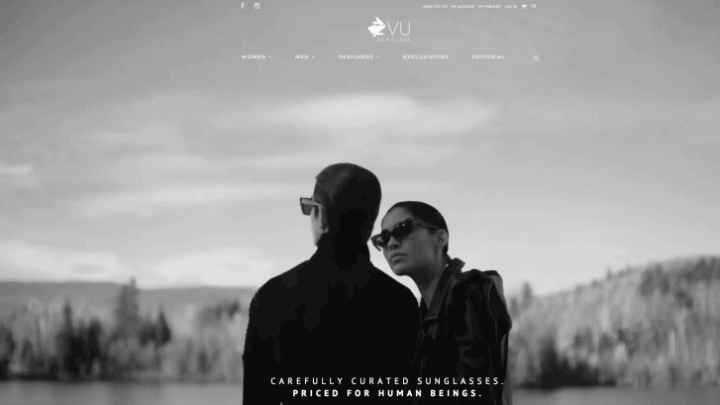
Background videos augment the design aesthetic of a website. Vu Sunglass, online sunglasses store, uses a Vimeo account to host the background video on their e-commerce site. The black and white clip captures the essence of the high-end quality of the collection.

With over-laid text, users can immediately tell the purpose of the brand. Movement has also been used to show off the curator’s Exclusivities, with floating close up shots boasting the fine details of the sunglasses.
Parallax
Parallax scrolling enhances the web design experience by creating an impression of depth, catching the audience’s eyes. Integrating high quality video content with a parallax effect, A6 Beoplay captures the value of its product in a luxe, tranquil manner.

As the visitor scrolls, more videos are revealed. This site has a distinct focus on how it feels to experience the product, and the design is an imperative component in communicating this.
Play Pause & Mouse Over
The ability to start and stop video is a key feature when integrating video in web design. The play-pause effect gives users more control over their experience. While some sites using this technique have click activation, Meritek, an IT recruitment website, has seamlessly integrated a video using mouse-over activation.

The clip shows people arriving to work in the morning, signifying the IT job placement platform’s objective. It begins to play when the mouse is hovered above the area and then pauses as the user mouses away. This interactive element uses MP4 codec hosted on the server to allow for the mouse-over effect to work.
YouTube & Vimeo Embedding
Video embedding is where motion in web design began. Cyclemon, a site dedicated to cyclists created by two designers, uses an embedded Vimeo clip to display a teaser about the brand. While the old-school embedding might seem a little clunky, the video is beautifully animated, in the same quirky style as the website’s homepage which has another form of aforementioned animation, parallax.

GIFs
A well-utilised technique, GIFs allow designers to create short burst of motion. Tumblr is well known for its use of GIFs by its users, from movie snippets to memes. On the professional side, its graphic design team also uses GIFs for Tumblr’s web design. One of their designers, Skip Hursh, has created several GIF logos for Tumblr. His Tumblr TV logo, inspired by the 90s MTV logo, ties in Tumblr’s love of hipster pop culture. Another set of Tumblr-related GIFs demonstrate the various ways of publishing on the blog site. These GIFs allow Tumblr’s purpose to be captured in a matter of seconds.

Cinemagraphs
Cinemagraphs are the middle ground digital artists have been waiting for. Somewhere between a static image and a video, cinemagraphs allow for moving elements within a still image. Using a combination of photo and video equipment, as well as some post-production editing, boring photos can now be brought to life. The picture of the Paris cityscape with moving cars and twinkling lights on the Eiffel Tower found on the site’s homepage allows users to feel like they are experiencing the image. Although still technically a GIF, it avoids the awkward start-stop-restart steps sometimes visible in GIFs. As it can be useful to demonstrate the movement of a particular product element, it has been warmly welcomed in the fashion industry.

Mouse-Guided Exploration
Web designers must handover control to the individual users, allowing them to direct their own site experiences. The Revenant’s website uses a 360-degree panorama technique within its series of videos, allowing visitors to explore the environment of the motion picture’s story.

This method permits an interactive event, meaning the audience can engage with the film, rather than the traditional film preview.
Animated Logo
If motion can be integrated into a logo it gives the designer additional methods of communicating the brand. As you enter Cardiogenix’s site (a private clinic in Montreal) an EKG animation welcomes you as the page loads. This quickly gives visitors an idea of what this page is about. 
On their about page, a heart-shaped logo is not only beating, it follows users down the page as they scroll, highlighting links to the site’s links as it goes. Another benefit of an animated logo is that it stands out among the hundreds of other static logos people see every day. Of course, as the number of moving logos increases, the stand-out effect could diminish.
WebGL
Relatively new to web designers, WebGL has become increasingly popular since its initial release in 2011. It is a Javascript API and can be used for rendering 2D and 3D graphics on web browsers without using a plugin. LEEROY, a web agency, uses a WebGL element on their homepage to create an interactive 2D logo.

The logo reacts as the user moves the mouse around the page. This technique not only allows the creative agency to display its web design skills, but also creates a more fun and aesthetically pleasing experience for the visitor.
HTML5 Animation
HTML5 animation allows web designers to create an original environment that cannot be created with live action film. Museum of the World, a project by the British Museum and Google Cultural Institute, uses HTML5 to create an animated archive of historical artifacts beginning from the year 2000 all the way back to 2,000,000 BC.

The design allows the user to easily time travel through history using the arrow keys, and to learn more about specific artifacts by click on the relevant nodes. The design of the website allows for a unified animated experience from start to finish.
Google Indoor Streetview
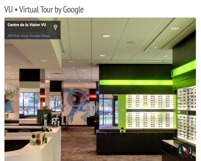
By incorporating Google Streetview in a web page, designers allow users to discover a brand’s edifice. Now, with indoor Streetview, businesses can let viewers look inside their establishment — ideal for hotels, restaurants, boutiques, and for those who simply want to show off the interior design of their enterprise.

Google provides the happy medium – still images do not provide enough experiential detail, and pre-filmed videos do not allow viewers to decide which areas they explore. Vu, a Montreal optometrist boutique, has a detailed indoor Streetview – viewers can see display cases, consultation desks, reception area and waiting room, optometry offices, and even a children’s playroom. This pragmatic technique allows potential clients to look around the store’s facilities before they make an appointment.
Virtual Reality
Web designers should aim to take viewers to places where they can be entertained and learn. Virtual reality allows experiencers access in to a world they may not be able to get to in their own reality. What better technique to show off one of the most exclusive hotels in the world? The famous Dubai hotel, Jumeirah, has collaborated with Google to create Jumeirah Inside: 360 Degrees of Luxury. The website combines a series of high-quality videos and Google’s Streetview technology to allow users around the world to look into the glamorous accommodation before (or without) paying the luxury prices to stay there. Images of helicopters, Rolls-Royces, and expensive suits combined with Google-fueled design instantaneously signals high-class.
