Blog
The Philographics poster series of Genis Carreras

 A little introduction
Genis’ poster series on various philosophical movements struck my eyes when he first released it earlier this summer. I think I mentioned it on the Go Media Facebook page, and then didn’t think about it anymore. Last week, someone linked to them on twitter again. Since the series was deemed officially completed, I decided to reach out to Genis to see if he would be interested in a feature of them here. He was kind enough to accept and to answer a few questions.
The interview
Hello Genis! Could you introduce yourself for our readers?
I’m a 23 years old graphic designer from Catalonia living and working in London at an agency called Mint Digital. I read Thus Spoke Zarathustra at the age of 15 and since then I loved philosophy. Design came earlier; I think I loved it since the first time I drew. I graduated first class in Graphic Communication this year and previously in Multimedia Design in Spain. I created a project called Philographics, which is the reason why I’m being interviewed here.
Can you present the “Philographics” series? What spark the interest in the project?
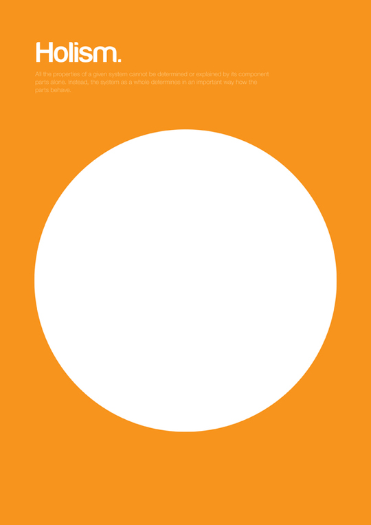
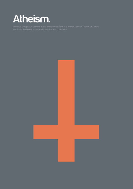
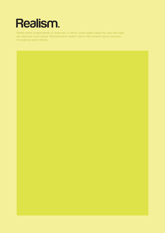
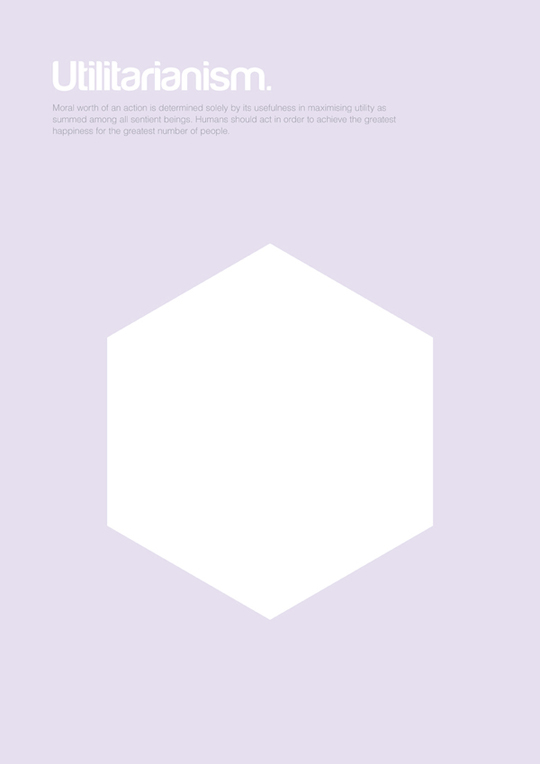
Philographics is all about explaining philosophy through basic shapes, using geometry and color. This means that the outcome can work as both pieces of design and educational resource. My purpose was to turn something complex into something simple, allowing people to understand it quickly and almost instinctively.
Can you talk a bit more about the visual identity you developed for the series? There’s a strong sense of unity that emerges. What were your constraints?
The goal was to create a new language to communicate philosophy visually, sometimes illustrating metaphors and others reinventing existent symbols. Using the same structure and negative space and just changing the shape or the color increased the sense of unity. That’s why the outcome works better as an ensemble rather than individual pieces. To answer your question, my constraints were to use the simplest shape and just one or two colors to communicate, to be precise with the concept to communicate but still allow some interpretation by the viewer. For instance, some people associate the pink triangle of Hedonism with an homosexual icon while others see a part of the female body… There’s not a correct or incorrect answer to me, the viewer creates his own meaning according to his own experience and knowledge.
Is that work feeding your current work as a designer?
Yes and no. Right now I’m working as a creative designer for Mint Digital in a research team named Foundry, where we’re exploring the connection between physical objects to the web through digital technology (you can see what we’re doing here: foundry.mintdigital.com). At the same time, I’m receiving some freelance offers more connected with Philographics, while I’m looking for a publisher for the journal and a place to exhibit the project.

Note: there’s an animated presentation of the journal on Genis’ website.
Any last words to share with our audience before we show them the pieces?
A lot of people create beautiful things, and a lot of people create useful things. I think there’s a gap in-between that is the playground for us, the designers. I’m glad about how people are responding to this project and the feedback given, it gives me strength to create more! It’s awesome how people are spreading the word and helping me to find a publisher for the journal.
If you want to help me to pay the rent, feel free to get some of the posters via Society6!
The posters


