Blog
State of the Union: Grunge Design
Grunge design was getting popular when I got started in 2004. I was inspired by the artwork and branding behind the underground punk, metal, and hardcore music I listened to. Naturally their aesthetic seemed to be riddled with dirt, grime, and blood because it seemed it fit the bands image and message. I had no idea why it was that way, it’s just how it was. So let’s take a step back a few years to see where it came from.

They say David Carson is the “father of grunge” because he rejected typical type layouts and played with non-mainstream techniques to achieve different results. He surrounded himself in the Southern California surf/skate culture in the late 80s and early 90s where he began to make his mark. This went on to help define the visual aesthetic for surf/skate culture as fans began to identify with it.

When I was in college from 2000-2004, I flipped through music magazines and read through the liner notes of my favorite albums, I noticed something that caught my eye. Here was “smart” type layout combined with illustration, dirt and grime. Something my newbie designer eyes had not seen before then. This helped me discover that design wasn’t ONLY about creating ads with a clever tagline like my friends who majored in Graphic Design did in college (I was an 3D Animation major).

I was soaking up the designers and artists responsible for this refreshing hybrid including Asterik Studio (now Invisible Creature), Eduardo Recife, Damnengine, THS, and the Bau-da Design Lab. To me it was the anti-mainstream and rejection of pop culture, boy bands, and the slick MTV aesthetic. I was all about it.

These are just a few of the many pioneers of the modern grunge style. They stood out because they were able to move between stunning photo manipulation and hand drawn illustration without neglecting their typography. Of course, the icing on their collective cakes were the dirt, stains, spills and splatters that symbolized the underground and alternative design sense. Their combination and skill of putting it all together was what made them great.

For the rest of us just getting started, we hadn’t yet learned or trained our eyes for type or had the resources for pro photography. However, we knew Photoshop and we had the tools to help us LOOK like we existed in the same realm. Around that time, Photoshop brushes, textures, and grungy fonts were tools developed to achieve that counter-culture vibe that so many of us found refreshing and relatable. At that time it seemed like everyone I knew was hording brushes, textures, and grunge fonts from sites like Misprinted Type and Dubtastic. Clean “corporate” design was so “pretentious” and “boring” and our young energetic selves needed to destroy all that was clean and too “business-like.” It kind of went with the territory when you listen to metal and punk rock and watched films by David Lynch or Harmony Korine. Also, adding “aged effects” was an attempt to make your designs feel less digital and more realistic and natural.

We found beauty in the grotesque and solace in the sinister. We found comfort in nostalgia and we smile when we see something that visually takes us back in time to our childhood. We wanted to make stuff in the same vein and the availability of these “tricks” made everyone who had Photoshop be able to put together a “grunge design.” Copy, paste, boom you’re done. Easy. And the popularity of those resources encouraged designers to create and share their own as a way to get exposure. In fact we did this in 2006 when we launched the Arsenal and sold hundreds of “vector packs” and were featured in magazines like IDN and Computer Arts.

So what has happened since? It’s exploded and because it’s so “easy” to find and download tricks to create a dirty and grungy design, you have young designers “grunging shit up” all the time because they can. What’s happened is that you’ve got an overabundance of awful and messy collages of used and reused free grunge brushes and vectors. Apparel brands and department stores are making loads of money selling tees using heraldry emblems, eagles, wings, skulls, splatters, etc. 4-5 years ago it was an emerging trend. 2 years ago it was a tired cliché. Today your grandmother owns a garment with a skull or dragon on it and a few copy/pasted splatters.

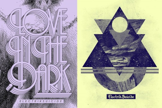
So where is the “grunge movement” going today? There are certainly designers still doing great work out there. A few years back, you had designers like Ronald Ashburn (Electrik Suicide) making waves with his futuristic retro style and Scott Hansen and Mark Weaver setting trends with a more minimal and Swiss approach.

On the music design side, you have Kyle Crawford, The Black Axe, and Sam Kaufman perfecting their craft and building upon the rich visual history of the bands they work for. I don’t see the trend ending any time soon, but I do see a more mature approach as designers grow and appreciate subtlety and get sick of the messy clutter or design objects often associated with grunge.

In reality, whatever the mainstream is doing, look for the new pioneers to reject it and create something entirely new. If grunge design is mainstream and ubiquitous by now, there’s certainly an undercurrent of young rebellious designers looking to destroy it.
If you have some inspiration for a refreshing take on the “grunge” movement, please post it below.
