Blog
Introduction to InDesign

Page layout is not as glamorous or interesting to a lot of designers and digital artists as creating t-shirts, posters and album covers. However, page layout is an important function for a lot of design projects, and there is an opportunity to do quite a bit with a layout. While QuarkXPress was once the page layout tool of choice for nearly everyone, Adobe InDesign has become the industry standard.
Here, I’ll introduce the basic concepts behind a simple page layout in Adobe InDesign CS5.
Goals:
- Become familiar with the InDesign work environment and fire setup procedures.
- Learn how to create text boxes, link them, insert and format text.
- Learn how to place images in an InDesign document.
- Learn basic image manipulation techniques.
- Become familiar with preflighting and output.

The basic InDesign work environment isn’t significantly different than Photoshop’s or Illustrator’s layout and can be reconfigured in a variety of different ways. I’m using CS5 and you can pick a variety of default views using the menu in the upper right. My choice is Essentials, which is a solid option for whatever you want to do without cluttering the space with specific tools.

It’s always a good idea to setup your file defaults before you create anything. If this is your very first time even opening InDesign, go to Edit->Preferences. The first thing I like to set is Units & Increments.
Select the unit types you wish to work with. InDesign’s default unit of measurement is the Pica. Since I’m American, I will set my default to Inches. Points are good for Text Size & Stroke with the Postscript setting.
I also set my Origin to Page. This puts my 0-0 for the x and y axis on my rulers to the top of my page, instead of the top of my document. I also like to set my display preferences to maximize the quality of everything. This can be taxing on your computer relative to how powerful it is. Still, I prefer to display everything at high quality so I know exactly what the output will look like.

Creating a new InDesign file is the same as any other application; ctrl or cmd + n will do the trick. When the new document dialog box comes up, click the More Options button. Under Intent, select Print. The Web setting in InDesign is useful for creating lightweight PDFs that are not intended to be printed. InDesign CS5 also possesses the ability to create interactive Flash documents.
Uncheck both Facing Pages and Master Text Frame. Facing Pages is for creating multi-page documents. A Master Text Frame could be useful if you plan on creating multiple single-page documents with the same layout. We’ll use both in a later tutorial.
We’ll leave the setting at letter size and portrait orientation. I’ve set our intro document to have 2 columns, leaving the default gutter. Using Imperial measurements, the document defaults to a .5” margin; change that to a more realistic .25” or its equivalent. I am also setting the bleed to a standard 1/8”.

Now we have our blank document with our basic guides already laid out and ready to work with. Looking at it, 25” margins may be a little tight to the edge of the page. Go to Layout->Margins & Columns and change the margins to .375”.

First up, we’ll insert and format text. Select the type tool and draw a type box in the left column,
Copy the text box it in the right column. We now want to link the two text boxes so that text will flow between them. On any text box, you will see a square on the lower left side of the box. Click on the square and then on the box you wish to link to.


Now, our text will flow into the right box if and when it overflows the left text box.

When the text tool is selected, the top toolbar displays the character options by default. Most of the character and paragraph options will seem familiar. InDesign provides the most control you can get over your type, including the ability to define type styles, which will be covered in another tutorial.
Since I haven’t already, I’m also going to change the typeface and set my kerning to Optical. This is a good time to un-check hyphenate.

Next we’ll insert our graphics into the layout. InDesign doesn’t embed images in the file, but maintains a link to the file where it resides on your computer. It’s necessary to maintain a fairly high level of organization working with InDesign files. Ctrl or cmd + D will place your graphic on the workspace.
If you have nothing selected, the graphic will be placed wherever you click your mouse or tap your pen. If you have an object like a text box or another content frame selected the graphic will be placed in that frame. Graphics will be placed on the document in their own frame.
Grabbing the frame handles to scale will actually scale the frame, not the graphic it contains. Hold ctrl or cmd + shift to scale the graphic and the frame together. You can also fit the image to the frame proportionally.

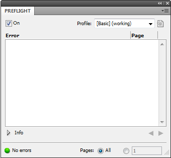
Since this layout is a simple PR mailing, we’re almost done. InDesign has built in preflight feature that will check your document for potential printing errors. In earlier versions this options is found under File->Preflight. In CS5 and up, it’s a panel located under Window->Output->Preflight.

This is what we want to see. The main errors you will frequently see are linked images using the wrong (RGB) color space.
Now we’re ready for print output. We can package the document, which will create a folder with a copy of the attached images and fonts used, use one of the pre-defined PDF or a user-defined preset.