Blog
The Definitive Guide: What Your Dropdown Menu Is Lacking
How to Improve Your Drop-Down Menu
The navigation menu is central to the user experience on a website or mobile app. When we visit a website, we have a particular goal in mind. We want to get somewhere on the site as quickly as possible. Usually, the drop-down menu is the most efficient way to do that.
Optimizing your navigation menu should be a top priority. Here are some things you should do to optimize it, plus some you shouldn’t.
Do Kill the Clutter
Keep your navigation simple. You may have tons of sub-pages and a variety of product categories, but you don’t have to include them all in your main navigation. There are other ways to set this up. Alternatively, you could create a top-seated breadcrumb-style menu to offer easier navigation through lesser sub-pages, while keeping all the juicy stuff in the main nav.
When you open a nav menu, you don’t want it to take up the entire screen. Many retailers and e-commerce sites do this, and it’s poor design. You want navigation to be quick and easy, but that also means keeping a lid on the box. If you add too many options, things get cluttered and confusing. This is especially true on mobile, where the screen is much smaller.

The restaurant Denny’s did this with their newer design. The menu displays the most important categories first. When you select one, it opens to reveal sub-categories or additional options.
Do Use Borders or Shadows
Adding a subtle border or drop shadow to your menu helps it stand out from the rest of the page especially if you’re using a lighter background. This isn’t so important when you have plenty of negative space below your menu foldout. However, if you have images or text content, sometimes these elements can make the menu harder to differentiate.
Do Consider Applications
When browsing on desktop, it makes sense to have the drop-down menu or main nav take up the width of the page. On mobile, however, where there’s much less space to work, a collapsible menu is the better choice. Consider the applications for your menu, such as how and where they will be used. This makes a huge difference when it comes to the function, style and even layout of your design.
Do Include Images or Icons
Most menus are text-based, which is a shame because many devices can display high-quality HD content. Why not spruce things up and make your menu more engaging? It’s okay to add images, icons or even visual indicators to your menu alongside text labels.
An auto seller or manufacturer, for example, might consider putting images of the vehicle next to the model name. As a bonus, this can also help when people know visually what they’re looking for, but don’t know the model.

Formula Boats gets this right with their visually appealing dropdown menu. Open it up, and you can see all their boat models, making it easier to choose between them.
Do Use a Column or Grid-Based Design
Column or grid-based navigation menus are better organized, simple to understand and easy to create. Keep your dropdown menu structured appropriately, especially since consumers and internet users are so used to this design technique.
Don’t Have a Disappearing Menu
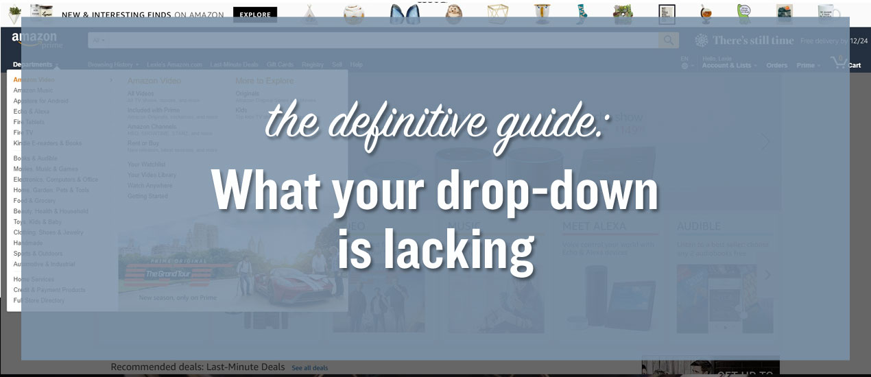
Ever notice when a site uses a dropdown menu, it remains visible and follows you down the page? This is good web design, especially on mobile. The main navigation menu is always only a tap away, no matter how far down you scroll. This is important for infinite or lengthy scrolling sites.

Amazon has one of the best examples of this anywhere. While their menu doesn’t collapse, it is a mega menu with a dropdown design. It’s visible no matter where you are on the site, on both desktop and mobile versions. Customers retain quick access, to any section of the site.
Don’t Use Unclear Headings
With a dropdown menu, you’re going to have quite a few menu items in view. That’s alright, so long as you have clear headers to differentiate the varying categories and pages.
For example, an electronics retailer might have categories for home theater, laptops and PCs and printers. The correct way to structure this is to bold the headers of each category so they stand out. The improper way to do this is to list all the options in the same font, color and weight. Then you end up with one list of items, and that’s confusing.

Take a look at the official Columbia site. Pay attention to their mega dropdown menu and how it’s structured. Notice how the header for each category stands out from the rest? Now imagine if all those fonts were the same. Even with the columns separate, things would get confusing.
Don’t Forget to Test
You may prefer Chrome over Microsoft Explorer, or maybe you use Safari. Whatever the case, the worst thing you can do is assume everyone has the same preferences as you. One of the biggest mistakes you can make with web design is not testing your setup on multiple platforms.
Before you roll out the final design for your drop-down menu, check it out on multiple devices, browser types and resolutions. The content may scale differently on certain platforms, which could ruin your perfectly crafted menu.

Look no further than IWC Schaffhausen. Open their site on desktop, and you see a drop-down menu with high-quality images of their watches. This makes sense considering you want to choose a watch that looks good. But on mobile, the menu acts differently. Instead of a full menu that takes up the entire screen, you only see a few of the watches, and you must scroll left or right to see the rest.
Don’t Neglect a “Best Sellers” Section
One of the beneficial aspects of a drop-down menu is when you structure it appropriately, you will have some wiggle room — some space to be innovative. Instead of doing something wild, include your popular or best sellers here. Your customers can jump to your most popular product or service right from the get-go.
Don’t Make It Sluggish
You want your site to look beautiful, and that means including animations, visuals and effects. But you don’t want to hinder the experience by creating something that takes too long to load. It is possible to bog down a drop-down menu, making it sluggish in the process. More importantly, you have control over open and close times, where it appears on the page and how hover elements work. Keep this in mind when designing your menu.
The same is true in the opposite direction, too. If a user is moving their mouse over a menu, you don’t want it to pop open and block another element they’re trying to interact with. Find the sweet spot — usually a half a second — before that menu shows up.
Time to Overhaul Your Menu
If you noticed one or two things on this list that conflict with your drop-down menu, you may want to head back to the drawing board. You see, the navigation menu — dropdown or not — is central to your customers’ experience on your site.
Think of it in terms of a brick-and-mortar storefront. When you go into a grocery store, the building is laid out and organized. Each aisle has a purpose and is properly labeled. If you want something specific, you can usually find the aisle quickly. Now imagine if all those signs were gone. It would be utter chaos.
Your nav menu is the equivalent of those signs in digital form. Not only do you need them to direct traffic, but your customers need them to understand your design.
Lexie Lu is a freelance UX designer and blogger. She enjoys researching the latest design trends and always has a cup of coffee nearby. She manages Design Roast and can be followed on Twitter @lexieludesigner.