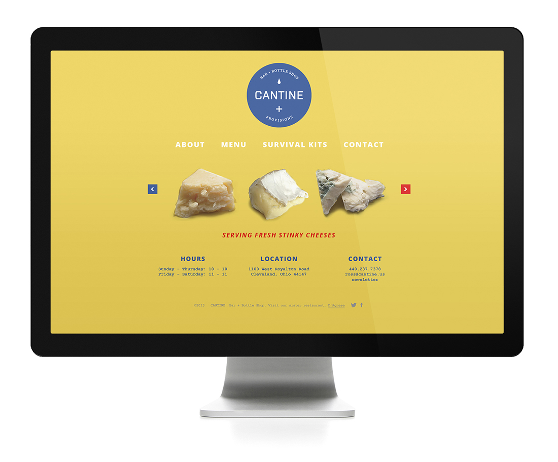
Cantine Bar + Bottle Shop Logo Design

Branding a hip and trendy new bar is something we are no strangers to at Go Media. We cut our teeth on Sam McNulty's Bier Markt and Market Garden Brewery branding and we were itching to work with another restaurateur again. When Ross Valenti came knocking on our doors we knew his project was going to be special. Designers, Aaron Roberts and Chris Comella began their work on Cantine’s logo design by researching imagery associated with the Boy Scouts and turn-of-the-century apothecaries as well as developing an appropriate color palette. Additionally, we knew that the client wanted his bottle shop to have an artisanal flair with a focus on clean and minimalist design. Our designers had a field-day conceptualizing the look-and-feel of the Cantine brand.


Below is an alternate concept we developed during the design process.

In the design process we'll explore multiple concepts. What you see here is a version of the identity that leaned closer towards the Scout influences, and less so on the apothecary side of the equation.


