Blog
Watercolor Design Trends: Where We’ve Seen Them & How to Use Them
Lately we’ve been noticing a lot of watercolor inspired designs floating around. Watercolors have been around a long time and have made their presence known in everything from fashion to stationery design and everything in between. It seems to be making a reappearance in the design world and can be seen in advertisements, packaging and website design. Maybe it’s because of spring’s arrival or just because of its timeless qualities, but many designers are experimenting with watercolor.
Where have we seen this trend?
Watercolors have been seen in many places lately and used by some big names. Some examples we’ve seen have come from Hillshire Farms, The Heads of State, Herbal Essences and the Discovery Channel’s show ‘Deadliest Catch’. With these big names experimenting with these trends, you shouldn’t miss out on the opportunity to try them out while they’re still hot.
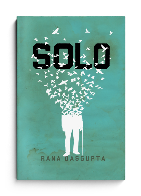
‘Solo’ Book Cover by ‘The Heads of State‘ in Philadelphia
The design shop The Heads of State created this beautiful book design using watercolor as the background. The watercolor bleed is subtle on the background, but used strategically can bring emphasis to certain parts of the design. There is a faintly darker stain right around the author’s name, which highlights it and brings it more attention.
_____________________________________________________________________________
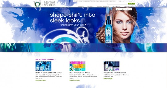
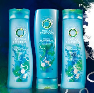 The Herbal Essences website uses a large blue splash of watercolor in its background. There is some variety within the hues, but it is mostly a dark blue. The watercolor design also changes as the main ad on the page changes. This watercolor feel is also carried into some of their packaging, as seen on the ‘Hello Hydration’ bottles. This helps streamline their campaign by integrating their packaging with the overall design and feel of their website.
_____________________________________________________________________________
This ad campaign for the Discovery Channel’s ‘Deadliest Catch’ is a great example of integrating the watercolor to be part of the design – not just a background or decorative element. Plus it’s especially appropriate because it relates to the real water and waves that are seen crashing down on the crew. Creative Overflow did a great case study on the process of creating this ad. See it here: http://creativeoverflow.net/discovery-channel-deadliest-catch-case-study/
_____________________________________________________________________________
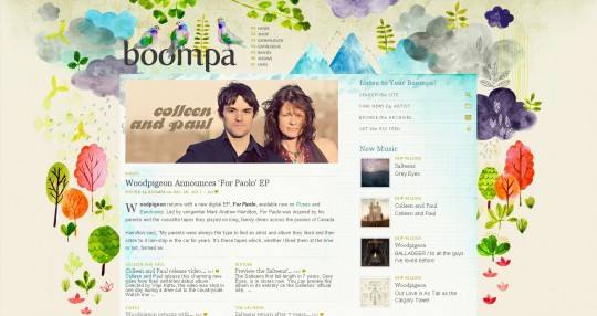
Boompa (music blog )
If you really want your watercolor designs to shine, this website is a great example. The main focus of this site is on the vibrant and creative little illustrations using watercolor. This would be a great technique for illustrators to experiment with. Now, these watercolor designs look like they were created and customized just for this site, so creating something similar would require some actual watercolor work. That doesn’t have to be difficult either, just make sure you have a plan. Sketch out your design until you have it just right, and then start painting with the watercolors. I’ll go over some tips later on how to create some of your own watercolor textures.
_____________________________________________________________________________
The Hillshire Farms commercial is an animated video of watercolor illustrations mixed with real photos. You watch as scenes of food are painted to life. The background is a soft cream, which is a perfect base for the watercolors. These great illustrations are painted in with watercolor but are defined with darker drawn outlines, helping them stand out more.
_____________________________________________________________________________
This fashion website uses a feminine pink and orange combo as the color scheme for its watercolor background. You can see some of the watercolor paper texture through the paint, which makes it much more interesting and not so flat. There is even a light wash of pink over the whole thing, so it doesn’t just turn to white. It makes up the whole background rather than just being an element within it.
_____________________________________________________________________________
The Croquis (personalized fashion illustrations) – This website uses a big block of watercolor as an element in the background. There is also a faint trace of watercolor on the top of the site. Each page of the website changes the color scheme of the large watercolor block, making each page unique. This is a beautiful way to use watercolor and it’s integrated well into the design of the site.
_____________________________________________________________________________
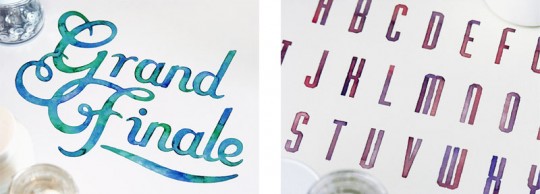
Sasha Prood lettering – One technique I love that uses watercolors is Sasha Prood’s watercolor lettering. Sasha uses watercolor textures in hand-lettered typography, which makes the lettering even more beautiful and unique.
_____________________________________________________________________________
Special K Campaign ‘What will you gain when you lose?’ design by Nomoco
Not too long ago, Special K launched a campaign that used watercolors as the main design theme. This is an example of an ad where the design consists mainly of a watercolor illustration. The artist Nomoco uses overlapping and transparent colors blending together to create a beautiful and soft design, resembling a bird. Some watercolor elements of the campaign can still be seen in a few places, as in here on their website: http://www.specialk.com/Promotions/WWYG#
_____________________________________________________________________________
Bear by Alvaro Tapia Hidalgo
This is an art print on Society6 by a graphic designer and illustrator based in Granada. It combines minimal geometric shapes and some type on top of a few splotches of organic watercolors. The watercolors are vibrant and messy and start to run into each other creating an interesting look. The artist’s pairing of watercolor is unexpected here and balances out the emotion of fear that the bear’s face imposes on the viewer.
How to use watercolors in your designs
One important thing to remember when creating watercolor inspired designs is balance. Watercolor designs seem to be most effective when used with the mindset ‘less is more.’ Traditionally, watercolors have been intended to be soft, subdued, and give a calming feel to a design. However, if you want to try loud & crazy, vibrant watercolors, go for it! Be creative, see what new spin you can put on this classic technique. Often times, they are a great background to display text and other images on. As I showed in some of the examples above, simply placing a watercolor texture in the background of your website will change the feel of it. But it’s always good to integrate it into other areas so it feels cohesive. In other instances, a big colorful watercolor might be the main focus of a design. This is shown in the ‘Bear’ print. You might become really inspired by watercolors and want to create a design based solely on that.
Techniques to create watercolor designs

Brushes
There are many ways that you could go about creating your own watercolor designs. One way would be to create or download watercolor brushes for Photoshop. Brushes take a little more time and have a similar trial and error process as when using real watercolor. You can set the brush to a lower opacity and paint just as you normally would with a brush. This technique will be even more effective if you use a background that looks like watercolor textured paper or a stained paper. Here is an example of a stationery design I created myself using a stained background and watercolor brushes.
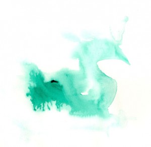 Textures
Another approach you could take would be to use photos of watercolor textures. You can use these in a variety of ways.
- Simply take a colorful watercolor splotch and use it as the background for your design. Experiment with layering different textures on top of each other and change the layer states to things like ‘Multiply’, ‘Darker Color’ and ‘Lighten’ to come up with different results.
- You can also change the blending modes on a texture while it’s on top of a picture. This will give your photo an interesting watercolor effect on top. Try adjusting the opacity to make it even more subtle.
- You can change the intensity of the color by saturating it, or if you don’t like the color scheme it’s in, change the hue in the hue/saturation panel.
- To fill a shape with the texture, make the shape on the layer of the texture using the pen or marquee tool. Once you have the shape you want selected, press CTRL + SHIFT + I to select the inverse selection, & delete it! (com + shift + i on a mac)
- One interesting effect to make the watercolor more intense is to place the texture layer over a black background layer. Set the watercolor to ‘Linear Light’ or ‘Hard Light’ and it instantly appears more vibrant.
Create your own textures
If you want to get really ‘hands on’ with this technique and use something that isn’t out there, you could try creating your own textures. Watercolor designs are different every time, so you will come up with something all your own.
Here are some tips on how to do it:
- The main thing is if you’re creating a design, have an idea of what kind of watercolor texture will suit it best. Look around the internet for inspiration and find something similar to the kind of texture you want. This will save you time rather than you having to painting a bunch of watercolors and then trying to fit one of those into your designs.
- Get some watercolor paper – the thicker the better so it doesn’t warp as much. More textured paper will help your watercolor look more authentic.

- Get a variety of watercolor paints. The more colors you have, the less you will have to mix paints to create unique colors. Your textures could get boring if your designs are limited in color.

- Have a few different brushes. A big fat one, a medium, and a small one are probably all you need. But you can really experiment with different techniques if you try different brushes, like a fan brush.

- Start painting. Just get a feel of how the watercolors work, and how much water you want to use. Set aside a few test sheets so you can experiment.
- If you really want that flowing or drippy watercolor look, first take your big brush, dip it in water and paint a big square swatch on the paper. Putting water down before you apply color will help it spread better. Then dip your smaller brush in water, load it with some paint, and apply it with some pressure onto part of the paper. The color should start to spread out, so you could let it work on its own and see what design you end up with, or you can keep adding paint to other sections. It’s especially interesting if you add a few different colors at once and see what happens when these colors bleed into each other.


- Once you have some designs you like, you can scan them into the computer. Set the resolution to 300 dpi or higher (I set mine at 600) to get even bigger images. Here you can also play around with the ‘Histogram Adjustment’ or ‘Levels’ if your scanner allows it. If you lower the middle greys and the highlights, it should blow out some of the background texture of the paper to a bright white. This way it doesn’t include the texture of the paper around your design. You also still want the colors to be vibrant and not fade, so don’t lower it too much. If your scanner doesn’t allow you to do this, you can always do it in Photoshop after you scan them.


- Crop the design so any extra paper around the border is gone and you’re pretty much done! You can start using your textures the way I described above.


