Blog
How To Design a Font: {Part2} Draw Up A Storm!
Terminology
Before we get into the meat of this tutorial I want to give you a crash course in font terminology. I know it’s not exactly the most exciting thing but I seriously think it’s good for you to know this before we get too far.

Sans serif: A type of font that doesn’t have accents on the end of its strokes.

Serif: A font that has little accents on the end of its strokes.
Vocabulary to Know:
Baseline: The line that the letter sits on.
Median: the middle line where lowercase letters end.
X height: the distance between baseline and median, traditionally 60 percent of the total height of the cap height.
Cap height: the line where capital letters end.
Ascender height: The line where ascenders end, only slightly above the cap height.
Ascender: the part of a lower case letter that extends above the median.
Decender: the part of a lower case letter that goes below the baseline.
Sketching
Now that you have your inspiration and an idea for your font it’s time to put it into action. I think that some designers sort of forget about the sketching process. It’s honestly the MOST crucial. The beauty of sketching is there isn’t a sense of commitment. You can crank out loads of ideas very quickly since you aren’t worried about making the design look perfect. It’s a lot faster to do 10 loose sketches on paper than trying to do the same thing on the computer. I remember one of my professors once said that the computer is a tool, no different than a pencil or pen, don’t rely on it to design for you.

There are several different ways in which you can draw some ideas. I use a combination of ways to get my thoughts together. Usually I use a scroll that’s always on my desk for sketching. The reason I use a scroll instead of a piece of paper is because I like not being limited by how many sketches I can do. Plus, it’s all contained in that one roll so I never have to worry about losing a sketch.

In the sketching process I will draw a few characters that I think might help me figure out the characteristics of the rest. Here are the characters that I usually start out with first: a, e, g, n, d. You can also do a few capitals as well like: A, E, G, M. From these characters it will give you a good variety of forms that are pretty similar in other letters. Start out designing these letters and see what you think. If they’re working try some more, if not then you haven’t wasted your time designing an entire font that sucks.

Draw a variety of perspectives of the font as well. I usually like to draw a few pieces of the font to show how different pieces are going to connect. Don’t be afraid to draw really quickly at first. When you start seeing something you like, draw a few different versions of that idea to see what you like best. Never settle for your first idea. Sometimes I will also write notes on the side of my sketches just to remind myself of something when I do the final sketch.

This initial sketching time is sort of like a funneling process to get down to that one idea that you are really excited about.
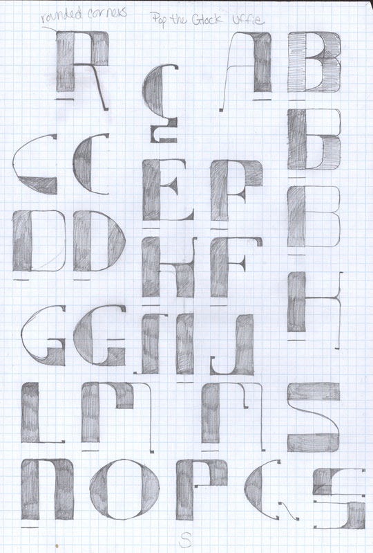
Once you’ve got a pretty clear idea of where you see the font going, it’s time to get out the grid paper. This is when you are going to draw out ALL of your characters. I like to use grid paper just because I can get the proportions between letters right on. Keep in mind that all your letters aren’t going to take up the same width, but they should be the same height. Some letters like “M” and “W” are going to take up a lot of width but letters like “I” don’t take up much at all. At this point in your sketching you’re still not fully committed to one idea, so feel free to play around with different ideas. Sometimes I will do a few different versions of a letter if I’m still not satisfied.
Next Time: Going Digital
Now that you have all of your characters drawn it’s time to get digital. Sometimes I will scan in my grid paper drawings and just trace them in illustrator. You can also just look at the drawings to design the characters, whatever works best for you. If this is your first font maybe you should go from a scan.

